
📌 Love these ideas? Follow us on Pinterest for daily home decor inspiration! Follow @SeasonalHomeMagic →
Blue for fall? Absolutely. If you’re tired of the same pumpkin-spice palette every year, a deep, cozy blue is the chic reset your dining table craves. It plays beautifully with harvest tones, feels modern, and yes—makes your everyday dinner look effortlessly put together, even without professional styling.
Grab your gourds and your favorite napkins. Here are eight scroll-stopping ideas to help you pull off a blue fall table that feels warm, layered, and effortlessly stylish.
1. Build Your Base With Moody Blues
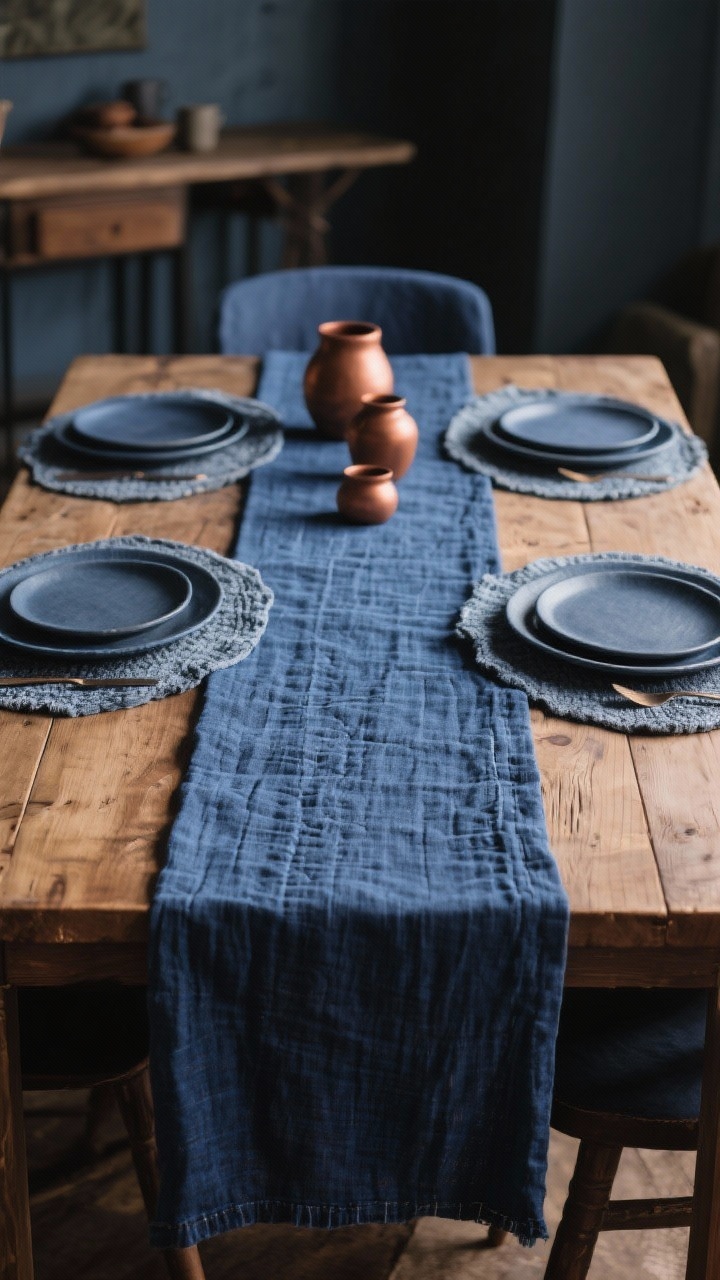
Start strong with a foundation that sets the vibe. A **navy or indigo tablecloth** instantly brings depth and drama, like turning on cinematic mode for your dining room. If you’re more “bare table” than “fabric forever,” try a heavyweight **denim runner** down the middle for a relaxed, rustic feel. I actually tried this combo last year for Thanksgiving — the navy runner with copper vases instantly made my small dining space feel warm and elegant without much effort.
Why it works
Blue reads calm and collected, so it grounds all those warm fall accents without competing. Think: navy + copper + caramel — it just works, trust me, it’s the kind of palette that always gets compliments.
Quick Tips:
- Choose textured fabrics—washed linen, chambray, or matelassé—to keep it cozy, not corporate.
- Layer a shorter runner over a full cloth in a slightly lighter blue for subtle dimension.
- If you’ve got a gorgeous wood table, use **placemats** in slate blue to frame place settings while letting wood shine.
2. Mix Blues With Earthy Neutrals
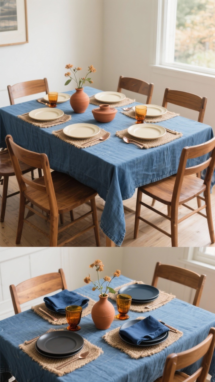
Blue loves a good supporting cast. Pair it with **warm woods, stoneware, and natural fibers** to avoid a cold palette. The contrast makes your table feel grounded and seasonal—like a crisp hike, but indoors and with bread. From experience, the denim and cream palette works beautifully under natural daylight. It tones down the intensity of blue and feels surprisingly calming during fall dinners.
Palette ideas
- Navy + Wheat + Terracotta: Navy runner, jute placemats, terracotta bud vases.
- Denim + Cream + Copper: Denim tablecloth, cream dinner plates, copper flatware. It’s one of my favorite combos.
- Ink Blue + Charcoal + Amber: Ink-blue napkins, charcoal plates, amber glassware.
Pro Move: Keep your blues within 2–3 shades so it looks curated, not chaotic. FYI, a little variation is good; a rainbow of blues is not.
3. Layer Plates Like a Stylist
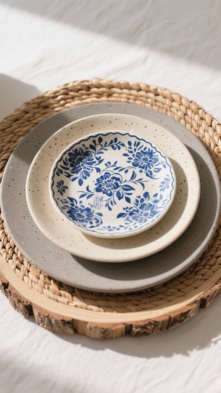
Stacking plates is the simplest way to get that “I tried” look without actually trying. Start with a **charger** (wood slice, rattan, or antique silver), then a neutral **dinner plate**, and top with a **patterned salad plate**—bonus points if it has a blue floral, stripe, or speckle.
Layering formula
- Base: Textured charger adds warmth and frames everything.
- Middle: Matte stoneware dinner plate keeps things modern.
- Top: Blue patterned salad plate = personality.
Tip: Don’t match every plate. Mix vintage blue-and-white with modern shapes for that collected, cool-girl vibe.
4. Napkins That Do the Heavy Lifting
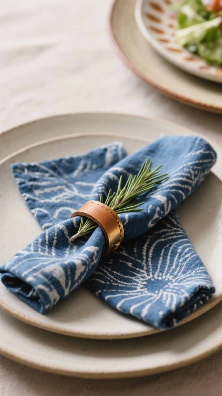
Napkins are small but mighty. Choose **indigo-dyed linen** or **block-printed blue napkins** to add pattern and softness. Fold them neatly on the plate or knot them casually if you’re going for “effortless but obviously thought about.”
Napkin styling ideas
- The Knot: Simple knot placed on the plate with a sprig of rosemary tucked in.
- The Tuck: Napkin threaded through a leather or brass ring, tucked into a bowl.
- The Layer: Napkin under the salad plate so the pattern peeks out.
Styling Hack: Use **contrasting napkin rings**—wood, brass, or ceramic—in warm tones to balance all that blue.
5. Centerpieces: Blue Meets Harvest
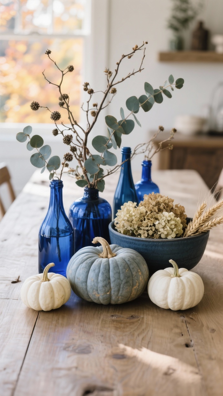
Centerpiece time, but let’s keep it breezy—no overstyled florist moment required. Combine **blue glass vases** or **bottles** with simple branches, seeded eucalyptus, or dried grasses. Add a few **mini pumpkins** in white or muted orange to keep it undeniably fall without clashing with your blue palette.
Easy centerpiece combos
- Blue Bottles + Branches: Asymmetrical cluster of bottles with foraged branches (yes, your yard counts).
- Stoneware + Dried Florals: Slate-blue ceramic bowl filled with dried hydrangeas and wheat.
- Pumpkin Trio: One standout heirloom pumpkin in a dusty blue-gray, flanked by two white minis.
Note: Keep centerpieces low so guests can actually see each other. IMO, no one wants to navigate a conversation around a fern wall.
6. Candlelight That Warms Up the Cool Tones

Blue can feel chilly without the glow factor. Enter **candles**—unscented tapers or pillars in soft neutrals like cream, taupe, or warm gray. Want some moody charm? Use **mismatched brass candlesticks** or **smoky glass hurricanes** for layered height and shine. I learned the hard way that placing candles too high blocks conversation. Keeping them at eye level or lower makes everything feel more inviting.
Light it right
- Cluster odd numbers of candles—3, 5, 7—for an organic look.
- Mix heights but keep the tallest under eye level to avoid the “castle candelabra” situation.
- Amber or smoky glass adds warmth and looks amazing against navy.
Safety PSA (because we care): If kids or pets are involved, go for **high-quality LED tapers**—the flicker has come a long way.
7. Add Blue Through Glassware and Details

Subtle pops of blue go a long way. Try **cobalt water goblets** or **blue-rimmed glasses** to echo your palette without overwhelming it. Layer in **blue-stitched place cards**, **indigo-dipped coasters**, or **navy ribbon** around napkins for that designer-level finish.
Detail ideas that make it special
- Blue Glassware + Clear Wine Stems: Keeps the table airy and balanced.
- Handwritten Place Cards: Use cream cardstock with navy ink or a gold paint pen for a luxe touch.
- Mini Take-Home: A tiny jar of blueberry jam or a packet of chai tied with blue ribbon. Cute and useful.
FYI: Repeating blue in three spots—base layer, centerpiece detail, and table setting—creates cohesion without feeling matchy-matchy.
8. Cozy Finishes: Runners, Throws, and Pattern Play
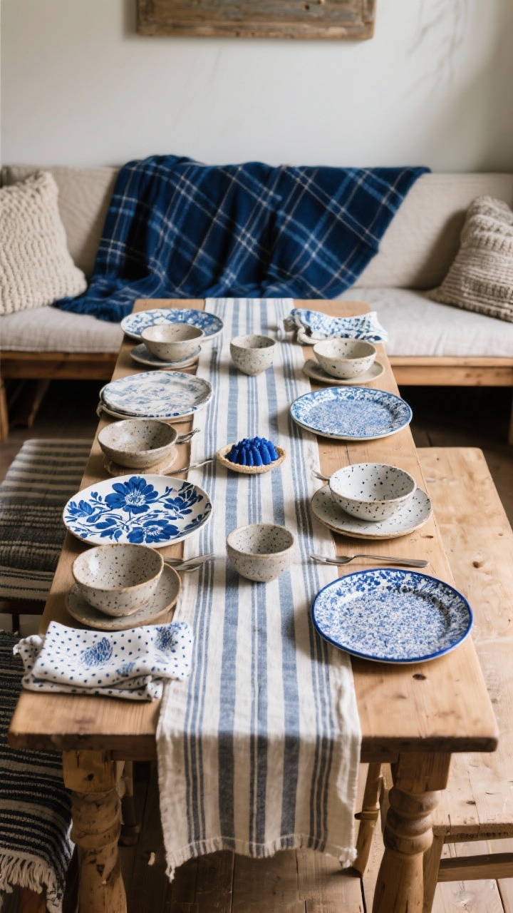
For the final polish, add **soft layers** that make guests want to linger. Drape a **navy or plaid throw** over the back of bench seating, or anchor the table with a **striped runner** to add movement. Mix patterns—stripes, checks, florals—in the same blue family for that editorial feel.
Pattern mixing cheat sheet
- One Bold, Two Quiet: Big floral, subtle stripe, tiny dot. All in blues or blue + cream.
- Scale Matters: Vary pattern sizes so they don’t compete.
- Texture Counts: Knit, linen, and stoneware add visual interest even in solids.
Mini Upgrade: Swap in **blue-edged dessert plates** or **speckled bowls** just for the final course. It’s the little surprise that gets compliments—every time.
There you go—eight ways to make blue the star of your fall table without sacrificing the cozy factor. Mix textures, layer your settings, and sprinkle in warm metals and natural elements to keep it balanced. Most importantly, have fun with it. Your table doesn’t need to be perfect; it just needs to feel like you. Now light those candles, pour something delicious, and let the compliments roll in.
FAQ
1.How can I style a fall table with blue tones easily?
2.What colors go best with blue for fall decor?
3.How do I make a blue fall table look natural, not too formal?
4.Can I use blue decor for Thanksgiving?
If you loved these fall decor ideas, make sure to check out these other autumn posts too!
- 9 Neutral Fall Table Decor Ideas You’ll Want to Copy Immediately
- 10 Easy DIY Fall Centerpiece Ideas That Impress
- 10 Fall Pumpkin Table Centerpiece Ideas for Every Style
- 7 Thanksgiving Table Decor Ideas for a Cozy Holiday Setting


Comments are closed.