There’s a particular kind of cheer that comes from a well-dressed kitchen window. Maybe it’s a row of red gingham gathered over the sink, a sunny floral valance catching the morning light, or a pair of cherry-print tiers that make you smile every time you fill the kettle. That happy, lived-in feeling is exactly what good retro kitchen curtains bring to a room, and the best part is how little it takes to get there.
Quick answer: The most classic retro kitchen curtains are short cafe or tier curtains in cheerful prints like gingham, cherries, lemons, or small florals, hung low on a bright chrome rod. Keep them at sill length so they let in light and stay clear of the sink and stove, pull the color from something you already own, and add a valance or tie-back for that gathered, vintage charm.
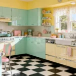
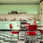
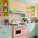
These 23 ideas run from bold prints and pastel solids to skirted sinks, clever no-sew tricks, and finishing details like ruffles and ribbon tie-backs. You’ll find something for every window, whether you sew or just want to clip up a tablecloth and call it done. Pour yourself a coffee and let’s dress some windows.
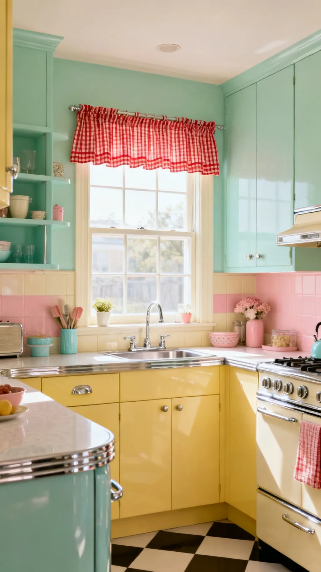
&# 10024; Setting the whole scene? Start here:21 1950s Kitchen Ideas to Recreate That Nostalgic Charm→1. Hang Classic Red Gingham Cafe Curtains
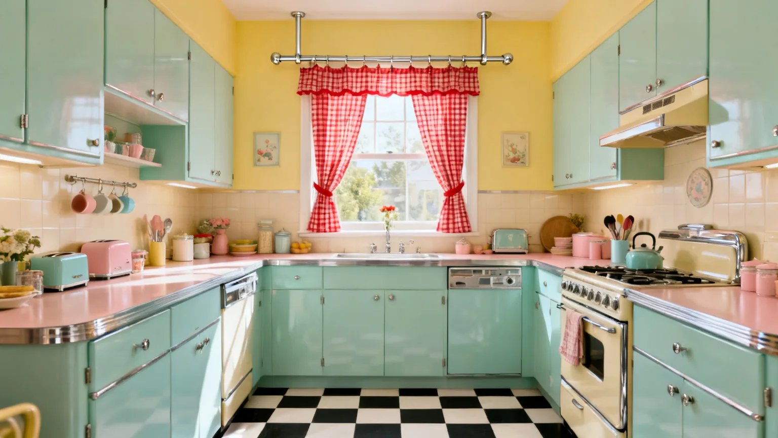
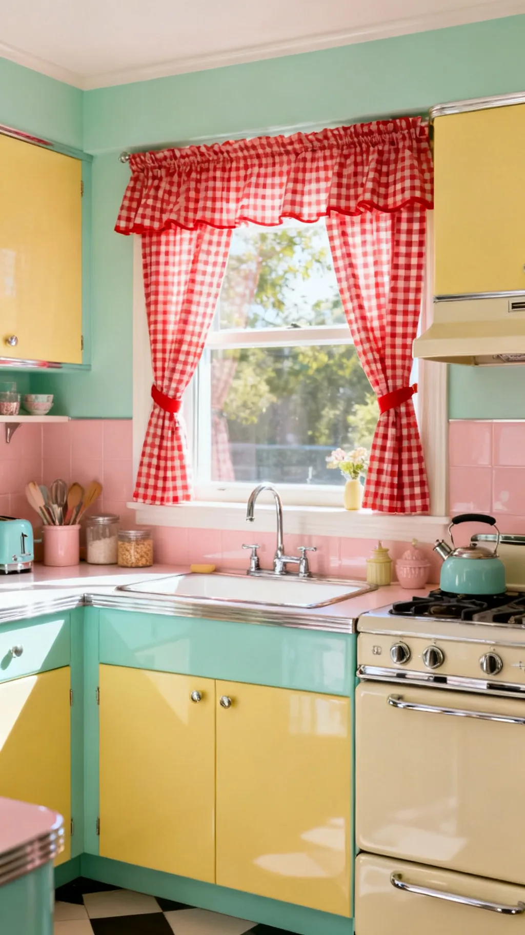
If there’s one print that says retro kitchen instantly, it’s a crisp red gingham check. Cafe curtains that cover just the lower half of the window let in plenty of light while still giving you privacy and a big dose of cottage charm. They’re the friendliest place to start with retro kitchen curtains, because the pattern is cheerful, forgiving, and pairs with almost any color you already have. I’ve seen a plain builder window turn sweet and lived-in with nothing more than a gathered gingham panel.
Why Gingham Works
- Half coverage: cafe length keeps the light while adding privacy.
- Cheerful check: red and white is the classic diner-era pairing.
- Easy to sew: straight seams make gingham a beginner-friendly project.
Hang them low on a tension rod so you can lift them out and wash them whenever you like.
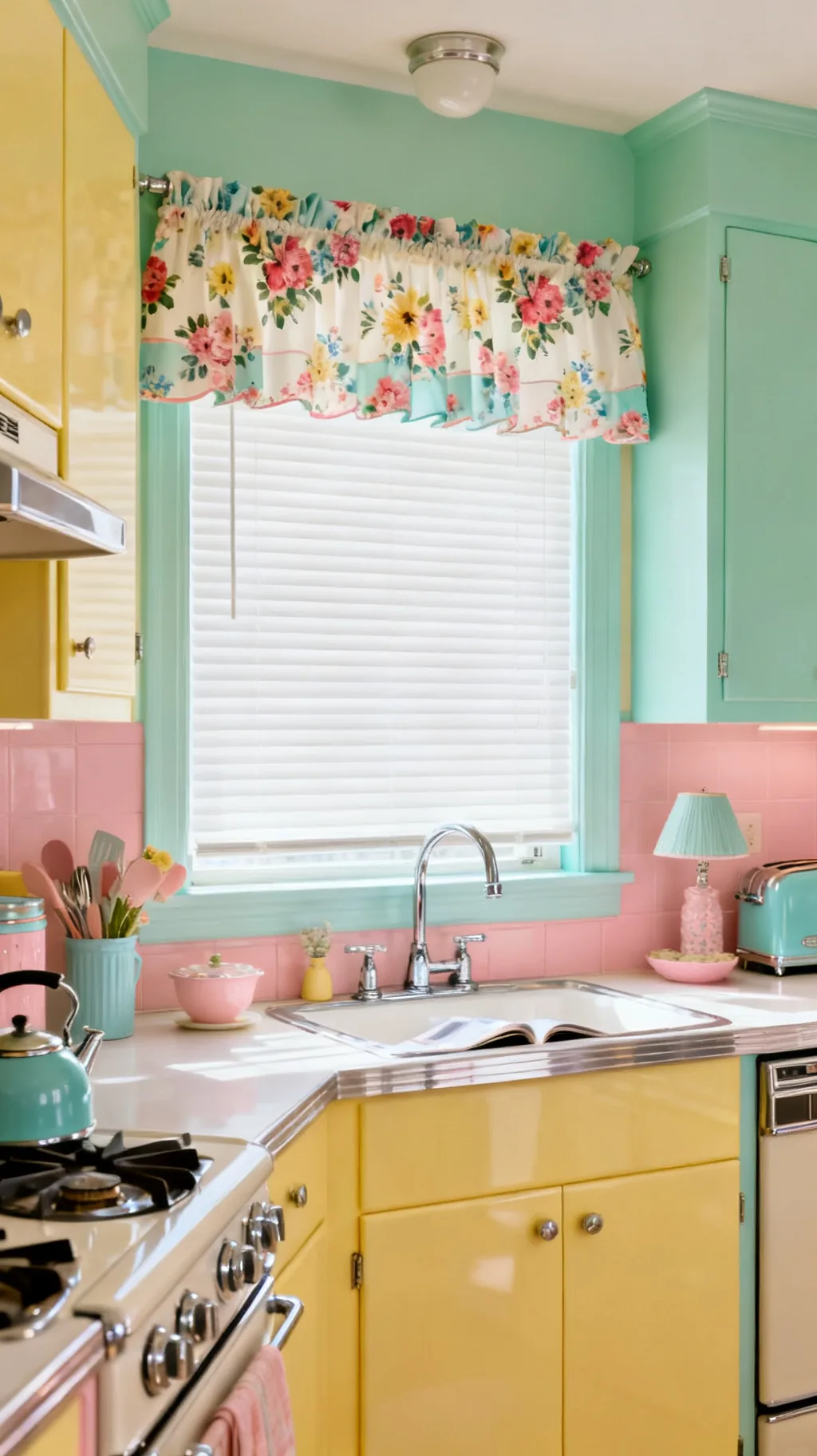
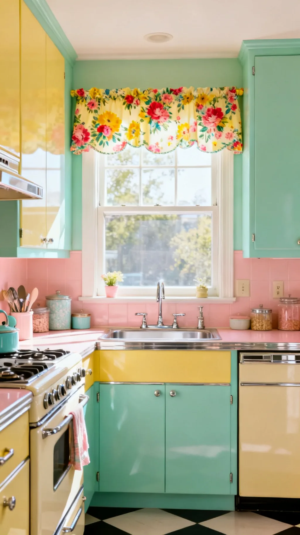
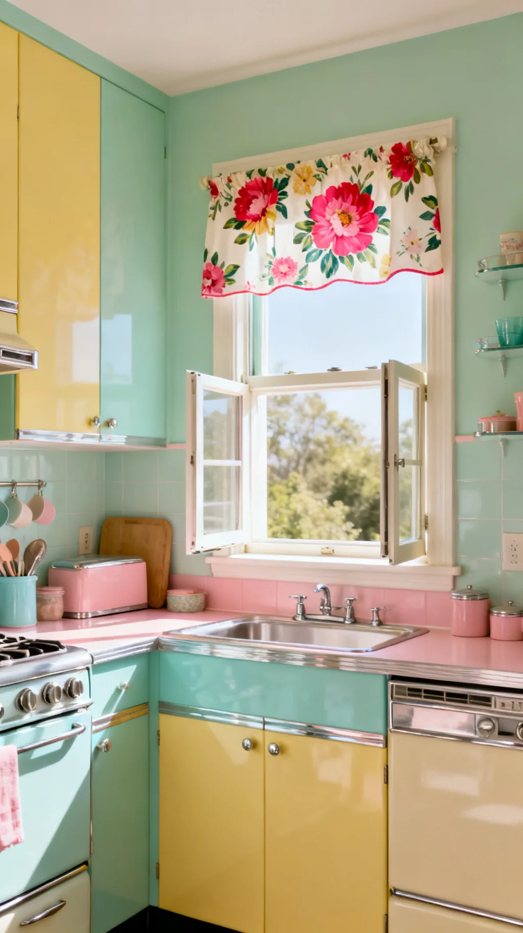
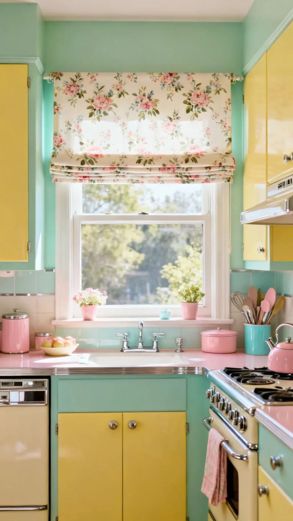
2. Try a Cheerful Floral Valance
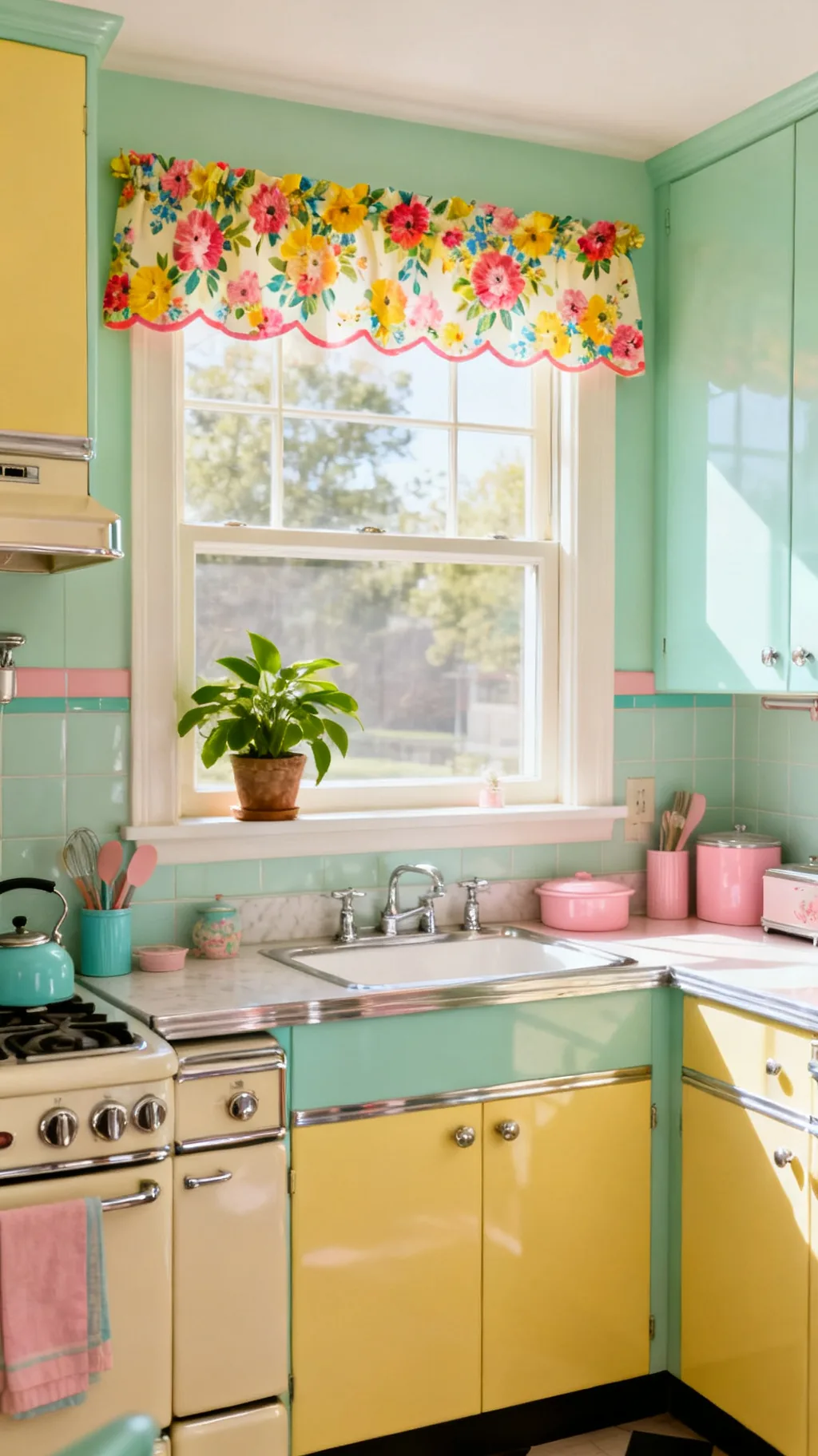
When you want pattern without covering the glass, a floral valance is the answer. This short topper sits across the top of the window and frames the view with a burst of sunny blooms. It’s a small touch that pulls a whole color scheme together, and it leaves the sill free for plants or canisters. A friend of mine swapped a heavy drape for a simple floral valance and said the whole room suddenly felt ten years younger.
Styling a Valance
- Keep it short: a valance tops the window without blocking light.
- Pick happy blooms: bright, simple florals read genuinely midcentury.
- Free the sill: the short length leaves room for plants and jars.
Match one color in the floral to your cabinets so the valance feels planned rather than added on.
3. Go Half-Window With Tier Curtains
Tier curtains, sometimes called cafe tiers, cover the bottom portion of the window in two gathered panels. They’re a retro staple because they balance privacy and light so gracefully, and they suit a kitchen where you want to hide a less-than-lovely view while keeping the morning sun. Pick a tidy check or a small print and you’ve got an honest, old-fashioned window in an afternoon.
Tier Curtain Basics
- Two panels: gathered tiers meet softly in the middle.
- Sill or apron length: stop at the sill for a crisp, tidy look.
- Light rod: a thin cafe rod keeps the focus on the fabric.
Add a matching valance on top later if you want the full layered, collected effect.
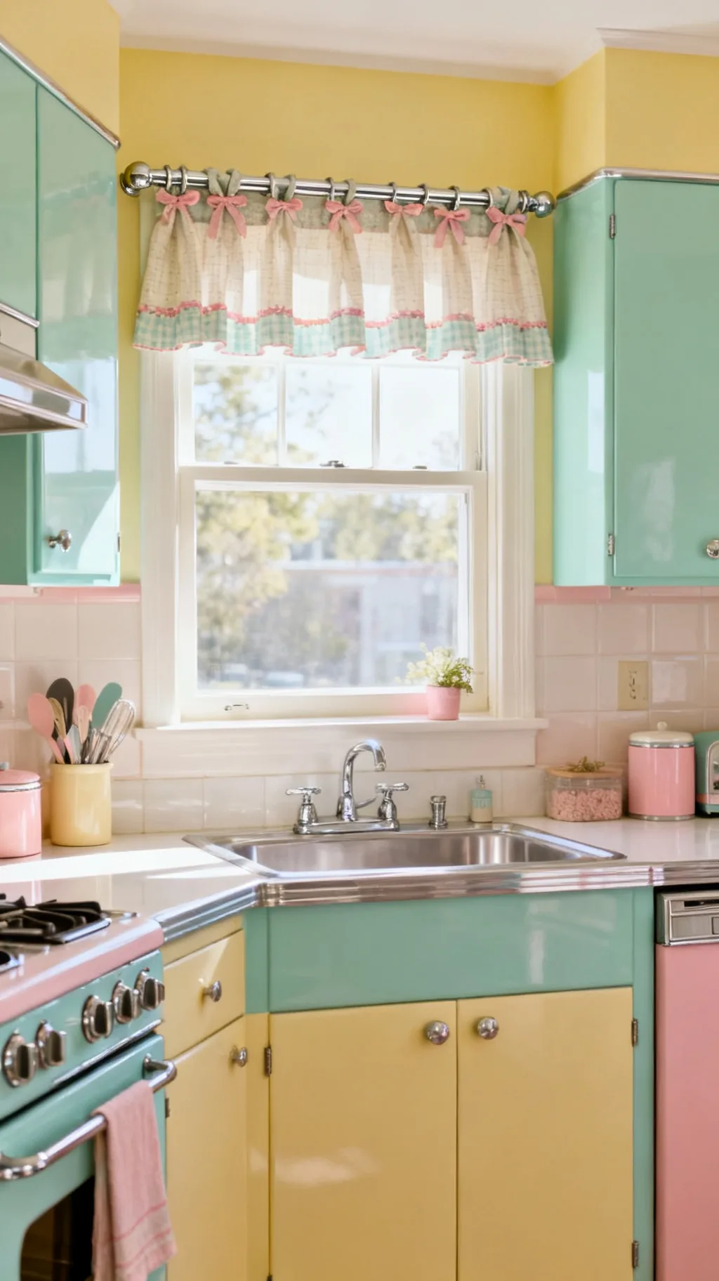
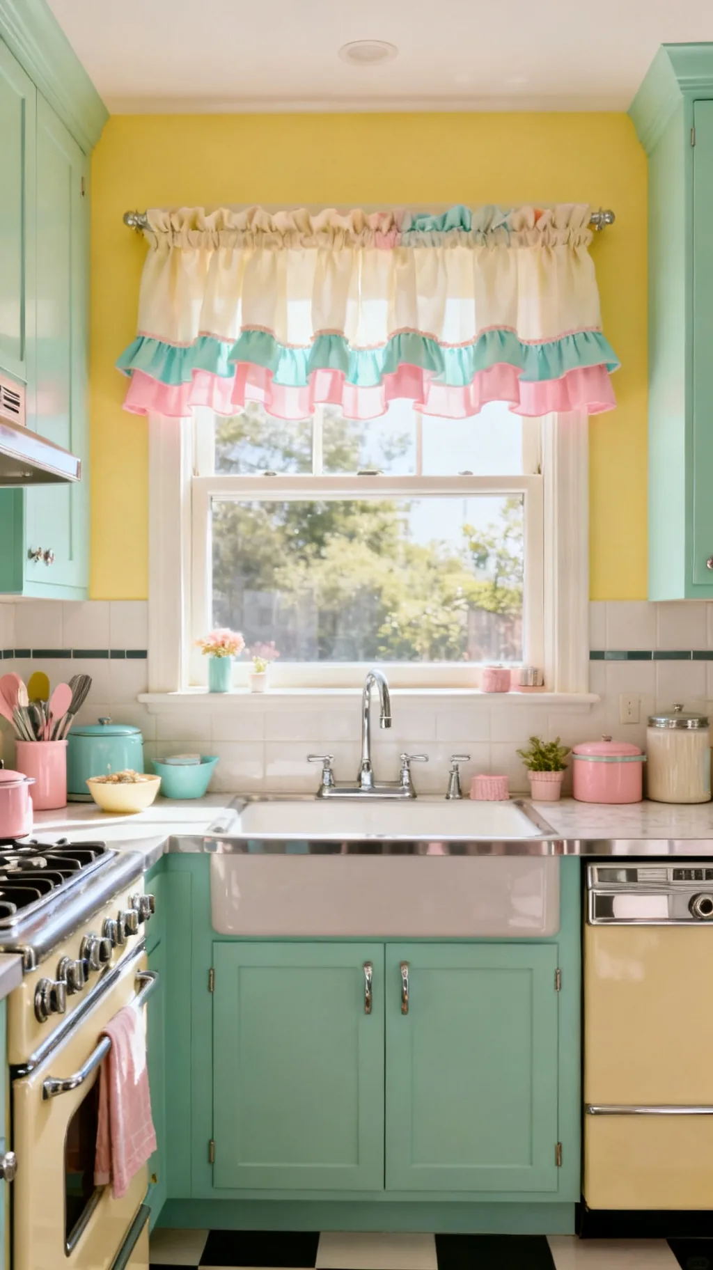
4. Add a Ruffled Trim for Cottage Charm
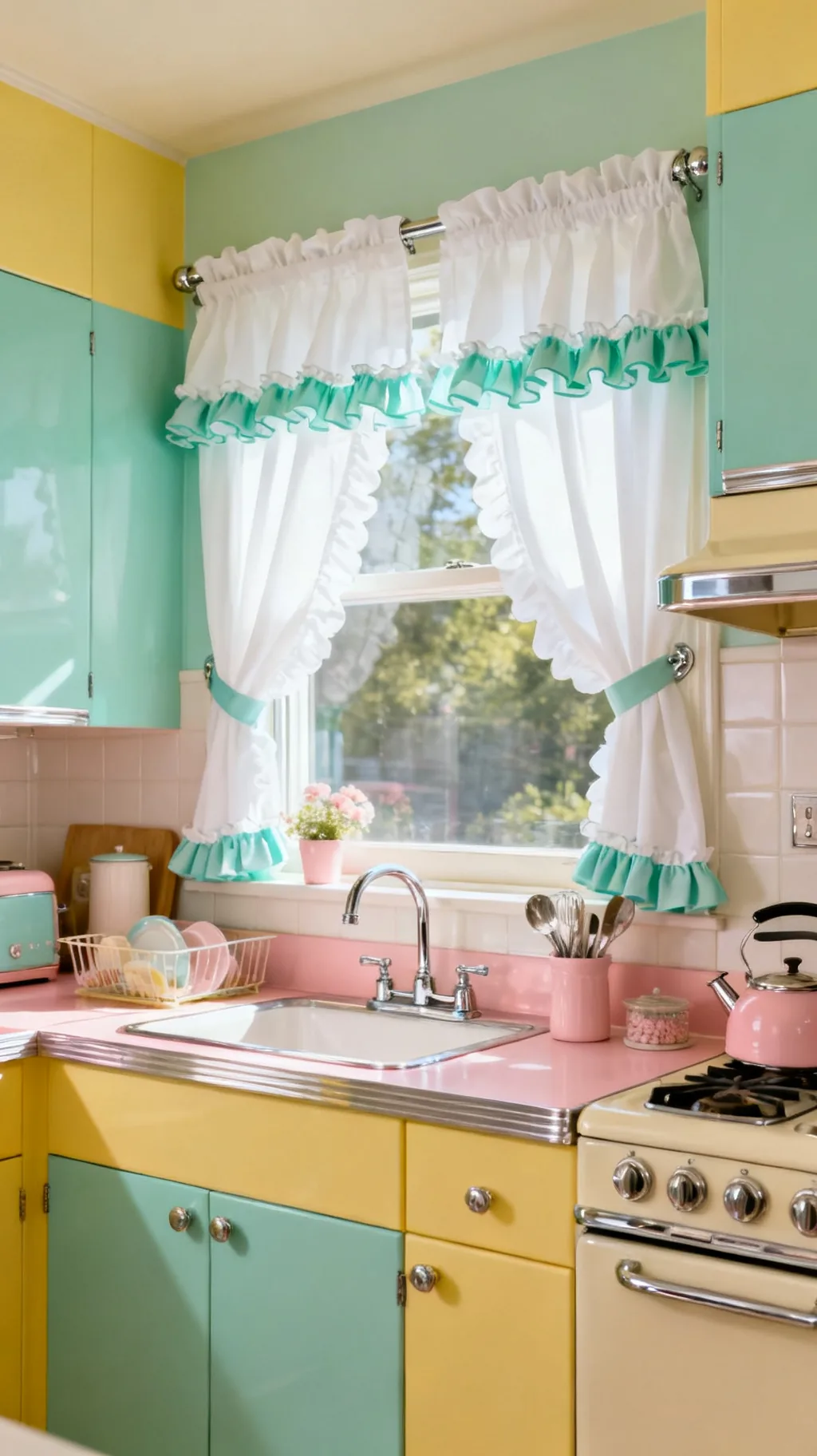
A soft ruffle along the edge of a curtain is pure vintage sweetness. Whether it runs down the leading edge or gathers along the hem, that little frill softens hard window lines and leans into cottage-kitchen nostalgia. It works beautifully on gingham, solids, and small florals alike. The ruffle is one of those details that quietly signals a curtain was made with care.
Where to Add Ruffles
- Hem ruffle: a gathered bottom edge adds gentle movement.
- Leading edge: a vertical frill frames the window softly.
- Valance ruffle: a ruffled topper doubles the cottage charm.
Keep the ruffle modest, a small frill reads charming while a deep one can feel fussy.
5. Pick Cherry-Print Panels
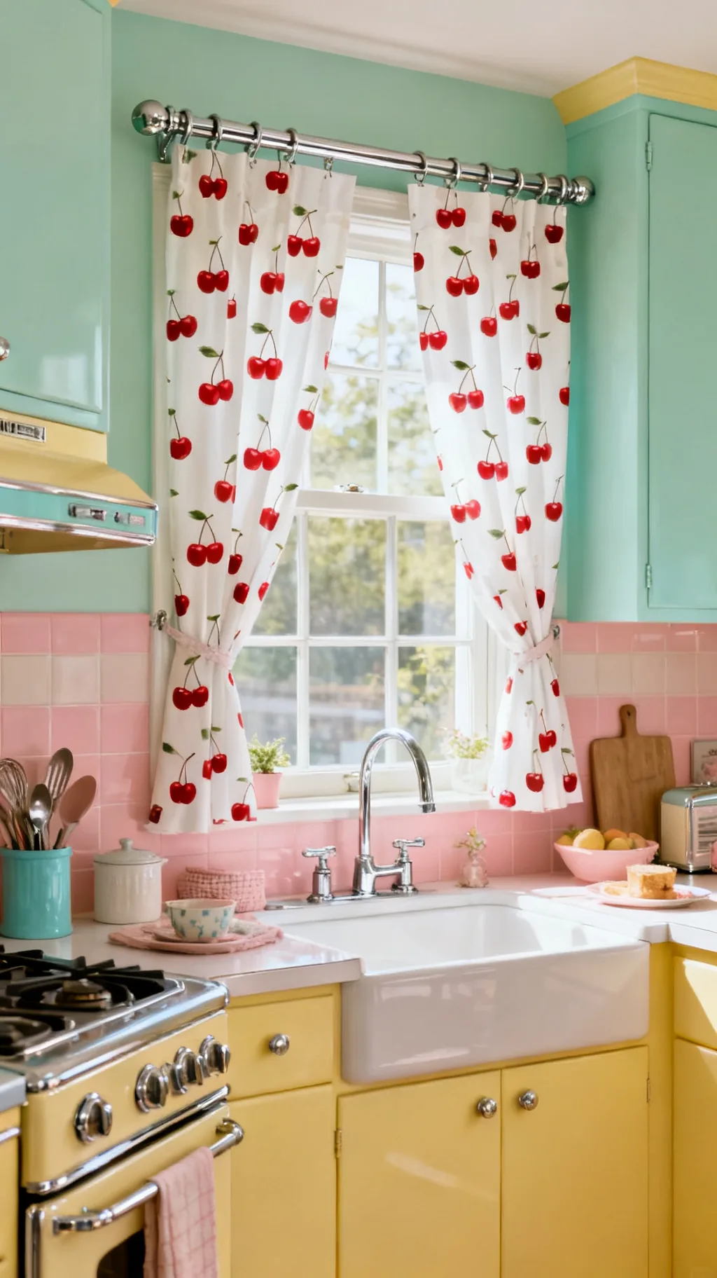
Few motifs feel as joyfully retro as a scatter of red cherries on a white ground. Cherry-print curtains bring instant 1950s cheer and pair perfectly with chrome, mint, and cream. Use them as full panels on a larger window or as a short valance over the sink. From what I’ve gathered, fruit prints like cherries and lemons are the ones people remember most fondly from a grandparent’s kitchen.
Working With Novelty Prints
- Cherries on white: the classic red-and-white combo never dates.
- Balance the busy: keep surrounding decor calm and solid.
- Tie in red: echo the cherry red in a towel or canister.
Let the print be the star and keep the rest of the window hardware simple and chrome.
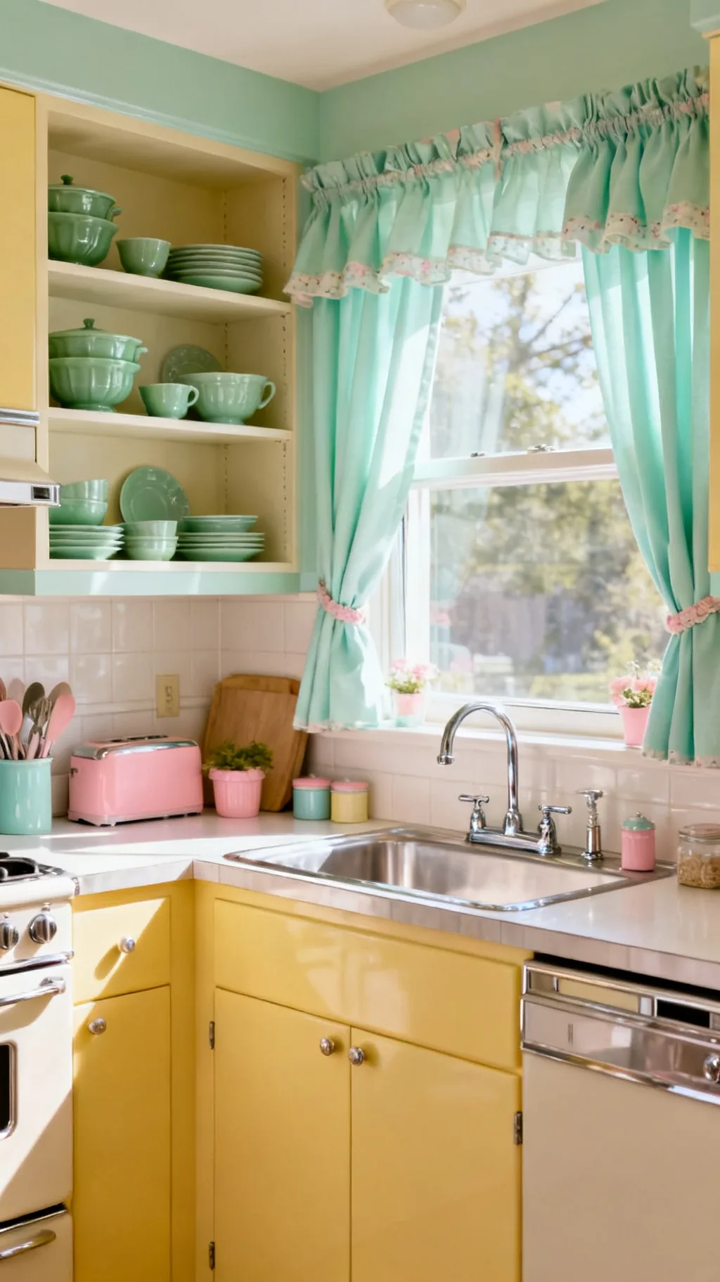
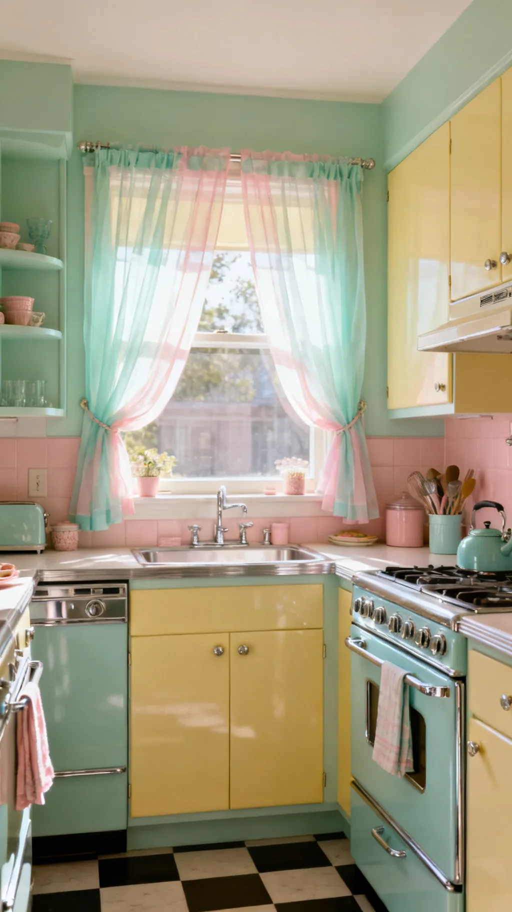
6. Use Sheer Pastel Voile for Soft Light
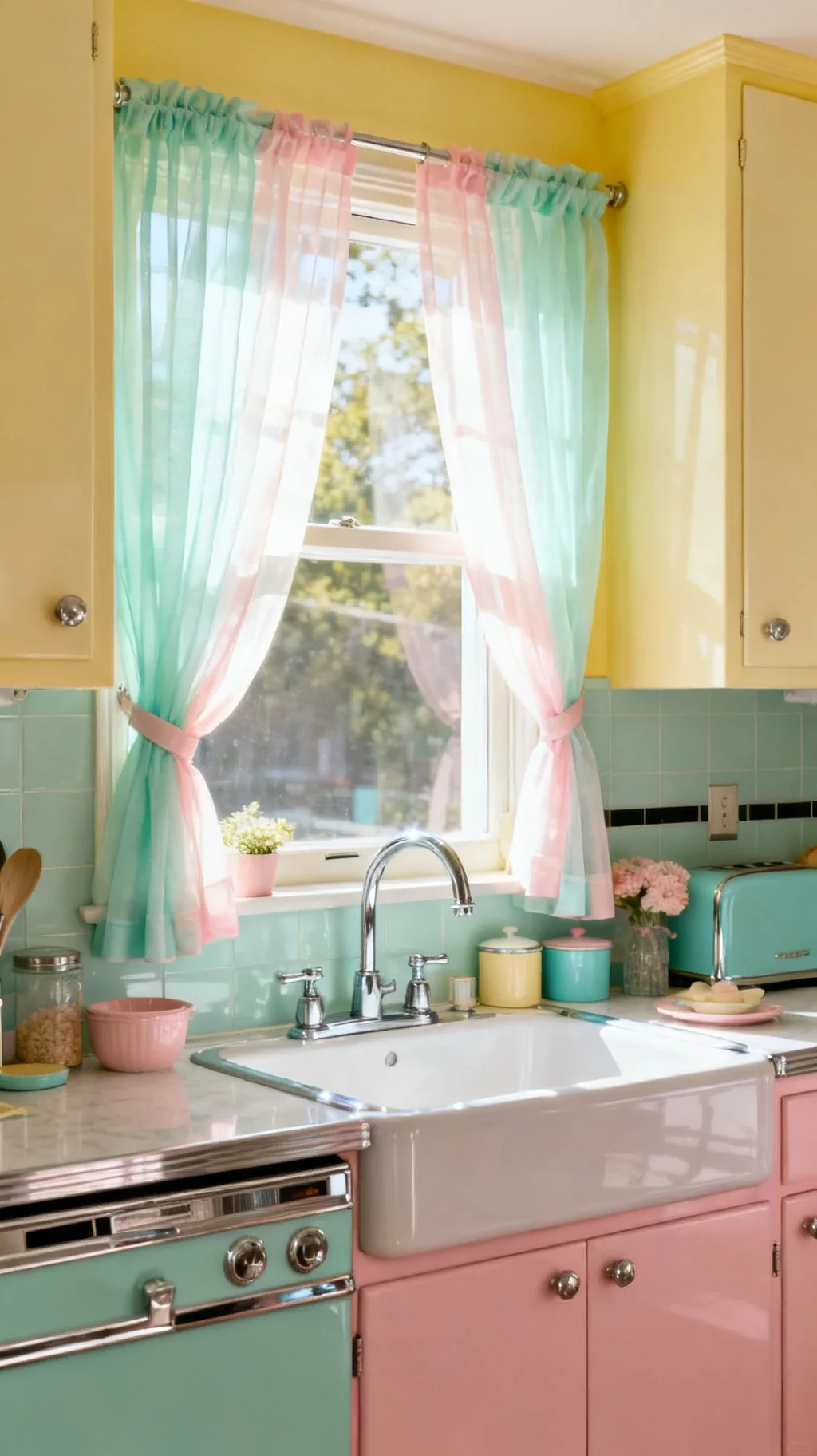
Not every retro window needs a bold print. A panel of sheer pastel voile in mint, blush, or buttercup filters the light into a soft, flattering glow while keeping the room feeling open and airy. Sheers are perfect over a sink where you want brightness but a little softness too. They move gently with the breeze, which adds a quiet, lived-in calm.
Choosing Sheers
- Pastel tint: a whisper of mint or pink warms the daylight.
- Full length or tier: sheers suit both depending on the window.
- Layer later: add an opaque valance on top for evening privacy.
Hang sheers a touch wide so they gather softly even when fully drawn back.
Swipe through these for a little inspiration.
 1 / 5
1 / 5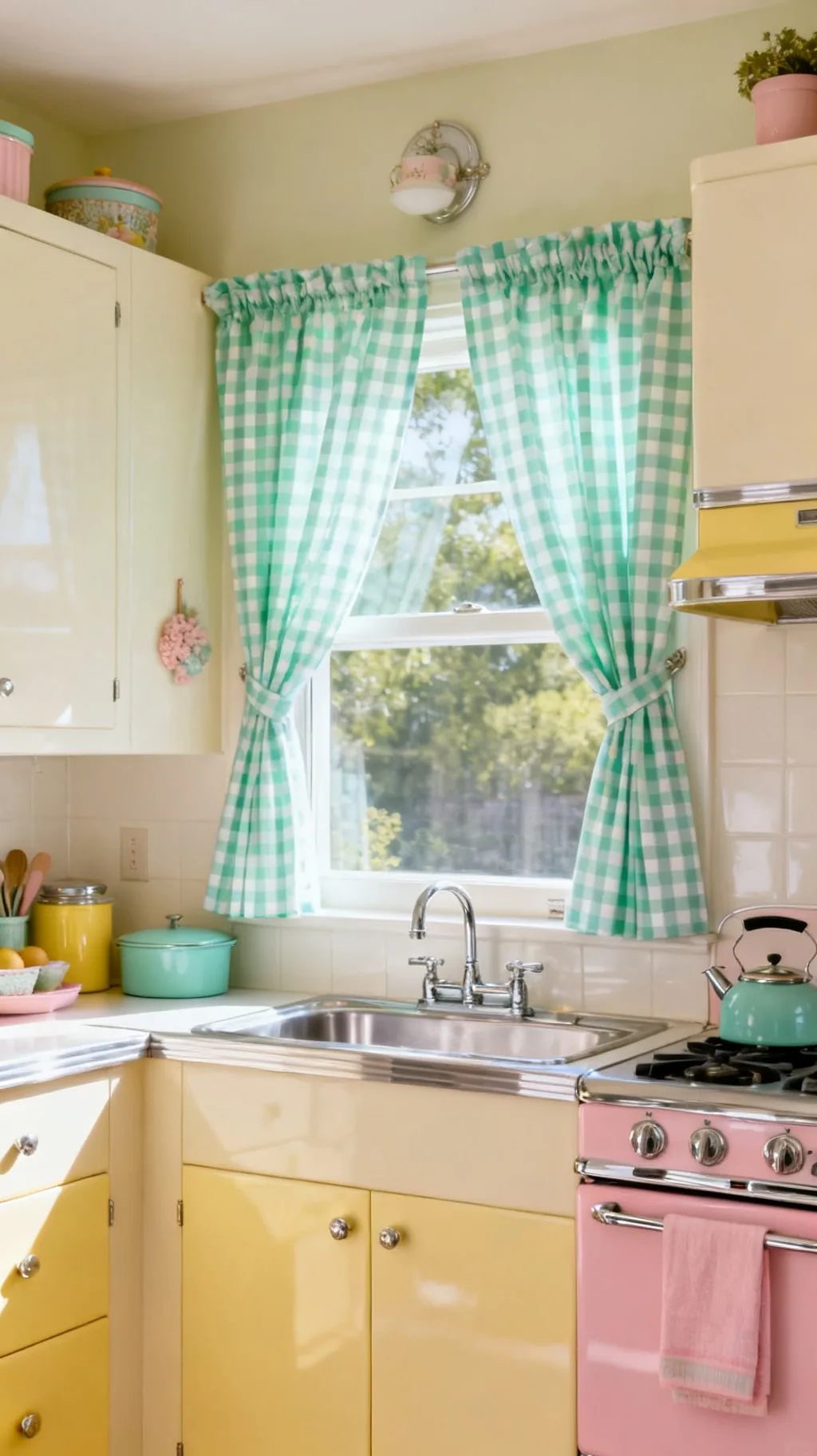 2 / 5
2 / 5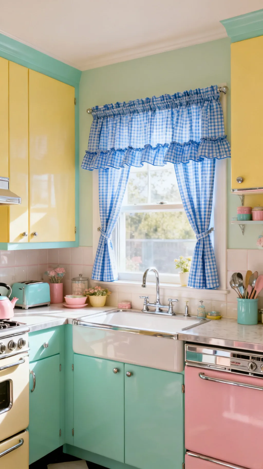 3 / 5
3 / 5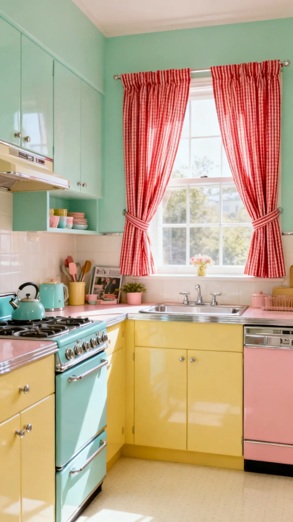 4 / 5
4 / 5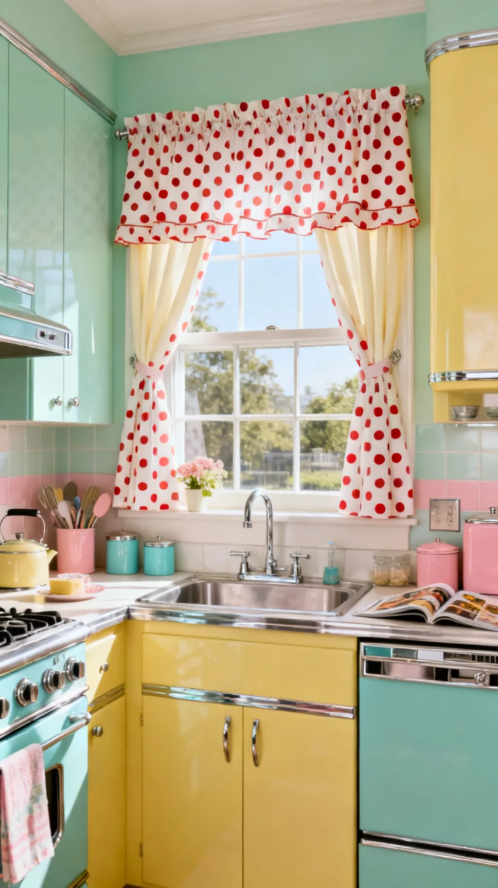 5 / 5
5 / 57. Frame the Sink With a Skirted Cabinet Curtain
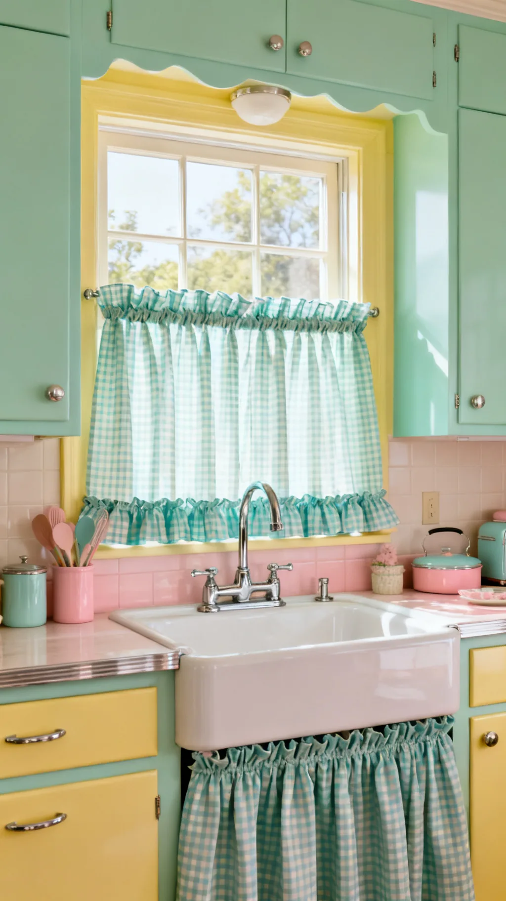
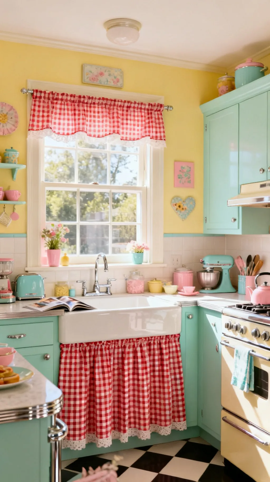
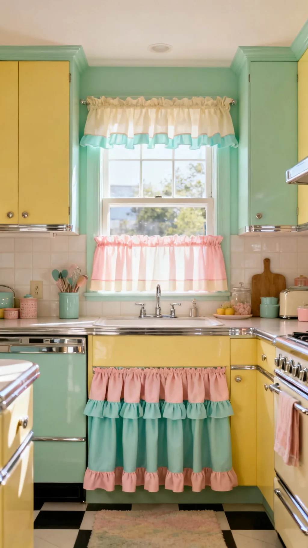
Retro kitchens love a skirted sink, a gathered curtain that hides the space beneath the basin where a cabinet door might be. A cheerful gingham or floral skirt softens the room’s lower half and gives you tidy hidden storage. It echoes the curtains above for a sweet, pulled-together look. This is one of the most authentically vintage touches you can add, and it asks for very little fabric.
Skirting the Sink
- Tension wire: a simple wire or rod gathers the skirt neatly.
- Match the window: repeat the curtain print for cohesion.
- Hide the clutter: the skirt conceals bins and cleaning supplies.
Use a snap or hook-and-loop tape so the skirt lifts away easily for laundry day.
8. Choose Ticking Stripe for Timeless Style
Ticking stripe, that narrow woven line on a cream ground, is a quiet classic that bridges vintage and retro effortlessly. In red, mint, or soft blue, it brings tailored charm without the busyness of a print. Ticking suits a kitchen that wants warmth and a little structure, and it plays nicely against both pastel and wood. It’s the print I keep coming back to when I want something cheerful but calm.
Styling Ticking
- Narrow stripe: the fine line reads tidy and timeless.
- Soft colors: red, mint, or blue on cream feels gently retro.
- Mix with check: ticking pairs happily with gingham accents.
Run the stripes vertically to make a short window feel a little taller.
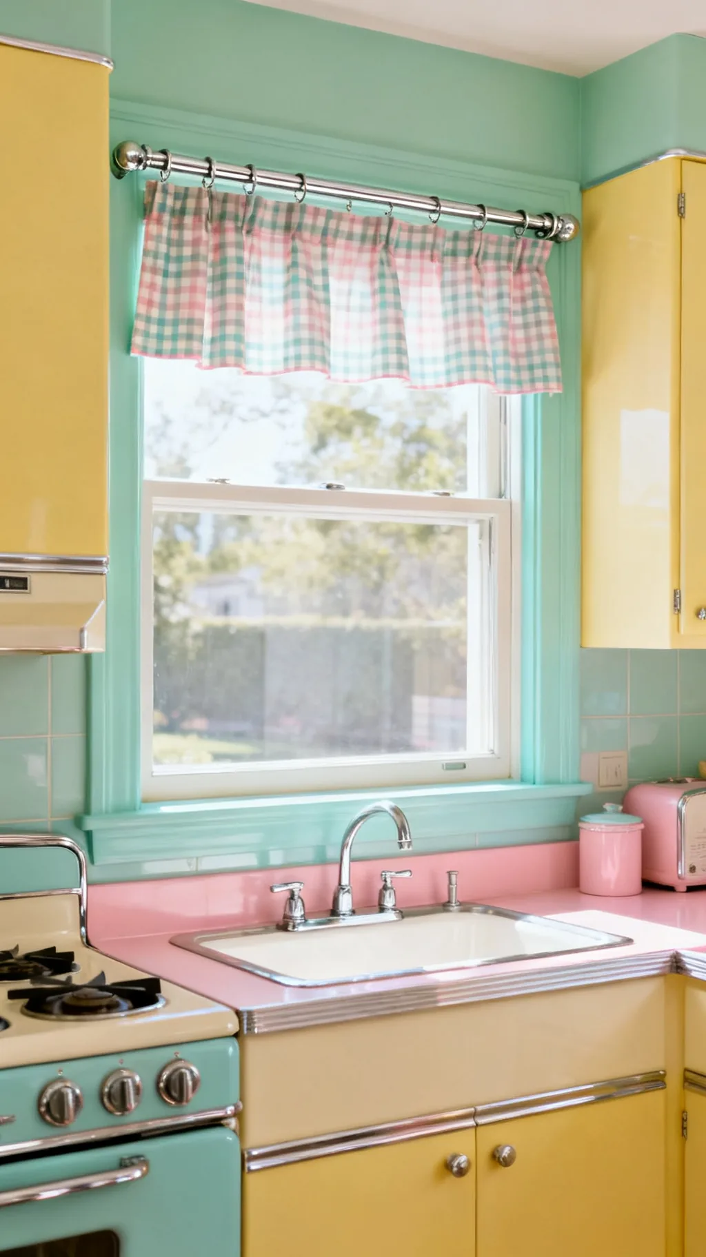
9. Mix Mint and White Checks
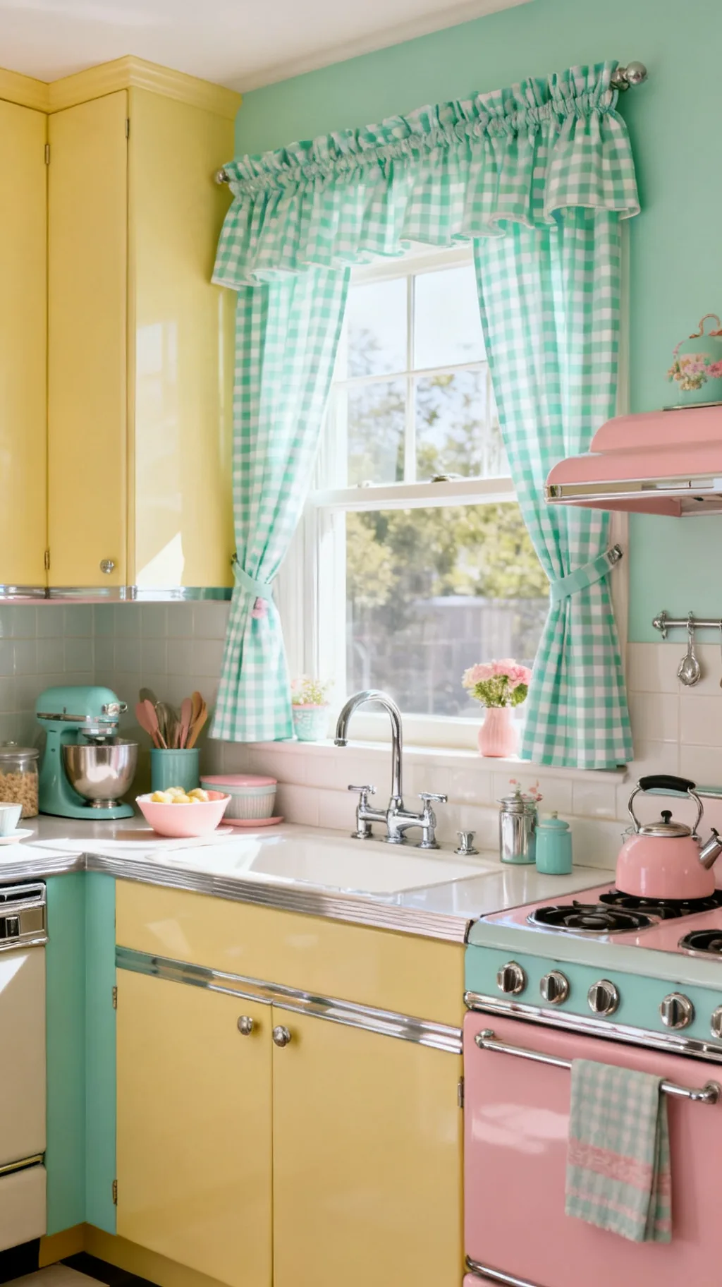
Red gingham gets all the attention, but a fresh mint-and-white check is just as retro and a touch more unexpected. The cool, minty tone feels airy and modern while still nodding to the diner era. It’s especially lovely in a kitchen with cream or pale wood cabinets, where the soft green reads like a breath of fresh air. These are the retro kitchen curtains I’d reach for in a room that already leans warm.
Make Mint Work
- Cool contrast: mint check freshens a warm, woody kitchen.
- Pair with chrome: the green and silver combo feels period-right.
- Keep it crisp: bright white in the check keeps it cheerful.
Add a few mint accents elsewhere, a canister or a bowl, so the curtains feel connected.
&# 10024; More vintage charm:11 Vintage Kitchen Aesthetic Ideas With a 70s Vibe→10. Layer a Valance Over Blinds
If you need the light control of a blind but crave retro softness, layer the two. A simple white or natural blind handles privacy and sun, while a cheerful valance or short curtain on top brings the color and charm. This combination is practical and pretty, which is why it shows up in so many real, lived-in kitchens. You get function underneath and personality up top.
Layering Done Right
- Plain blind below: a neutral shade does the hard work quietly.
- Colorful topper: a valance adds the retro print and warmth.
- Coordinate colors: tie the valance to a nearby accent.
Mount the valance a little above the window frame so it hides the blind’s hardware.
11. Sew Simple Tab-Top Panels
Tab-top curtains, with their little loops of fabric over the rod, have a relaxed, handmade feel that suits a retro kitchen perfectly. They hang in soft, even folds and show off the rod, so a chrome or wooden pole becomes part of the look. They’re also one of the simplest styles to sew yourself, which makes them a satisfying weekend project. I remember stitching a set in an evening and feeling unreasonably proud of them.
Tab-Top Tips
- Show the rod: tabs reveal a pretty chrome or wood pole.
- Even folds: the loops hold a soft, regular pleat.
- Beginner-friendly: straight seams and simple tabs sew up fast.
Space the tabs evenly and the panels will fall into neat folds on their own.
12. Hang Curtains on a Chrome Tension Rod
The hardware matters as much as the fabric. A slim chrome tension rod is the retro kitchen’s quiet hero, it slips inside the window frame with no drilling and gives that bright, period-correct shine. It’s renter-friendly, easy to reposition, and perfect for cafe curtains and tiers. Sometimes the smallest detail, a gleam of chrome, is what makes retro kitchen curtains feel truly finished.
Rod Choices
- Tension rod: no drilling, ideal for renters and quick swaps.
- Chrome finish: bright metal echoes retro hardware and appliances.
- Inside mount: sitting in the frame keeps the look tidy.
Keep a spare rod on hand so you can hang a second tier or a skirt whenever the mood strikes.
Take a peek at a few of these looks.
 1 / 5
1 / 5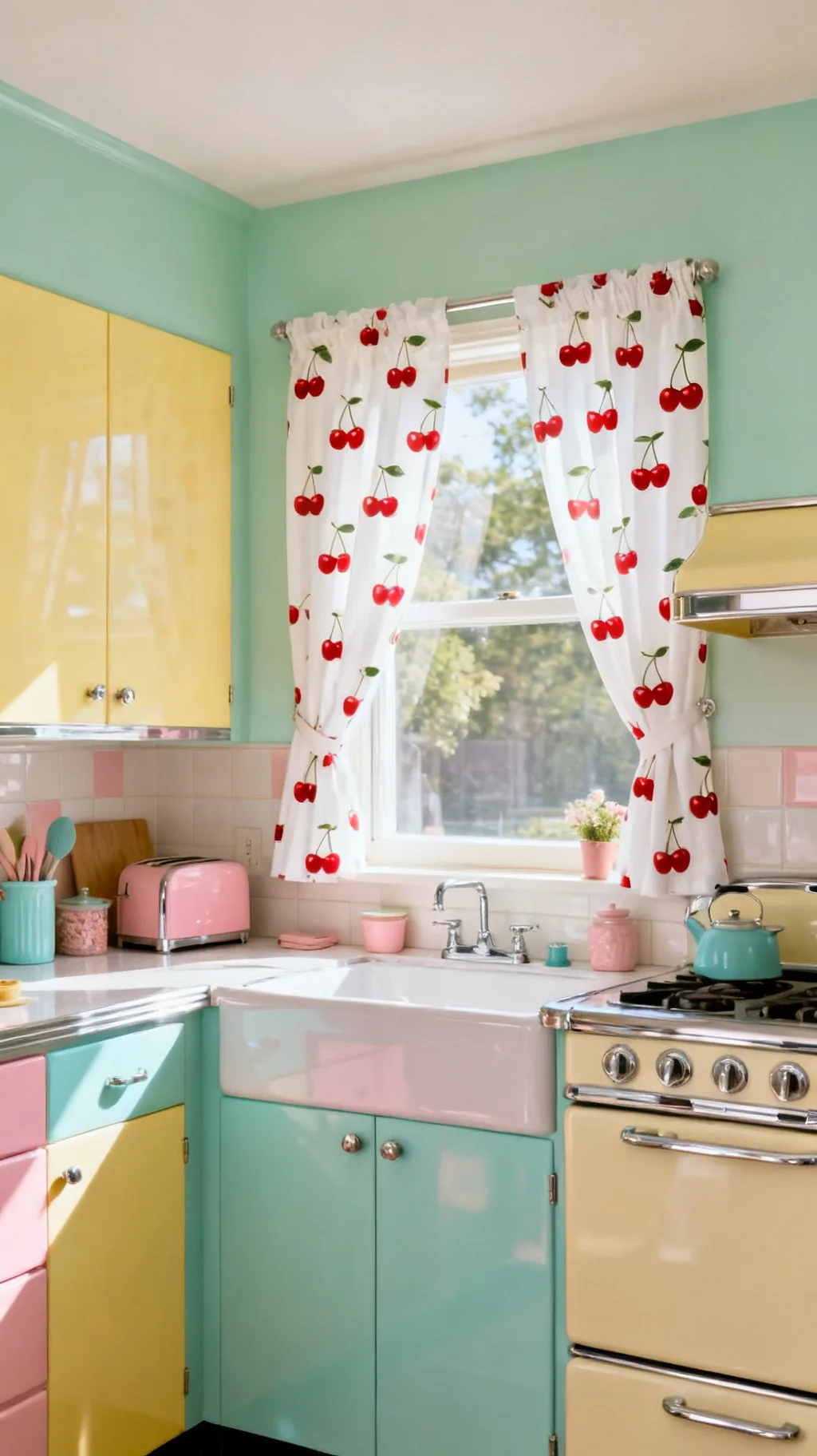 2 / 5
2 / 5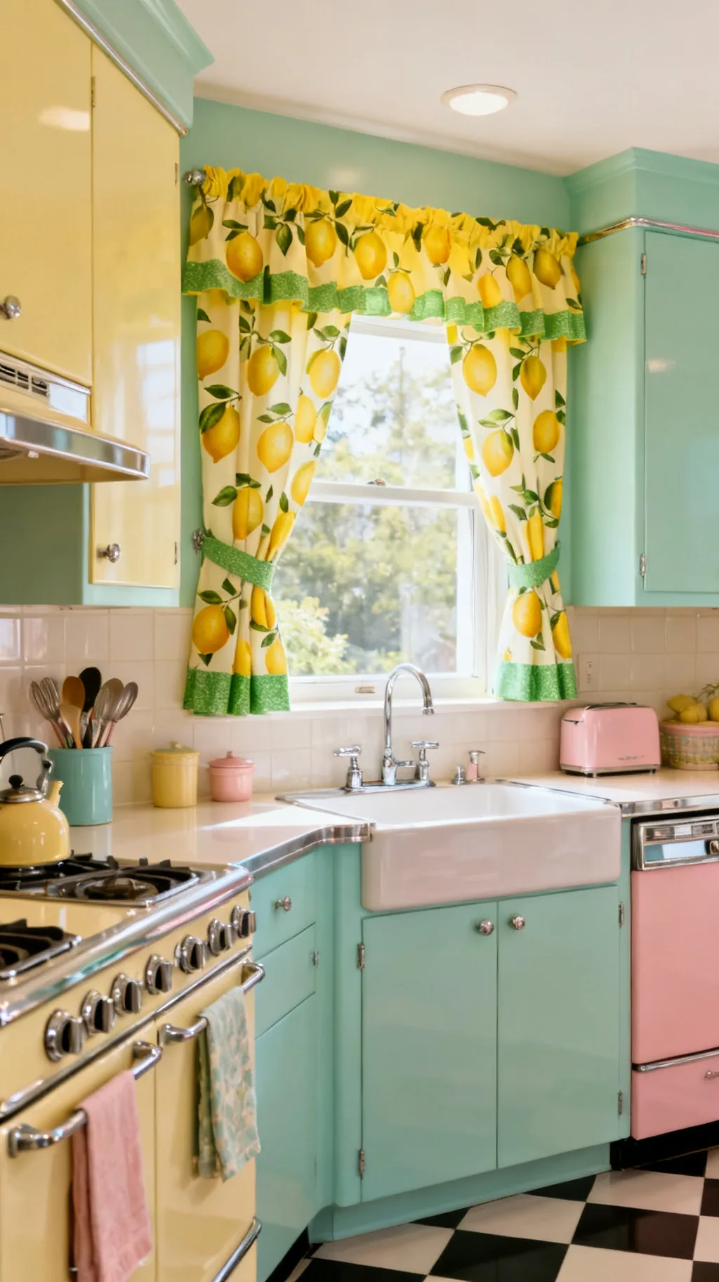 3 / 5
3 / 5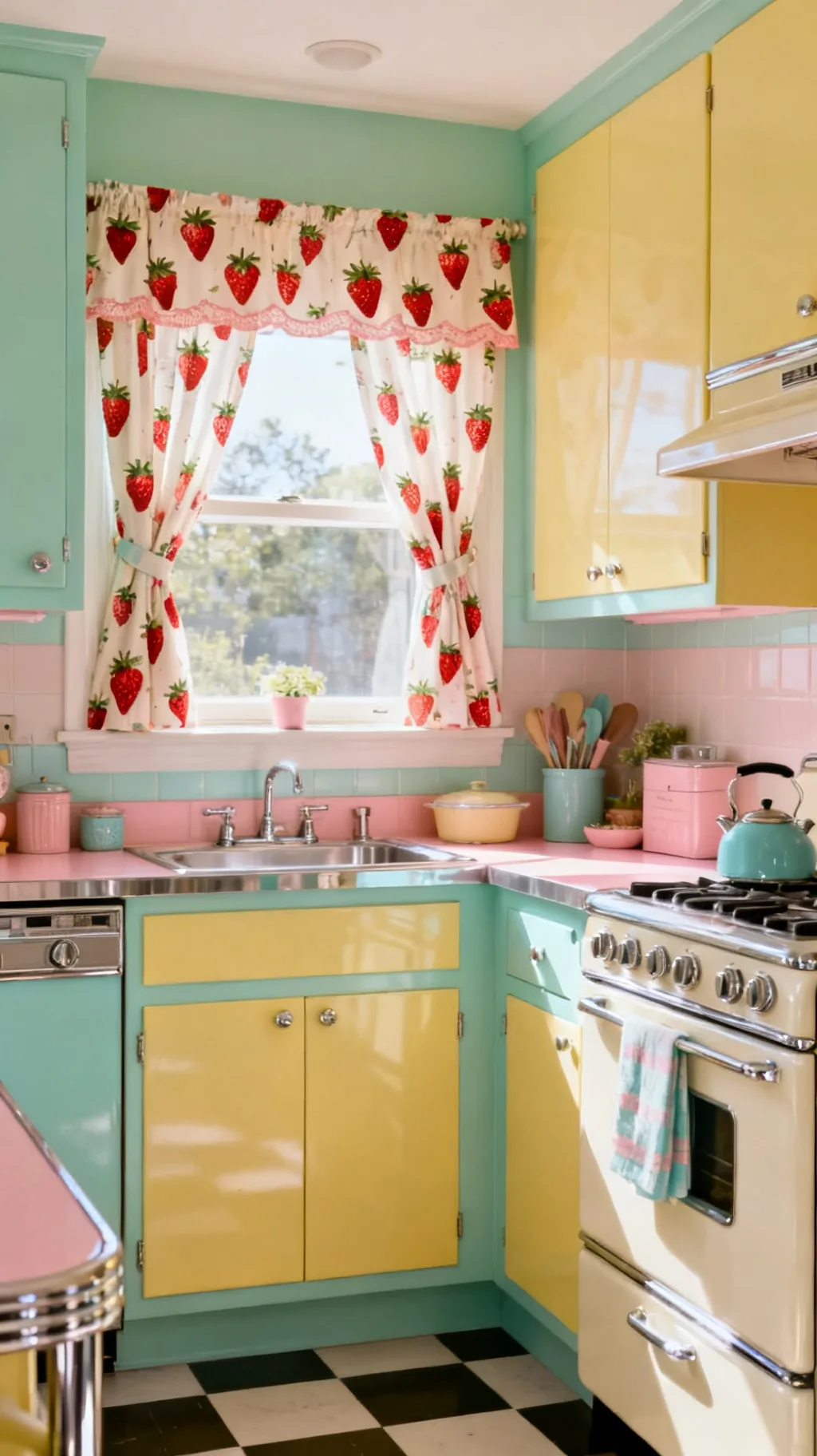 4 / 5
4 / 5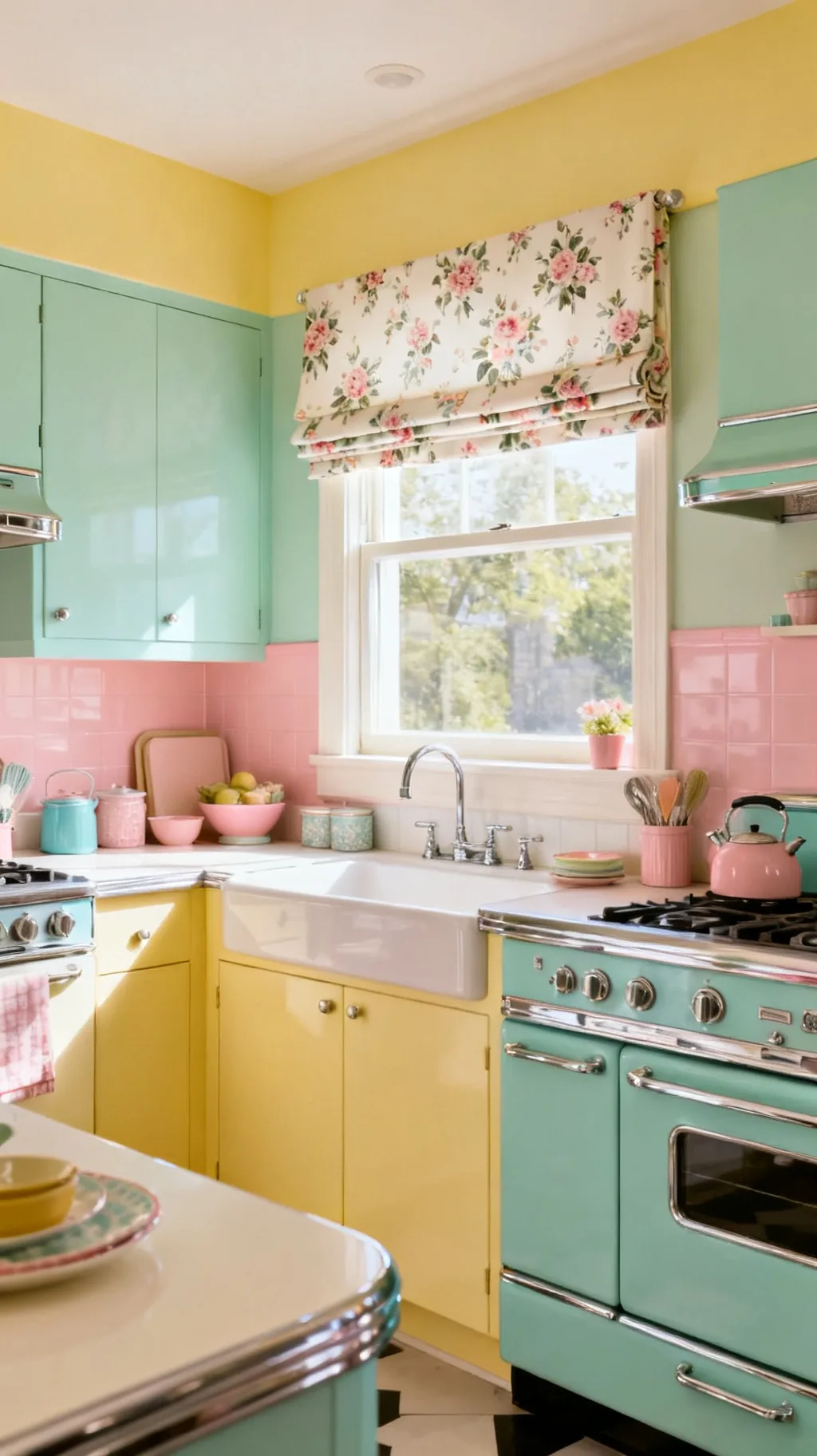 5 / 5
5 / 513. Pick a Bold Atomic or Boomerang Print
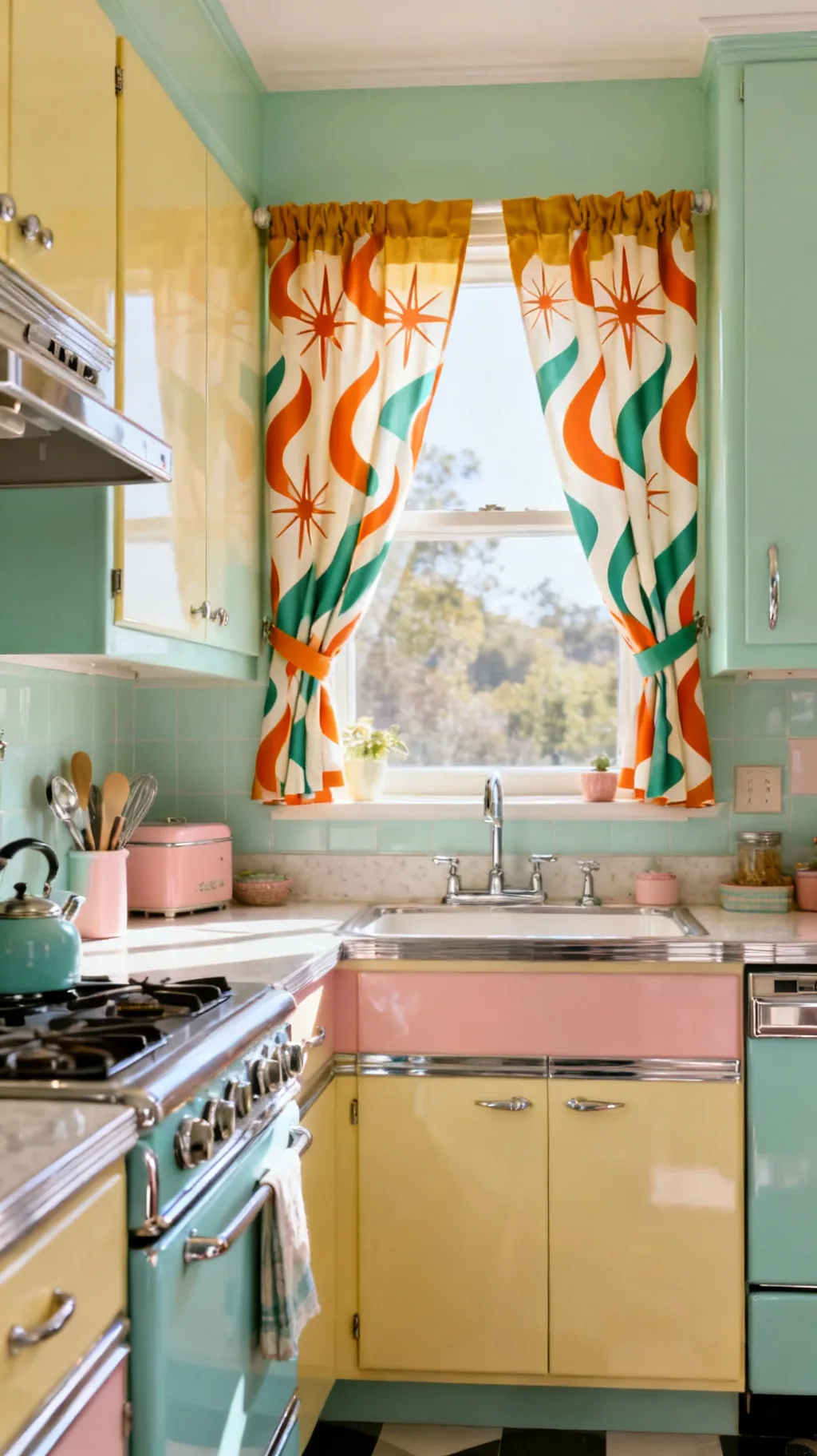
For a later, groovier take on retro, reach for an atomic print, those starbursts, boomerangs, and amoeba shapes that defined midcentury design. In warm orange, mustard, and avocado, they bring real personality to a window. A bold print like this wants a calm room around it, so let the curtains be the statement. It’s a confident choice that instantly dates a kitchen, in the best possible way. For more bold, colorful inspiration, see our 11 retro kitchen ideas that make your space pop.
Going Atomic
- Geometric shapes: boomerangs and starbursts read pure midcentury.
- Warm palette: orange, mustard, and avocado feel later-decade retro.
- Calm surroundings: keep nearby walls and counters quiet.
If a full panel feels like a lot, try the atomic print as a single short valance first.
14. Add Pom-Pom or Ric-Rac Edging
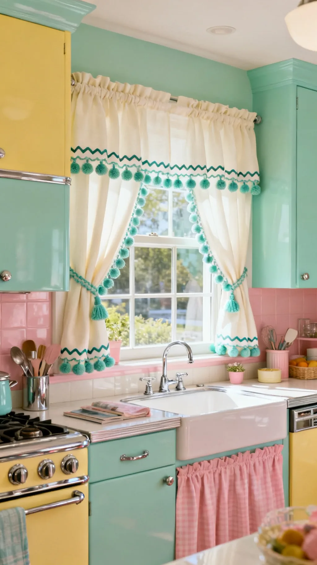
A row of little pom-poms or a zigzag of ric-rac along the hem is a small detail that brings a big smile. This playful trim leans into the homemade, cared-for spirit of a retro kitchen and adds texture without extra pattern. It’s an easy way to customize plain curtains and make them feel uniquely yours. A friend of mine added mint pom-poms to cream panels and they became her favorite thing in the room.
Trim Ideas
- Pom-pom fringe: a bobbled hem adds cheerful movement.
- Ric-rac: a zigzag tape is the classic retro edging.
- Match or contrast: pick a trim color that pops gently.
Stitch trim onto curtains you already own for an instant, low-effort refresh.
15. Try Lemon or Fruit Novelty Prints
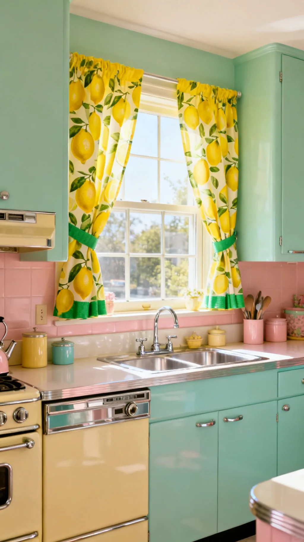
Bright lemons, ripe strawberries, and cheerful fruit prints are a retro kitchen’s happiest curtains. They bring sunny yellow and fresh green to the window and feel timelessly kitchen-appropriate. Use them where you want an instant lift, over the sink or on a sunny breakfast-nook window. Fruit prints have a way of making a room feel cooked-in and loved, which is exactly the retro feeling we’re after.
Fruity Window Style
- Lemons: yellow and green read fresh, sunny, and retro.
- Strawberries: sweet red dots pair with gingham beautifully.
- Keep it light: fruit on a white ground keeps the look airy.
Pull one shade from the print into a nearby towel or bowl to tie it all together.
16. Use Vintage Tea-Towel Fabric
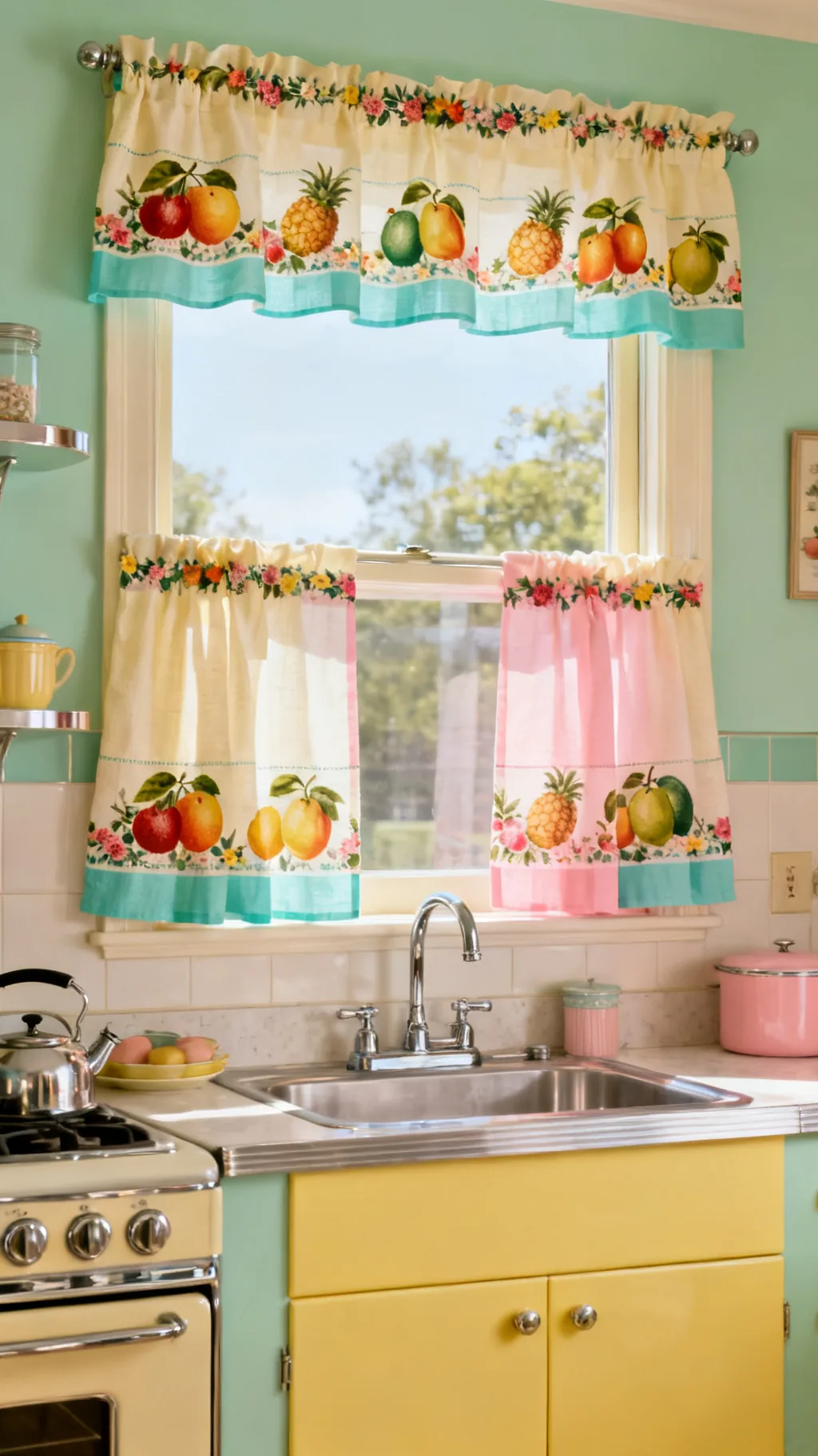
Some of the loveliest retro curtains start life as tea towels. Their cheerful printed borders, fruit, flowers, roosters, and stripes, make charming short panels or a patchwork valance. Stitching a few together is a thrifty, satisfying project that turns flea-market finds into something useful. I keep coming back to this idea because no two windows ever end up quite the same.
Tea-Towel Curtains
- Printed borders: the decorative edge becomes the curtain’s hem.
- Patchwork valance: sew several towels into a cheerful topper.
- Thrifty hunt: mismatched towels add collected character.
Look for towels with a strong printed border, that ready-made edge does half the design for you.
17. Go Buttercup Yellow for Sunny Windows
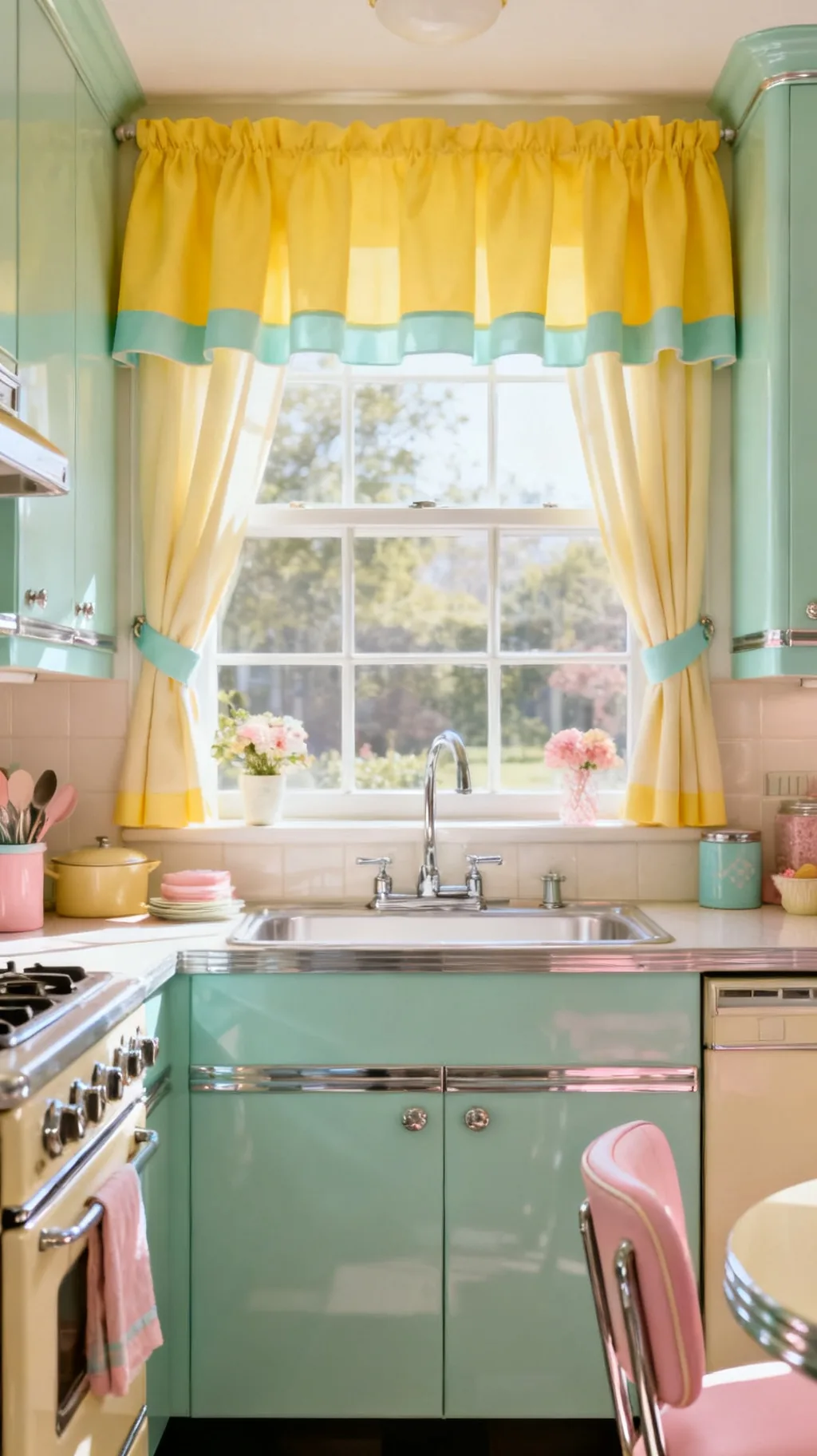
A solid buttercup-yellow curtain is like bottling sunshine. Without any print at all, that warm, cheerful color brings retro happiness and makes even a north-facing window feel bright. Yellow pairs especially well with mint, gray, and white, the cool tones keep it from feeling too sweet. Sometimes a single joyful color is all a window needs.
Working With Yellow
- Solid color: buttercup brings cheer without a busy pattern.
- Cool partners: mint, gray, and white balance the warmth.
- Brighten dim rooms: yellow lifts a window with little light.
Choose a soft, slightly muted yellow rather than a neon one so it reads vintage, not loud.
Scroll through and see which one speaks to you.
 1 / 5
1 / 5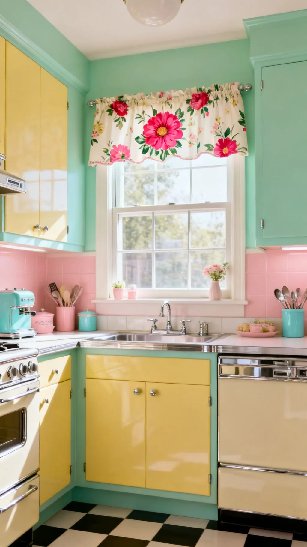 2 / 5
2 / 5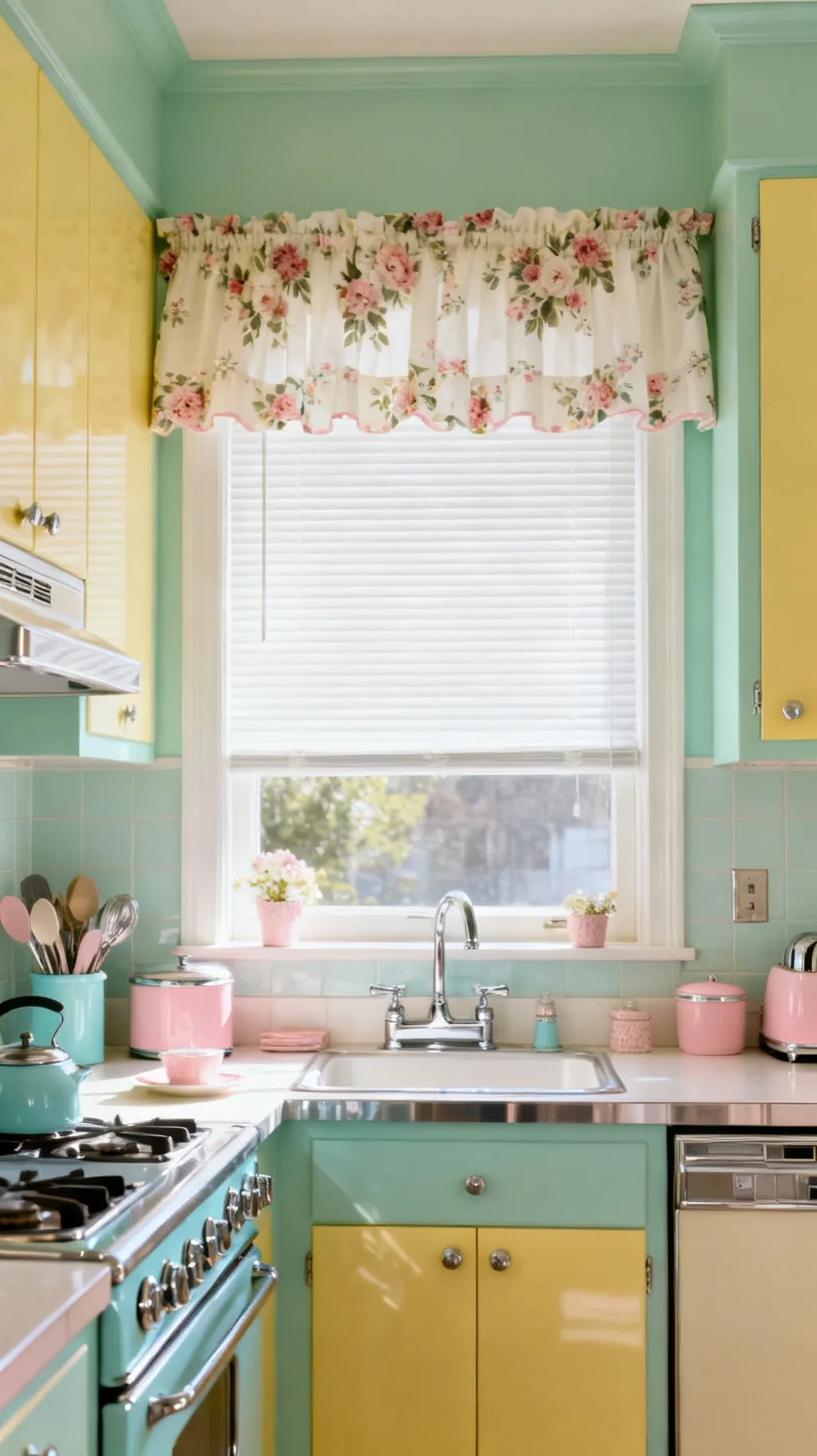 3 / 5
3 / 5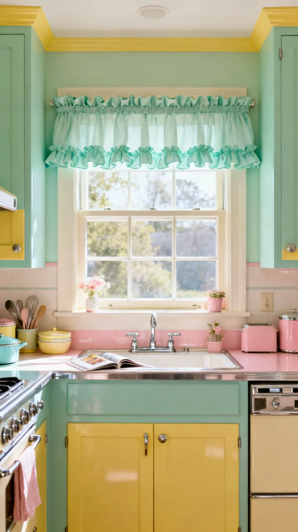 4 / 5
4 / 5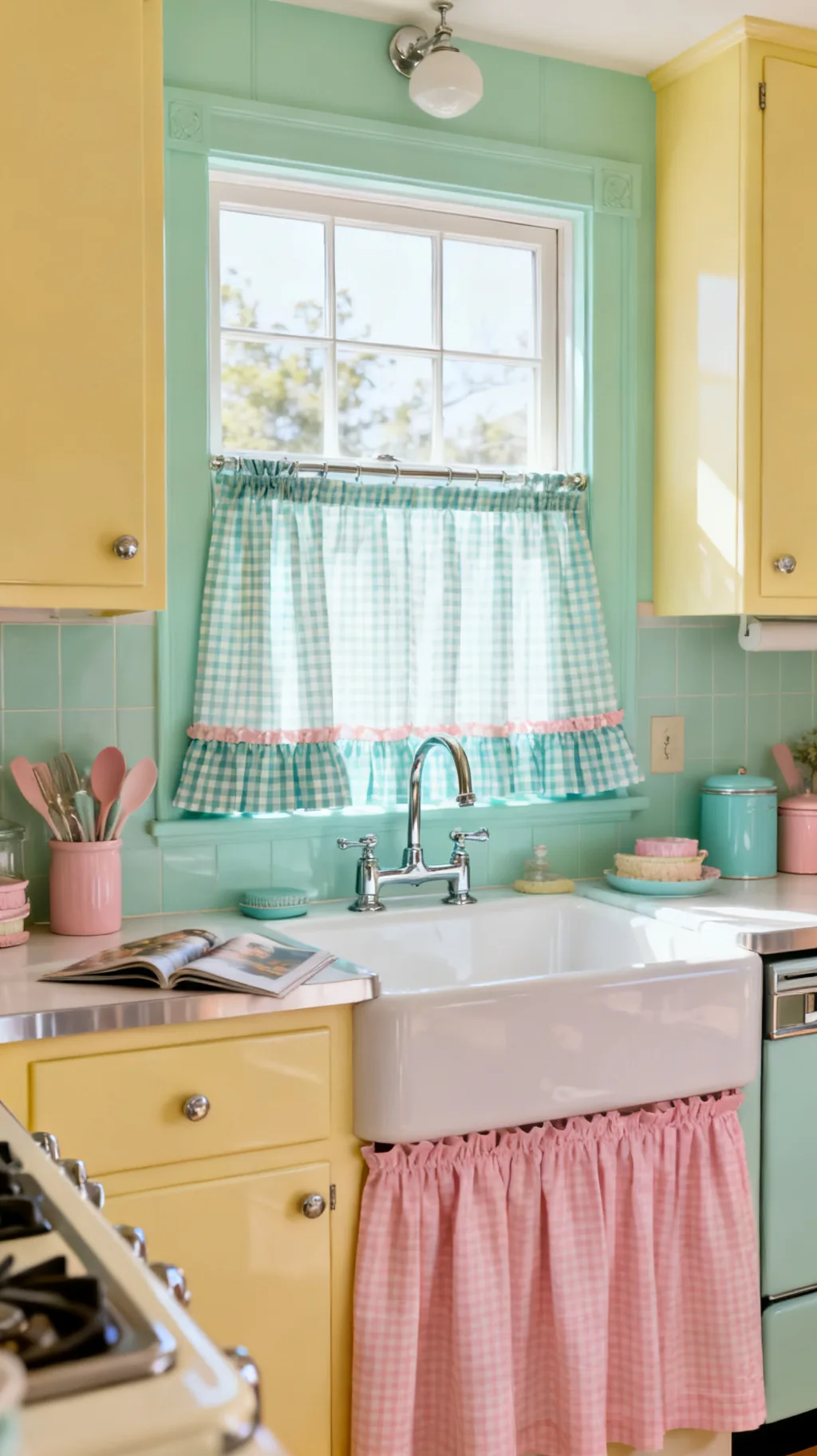 5 / 5
5 / 518. Hang a Single Statement Valance
When a window is small or you simply want a light touch, one well-chosen valance can do all the work. It adds color, frames the glass, and signals retro charm without committing to full panels. This is the lowest-effort way to bring retro kitchen curtains into a room, and it leaves the sill and view completely open. A single bold valance can carry an entire window’s personality.
Valance-Only Style
- One bold print: let the valance be the window’s whole statement.
- Open view: the short length keeps the glass and sill clear.
- Quick change: a valance is the easiest piece to swap seasonally.
Hang it a little wider than the frame so the window looks generous and well-dressed.
&# 10024; Worth a look:27 Mid-Century Modern Kitchen Ideas for a Timeless Retro Look→19. Choose Polka-Dot Panels
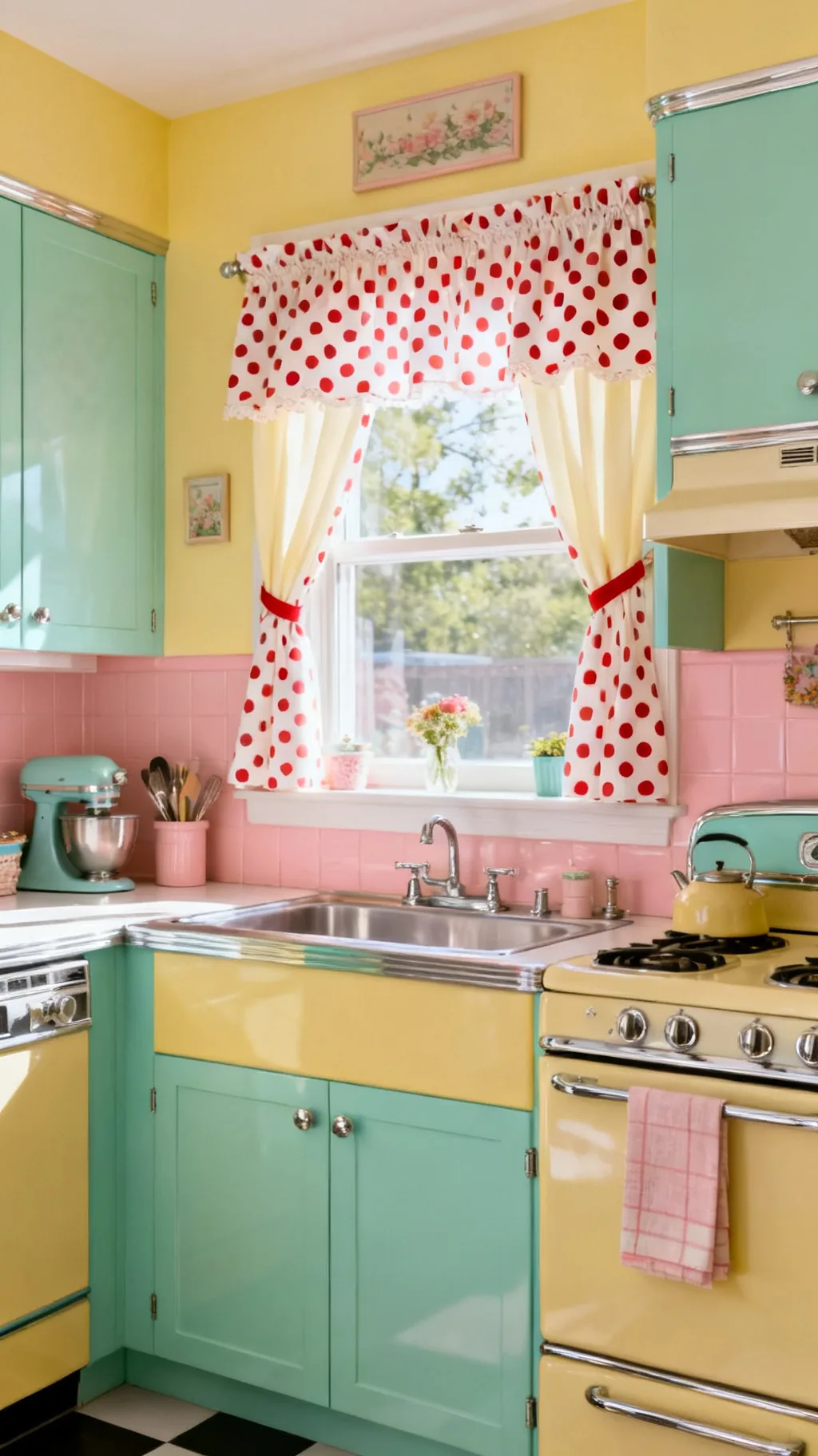
Polka dots are cheerful, tidy, and quietly retro. A white-on-red or mint-on-cream dot brings playful rhythm to a window without the busyness of a floral. Dots feel fresh in a modern kitchen and right at home in a vintage one, which makes them a versatile pick. They’re the sort of pattern that makes you smile without quite knowing why.
Dot Styling
- Scale matters: medium dots feel retro, tiny ones feel modern.
- Two-tone: red, mint, or navy on white stays cheerful.
- Mix with stripe: dots and ticking are a classic retro pair.
Keep the dot color in your existing palette so the panels feel like they belong.
20. Add Tie-Backs With Cheerful Ribbon
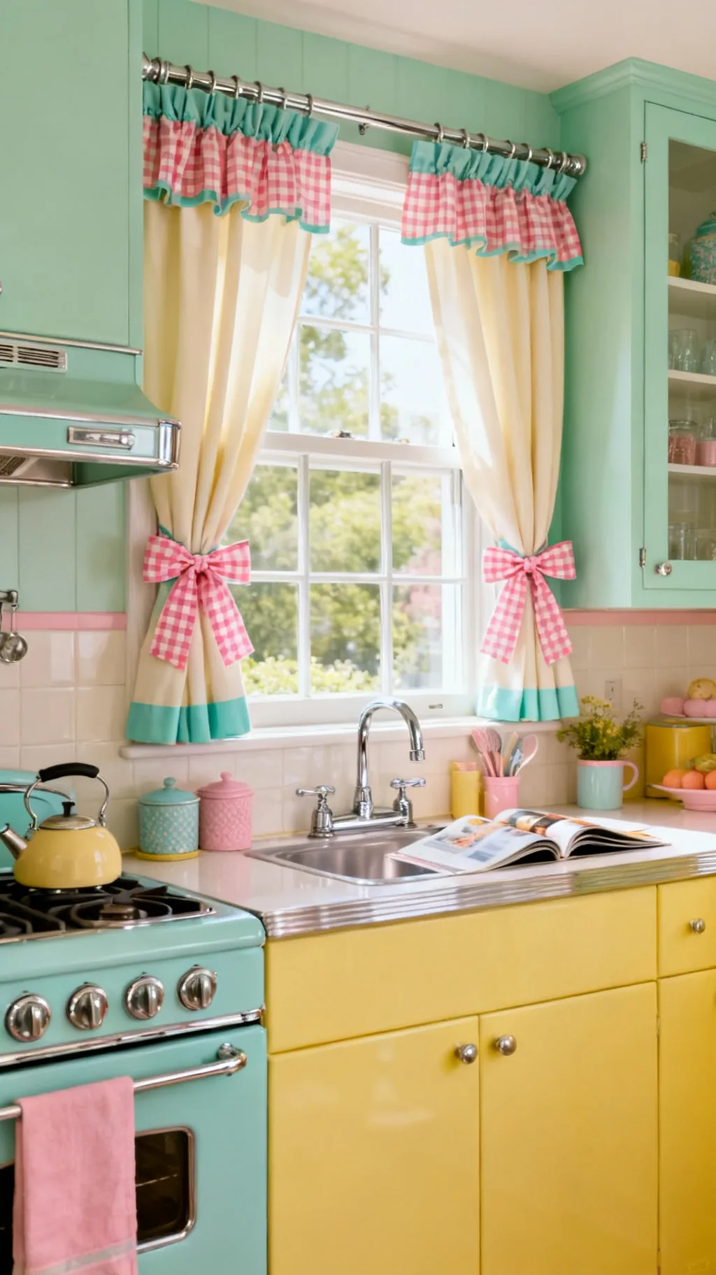
A simple tie-back transforms how a curtain hangs and how much light comes in. Gather your panels with a length of gingham ribbon, a fabric bow, or a little chrome hook and the window suddenly looks dressed and intentional. Tie-backs are an easy, almost-free detail that adds shape and softness. They also let you swap the mood from open and sunny to cozy and closed in a second.
Tie-Back Touches
- Ribbon ties: gingham or grosgrain adds a sweet bow.
- Chrome holdbacks: a little metal hook feels period-correct.
- Adjustable light: tie back high for sun, low for cozy.
Tie the curtains back during the day and let them fall loose at night for instant evening softness.
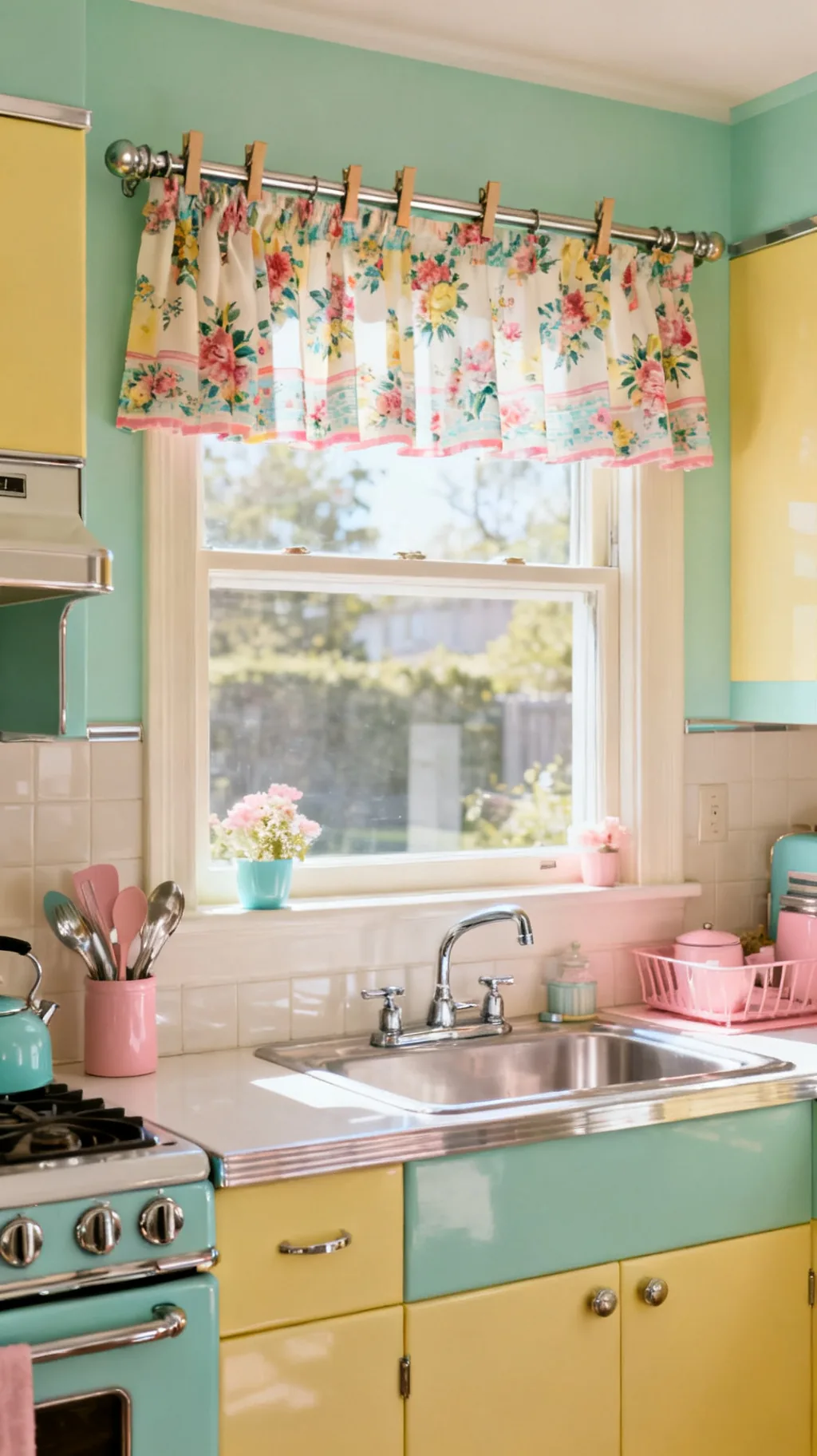
21. Try a Cottage Floral Roman Shade
A roman shade in a soft cottage floral gives you the tidy lines of a blind with the warmth of fabric. It folds up neatly to let in full light and lowers to a smooth panel of cheerful print, a lovely middle ground between curtain and shade. Romans suit a kitchen that wants a slightly more finished, tailored look while staying genuinely retro. The fabric does all the charming while the mechanism keeps things crisp.
Roman Shade Notes
- Soft florals: a gentle bloom keeps it cottage and cheerful.
- Neat folds: the shade stacks tidily when raised.
- Tailored look: romans suit a more put-together window.
Pick a lightweight cotton so the folds stay soft rather than stiff and bulky.
22. Match Curtains to Your Dishware
Here’s a stylist’s trick: pull your curtain color or print straight from your favorite dishes. If you collect jadeite, a mint curtain ties it together; if you love cherry-printed plates, echo them at the window. This little bit of coordination makes a kitchen feel thoughtfully designed rather than thrown together. It’s a gentle way to let the pieces you already love guide your retro kitchen curtains.
Coordinating With Dishes
- Pull one color: match the curtain to a dish you display.
- Echo a motif: repeat a fruit or floral from your china.
- Display nearby: set the matching dishes on an open shelf.
Keep the matching loose, an echo of color is friendlier than a perfect, matchy set.
A few more to spark your imagination.
 1 / 5
1 / 5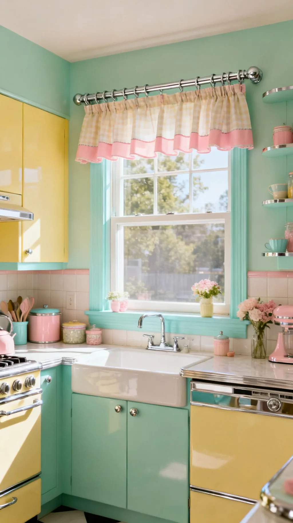 2 / 5
2 / 5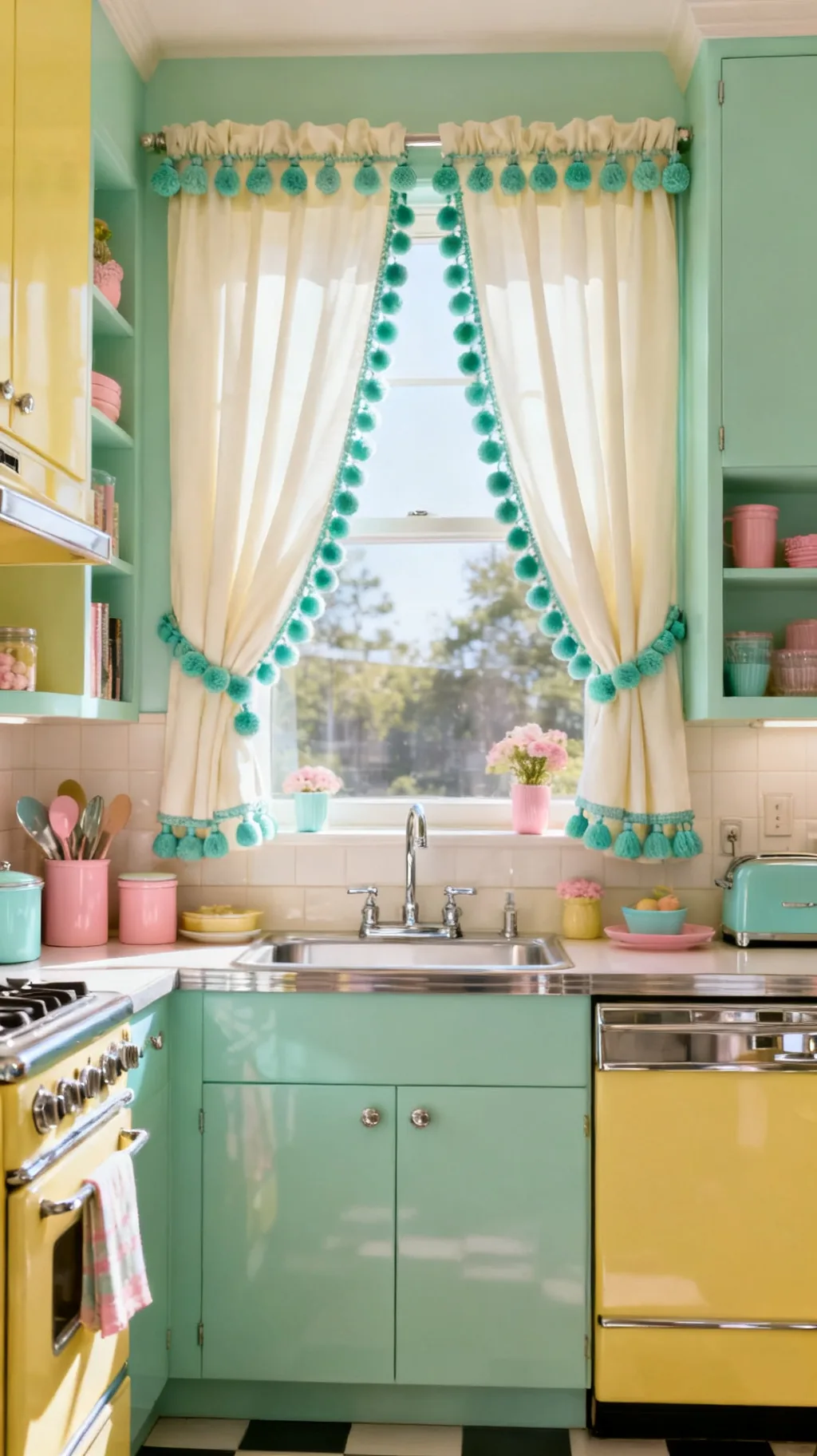 3 / 5
3 / 5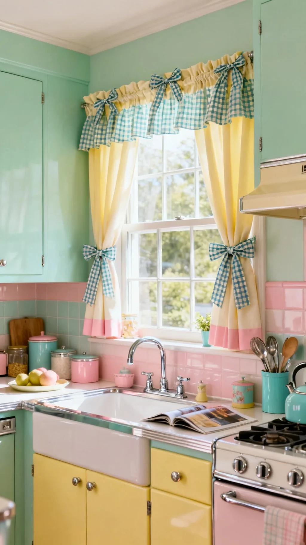 4 / 5
4 / 5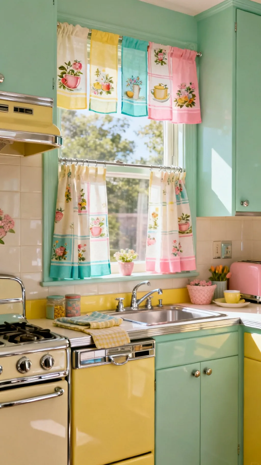 5 / 5
5 / 523. Repurpose Vintage Linens as Curtains
Finally, look in the linen drawer before you shop. Old tablecloths, embroidered runners, and printed feed-sack fabric make wonderful, one-of-a-kind curtains full of genuine history. A cheerful vintage tablecloth, clipped to a rod with rings, becomes a window treatment in minutes with no sewing at all. From what I’ve gathered, these repurposed pieces are the ones guests always ask about, because they carry a story you can’t buy new.
Repurposing Ideas
- Tablecloth panels: clip a printed cloth to rings, no sewing needed.
- Feed-sack fabric: soft, faded prints feel authentically old.
- Embroidered edges: hand-stitched details add real charm.
Use curtain clip rings so you can borrow a linen for the window and return it to the table anytime.
Quick Retro Curtain Pairings to Copy
- Diner Classic: Red gingham, chrome rod, white walls, cherry-red accents.
- Fresh Mint: Mint check, cream cabinets, soft wood, jadeite dishware.
- Sunny Fruit: Lemon print, buttercup yellow, white sill, green plants.
- Groovy Atomic: Boomerang print, mustard, avocado, walnut wood.
A simple rule: echo your curtain color at least twice more around the room so the window feels connected, not random. If you love a lighter, breezier take on the same idea, the picks in our summer curtains for the living room translate beautifully to a sunny kitchen too.
Frequently Asked Questions
What kind of curtains go in a retro kitchen?
Cafe and tier curtains that cover the lower half of the window are the most classic retro kitchen curtains, usually in cheerful prints like gingham, cherries, lemons, or small florals. Short valances and skirted sinks are popular too. The key is happy color, a tidy half-length, and a chrome rod, which together give that bright, lived-in 1950s feeling without blocking the light.
What colors are best for retro kitchen curtains?
Soft retro pastels lead the way: mint green, buttercup yellow, blush pink, and soft turquoise, usually paired with crisp white and a pop of cherry red. For a later, groovier look, warm orange, mustard, and avocado read retro too. Pulling your curtain color from something you already own, like your dishware or canisters, keeps the whole kitchen feeling pulled together.
How long should kitchen curtains be?
In a kitchen, shorter is usually better and safer. Cafe and tier curtains stop at the windowsill or just below the apron, which keeps fabric away from the sink and stove and lets in plenty of light. A valance sits at the very top and covers only a few inches. Long, floor-length panels are rare in a working kitchen because they get in the way and catch splashes.
Are cafe curtains still in style?
Yes, cafe curtains have come right back around and suit retro, cottage, and modern-farmhouse kitchens alike. They offer privacy on the lower half of the window while keeping the top open for light, which is exactly what most kitchens need. In a cheerful gingham or floral, they’re one of the easiest ways to add genuine vintage charm to a window.
How do I hang retro kitchen curtains without drilling?
A spring-loaded chrome tension rod is the simplest no-drill option, it sits snugly inside the window frame and holds cafe curtains or tiers beautifully. Clip rings let you hang a tablecloth or tea towel with no sewing, and self-adhesive hooks can hold a lightweight valance. These renter-friendly tricks make it easy to add retro kitchen curtains to almost any window.
Final Thoughts on Retro Kitchen Curtains
The lovely thing about retro kitchen curtains is how forgiving they are. A length of cheerful fabric, a chrome rod, and a little gathering is all it takes to turn a plain window into the happiest spot in the room. Start with one window and one print you love, maybe a red gingham over the sink or a sunny lemon valance, and let the rest follow as you find pieces that make you smile. Happy decorating!
You Might Also Like
Get cozy seasonal ideas in your inbox
Seasonal decor, recipes & home inspiration — straight to you. No spam, unsubscribe anytime.