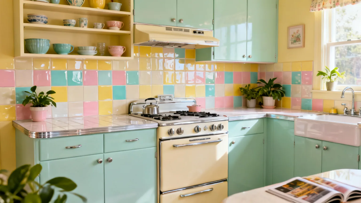
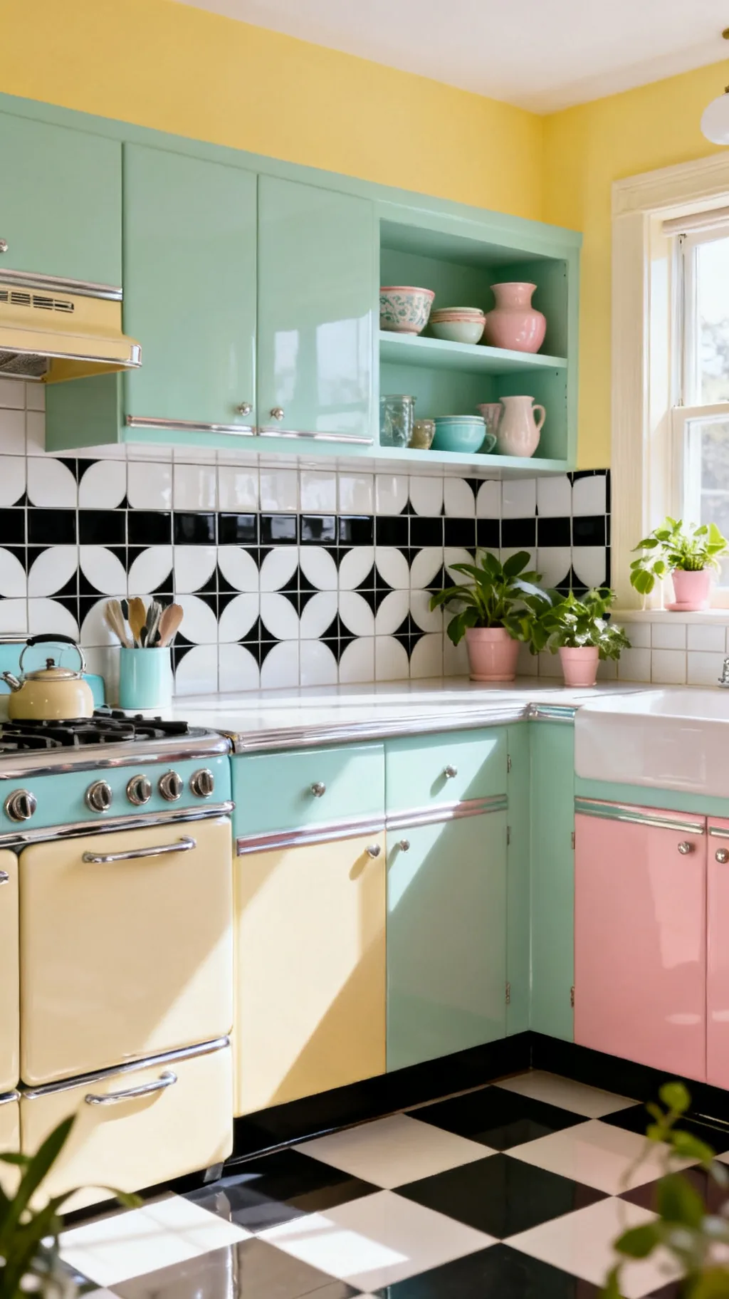
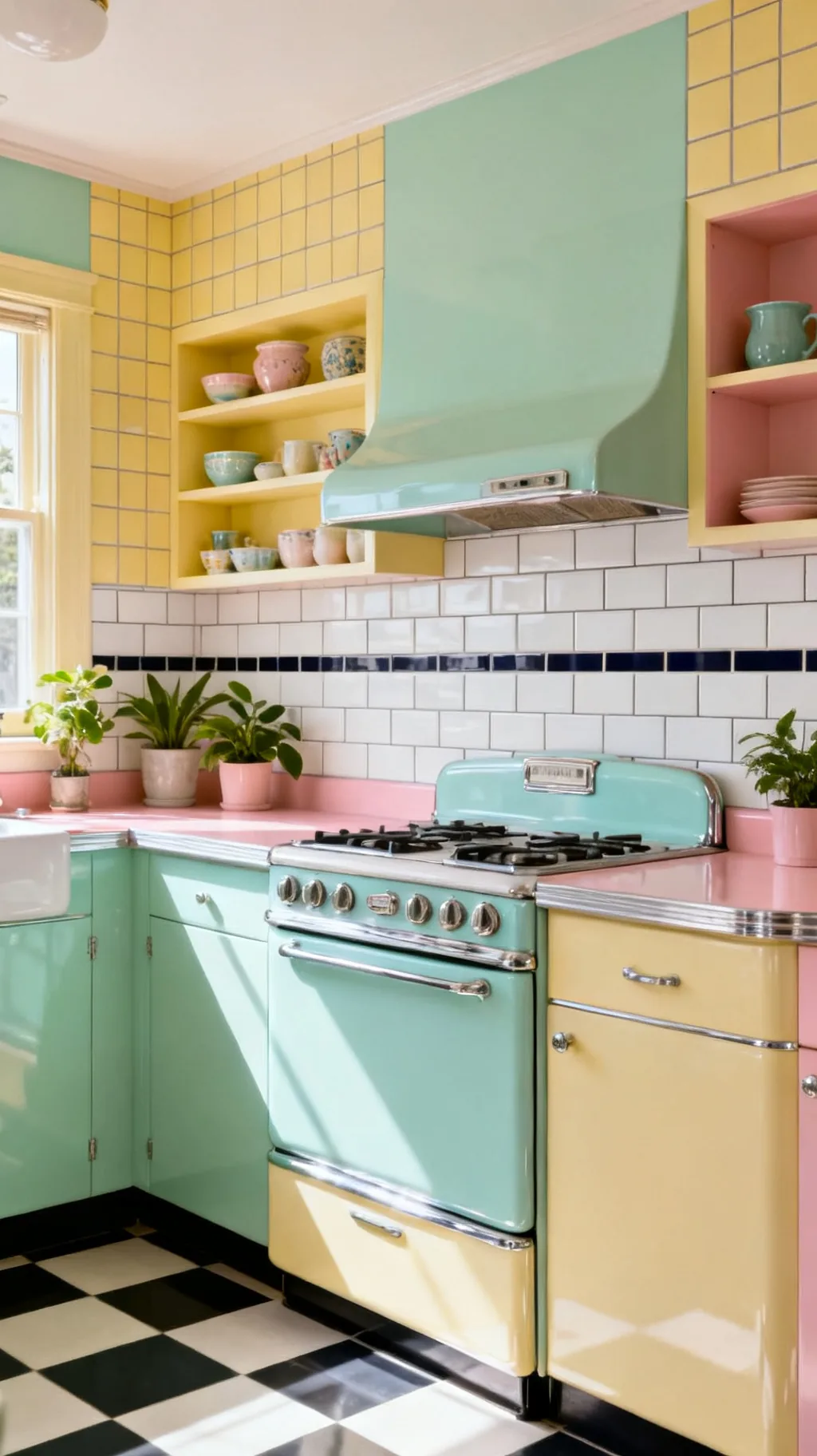
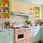
A backsplash is a small stretch of wall, but it does an outsized amount of work in setting a kitchen’s mood. In a retro kitchen it is where all the cheerful color and playful pattern get to shine, the glossy mint tile, the diner checkerboard, the sweet penny rounds behind the stove. A great retro kitchen backsplash can carry the whole room’s personality, and the loveliest part is how many bold, charming directions there are to choose from.
The most classic retro backsplashes lean on glossy ceramic tile in soft pastel colors and timeless shapes: subway, checkerboard, penny round, fish-scale, and hexagon, in mint, butter yellow, blush, or turquoise. Choose a color that echoes your cabinets or counters, save your boldest pattern for the wall behind the stove, and add vintage touches like contrasting grout or a decorative border so the whole backsplash feels collected and intentional.
These 23 ideas run from pastel subway and bold checkerboard to penny rounds, scallops, mosaics, color-block looks, and clever budget-friendly alternatives. You’ll find something for every kitchen, whether you’re planning a full retro renovation or just refreshing the wall behind your stove. Pour yourself a coffee and let’s find your favorite.
&# 10024; New to the look? Start with the big picture:our favorite retro kitchen ideas→1. Start With Glossy Pastel Subway Tile
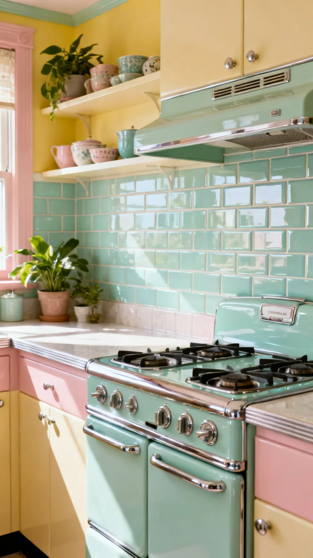
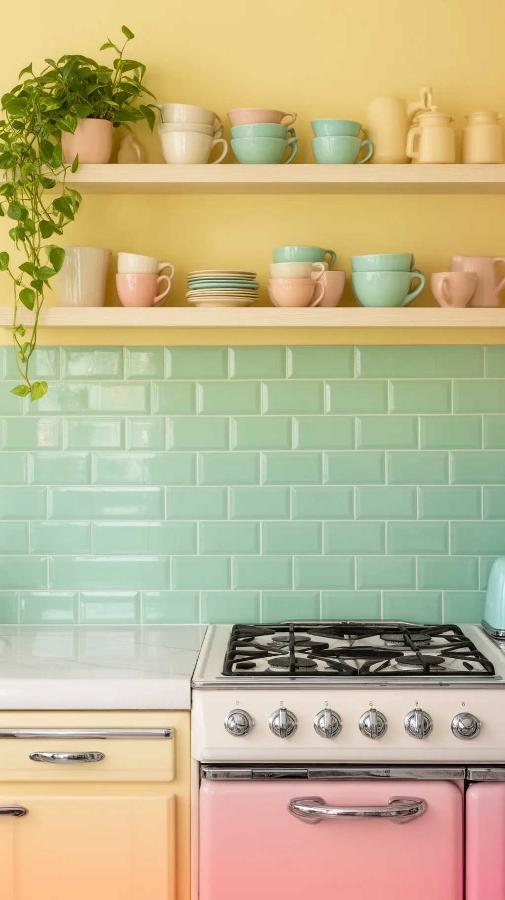
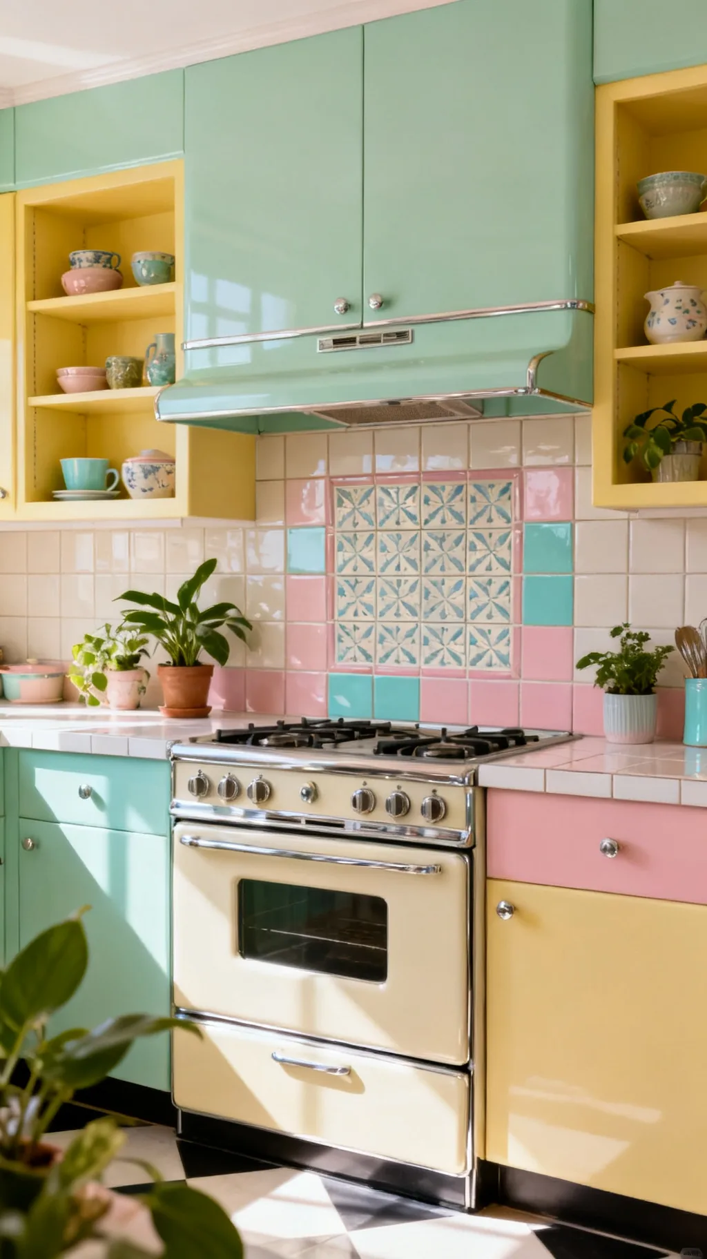
If there is one backsplash that says vintage kitchen without trying too hard, it is glossy subway tile in a soft pastel. The simple brick shape has been around for a century, and in mint, butter yellow, or pale blue it feels cheerful and timeless at once. The shiny glaze bounces light around and keeps a small kitchen feeling bright. I keep coming back to pastel subway because it is the easiest way to get a sweet retro kitchen backsplash that never goes out of style.
Why Pastel Subway Works
- Timeless shape: the classic brick reads vintage in any color.
- Bounces light: a glossy glaze brightens a small kitchen.
- Easy to clean: smooth ceramic wipes down in seconds.
Run the tile all the way up to the shelves or hood so the color really sings.
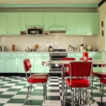
2. Make a Statement With Checkerboard Tile
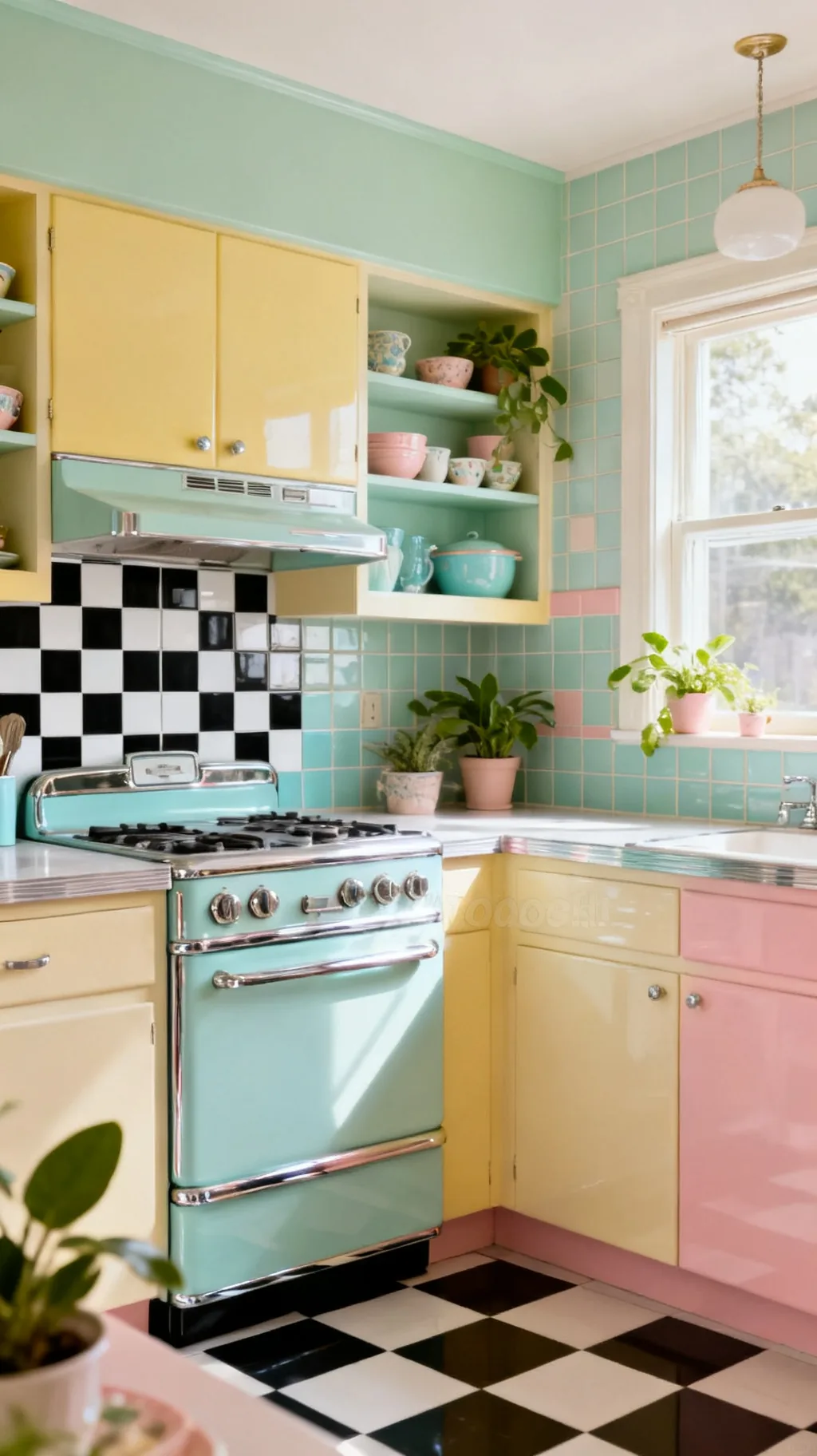
Nothing nods to a 1950s diner quite like a checkerboard backsplash. Whether you go classic black and white or soften it with mint and cream, the alternating squares bring playful, graphic energy to a wall. It pairs beautifully with chrome accents and a pastel stove, and it instantly sets a cheerful retro mood. A friend of mine added a small checkerboard panel behind her range and said it made the whole kitchen feel like a soda fountain.
Checkerboard Tips
- Pick your contrast: black and white is bold, pastels are softer.
- Mind the scale: larger squares suit a bigger wall.
- Set it straight: a level grid keeps the pattern crisp.
Keep surrounding colors calm so the checkerboard gets to be the star.
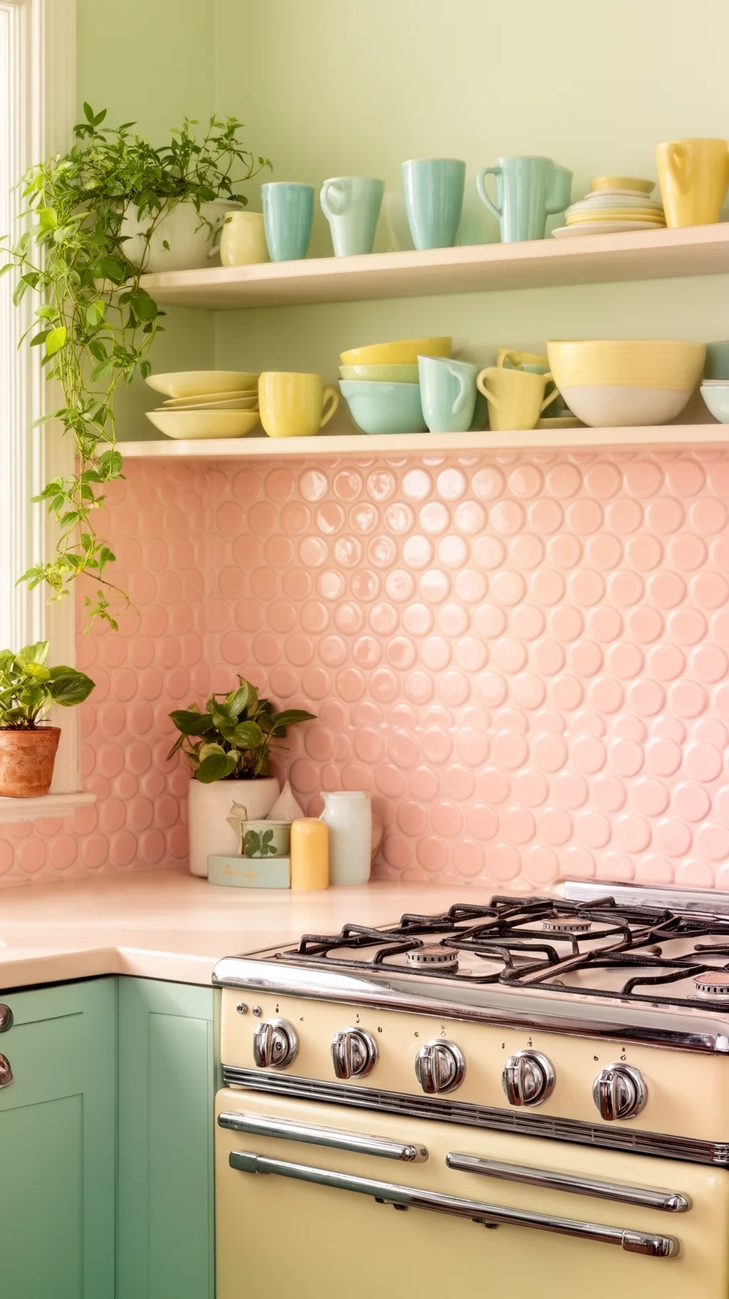
3. Try Cheerful Penny Round Tile
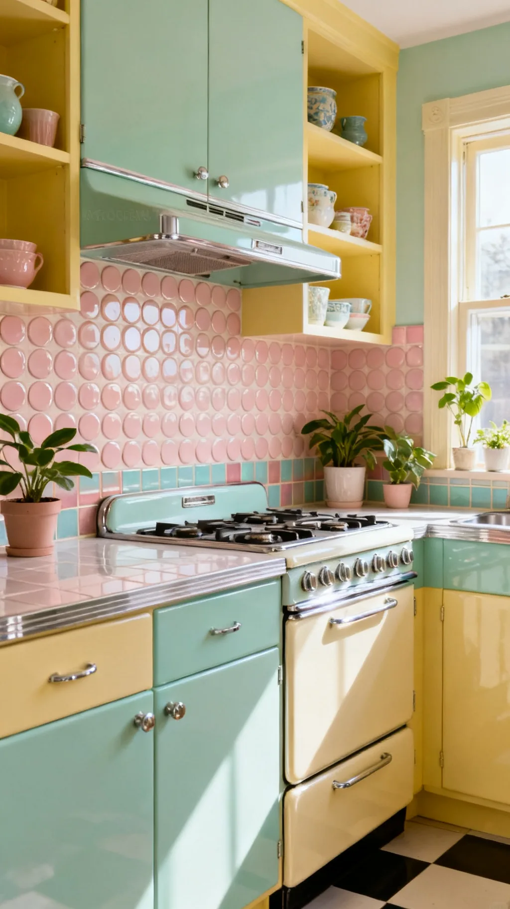
Penny round tile is pure vintage charm, those little circles have been brightening kitchens and bathrooms since the early 1900s. In a soft pastel or a glossy white with colored grout, a penny backsplash feels sweet, textured, and a little nostalgic. The rounded shape softens all the straight lines in a kitchen and catches the light in a pretty, dappled way. From what I’ve gathered, penny tile is one of those details that makes people smile the moment they notice it.
Penny Tile Ideas
- Soft texture: tiny circles add gentle, dappled interest.
- Color the grout: a tinted grout makes the pattern pop.
- Stays classic: penny rounds have charmed kitchens for decades.
Choose a grout a shade darker than the tile so each little circle stands out.
4. Add Sweet Fish-Scale or Scallop Tile
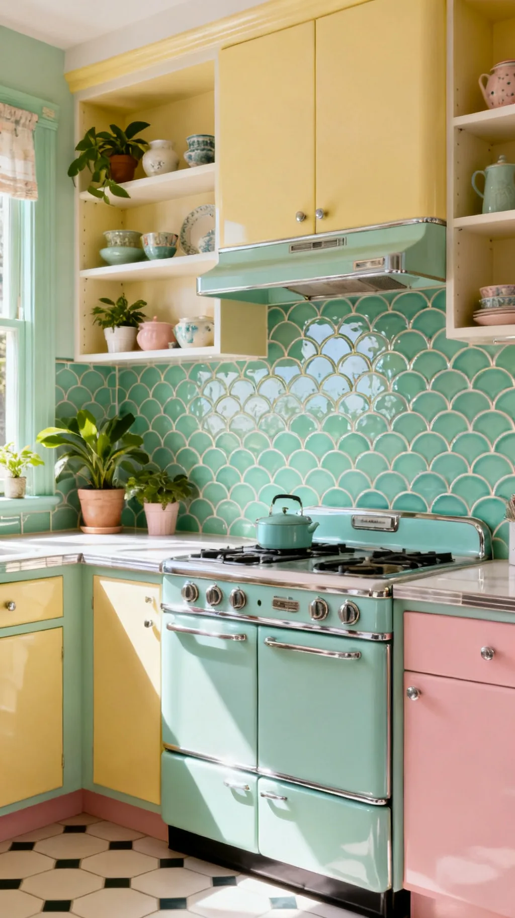
Fish-scale tile, sometimes called scallop or fan tile, brings a soft, scalloped curve that feels both retro and a touch whimsical. Arranged in overlapping rows, the rounded tops create a gentle wave pattern that is unexpected behind a stove or sink. In mint, blush, or turquoise it reads sweetly vintage and pairs wonderfully with pastel cabinets. I love how this shape adds movement to a wall without any extra color or fuss.
Scallop Tile Style
- Soft movement: overlapping curves create a gentle wave.
- Whimsical charm: the fan shape feels playful and retro.
- Pretty in pastel: mint and blush suit the scalloped look.
Run the scallops vertically behind the stove for a sweet focal panel.
5. Go Geometric With Hexagon Tile
Hexagon tile is a midcentury favorite, and it brings a crisp, geometric edge to a retro kitchen. Small white hexes with a few colored accents feel classic, while larger pastel hexagons read more modern-retro and bold. The honeycomb shape adds quiet pattern without competing with colorful cabinets or a busy counter. This is a lovely choice if you want a backsplash that feels vintage but still clean and graphic.
Hexagon Looks
- Classic or bold: small white hexes or big pastel ones both charm.
- Add accents: a few colored tiles scattered in look retro.
- Quiet pattern: the honeycomb adds interest without clutter.
Scatter a handful of colored hexes among white ones for a playful vintage touch.
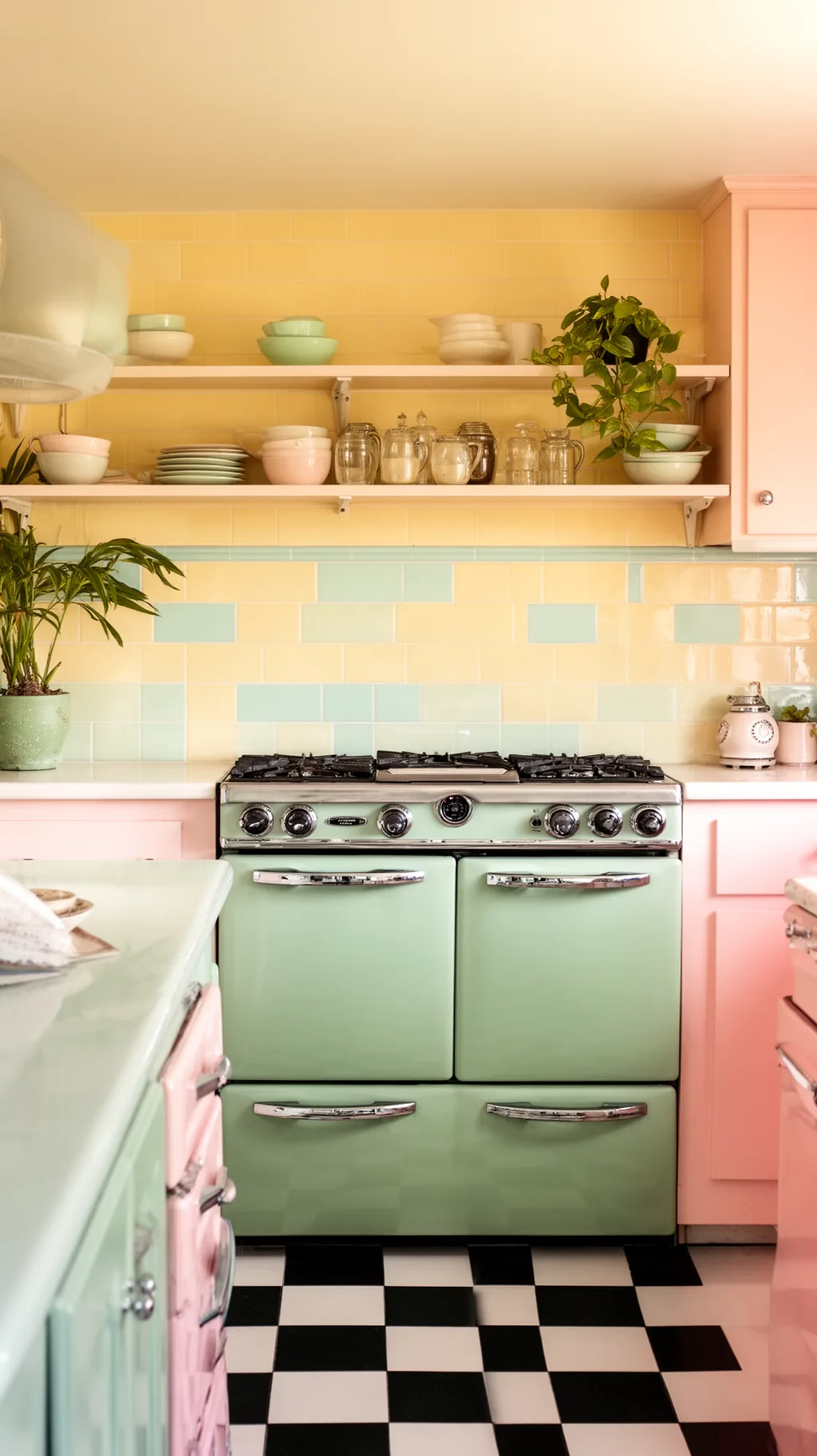
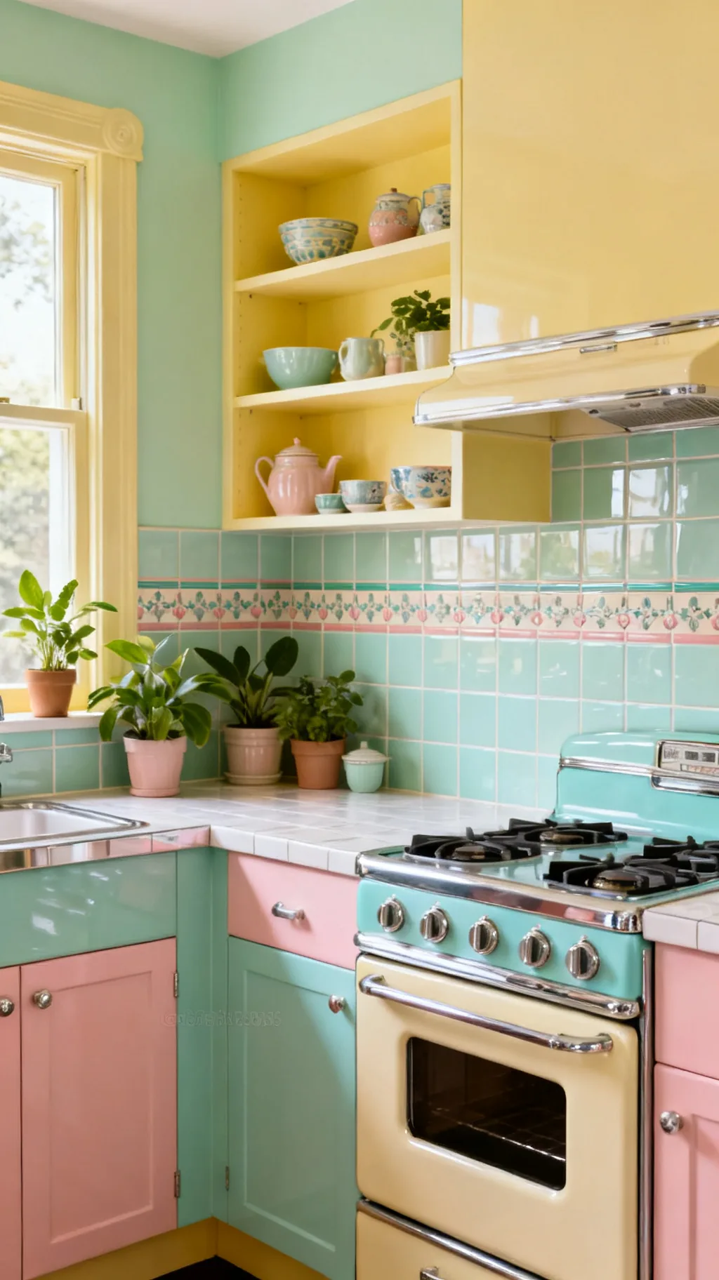
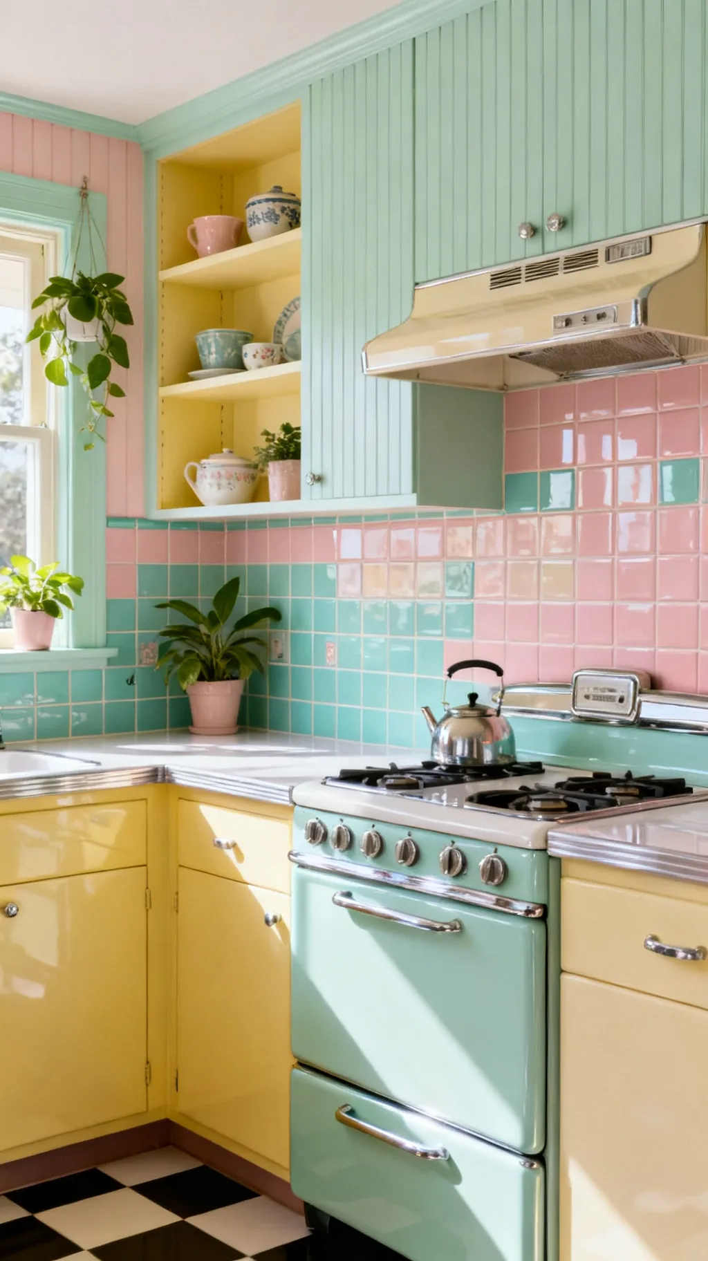
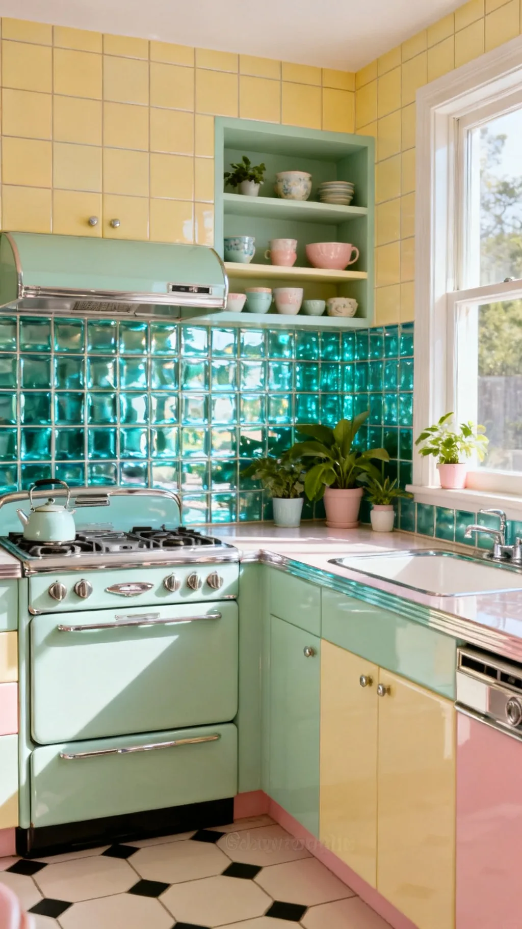
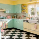
6. Embrace a Mint Green Backsplash
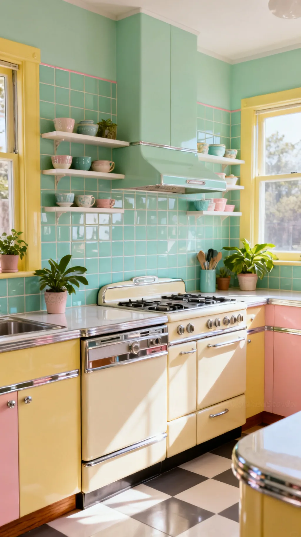
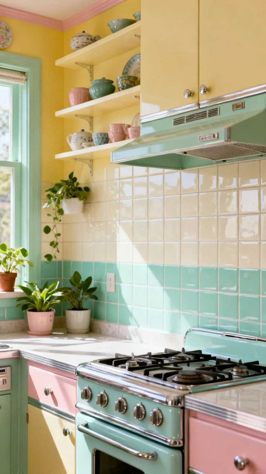
Mint green is the quintessential retro kitchen color, and a mint backsplash instantly carries a room back to the 1950s. Soft and soothing, it pairs beautifully with cream cabinets, chrome, and warm wood, and it feels fresh rather than dated. Whether in subway, square, or scallop tile, mint brings that signature pastel cheer. I find a mint backsplash is one of the surest ways to capture genuine vintage charm.
Styling Mint
- Signature shade: mint reads vintage the moment it goes up.
- Pairs softly: cream, chrome, and wood all flatter it.
- Any tile shape: subway, square, or scallop all work.
Repeat a touch of the mint in your enamelware or a tea towel to tie the room together.
Swipe through these for a little inspiration.
 1 / 5
1 / 5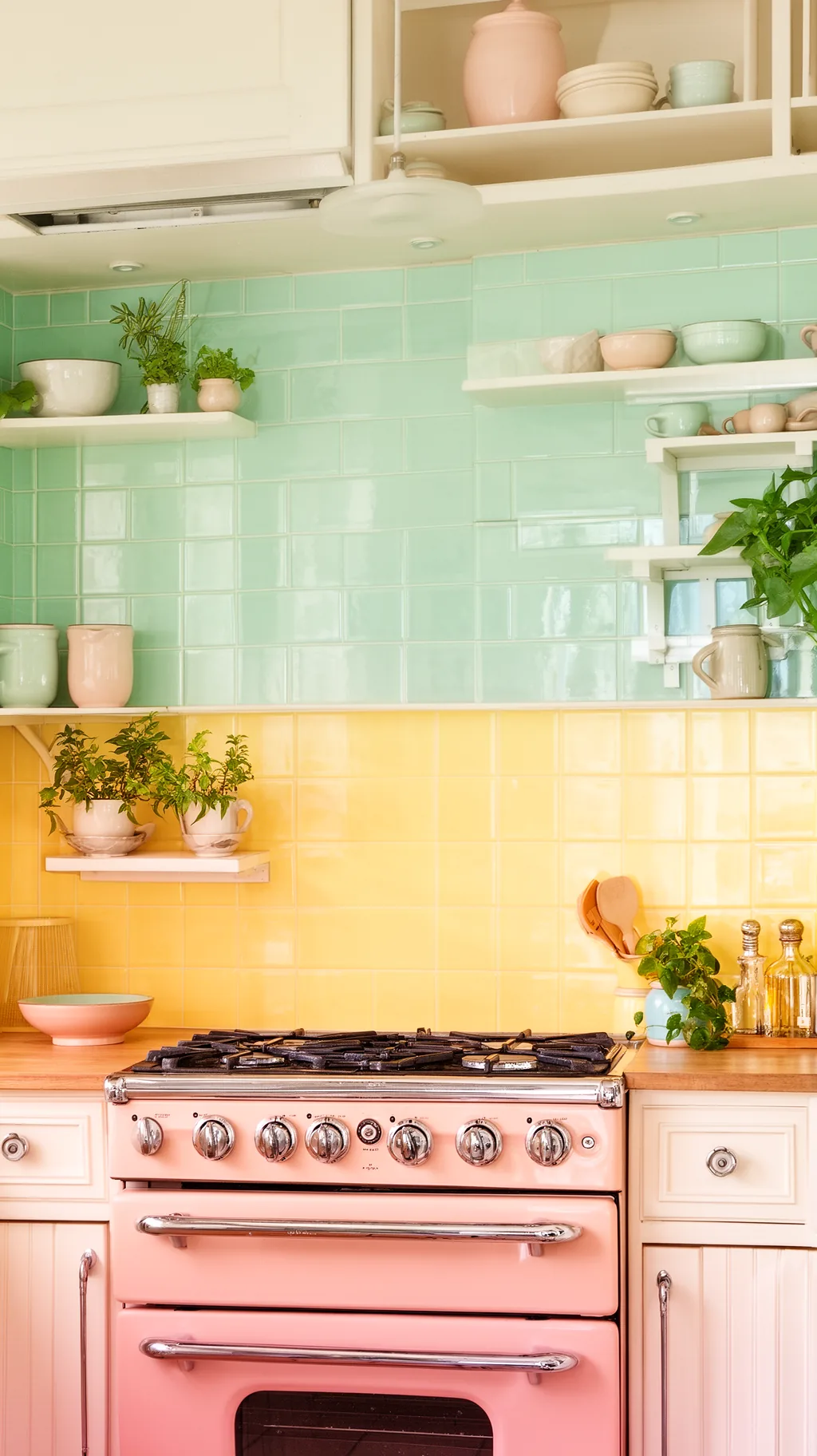 2 / 5
2 / 5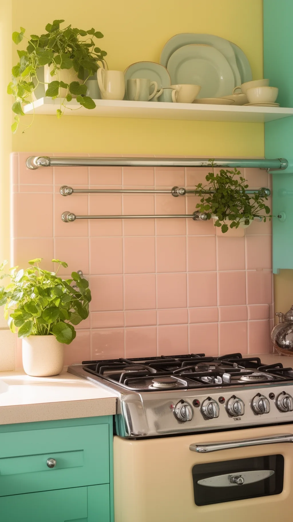 3 / 5
3 / 5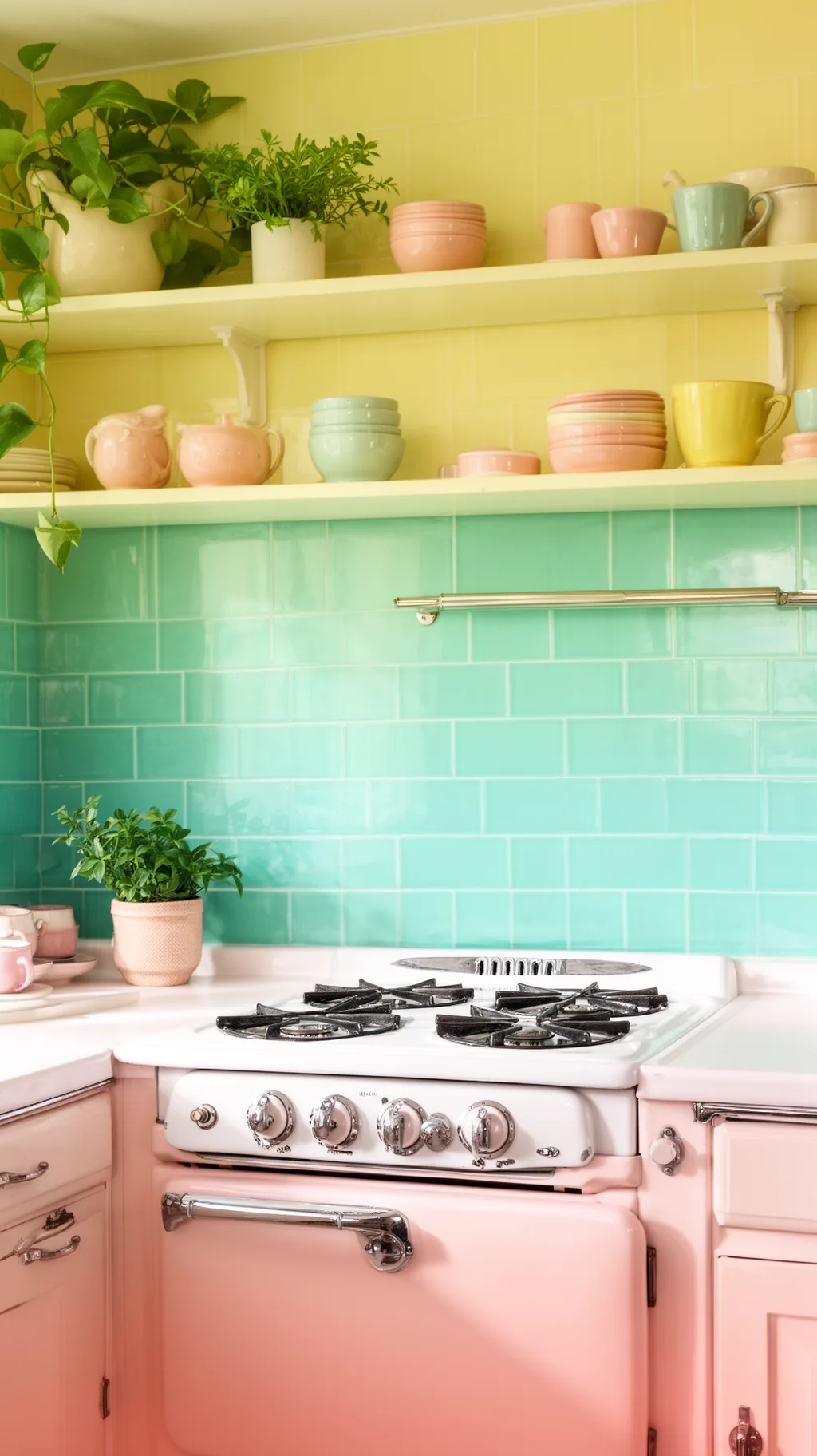 4 / 5
4 / 5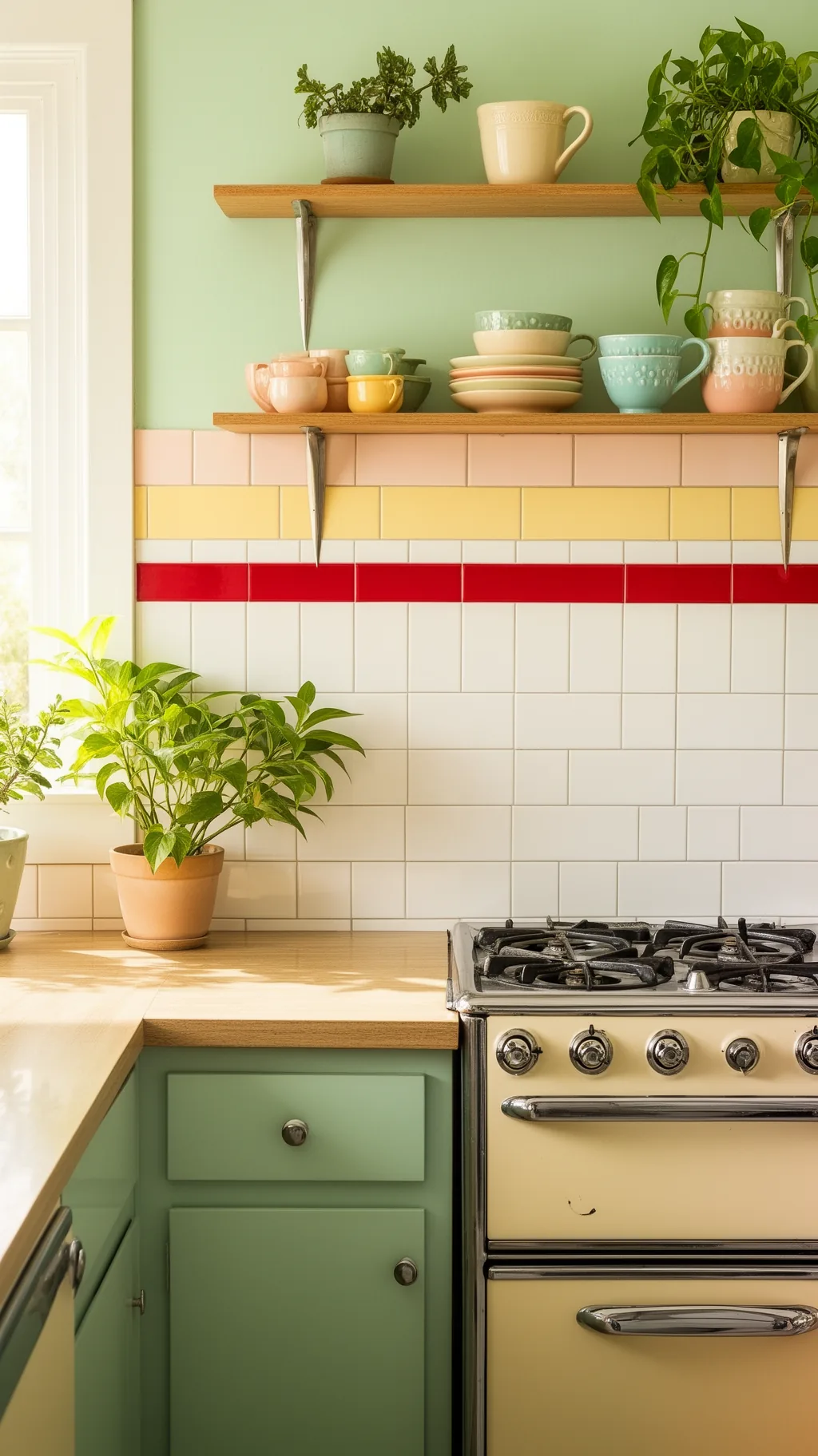 5 / 5
5 / 57. Cool It Down With Turquoise or Aqua
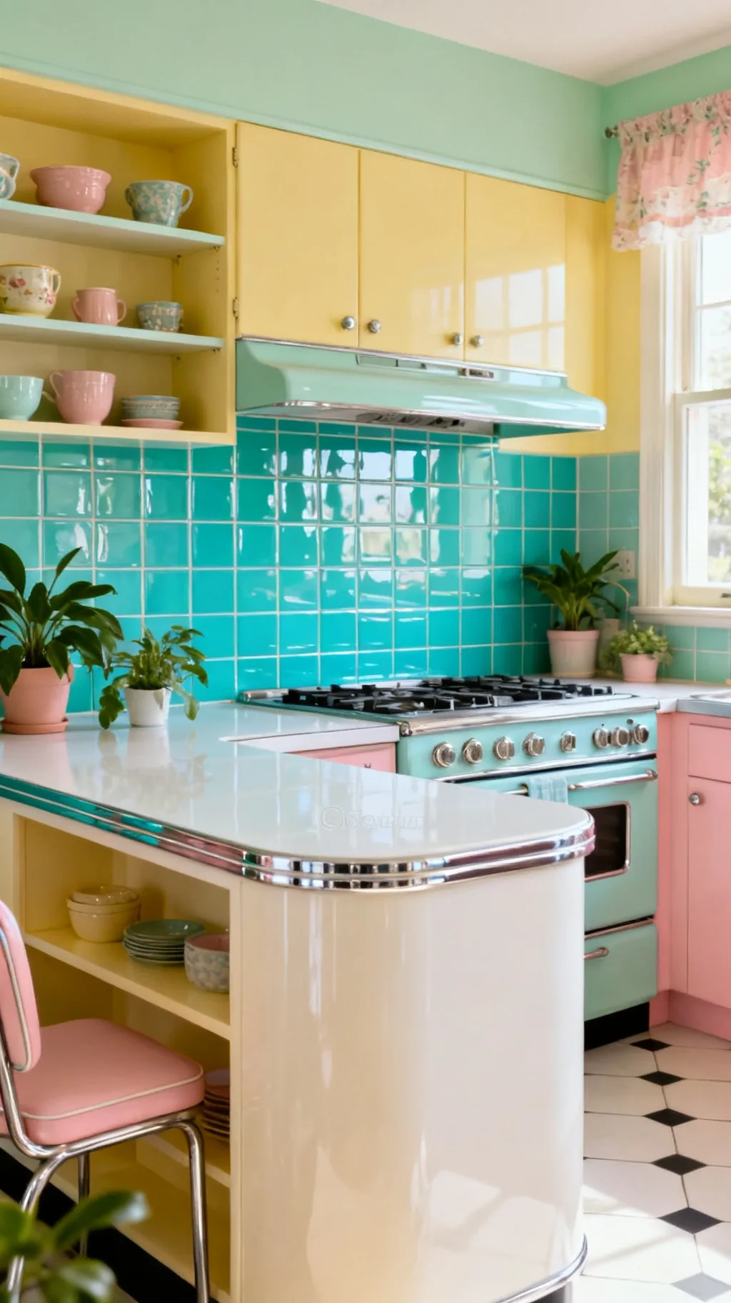
For a backsplash with a little more punch, turquoise or aqua tile brings a bright, jewel-like pop that feels straight out of a midcentury postcard. The vivid blue-green plays beautifully against white counters and chrome, and it gives a kitchen a confident, cheerful personality. Used as a full backsplash or a bold accent stripe, it never fails to lift the mood. This is the shade for anyone who wants their retro kitchen to feel joyful and a bit daring.
Working With Aqua
- Bright and bold: turquoise adds confident retro color.
- Loves chrome: the blue-green pops against shiny accents.
- Full or accent: a whole wall or a stripe both work.
Balance the bold color with plenty of white around it so the aqua stays the highlight.
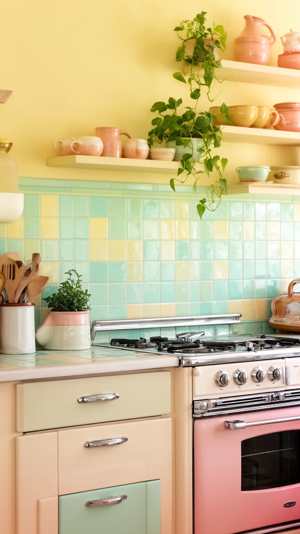
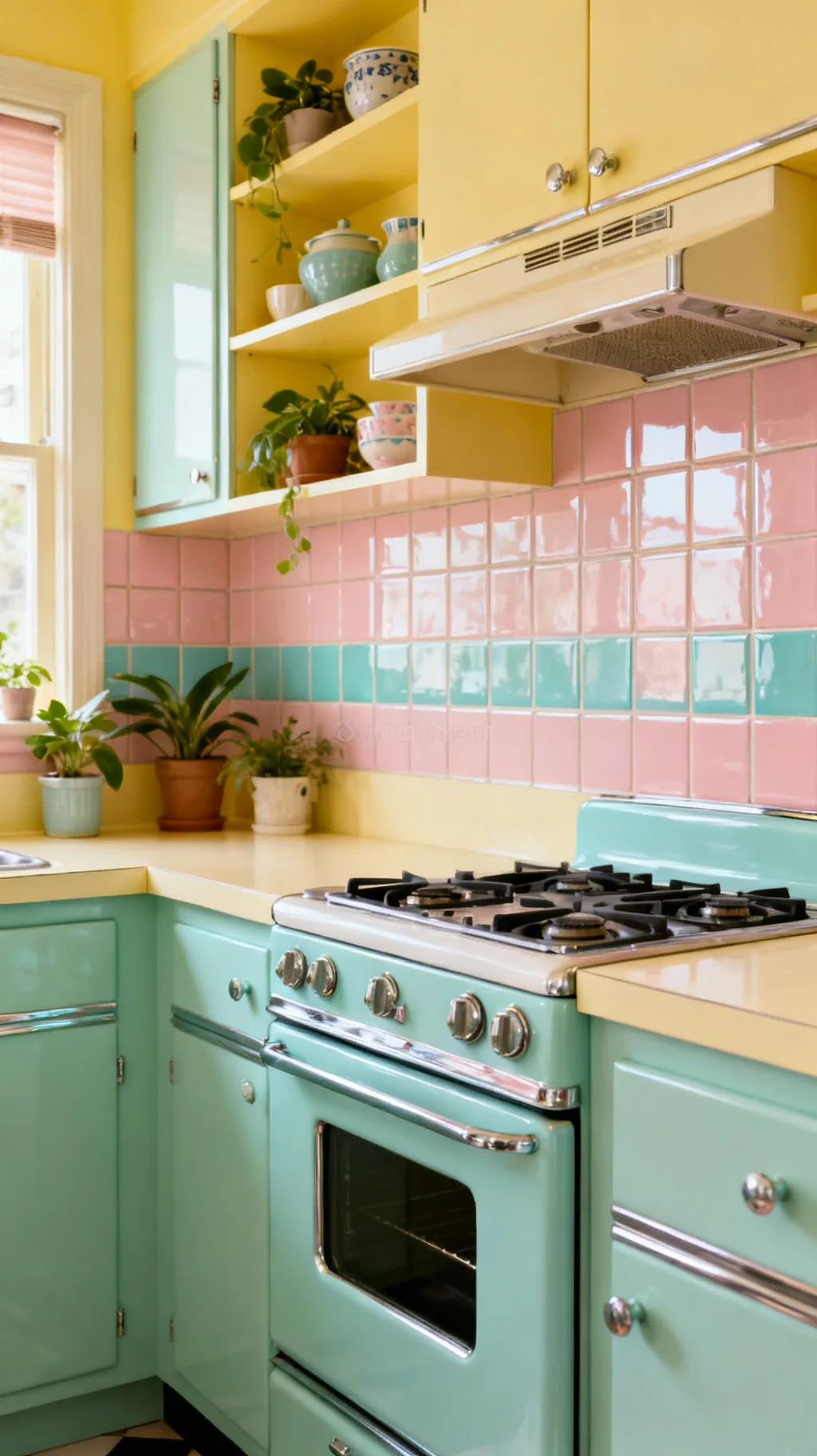
8. Warm the Room With Butter Yellow Tile
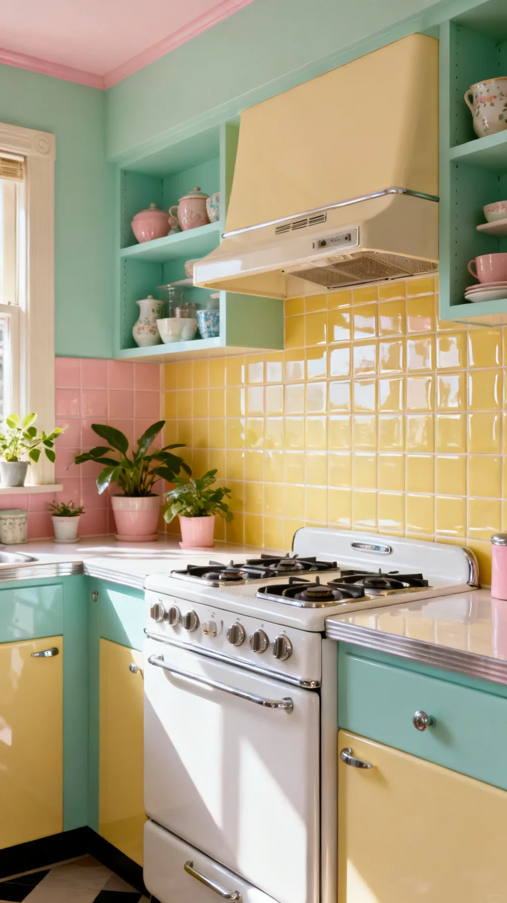
Butter yellow tile brings a sunny, welcoming warmth that feels right at home in a vintage kitchen. The soft, creamy shade is cheerful without being loud, and it glows beautifully in morning light against white or pale wood cabinets. It pairs sweetly with mint and blush for a full pastel palette, or stands alone for a gentle wash of sunshine. I love how a butter yellow backsplash makes a kitchen feel warm and happy all day long.
Yellow Pairings
- Sunny warmth: creamy yellow feels cheerful, not loud.
- Glows in light: it looks especially lovely in the morning.
- Mixes well: pair with mint and blush for full pastel charm.
Choose a soft, chalky yellow rather than a bright primary so it reads vintage.
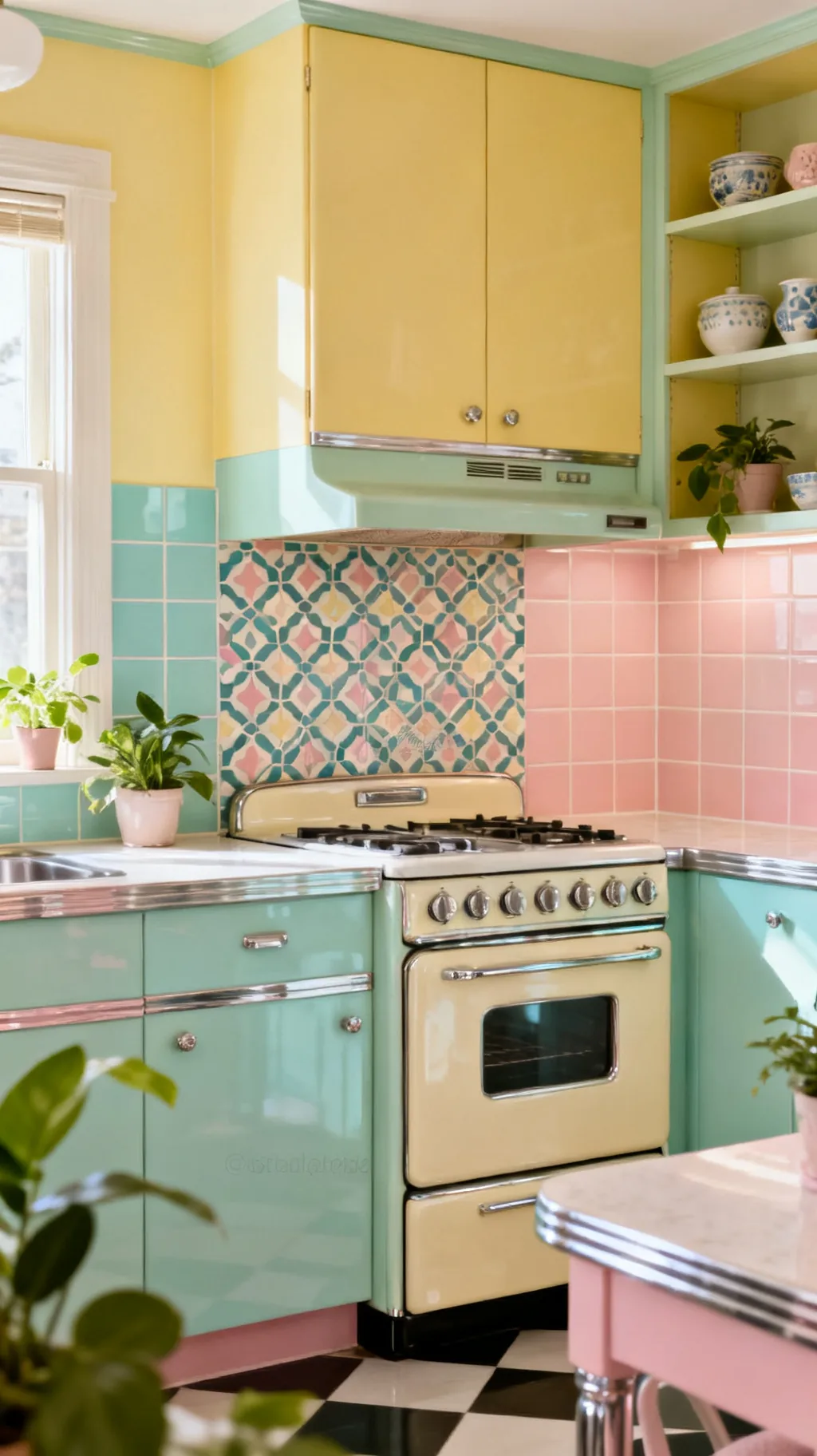
9. Sweeten It With Blush Pink Tile
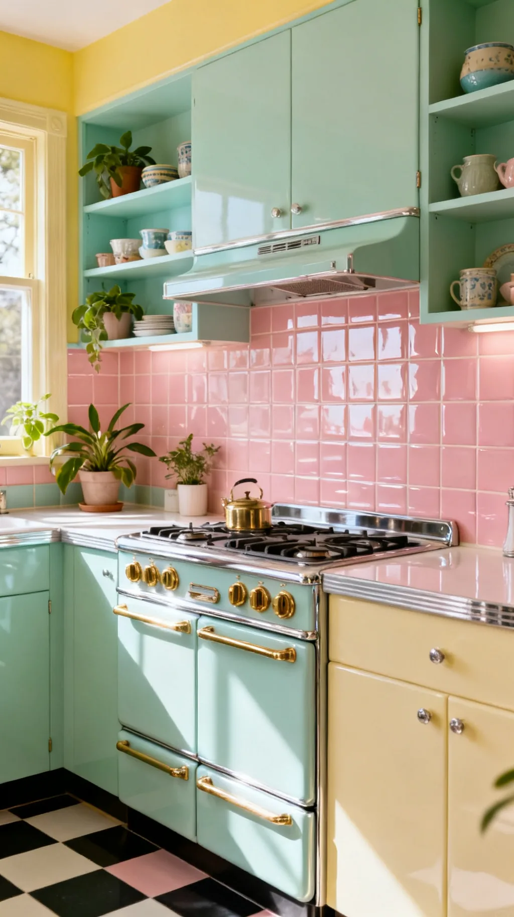
Blush pink tile is having a real moment, but it has charmed kitchens since the 1950s pink-bathroom era. A soft pink backsplash feels gentle, romantic, and unmistakably retro, especially paired with mint, chrome, or warm brass. It is sweet without being saccharine, and it brings a lovely warmth to white or gray cabinets. From what I’ve gathered, blush is the shade that makes a vintage kitchen feel cozy and a little bit dreamy.
Blush Tile Tips
- Gentle warmth: soft pink reads cozy and romantic.
- Retro roots: pink kitchens charmed the whole 1950s.
- Pairs prettily: mint, chrome, and brass all flatter it.
Keep the rest of the palette soft so the blush feels intentional, not theme-y.
&# 10024; Setting the whole scene?21 1950s Kitchen Ideas to Recreate That Nostalgic Charm→10. Add a Cherry Red Accent
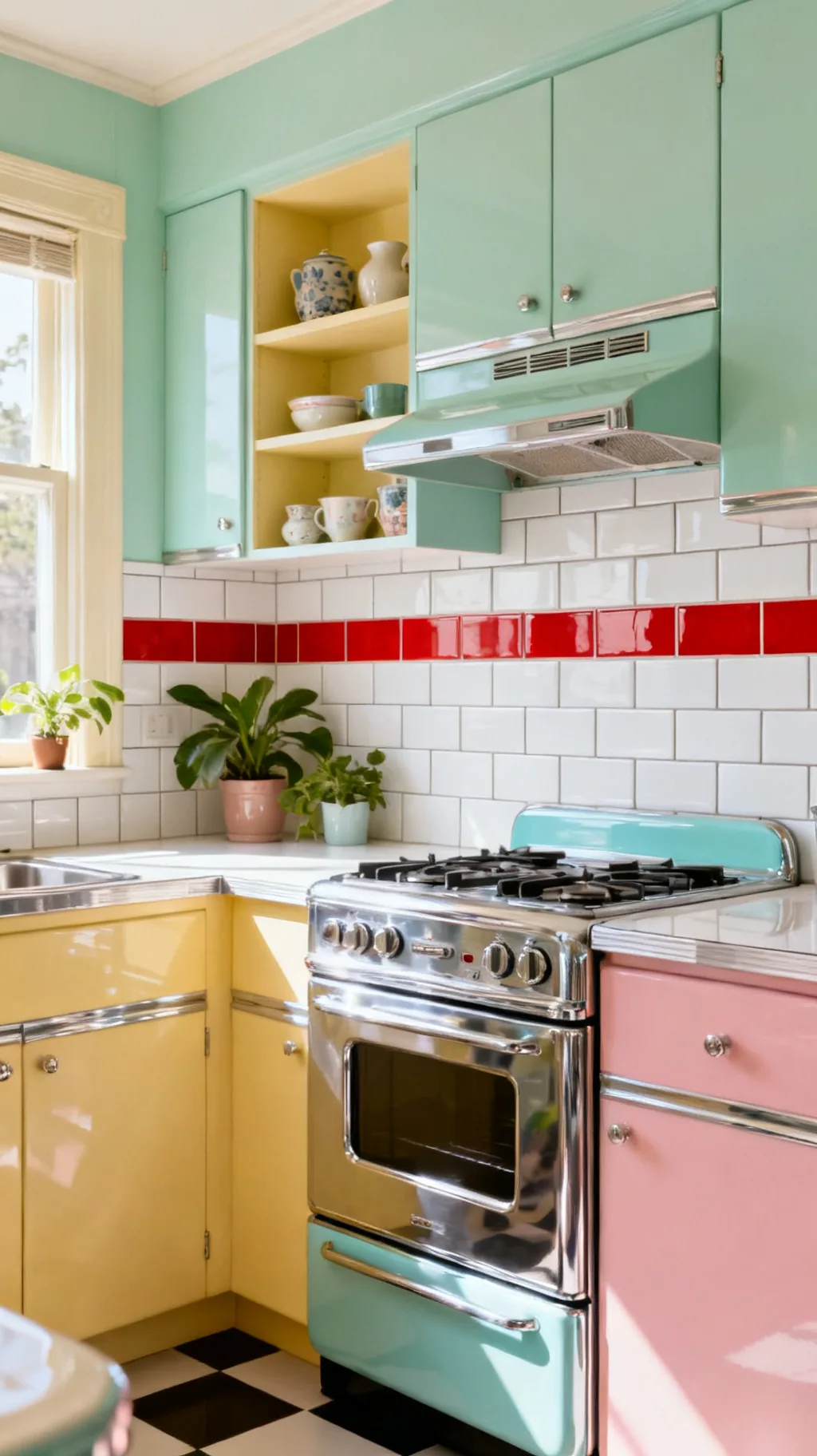
Sometimes a kitchen just needs a jolt of joyful color, and cherry red tile delivers it. Used as a bold accent row, a border, or a full statement wall behind the stove, retro red feels energetic and diner-fresh. It looks striking against white and chrome and instantly captures that classic 1950s soda-fountain spirit. This is the choice for a backsplash that makes a confident, cheerful statement.
Using Retro Red
- Joyful jolt: red brings energetic, diner-style cheer.
- Try an accent: a single row or border keeps it balanced.
- Loves white: red pops beautifully against crisp white.
Use red sparingly as an accent unless you want a full, bold statement wall.
11. Keep It Graphic in Black and White
A black and white backsplash is the bold, graphic heart of many retro kitchens. Whether it is a classic checkerboard, a tidy grid with black grout, or a patterned tile, the high contrast feels crisp, timeless, and a little glamorous. It grounds a colorful room and pairs with absolutely any pastel accent. I love how black and white reads both vintage and surprisingly modern, so it never feels stuck in one era.
Black and White Style
- Crisp contrast: high contrast feels timeless and clean.
- Grounds color: it steadies a bright, busy kitchen.
- Mixes with all: black and white suits any pastel accent.
Try black grout with white tile for an easy graphic punch without any pattern.
Take a peek at a few of these looks.
 1 / 5
1 / 5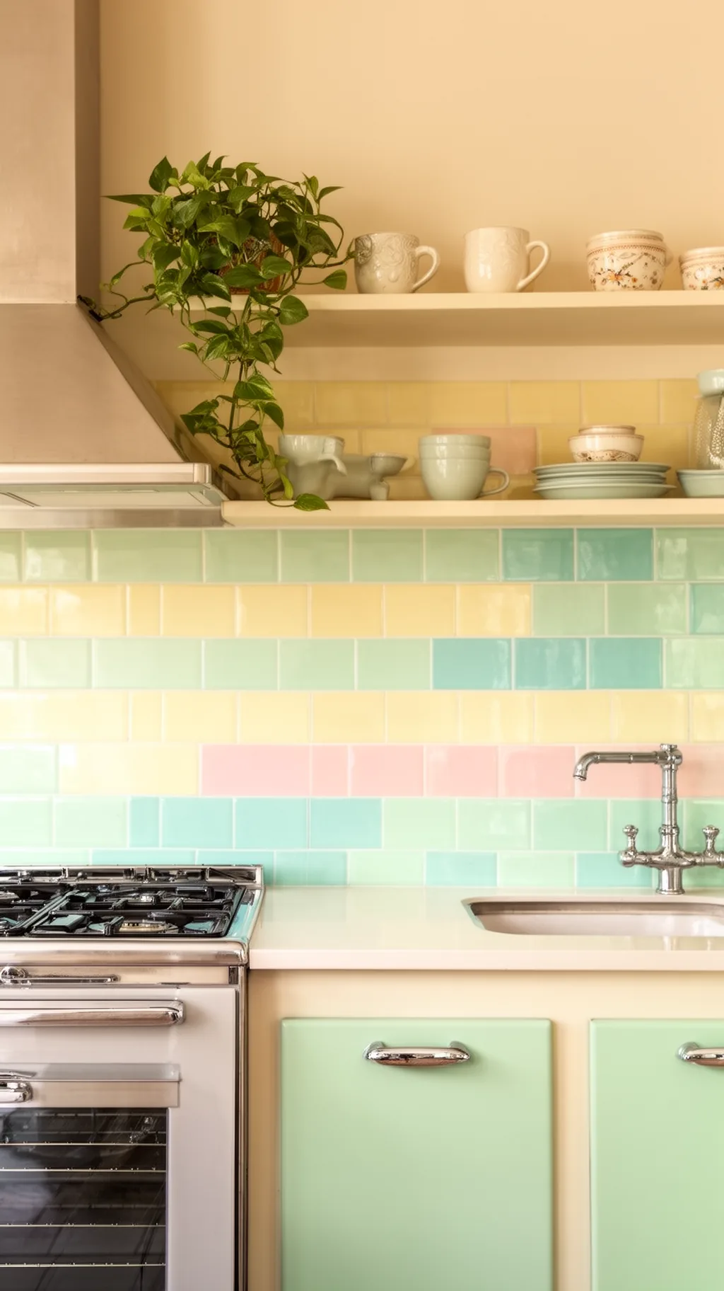 2 / 5
2 / 5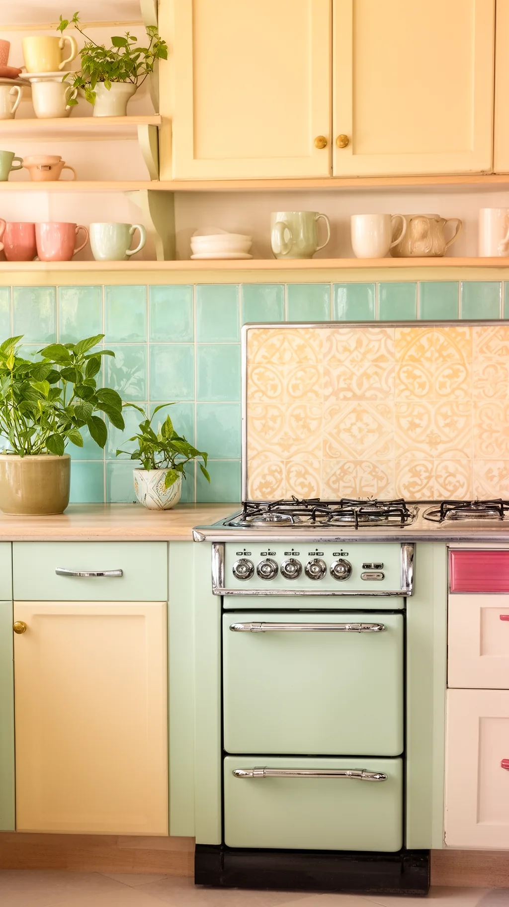 3 / 5
3 / 5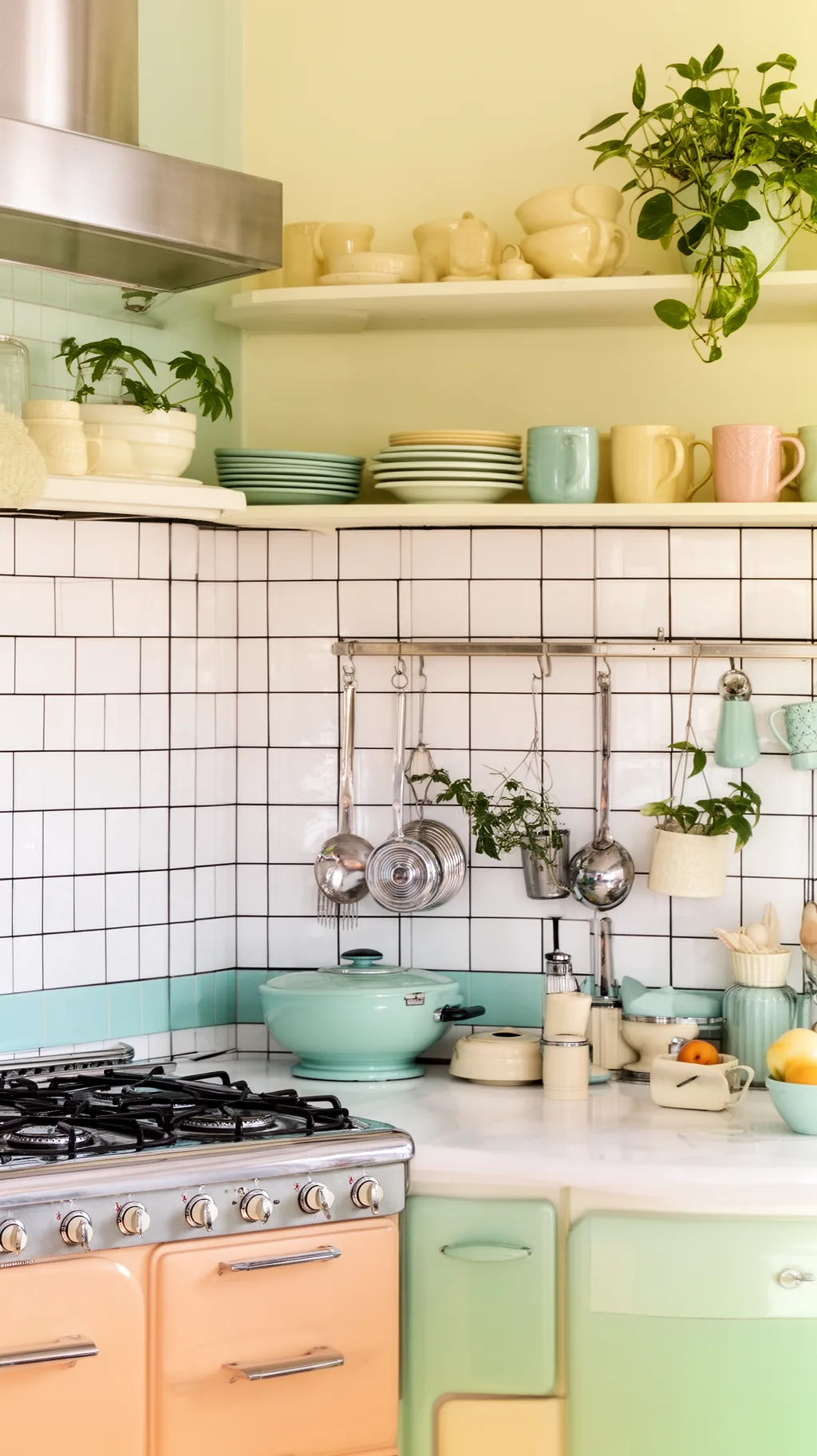 4 / 5
4 / 5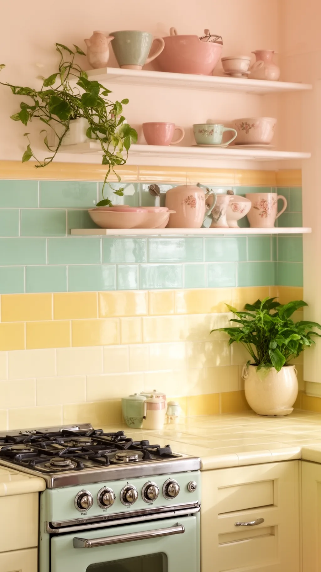 5 / 5
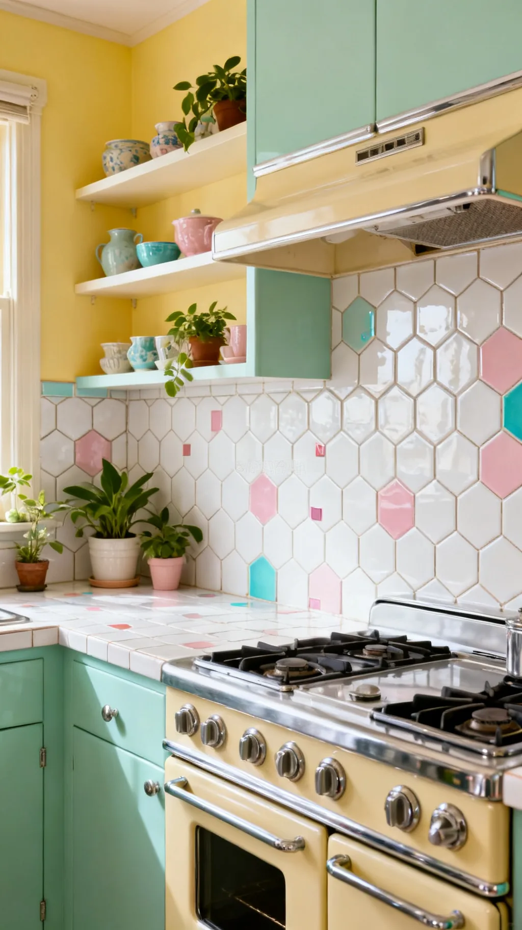
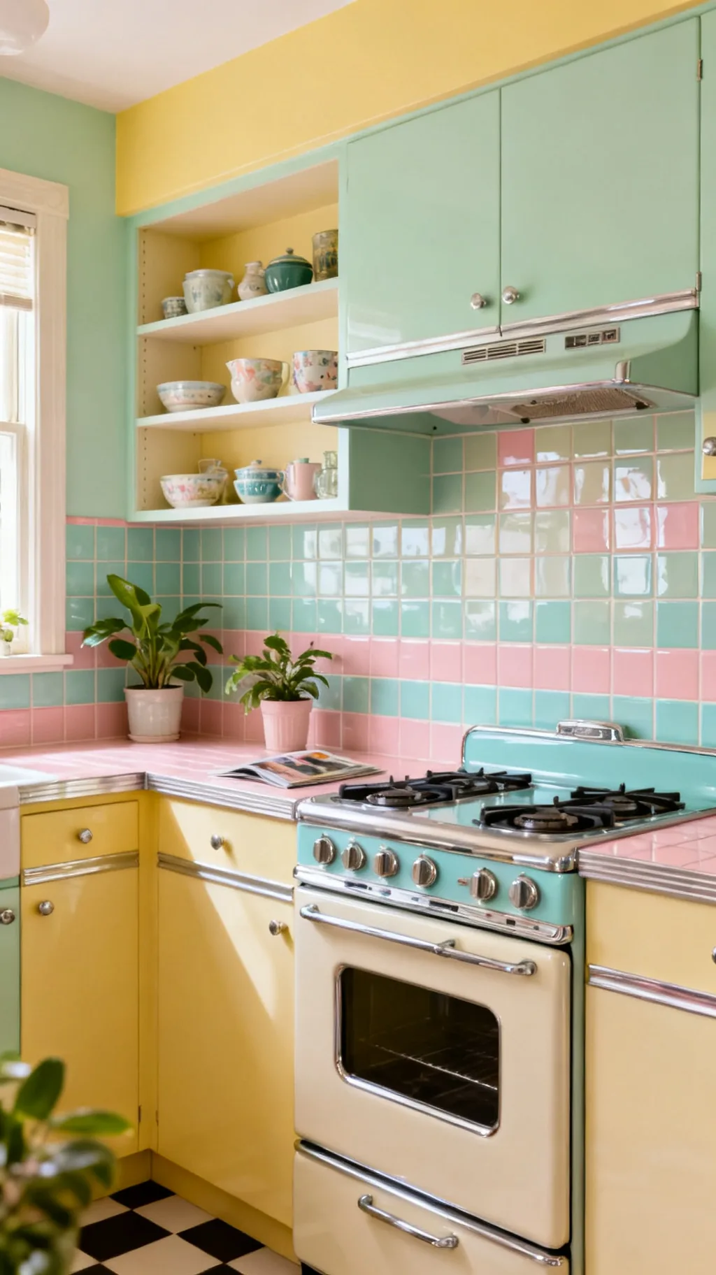
5 / 512. Cover the Wall in Retro Mosaic Tile
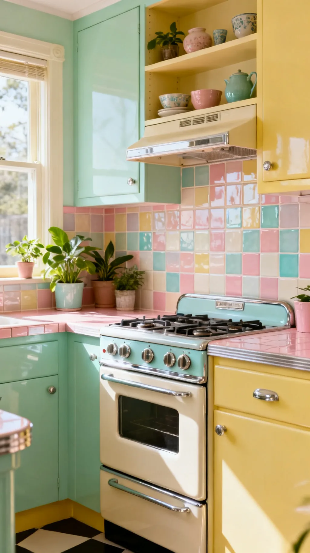
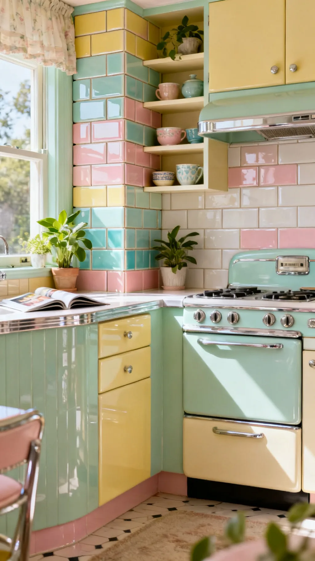
Tiny mosaic tiles bring rich texture and a wonderfully nostalgic, hand-laid feeling to a backsplash. A blend of soft pastels, or a classic mix of white with scattered color, creates gentle pattern and depth across the wall. Mosaics catch the light beautifully and feel cozy and detailed up close. This is a lovely option if you want a backsplash with a little old-world character and lots of subtle interest.
Mosaic Ideas
- Rich texture: tiny tiles add depth and detail.
- Blend the colors: mixed pastels feel soft and nostalgic.
- Catches light: small facets shimmer gently on the wall.
Choose a mosaic blend that includes a color already in your cabinets for cohesion.
13. Tile All the Way to the Ceiling
For full diner drama, run glossy tile all the way from the counter to the ceiling. This bold, floor-to-ceiling treatment wraps a kitchen in color and makes a small space feel intentional and immersive. In a cheerful pastel or crisp white, it reads like a classic luncheonette and gives the room a real sense of polish. A friend of mine tiled her whole stove wall this way and it became the showpiece of the kitchen.
Full-Height Tips
- Immersive color: floor-to-ceiling wraps the room in charm.
- Feels polished: a full wall reads intentional and finished.
- Diner drama: it captures that classic luncheonette look.
Keep open shelves or a hood to break up the expanse so it does not feel flat.
14. Try Patterned Encaustic or Cement Tile
Patterned encaustic and cement tiles bring vintage European charm and a beautiful hand-painted look to a backsplash. Their soft, faded motifs, florals, geometrics, or Moorish patterns, feel collected and full of character. Used behind a stove as a feature panel, a patterned tile becomes a little piece of art. I find these tiles add the kind of old-world soul that makes a kitchen feel like it has a story.
Pattern Tile Tips
- Hand-painted look: faded motifs feel old-world and warm.
- Use as a panel: a feature section behind the stove shines.
- Soft palette: muted colors keep the pattern from shouting.
Frame a patterned panel with plain tile so the design reads as a deliberate feature.
15. Stack Subway Tile Vertically
A simple twist on classic subway tile is to stack it vertically instead of laying the usual offset brick. Running the rectangles straight up draws the eye toward the ceiling, makes a low wall feel taller, and gives a familiar tile a fresh, slightly modern-retro rhythm. In a glossy pastel it feels clean and cheerful. This is an easy way to make a standard tile feel a little more designed and intentional.
Vertical Stack Style
- Draws the eye up: vertical lines add a sense of height.
- Fresh rhythm: a straight stack feels crisp and modern-retro.
- Same tile, new look: it reinvents classic subway easily.
Pair a vertical stack with a horizontal accent row to keep the pattern lively.
16. Mix Two Tones for a Color-Block Look
A two-tone backsplash brings a playful, graphic energy that feels right at home in a retro kitchen. Splitting the wall into bands of color, perhaps mint below and cream above, or adding a bold horizontal stripe, creates a cheerful color-block effect. It adds personality without the commitment of a full bold wall. I love how a simple two-color split can make even plain tile feel thoughtful and fun.
Color-Block Ideas
- Playful bands: split colors add graphic, retro energy.
- Try a stripe: a bold horizontal row breaks up plain tile.
- Easy commitment: two tones feel bold but still balanced.
Place the darker tone on the bottom so the wall feels grounded and tall.
Scroll through and see which one speaks to you.
 1 / 5
1 / 5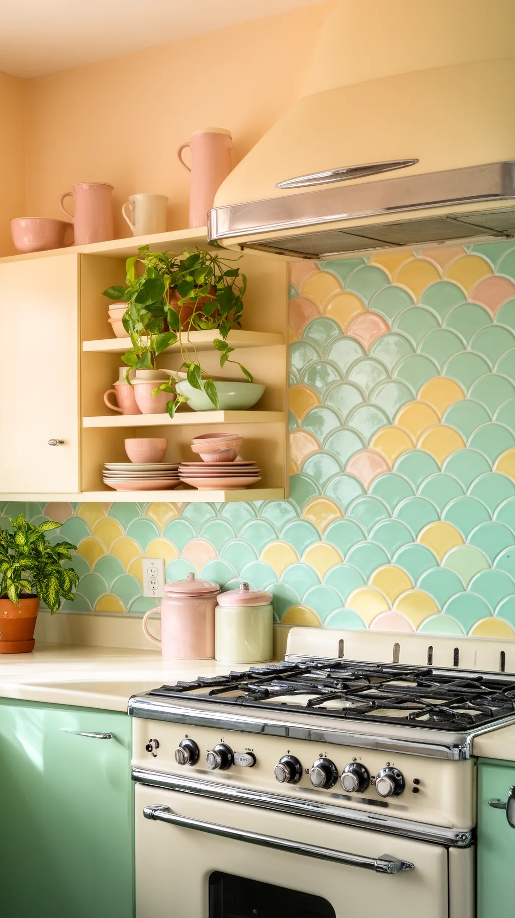 2 / 5
2 / 5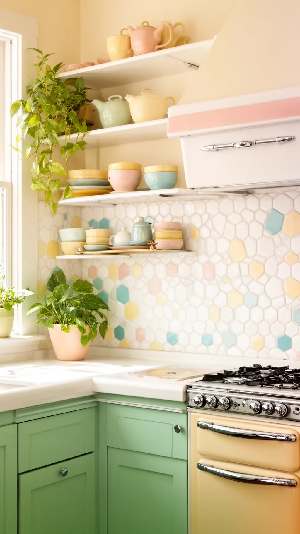 3 / 5
3 / 5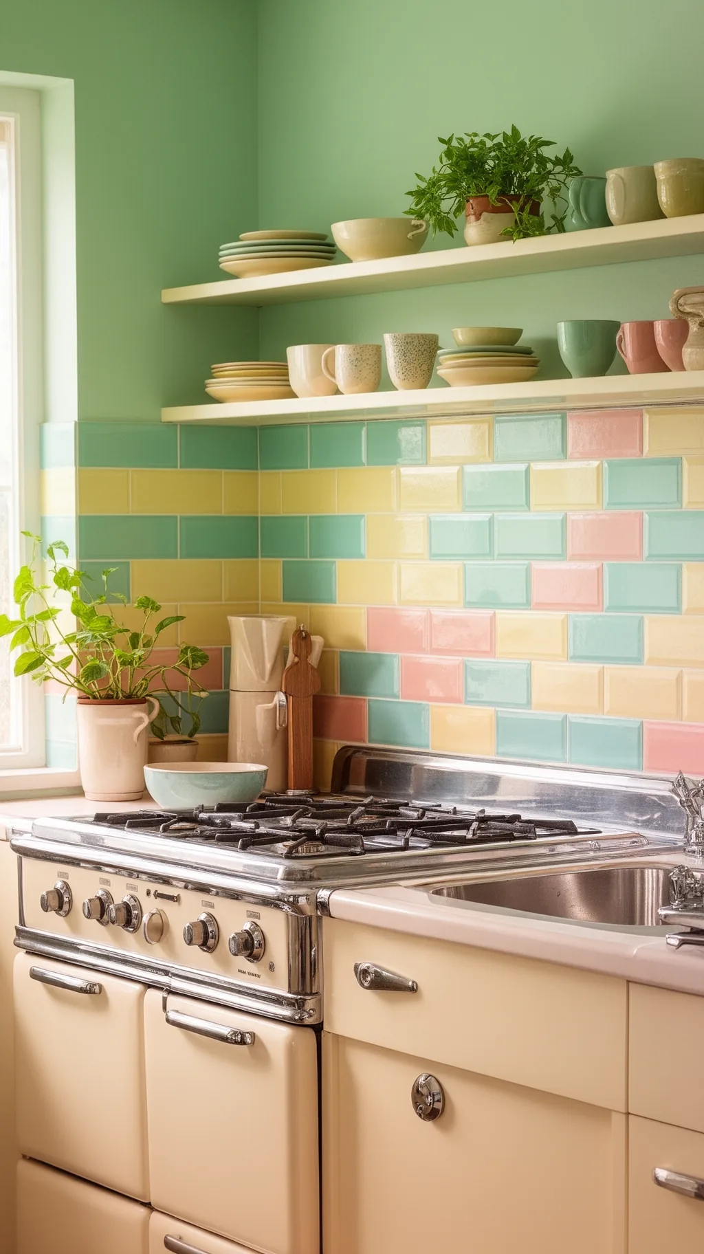 4 / 5
4 / 5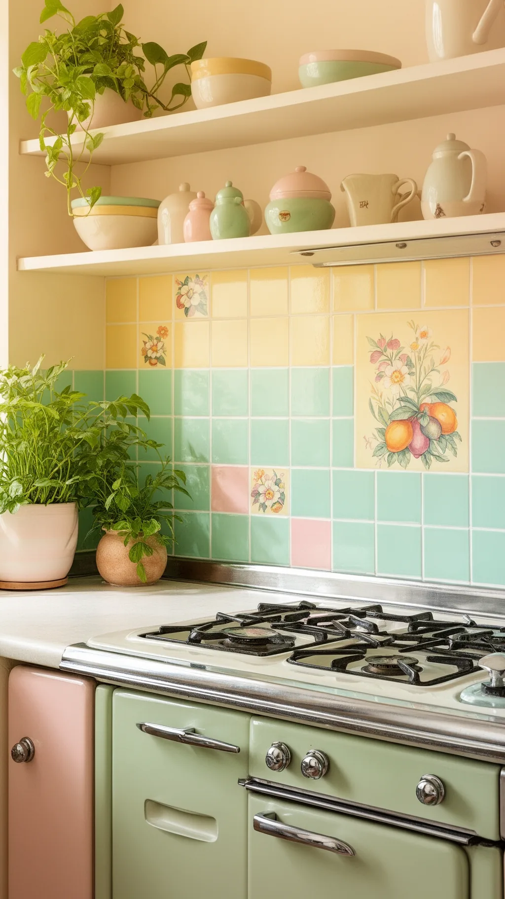 5 / 5
5 / 517. Let Contrasting Grout Do the Work
You do not always need bold tile to get a retro look, sometimes the grout is the secret. Pairing simple white or pastel tile with a darker contrasting grout instantly highlights the pattern and gives a backsplash a crisp, graphic, vintage feel. It is an affordable way to add character to plain tile, and it works with subway, hexagon, or penny shapes. From what I’ve gathered, switching the grout color is the easiest backsplash upgrade there is.
Grout Tricks
- Highlights shape: dark grout outlines every tile crisply.
- Budget-friendly: grout color costs little but changes a lot.
- Works anywhere: subway, hex, and penny all benefit.
Test a grout sample first, since dark grout reads much bolder once it is dry.
18. Add a Decorative Tile Border or Trim
A decorative border or trim tile is a small detail that makes a backsplash feel finished and genuinely vintage. A pencil-thin liner in a contrasting color, a row of patterned tiles, or a scalloped edge along the top draws a sweet line across the wall. It frames the backsplash neatly and adds a custom, collected touch. I love how one little border row can turn a plain field of tile into something that feels designed.
Border Ideas
- Frames the wall: a trim row gives the backsplash an edge.
- Add contrast: a colored liner pops against plain tile.
- Custom feel: a border makes simple tile look designed.
Run the border at upper-cabinet height so it lines up neatly across the room.
&# 10024; Love a softer retro vibe?11 Vintage Kitchen Aesthetic Ideas With a 70s Vibe→19. Hand-Paint Floral or Fruit Tiles
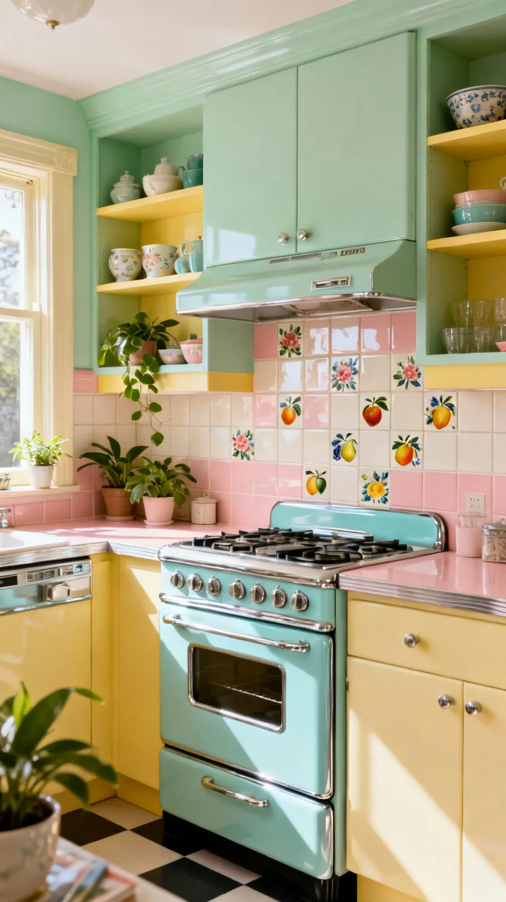
Hand-painted tiles with cheerful fruit, flowers, or little kitchen motifs bring sweet, storybook charm to a backsplash. Scattered among plain tiles or grouped into a feature panel behind the stove, they feel collected and full of personality. Cherries, lemons, and folk flowers are classic retro choices that nod to vintage linens and dishware. This is a delightful way to add a personal, hand-crafted touch to a tiled wall.
Painted Tile Style
- Storybook charm: fruit and flower tiles feel sweet and homey.
- Scatter or group: mix them in or cluster a feature panel.
- Retro motifs: cherries and lemons nod to vintage linens.
Repeat a painted motif’s color in your dishware so the tiles feel connected.
20. Consider Beadboard or Tin-Look Panels
Not every retro backsplash has to be tile. Beadboard paneling or a pressed tin-look panel brings cottage and farmhouse warmth, with a texture that feels charmingly old-fashioned. Painted a soft pastel or classic cream, beadboard adds gentle vertical lines, while a tin-style panel offers vintage pattern and a little shine. These are budget-friendly, renter-kind alternatives that still capture real vintage character.
Panel Alternatives
- Cottage warmth: beadboard adds soft, vertical texture.
- Tin shine: a pressed panel brings vintage pattern and glow.
- Budget-kind: panels cost less and suit renters too.
Seal painted beadboard well so it wipes clean near the stove and sink.
21. Add Shine With Glass Tile
Glass tile brings a luminous, glossy shimmer that makes a backsplash glow. Its reflective surface bounces light around and gives soft pastels a jewel-like depth that ceramic cannot quite match. In aqua, mint, or pale pink, glass tile feels fresh and a little glamorous while still reading vintage. I love how a glass backsplash brightens a kitchen and adds a gentle, watery sparkle behind the counter.
Glass Tile Tips
- Luminous glow: glass reflects light and feels bright.
- Jewel depth: pastels look richer in glossy glass.
- Fresh shimmer: a watery sparkle lifts the whole counter.
Use glass tile where light hits it, like beside a window, to maximize the shimmer.
A few more to spark your imagination.
 1 / 5
1 / 5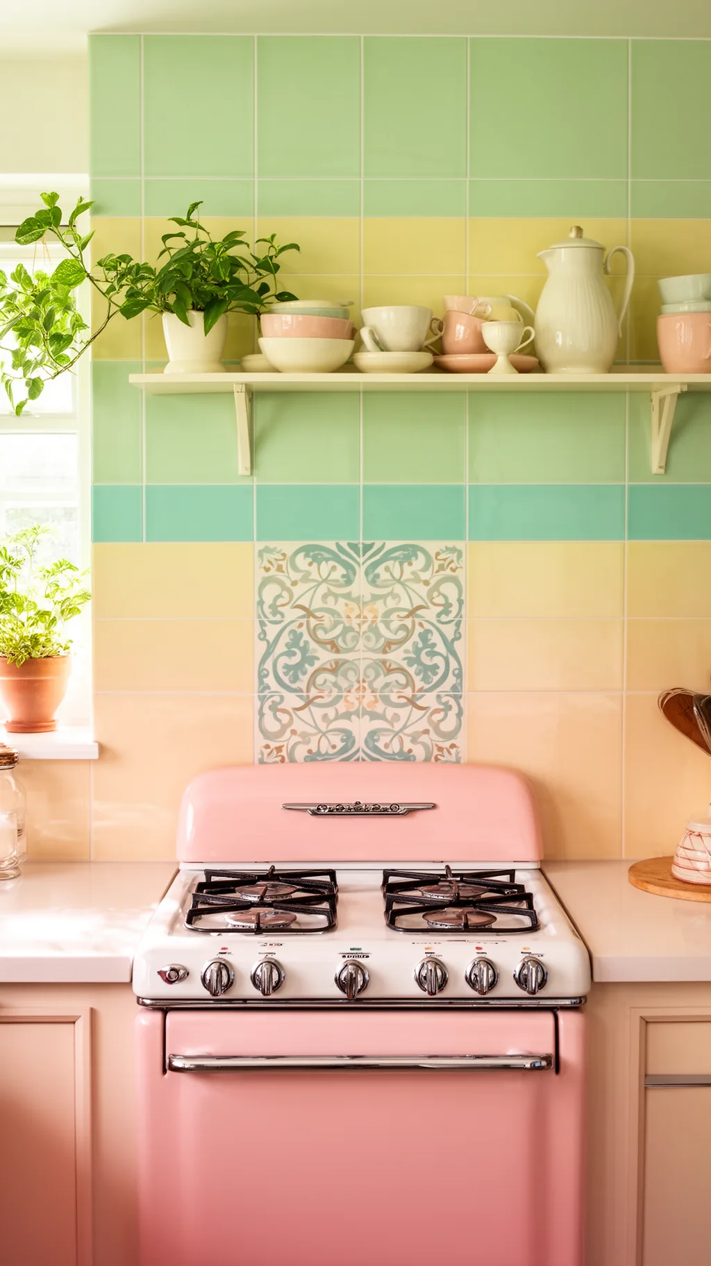 2 / 5
2 / 5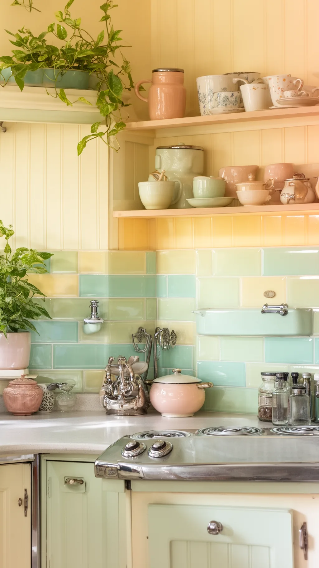 3 / 5
3 / 5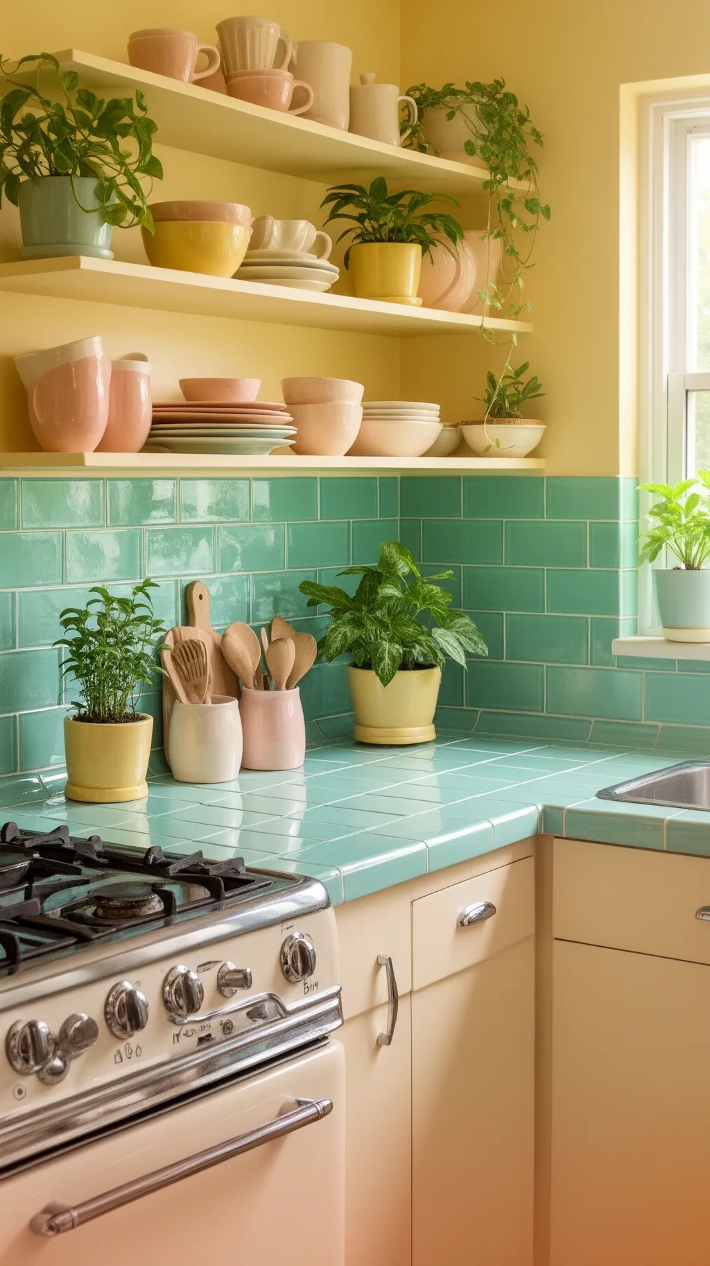 4 / 5
4 / 5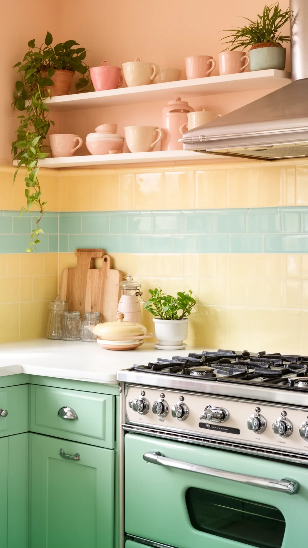 5 / 5
5 / 522. Make a Bold Feature Behind the Stove
The wall behind the stove is the natural place for your boldest backsplash idea. A patterned panel, a vivid color, or a special tile shape there becomes an instant focal point and draws the eye to the heart of the kitchen. You can keep the rest of the backsplash simple and let this one spot shine. This is where a single, daring choice can give a whole retro kitchen its personality.
Stove-Wall Drama
- Natural focal point: the stove wall draws every eye.
- Go bold here: save your daring tile for this one spot.
- Keep the rest calm: simple tile elsewhere lets it shine.
Frame the feature panel with the same plain tile as the rest for a tidy finish.
23. Tie the Backsplash to Cabinets and Counters
The loveliest retro kitchen backsplash feels like part of the whole room, not an afterthought. Pulling your tile color from your cabinets, echoing a counter tone, or repeating a shade in your enamelware makes everything feel collected and intentional. A backsplash that nods to the rest of the palette reads calm and considered rather than busy. This final step is what turns a pretty tile choice into a kitchen that feels truly pulled together.
Cohesion Tips
- Pull a color: echo your cabinets or counter in the tile.
- Repeat a shade: match a tone in dishware or linens.
- Stay considered: a tied-in backsplash feels calm and whole.
Hold a tile sample against your cabinets in daylight before you commit to the color.
Quick Retro Backsplash Pairings to Copy
- Diner Cheer: Black-and-white checkerboard, chrome accents, a cherry red stripe, white counters.
- Soft Pastel: Glossy mint subway tile, cream cabinets, brass hardware, open shelves of enamelware.
- Sweet Cottage: Blush penny rounds with tinted grout, beadboard, and a hand-painted fruit tile or two.
- Bold Statement: A patterned encaustic panel behind the stove, plain pastel tile around it, warm wood shelves.
A simple rule: let the backsplash color either echo your cabinets or provide one cheerful pop, then keep everything else calm. If you want to plan the cabinets and layout around your tile, the picks in our mid-century modern kitchen ideas pair beautifully with any retro backsplash.
Frequently Asked Questions
What backsplash is best for a retro kitchen?
Glossy ceramic tile is the classic choice, and a few styles feel especially vintage: pastel subway tile, black-and-white checkerboard, penny rounds, fish-scale scallops, and small hexagons. Soft retro colors like mint, butter yellow, blush, and turquoise all read genuinely 1950s. The best pick comes down to your cabinets and counters, since a backsplash that echoes a color already in the room always feels the most pulled together.
What colors are most retro for a kitchen backsplash?
Mint green and turquoise are the most iconic retro shades, closely followed by butter yellow, blush pink, and cherry red as a bold accent. Black and white, especially in a checkerboard, is another timeless retro look. For an authentic vintage feel, choose soft, slightly chalky pastels rather than bright primaries, and keep the rest of the palette gentle so the color stays the highlight.
Is subway tile retro or modern?
Subway tile is both, which is exactly why it is so popular. It first appeared in early 1900s subway stations, so a glossy white or pastel subway backsplash reads genuinely vintage, especially with colored grout. Laid in the classic offset brick pattern it feels retro, while a vertical stack or crisp white with dark grout leans more modern. That flexibility makes subway tile a safe, timeless choice for a retro kitchen.
How do I make a new backsplash look vintage?
Lean into soft pastel colors, glossy ceramic finishes, and classic shapes like subway, penny, or scallop tile. Adding a contrasting grout, a decorative border row, or a few hand-painted fruit or floral tiles instantly boosts the vintage feel. Pairing the tile with chrome accents, open shelves of enamelware, and a pastel stove completes the look, so the backsplash feels like part of a whole retro kitchen rather than a single new feature.
Can I get a retro backsplash on a budget?
Yes, there are several budget-friendly routes. Switching to a contrasting grout color, adding a peel-and-stick tile, or using beadboard or a tin-look panel all capture vintage character for less. You can also tile just a small feature panel behind the stove and keep the rest simple. Hunting for discontinued or salvaged vintage tile is another affordable way to get an authentic retro backsplash without a full renovation budget.
Final Thoughts on Your Retro Kitchen Backsplash
The wonderful thing about a retro kitchen backsplash is how much joy it brings for such a small slice of wall. A few glossy mint tiles, a cheerful checkerboard, a sweet row of penny rounds, and suddenly the whole kitchen feels bright, playful, and full of vintage charm. Start with a color that makes you happy and a shape that suits your style, then let the rest of the room follow its lead. Have fun with the color and pattern, and make it a backsplash you smile at every morning. Happy decorating!
You Might Also Like
Get cozy seasonal ideas in your inbox
Seasonal decor, recipes & home inspiration — straight to you. No spam, unsubscribe anytime.