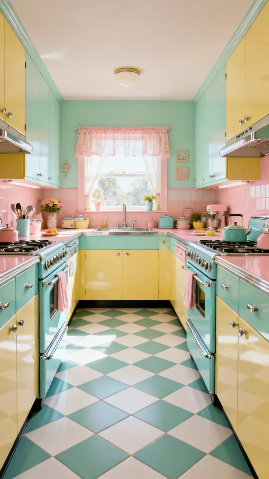
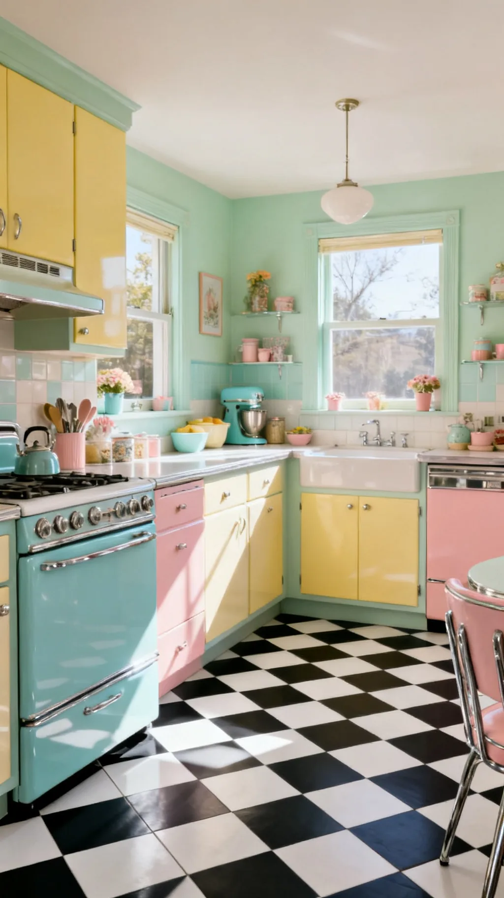
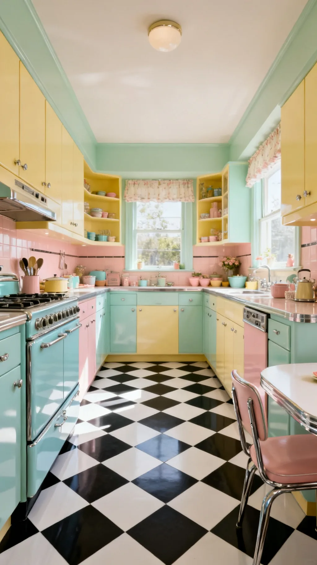
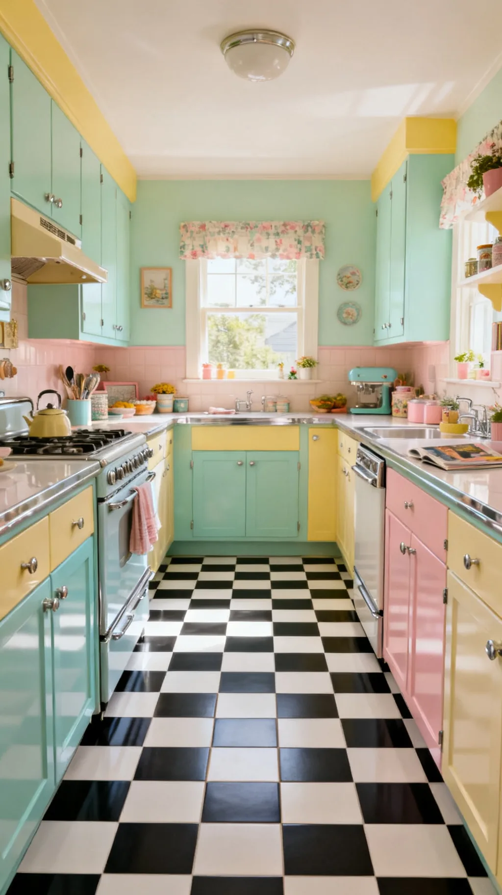
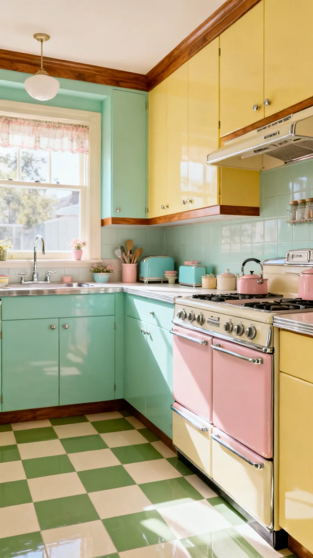
There’s a particular kind of joy that lives in a checkerboard floor. Maybe it’s the way a crisp black and white grid makes a kitchen feel like a 1950s diner, or how a soft mint and cream version turns the same room sweet and cottage-cozy. That cheerful, playful feeling underfoot is exactly what a good checkerboard kitchen floor brings to a home, and the loveliest part is just how many ways there are to wear it.
Quick answer: The most classic checkerboard kitchen floor is black and white tile, but soft retro pastels like mint, pink, yellow, and turquoise feel just as vintage and a little fresher. Choose durable ceramic or easy peel-and-stick vinyl, match your grout to the lighter tile, and pull one floor color up into your cabinets or accents so the whole room feels connected.
These 25 ideas run from bold diner classics and dreamy pastels to clever materials, layouts, and the finishing touches that tie a room together. You’ll find something for every kitchen, whether you’re tiling from scratch, painting a weekend project, or just clicking down peel-and-stick squares. Pour yourself a coffee and let’s play with some checks.
1. Start With the Classic Black and White
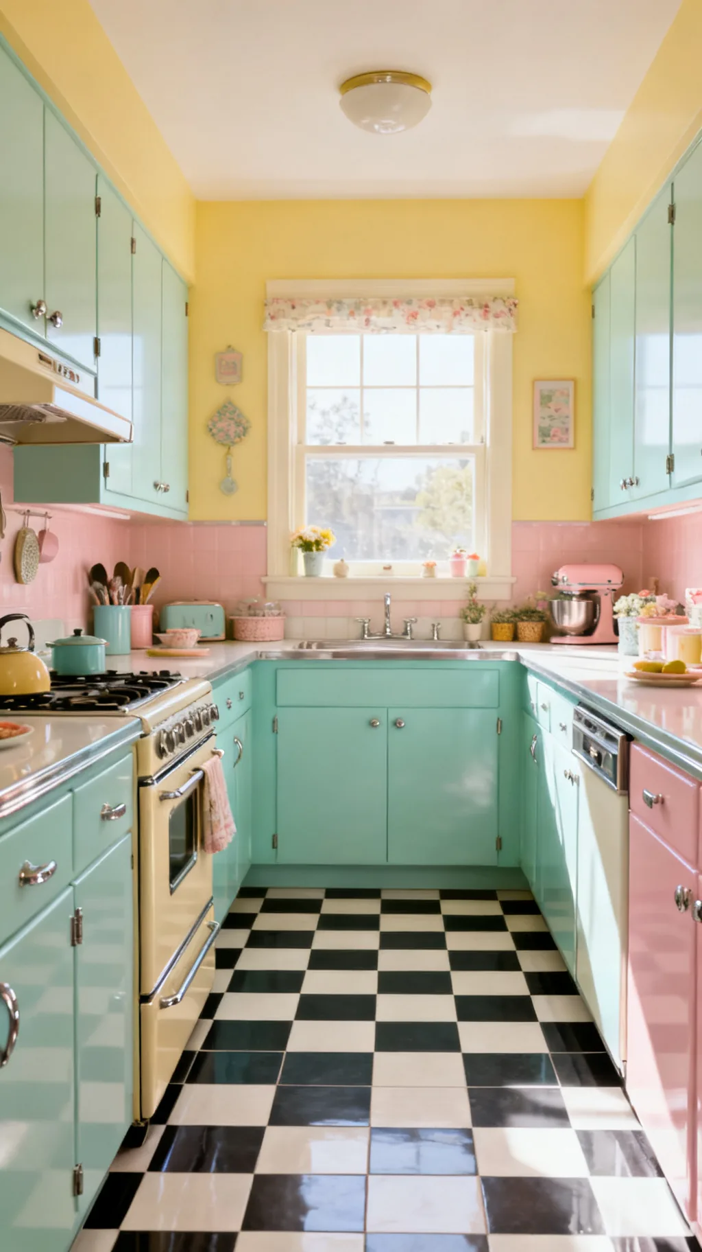
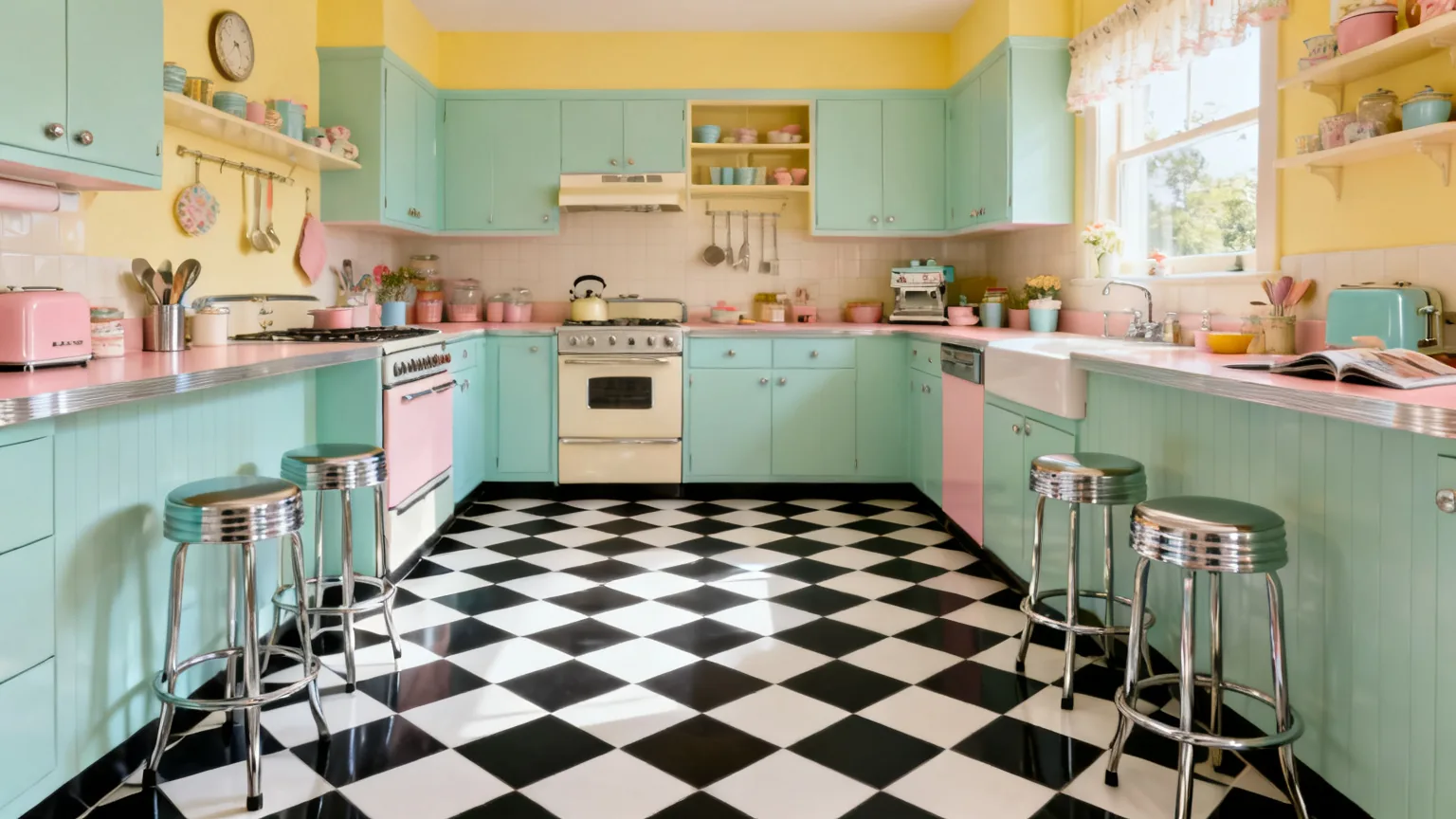
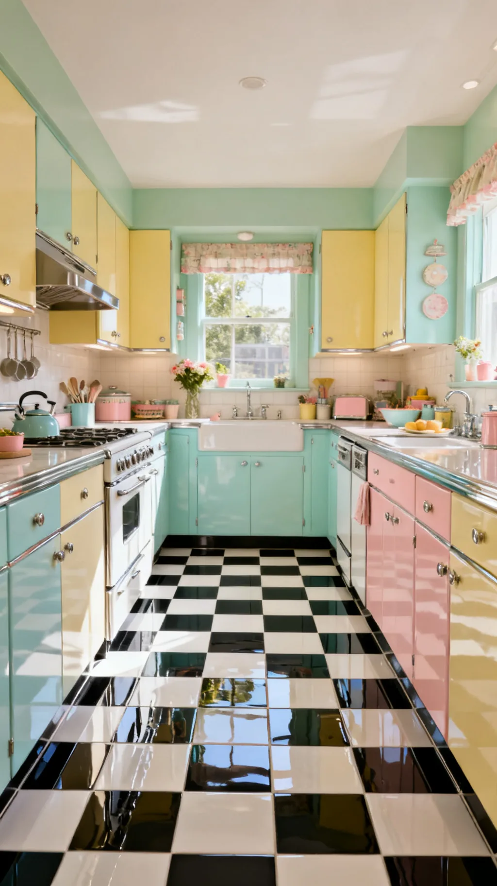
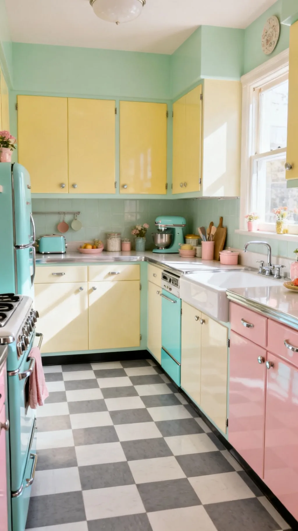
Nothing says retro quite like a crisp black and white checkerboard kitchen floor. That bold, graphic contrast is the look people picture when they think of a 1950s diner or a sweet cottage kitchen, and it never seems to go out of style. The high contrast grounds a bright, pastel room and gives every other color something solid to lean on. I keep coming back to this combination because it works in almost any kitchen, big or small.
Why Black and White Endures
- Timeless contrast: the bold pairing reads retro in any decade.
- Goes with everything: it anchors pastels, wood, and chrome alike.
- Hides nothing, forgives plenty: the pattern disguises everyday crumbs.
If you only try one version, this is the safest, most classic place to begin.
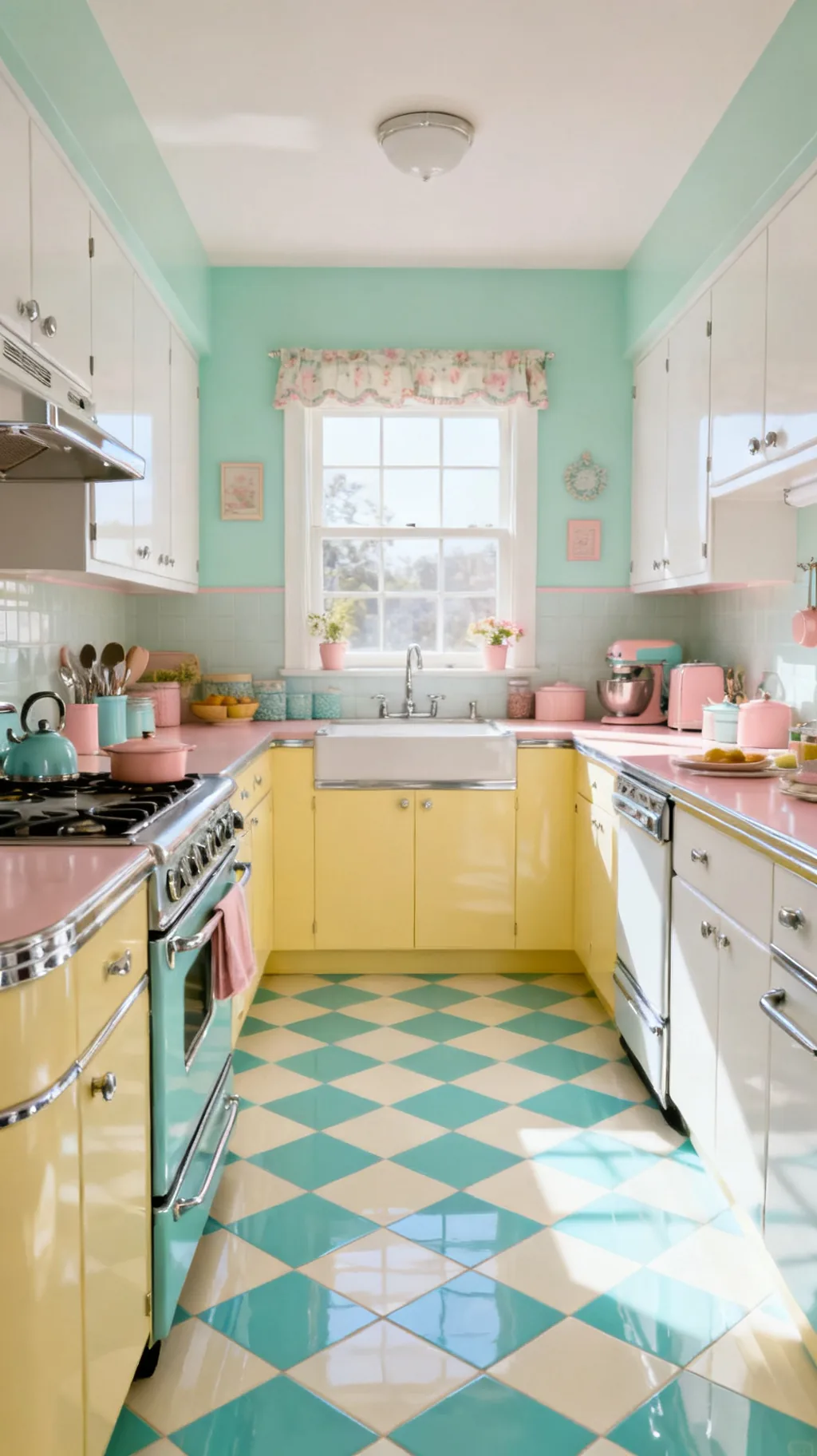
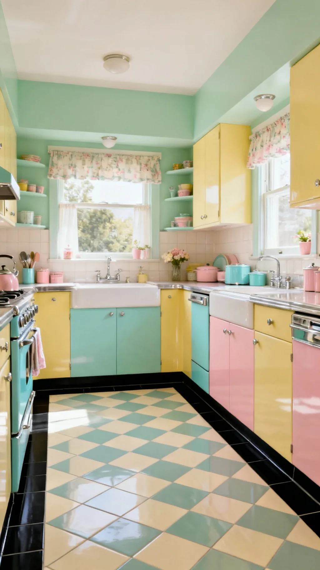
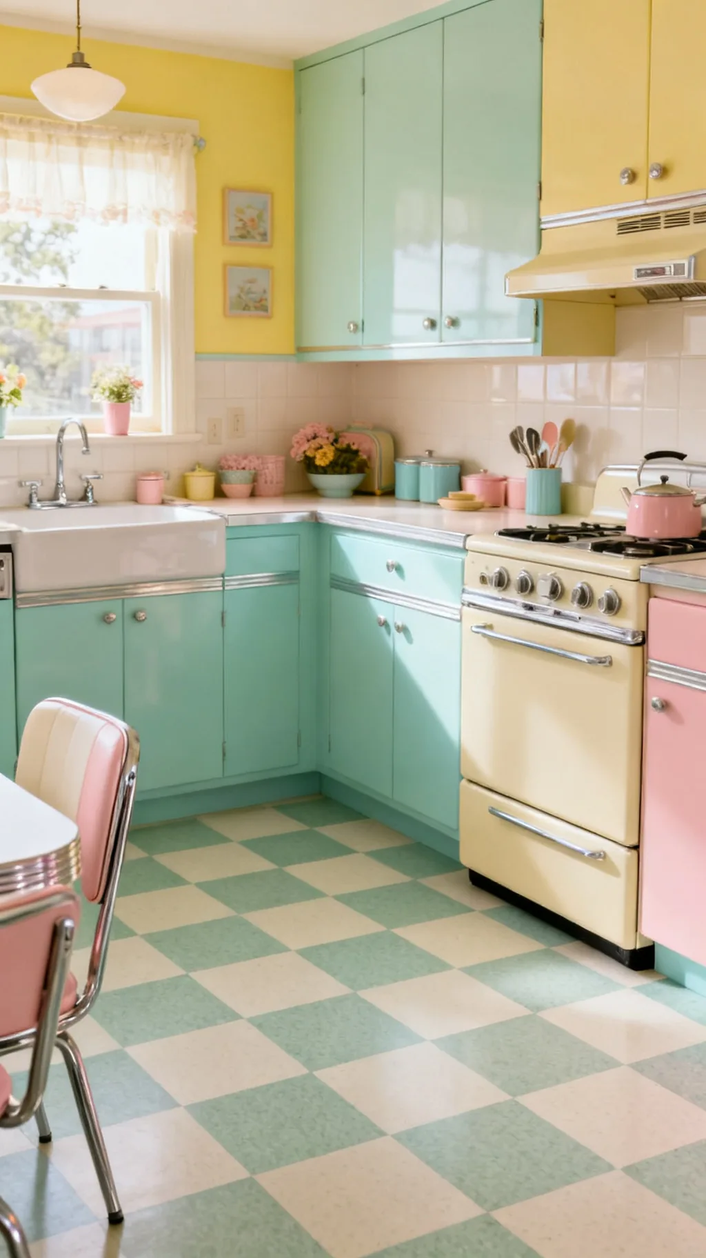
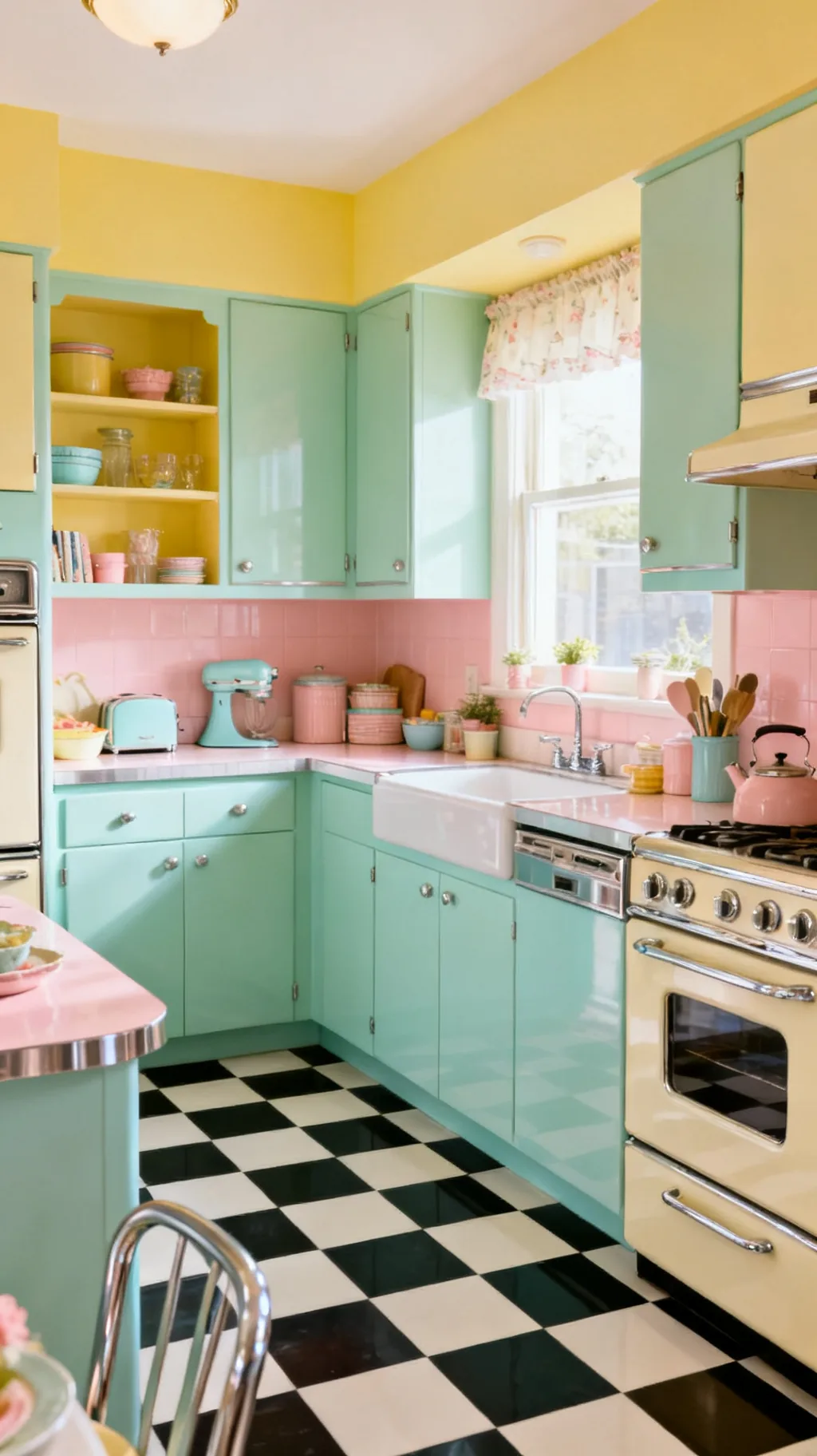
2. Soften It With Mint and Cream
For a gentler, more pastel take, swap the black for a soft mint green against cream. The checkerboard shape still reads retro, but the lower contrast feels airy and cottage-sweet rather than bold and graphic. This is a lovely choice in a kitchen with white or pale wood cabinets, where you want pattern underfoot without it shouting. A friend of mine chose mint and cream and said her kitchen suddenly felt like a permanent spring morning.
Making Pastel Checks Work
- Lower contrast: mint and cream keep the look soft and calm.
- Cottage feel: the gentle green leans sweet rather than diner-bold.
- Pairs with white: pale cabinets let the floor glow quietly.
Echo the mint in a canister or a bowl so the floor feels connected to the room above.
3. Try Red and White for Diner Cheer
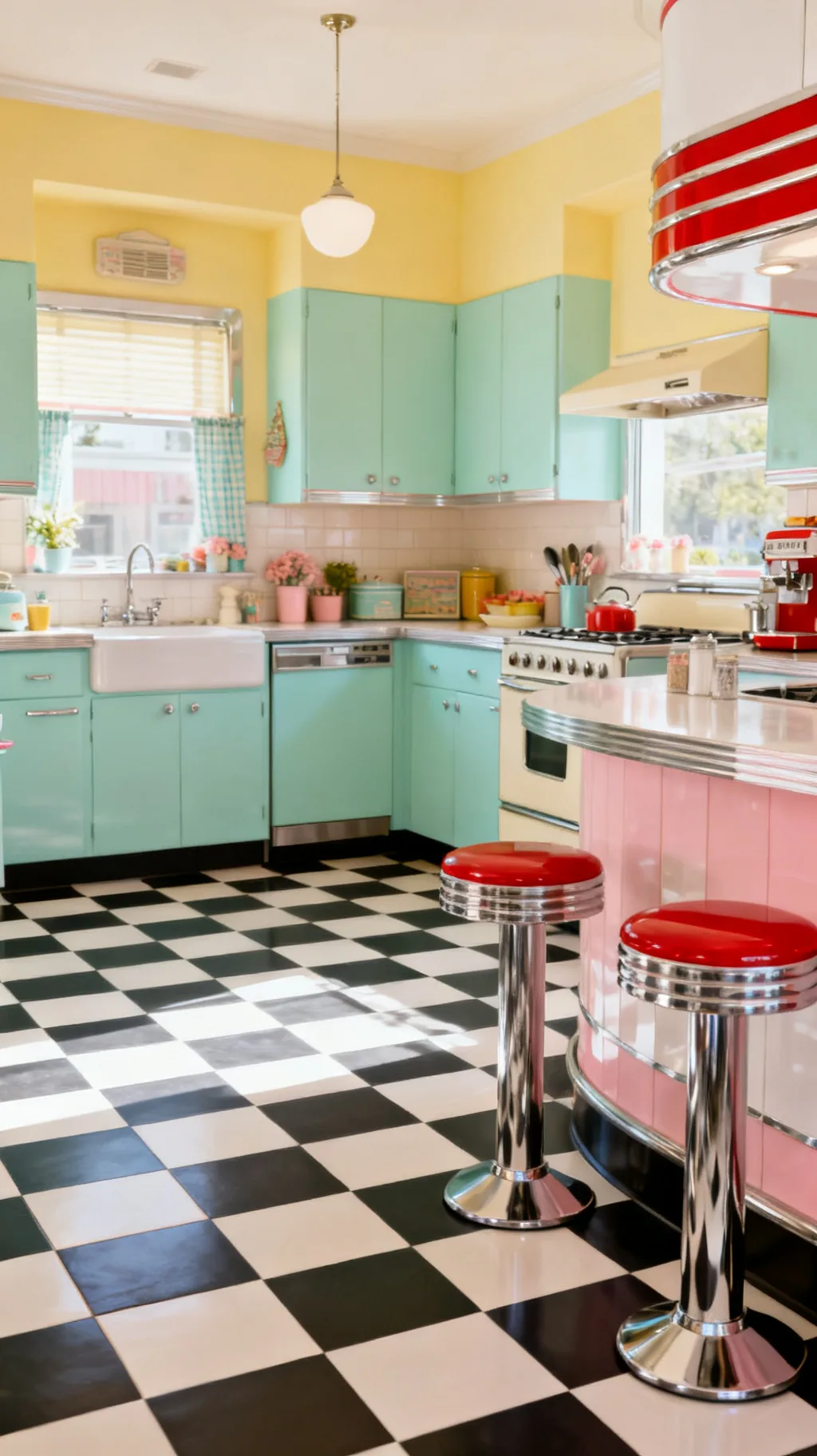
A red and white checkerboard floor brings instant diner energy and a big dose of cheerful nostalgia. Paired with chrome stools and a little cherry-red here and there, it turns an ordinary kitchen into a place that feels like a slice of the 1950s. Red is a confident choice, so let it carry the room and keep surrounding colors calm. From what I’ve gathered, it is the version that makes people smile the moment they walk in.
Styling Red Checks
- Diner spirit: red and white nods straight to the soda-fountain era.
- Add chrome: shiny metal stools and trim complete the look.
- Keep walls calm: white or cream lets the floor be the star.
A red floor loves a quiet ceiling and walls, so let the pattern do all the talking.
4. Lay the Checks on the Diagonal
The very same tiles feel completely different when you turn them on point. A diagonal checkerboard, with the squares set like diamonds, adds movement and makes a narrow kitchen feel wider than it is. It is a small change in direction that gives the floor a more dynamic, custom look. If your kitchen is on the snug side, this layout is a quiet trick worth knowing.
When to Go Diagonal
- Widens a room: diamonds draw the eye across, not down.
- Adds movement: the angled grid feels lively and intentional.
- Custom touch: it reads more designed than a straight grid.
Start your diagonal from the most visible doorway so the pattern greets you as you walk in.
5. Go Pastel With Pink and Gray
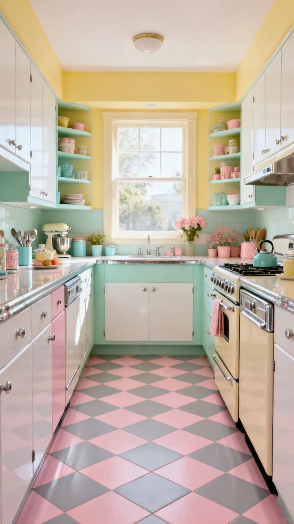
Blush pink paired with a soft dove gray is an unexpectedly chic checkerboard kitchen floor. The pink keeps things sweet and retro while the gray grounds it so the room never tips into too-cute. It is a wonderful match for white cabinets and a little brass or chrome. This combination feels both vintage and quietly current, which is a hard balance to strike.
Pink and Gray Balance
- Sweet but grounded: gray keeps the pink from feeling childish.
- Soft contrast: the pairing is gentle on a bright kitchen.
- Metal friendly: brass or chrome both look lovely against it.
Keep your cabinets and counters pale so the floor reads as the gentle hero of the room.
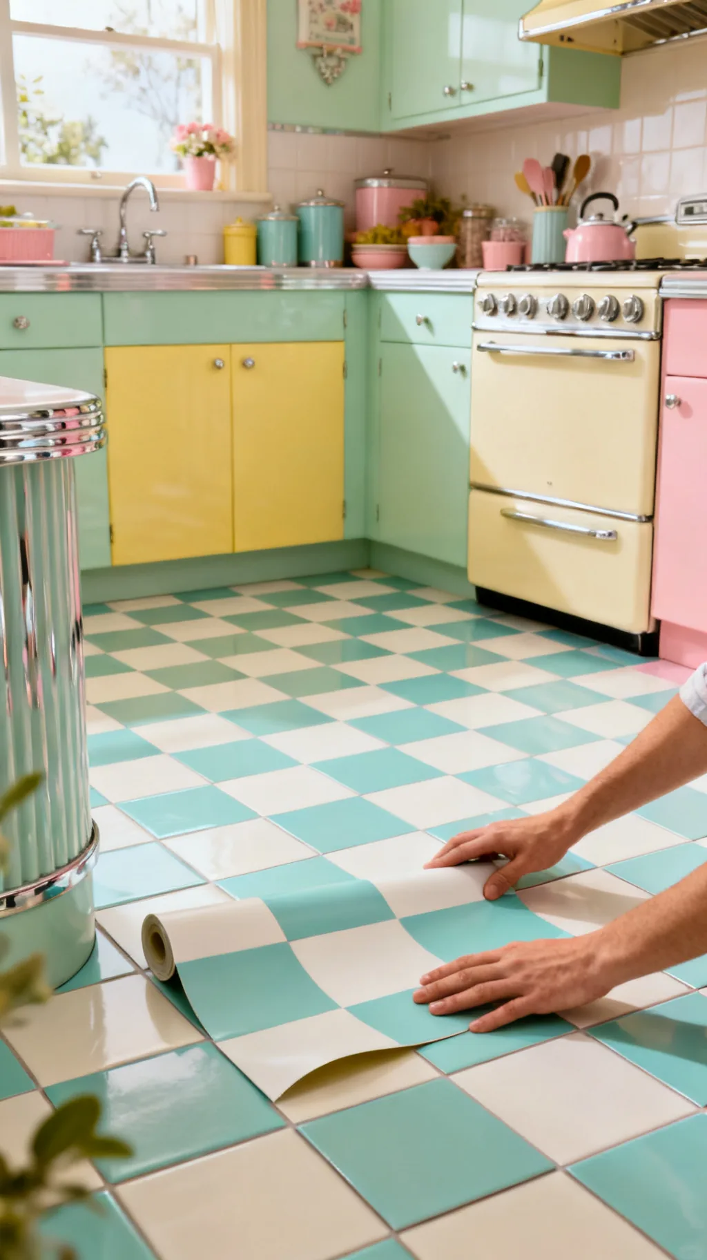
6. Use Peel-and-Stick Tiles for a Quick Change
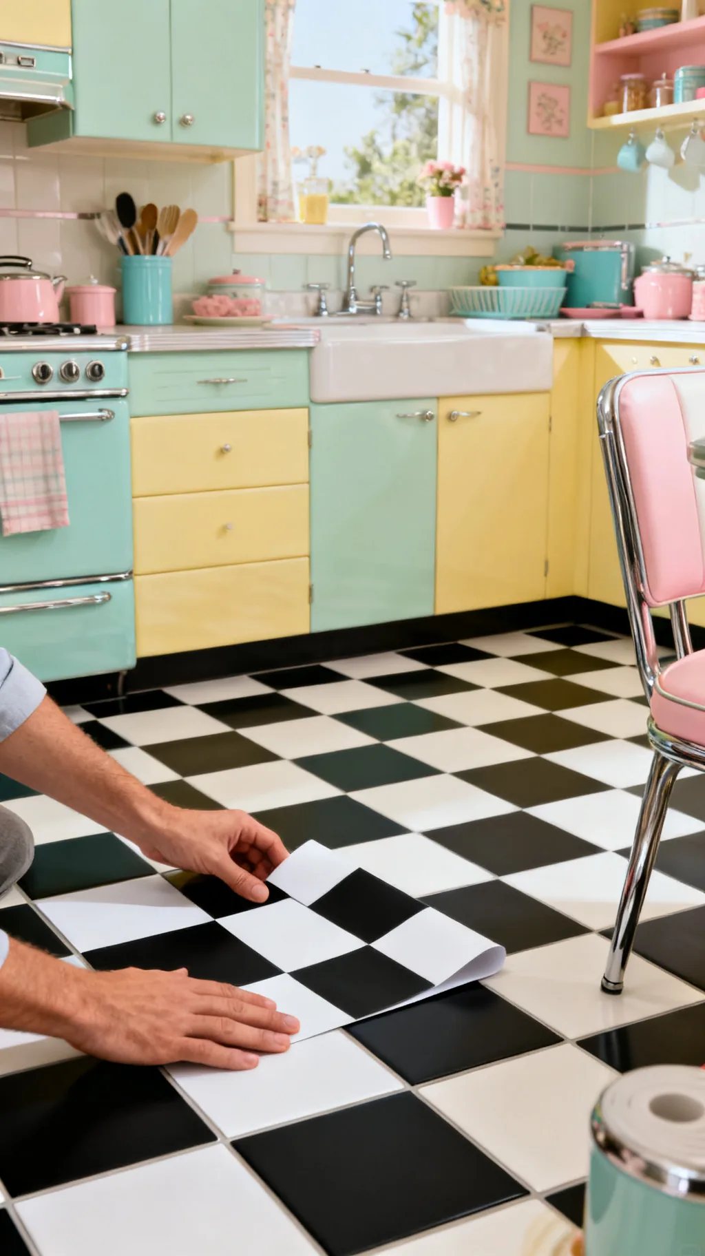
If you rent or simply want a low-commitment update, peel-and-stick vinyl checkerboard tiles are a small miracle. They go down over an existing floor in an afternoon, ask for no special tools, and lift away later without damage. The look has come a long way, and a good matte vinyl reads surprisingly close to real tile. I remember helping a friend redo a dull rental kitchen floor in a single Saturday this way.
Peel-and-Stick Basics
- Renter-friendly: no drilling, no grout, no permanent change.
- Fast install: a whole floor can go down in an afternoon.
- Budget-kind: it is the easiest way to test the look first.
Clean and dry the existing floor thoroughly first, good adhesion is everything with peel-and-stick.
7. Paint a Checkerboard Floor Yourself
A painted checkerboard is one of the most satisfying weekend projects there is. With a tape measure, painter’s tape, and good floor paint, you can turn plain wood or even old linoleum into a cheerful retro grid. The slightly handmade quality is part of the charm, and you can choose any two colors you like. It is a project that rewards patience and a steady taping hand.
Painting Tips
- Measure twice: a careful grid is the secret to crisp squares.
- Use floor paint: a durable, scrubbable finish lasts far longer.
- Seal it well: a clear topcoat protects all your hard work.
Lay out your whole grid in pencil before any paint touches the floor, the planning is half the job.
Swipe through these for a little inspiration.
 1 / 5
1 / 5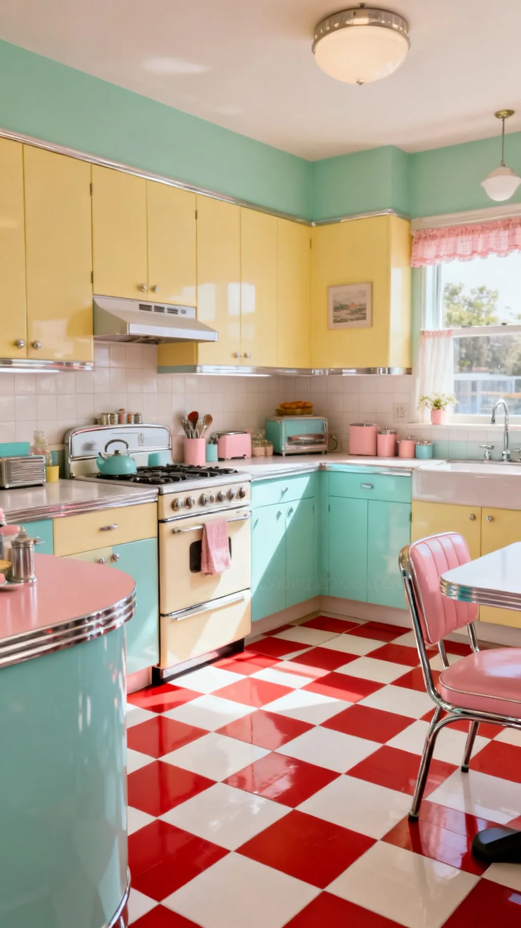 2 / 5
2 / 5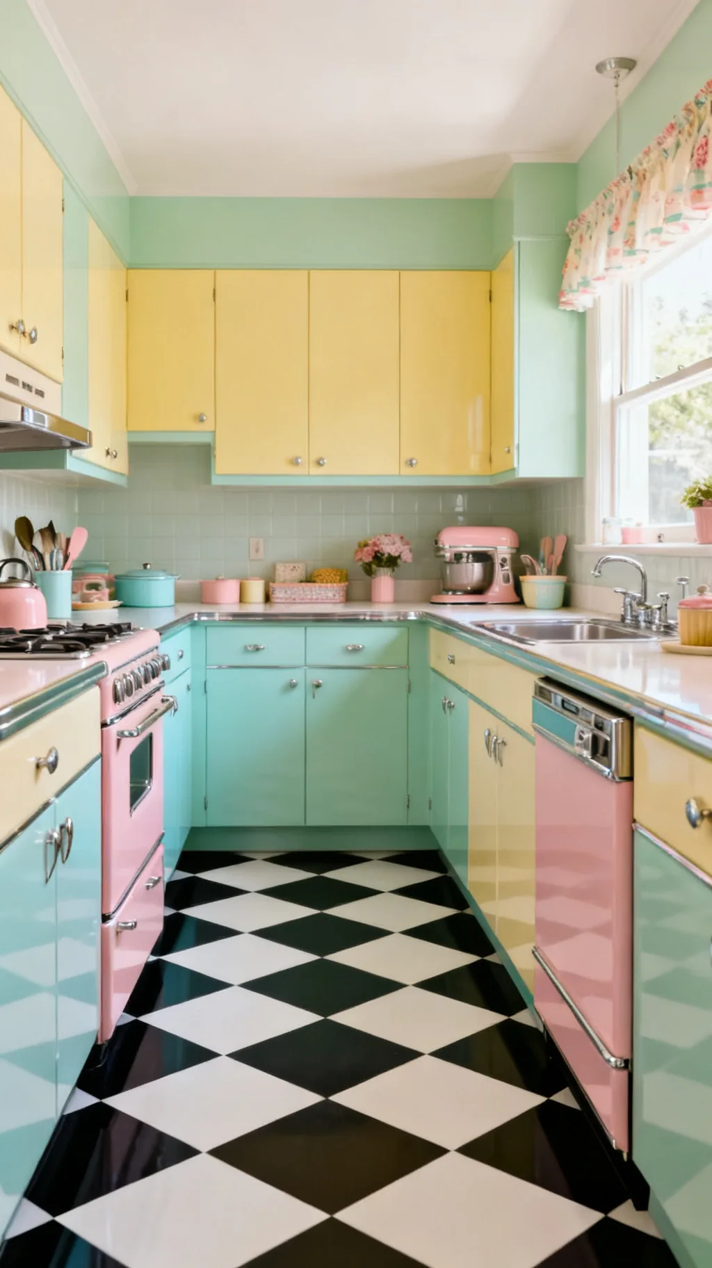 3 / 5
3 / 5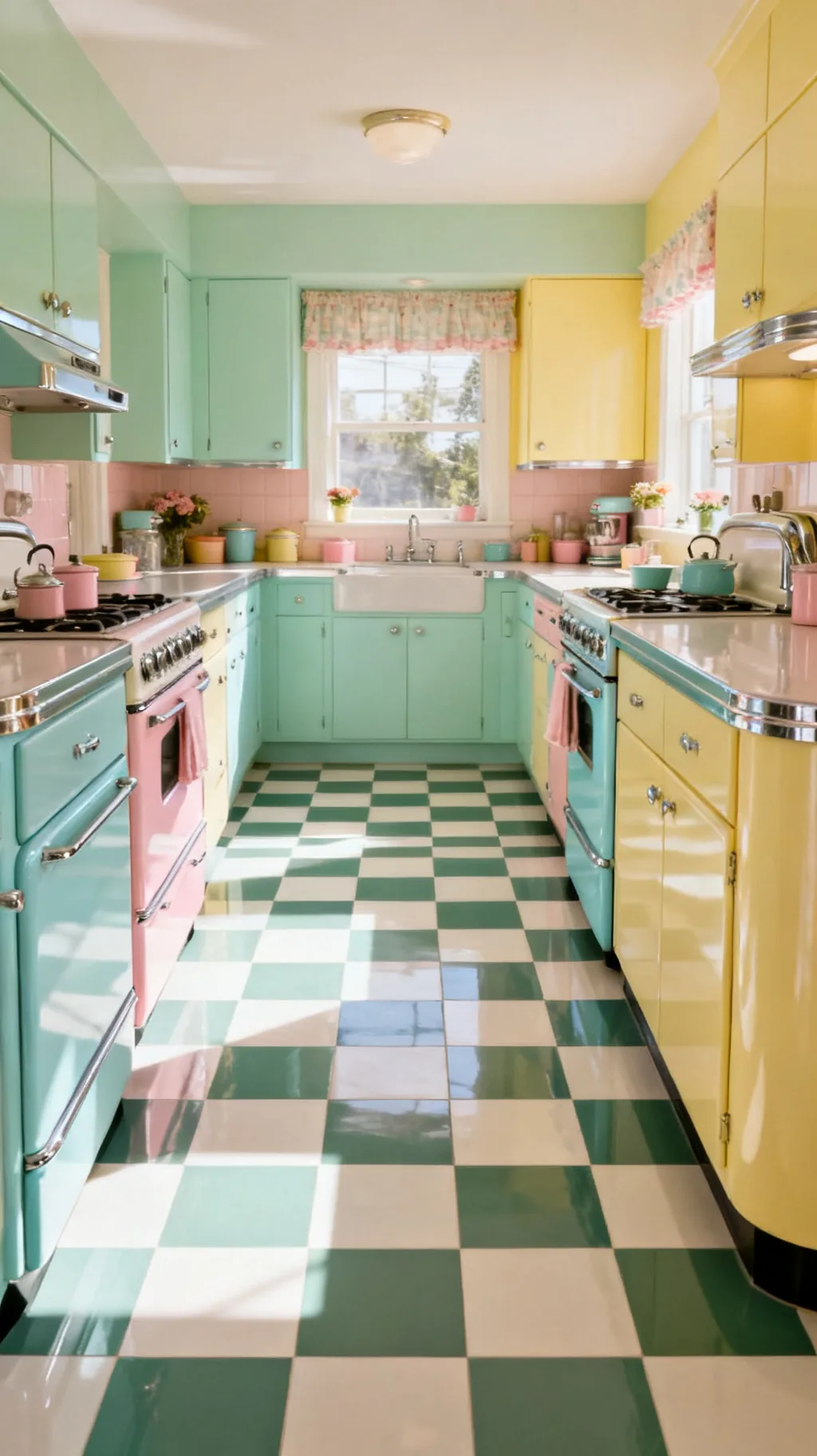 4 / 5
4 / 5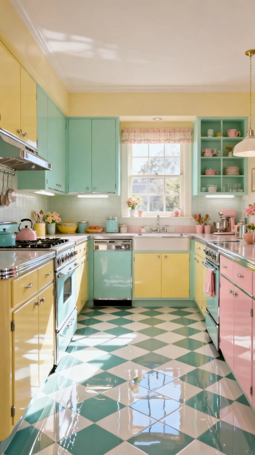 5 / 5
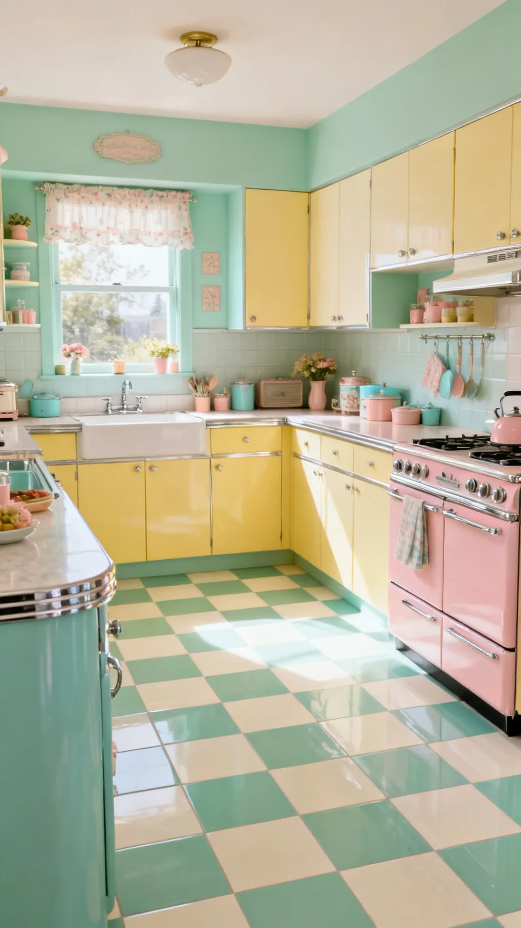
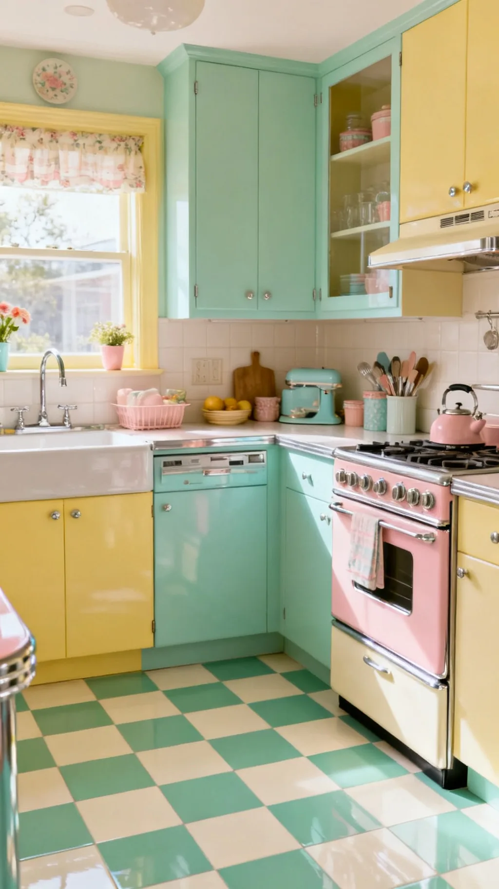
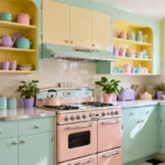
5 / 58. Choose Buttercup Yellow and White
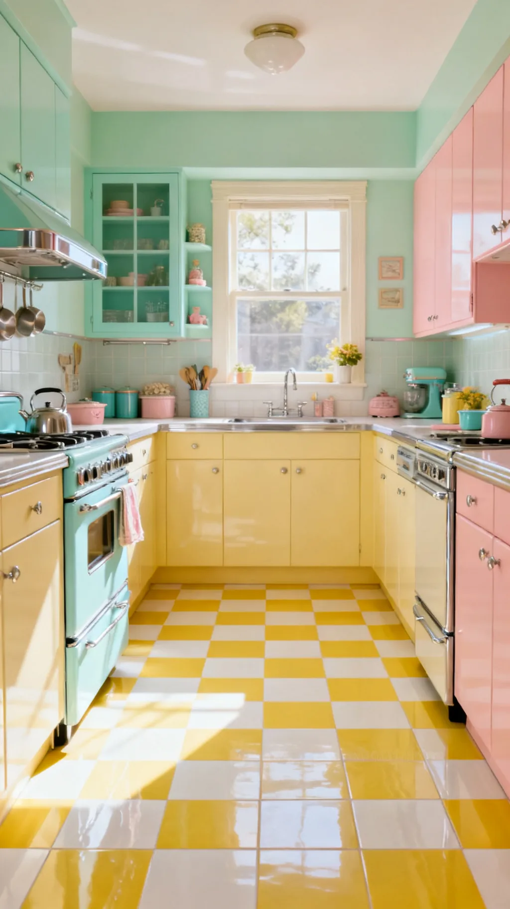
For pure sunshine underfoot, a buttercup yellow and white checkerboard is hard to beat. The warm, cheerful yellow brightens even a north-facing kitchen and feels wonderfully retro without the boldness of red or black. It pairs beautifully with mint, gray, and plenty of white. Sometimes a single happy color is all a floor needs to set the whole mood of a room.
Working With Yellow Checks
- Instant warmth: buttercup yellow lifts a dim kitchen.
- Soft not loud: a muted yellow reads vintage, not neon.
- Cool partners: mint and gray balance the sunny tone.
Pick a slightly muted, creamy yellow rather than a bright primary so it feels gently old-fashioned.
9. Scale Up With Large Checks
The size of the squares changes the whole feeling of a checkerboard. Large-format checks, with generous squares, read more modern and make a roomy kitchen feel calm and architectural. Bigger tiles also mean fewer grout lines, which keeps the floor looking clean and uncluttered. If your kitchen has the space, going large is a fresh, current way to wear a retro pattern.
Big-Check Style
- Modern read: large squares feel architectural and calm.
- Fewer grout lines: bigger tiles look tidier underfoot.
- Best in big rooms: generous checks need a little space to breathe.
In a larger kitchen, oversized checks keep the floor feeling intentional rather than busy.
10. Keep It Small for a Vintage Feel
At the other end, small checks feel cozy, busy, and authentically old. Tighter squares recall genuine period floors and bring a sweet, detailed texture to a compact kitchen. The smaller scale suits cottage and farmhouse rooms beautifully, where a little visual busyness adds character. This is the version that feels most like stepping into a real vintage home.
Small-Check Charm
- Period-accurate: tight squares mimic genuine old floors.
- Cozy texture: the busy grid suits snug, characterful rooms.
- Cottage-ready: small checks lean sweet and homespun.
In a tiny kitchen, smaller squares can actually feel more in proportion than oversized ones.
11. Cool It Down With Turquoise and Cream
Turquoise paired with cream is a joyfully retro checkerboard kitchen floor that feels like a midcentury postcard. The cool, watery blue-green is cheerful and a little unexpected, and it sings against white cabinets and chrome. Turquoise was everywhere in 1950s kitchens, so it brings real period authenticity. It is a color that makes a room feel fresh and breezy all year round.
Turquoise Pairings
- Period color: turquoise is a true 1950s kitchen classic.
- Fresh and cool: the blue-green feels breezy and bright.
- Loves chrome: shiny metal pops against the cool tone.
Carry a touch of turquoise up into a small appliance or a set of canisters for a pulled-together look.
12. Frame the Floor With a Tile Border
A simple border around the edge of a checkerboard floor gives it a finished, custom look, like a rug woven right into the tile. A solid band in one of the check colors neatly contains the pattern and softens the transition to walls and cabinets. It is a small detail that makes a floor feel thoughtfully planned. Borders work especially well in square or oddly shaped kitchens.
Adding a Border
- Framed look: a border contains the checks like a rug.
- Tidy edges: it softens awkward transitions to the walls.
- Custom feel: the band makes a standard floor look designed.
Match the border to the darker check color so it reads as a crisp, intentional frame.
13. Warm It Up With Terracotta and Cream
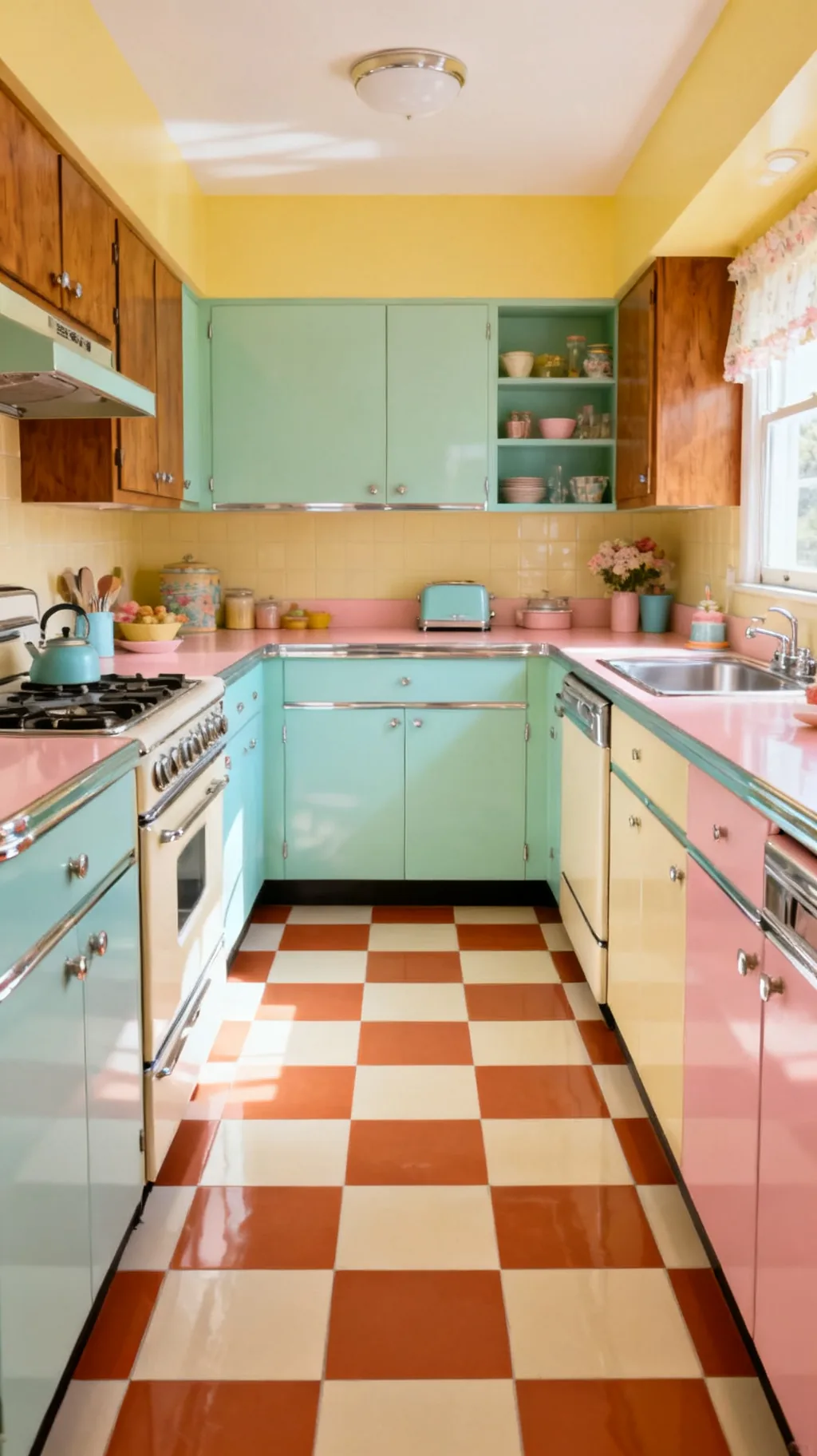
For a sun-baked, Mediterranean twist on retro, try terracotta and cream checks. The earthy clay tone brings warmth and a rustic, lived-in softness that black and white cannot. It is a wonderful match for wood cabinets, copper, and plenty of greenery. This version feels cozy and grounded, perfect for a kitchen that leans warm and homey rather than crisp and graphic.
Terracotta Style
- Earthy warmth: clay tones feel rustic and grounded.
- Wood-friendly: terracotta loves warm wood cabinets.
- Soft contrast: the gentle pairing reads cozy, not bold.
Add a few green plants and a copper pot, terracotta floors come alive next to warm metals and foliage.
Take a peek at a few of these looks.
 1 / 5
1 / 5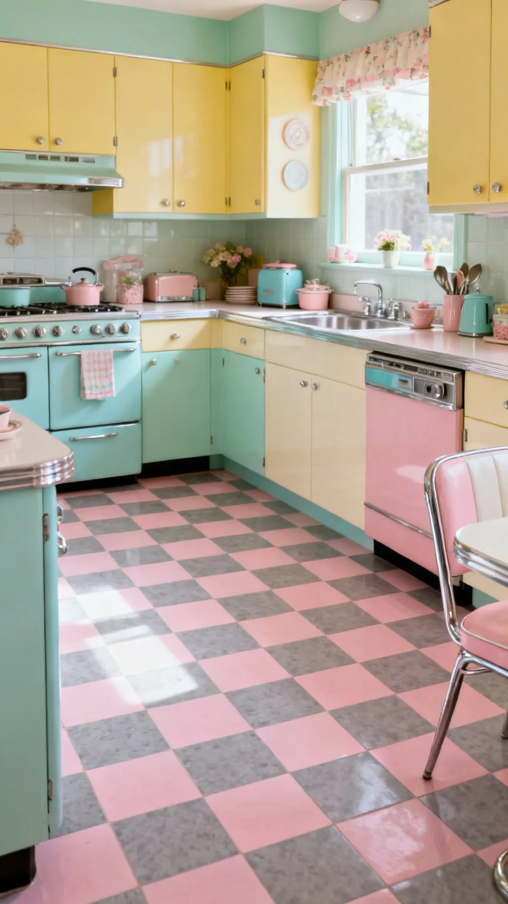 2 / 5
2 / 5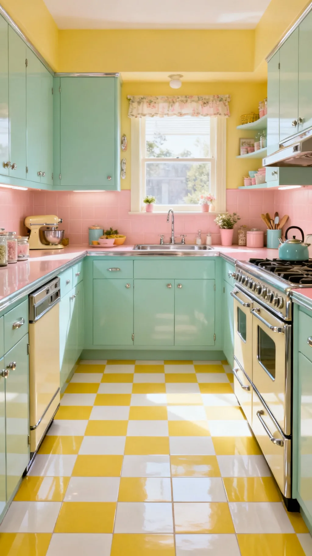 3 / 5
3 / 5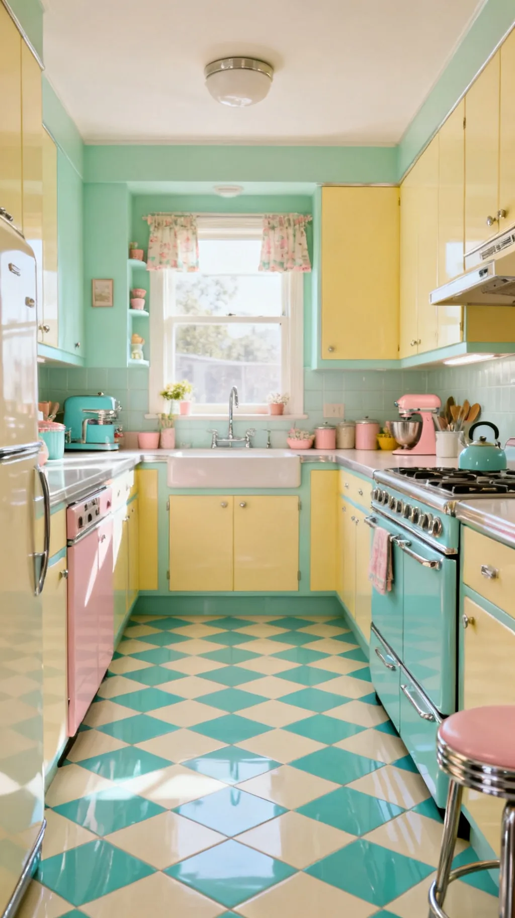 4 / 5
4 / 5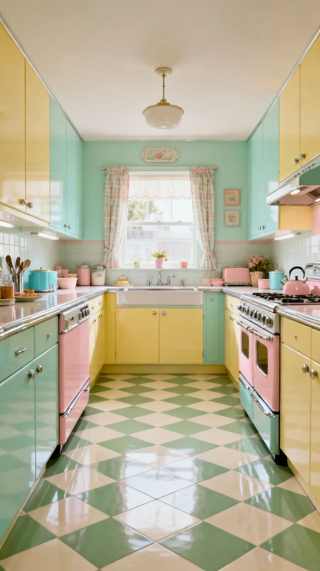 5 / 5
5 / 514. Pick Durable Ceramic Tile
When you want a checkerboard that will last for decades, glazed ceramic or porcelain tile is the workhorse choice. It shrugs off spills, scrubs clean, and holds its color through years of busy kitchen life. The slight sheen of a glazed tile also bounces light around beautifully. For a hardworking family kitchen, this is the version that earns its keep.
Ceramic Considerations
- Hardwearing: glazed tile takes daily kitchen life in stride.
- Easy to clean: spills wipe away without a fuss.
- Light-reflecting: a soft glaze brightens the whole room.
Choose a slip-resistant finish for the kitchen, a little texture underfoot is safer near the sink.
15. Go Authentic With Vintage Linoleum
True period kitchens often had checkerboard linoleum, and that soft, slightly springy material is still a wonderfully authentic choice. Real linoleum is warm underfoot, quiet, and made from natural ingredients, which suits a genuinely vintage home. Its gentle matte finish reads honest and old in the best way. I love that it brings a little of the original 1950s feeling back to a floor.
Linoleum Notes
- Soft underfoot: linoleum is warm and gently springy.
- Authentically retro: it was the original midcentury kitchen floor.
- Quiet finish: the matte surface reads honest and old.
Sheet linoleum has very few seams, which keeps water out and the vintage look seamless.
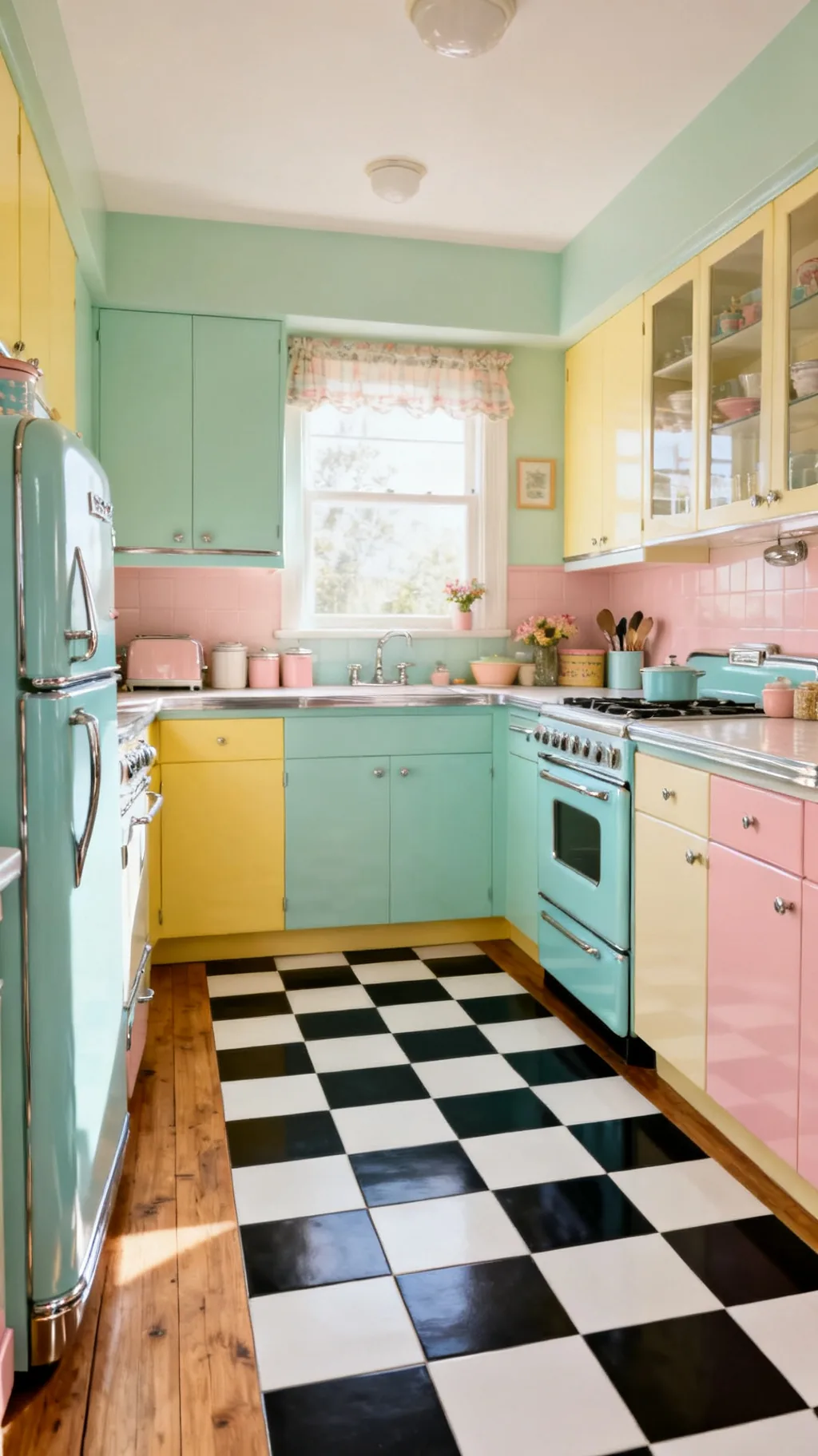
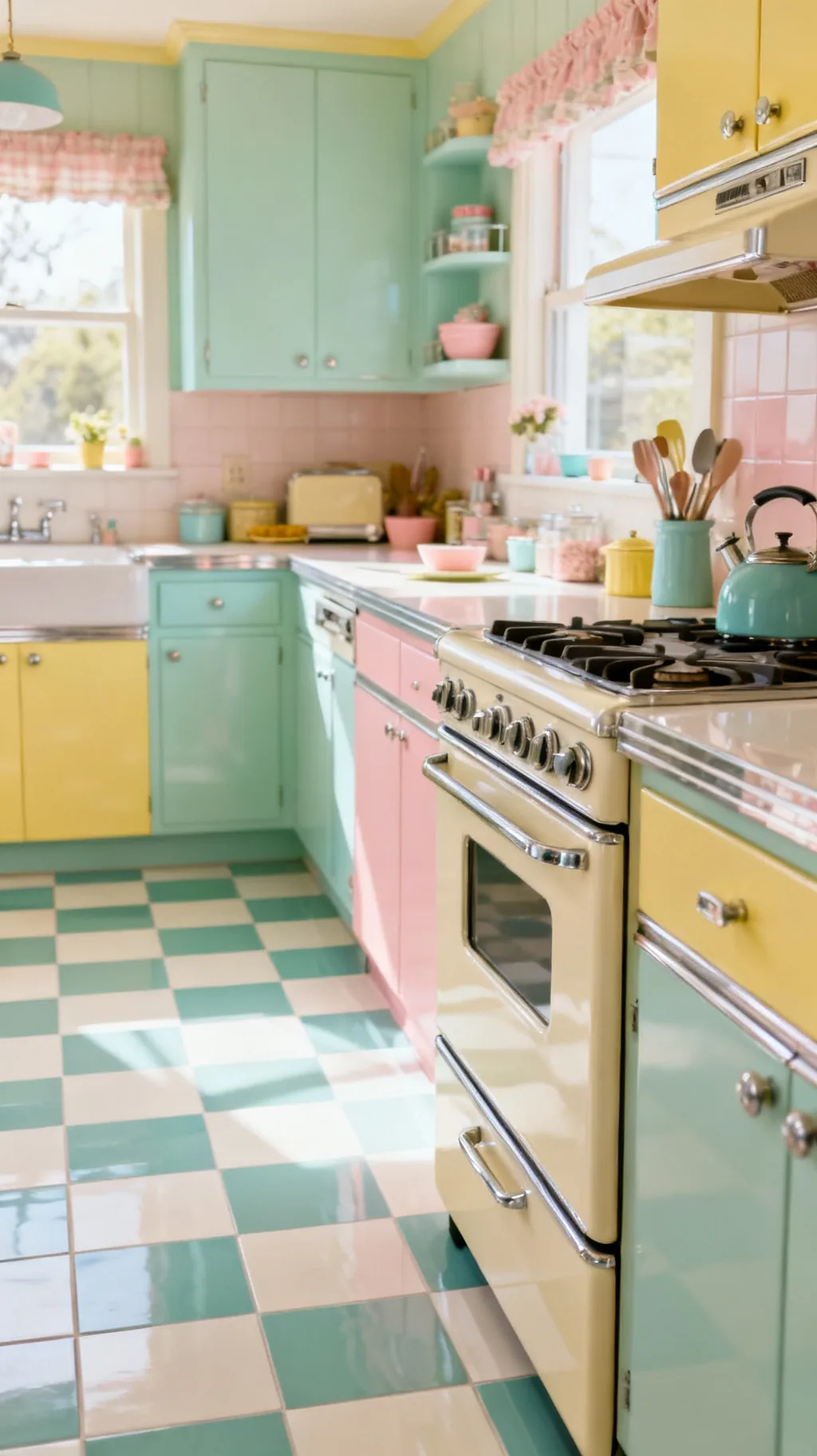
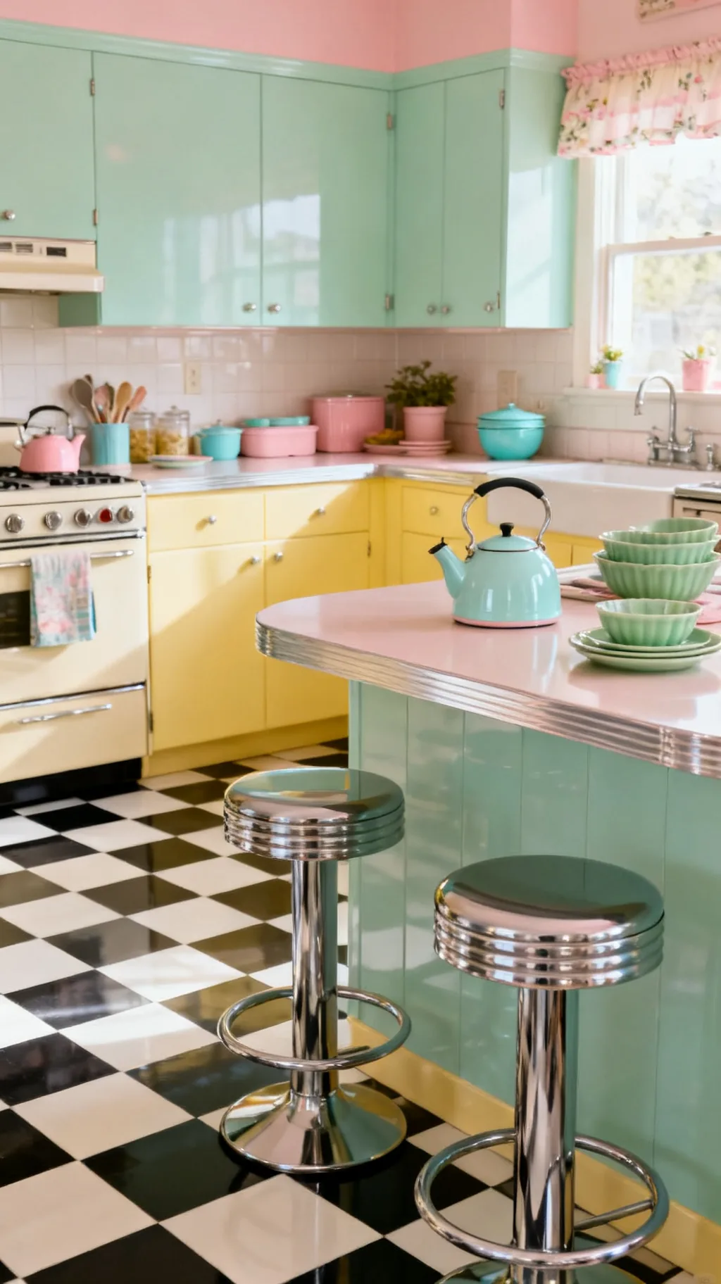
16. Pair the Floor With Mint Cabinets
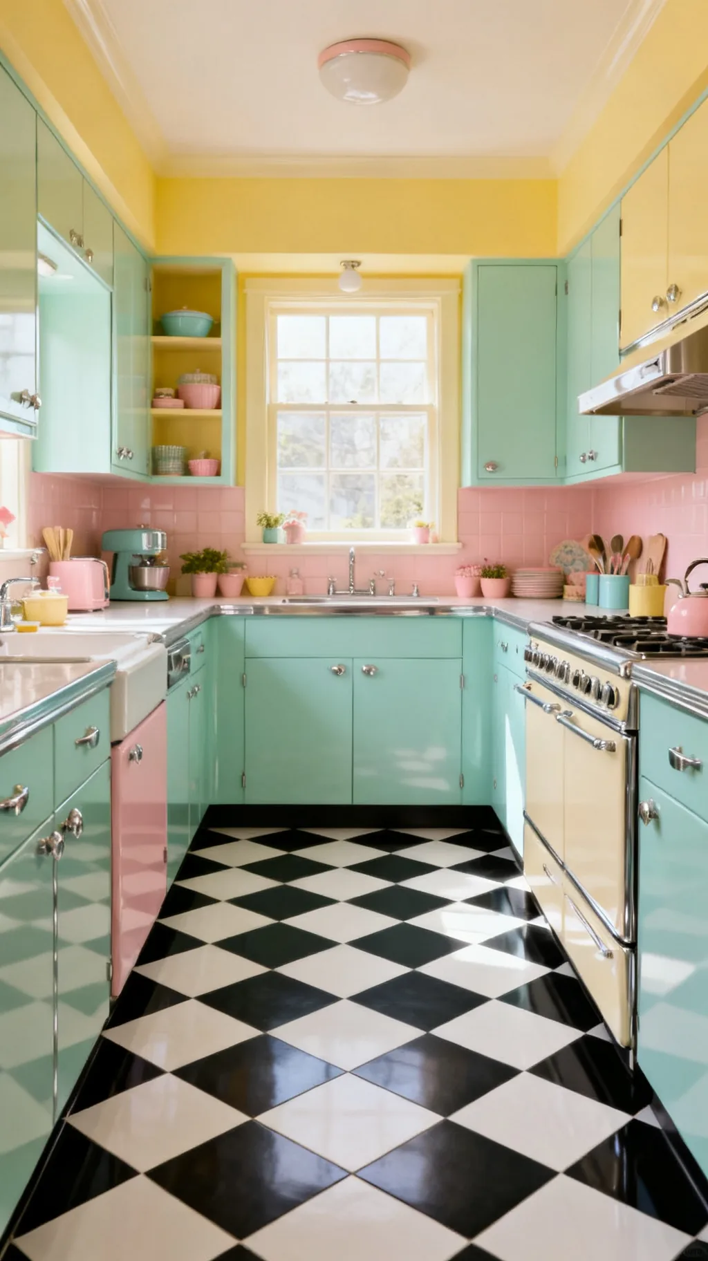
A checkerboard floor and a set of mint green cabinets are a match made in retro heaven. The black and white grid grounds the soft green and lets it feel fresh rather than flat, while the mint keeps the whole room sweet and airy. Together they capture that cheerful 1950s spirit perfectly. This is one of those pairings that simply looks right the moment it comes together.
Floor Meets Cabinet
- Grounded green: the bold floor anchors soft mint cabinets.
- Balanced cheer: graphic and pastel temper each other nicely.
- Period-perfect: the combo is pure midcentury kitchen.
Keep counters and walls pale so the floor and cabinets share the spotlight without competing.
17. Soften the Look With a Vintage Rug
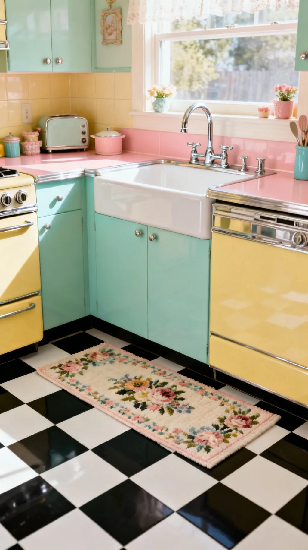
A checkerboard floor and a soft rug are not rivals, they are partners. A cheerful runner or a small floral rug placed in front of the sink adds comfort underfoot and a welcome layer of softness over all that crisp pattern. The mix of geometric tile and gentle textile feels collected and homey. It is also a practical way to cushion the spots where you stand the longest.
Layering a Rug
- Comfort underfoot: a rug cushions the busy work zones.
- Pattern mix: soft floral plays beautifully against checks.
- Easy to swap: a washable runner refreshes the look anytime.
Choose a low-pile, washable rug for the kitchen so it handles spills and slips under the door.
18. Keep It Subtle With Gray and White
If a bold floor feels like too much, a soft gray and white checkerboard offers the same retro shape in a whisper-quiet palette. The low contrast reads calm and current while still nodding to vintage style. It is a versatile choice that works in modern and traditional kitchens alike, and it lets your cabinets and accents take the lead. Subtle does not mean boring, it means flexible.
Gray-and-White Appeal
- Quiet contrast: soft gray keeps the pattern gentle.
- Modern-friendly: it suits current kitchens as easily as retro ones.
- Lets accents shine: the calm floor steps back for color above.
This is a smart pick if you like to change your accent colors often, the floor goes with anything.
19. Make a Galley Kitchen Feel Longer
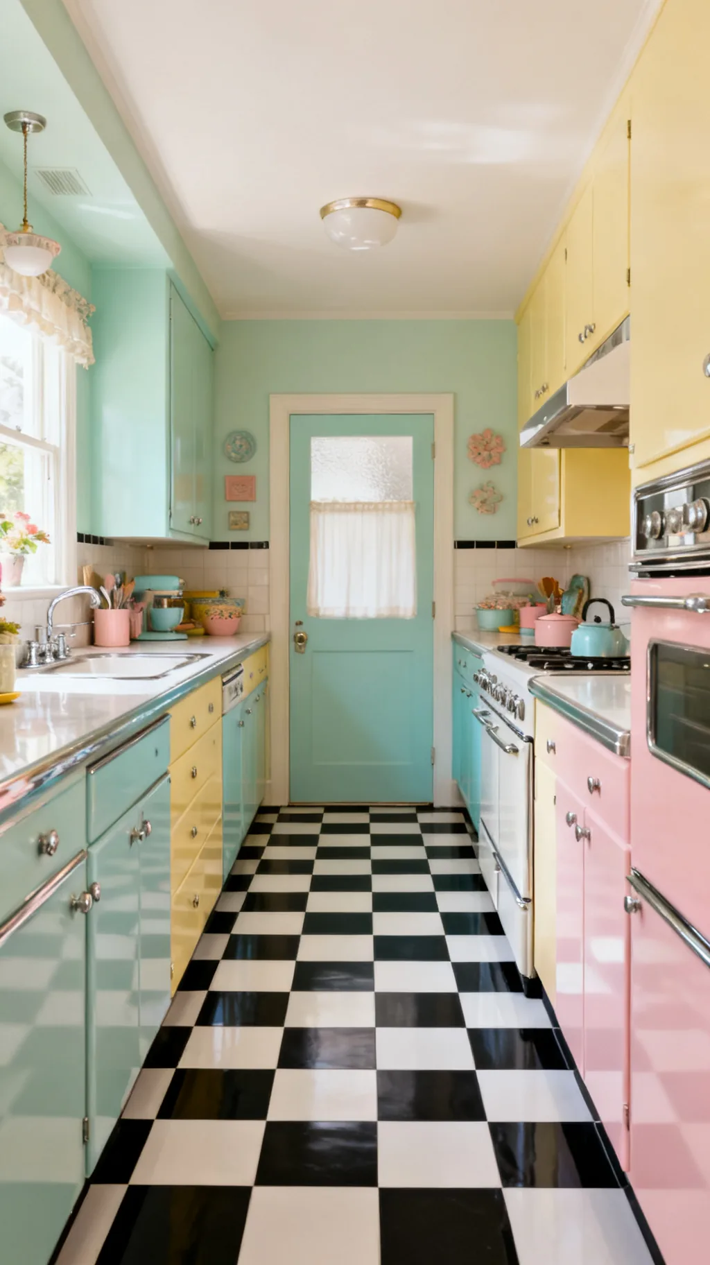
In a narrow galley kitchen, a checkerboard floor can do clever things with the eye. Run the squares straight down the length and the floor leads you through; set them on the diagonal and the space feels wider. Either way, the pattern adds personality to a hardworking, slender room that often gets overlooked. A galley is exactly the kind of space a checkerboard kitchen floor loves to brighten.
Galley Floor Tricks
- Lengthen the run: straight squares lead the eye through.
- Widen with diagonals: diamonds open up a narrow space.
- Add personality: pattern lifts a plain, slender room.
Keep the galley’s cabinets light and simple so the floor brings the energy without crowding.
Scroll through and see which one speaks to you.
 1 / 5
1 / 5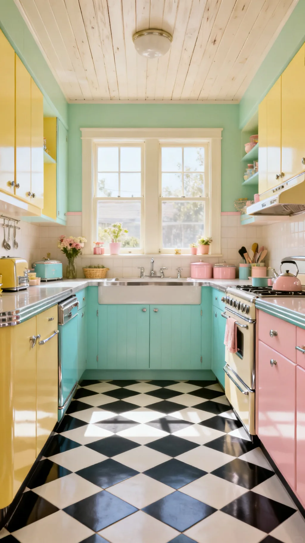 2 / 5
2 / 5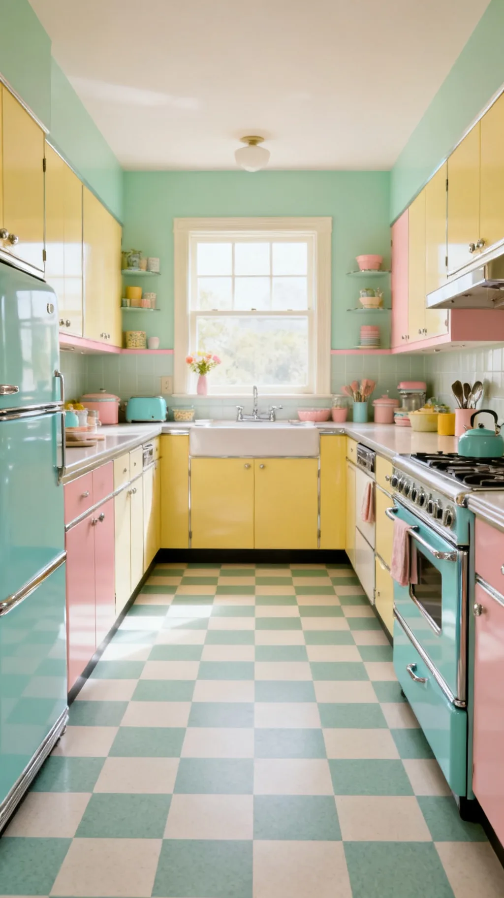 3 / 5
3 / 5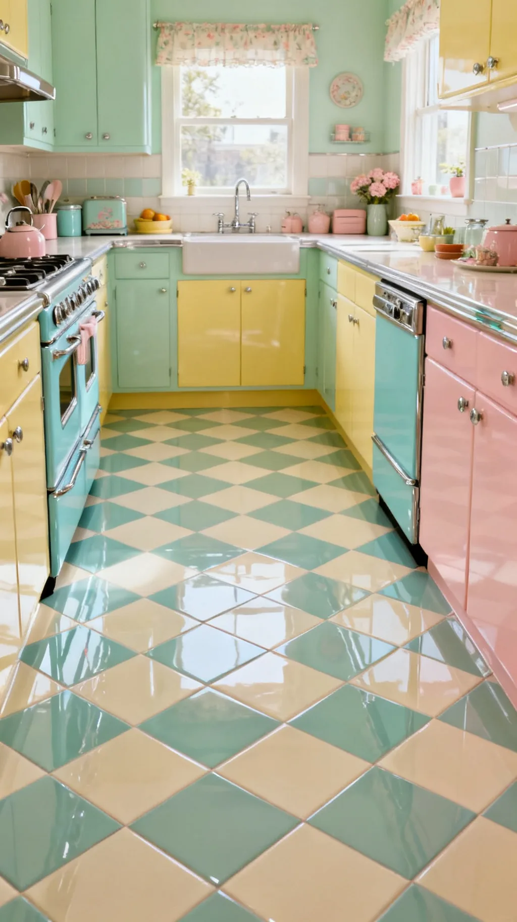 4 / 5
4 / 5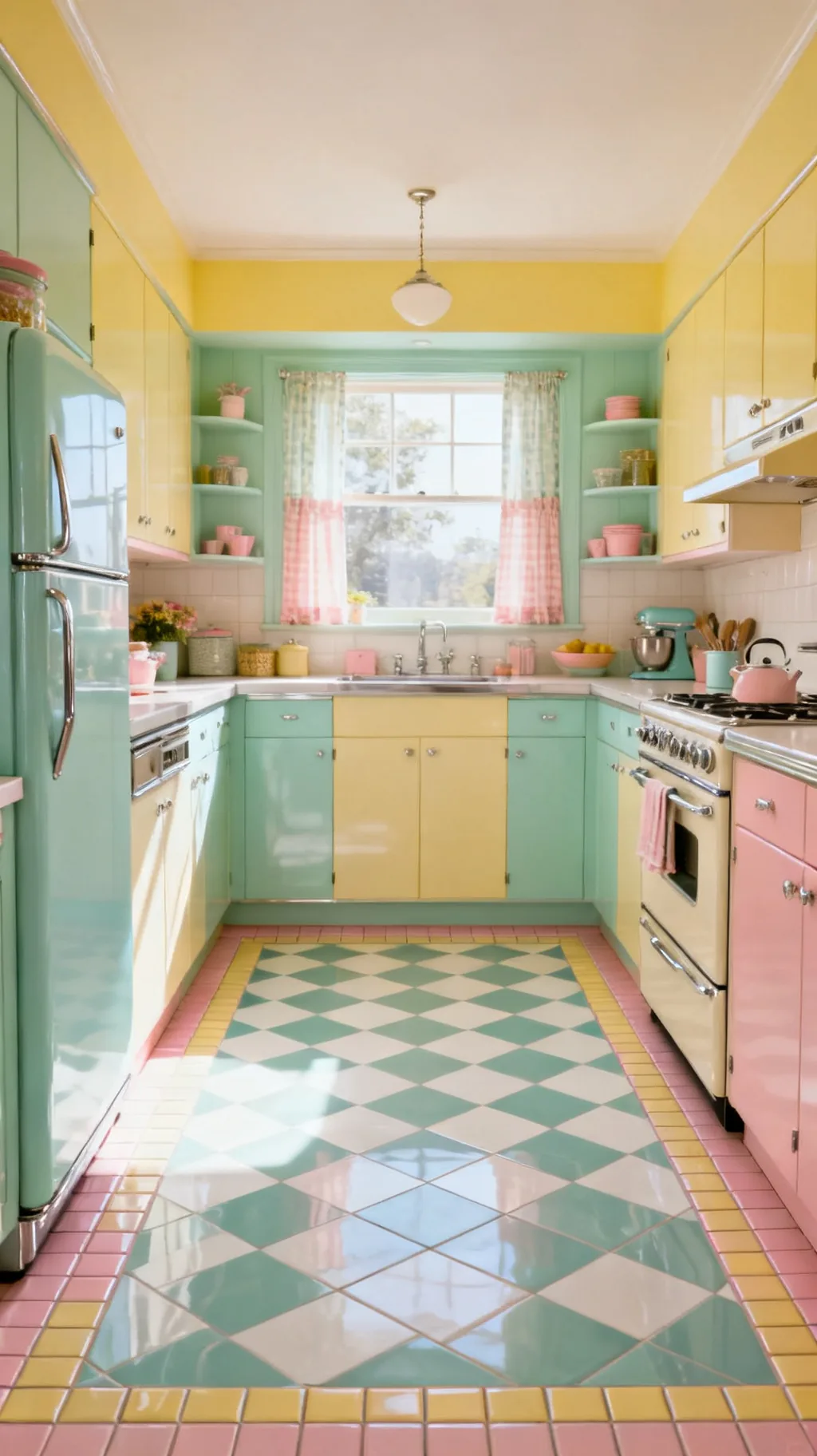 5 / 5
5 / 520. Anchor a Kitchen Island With Checks
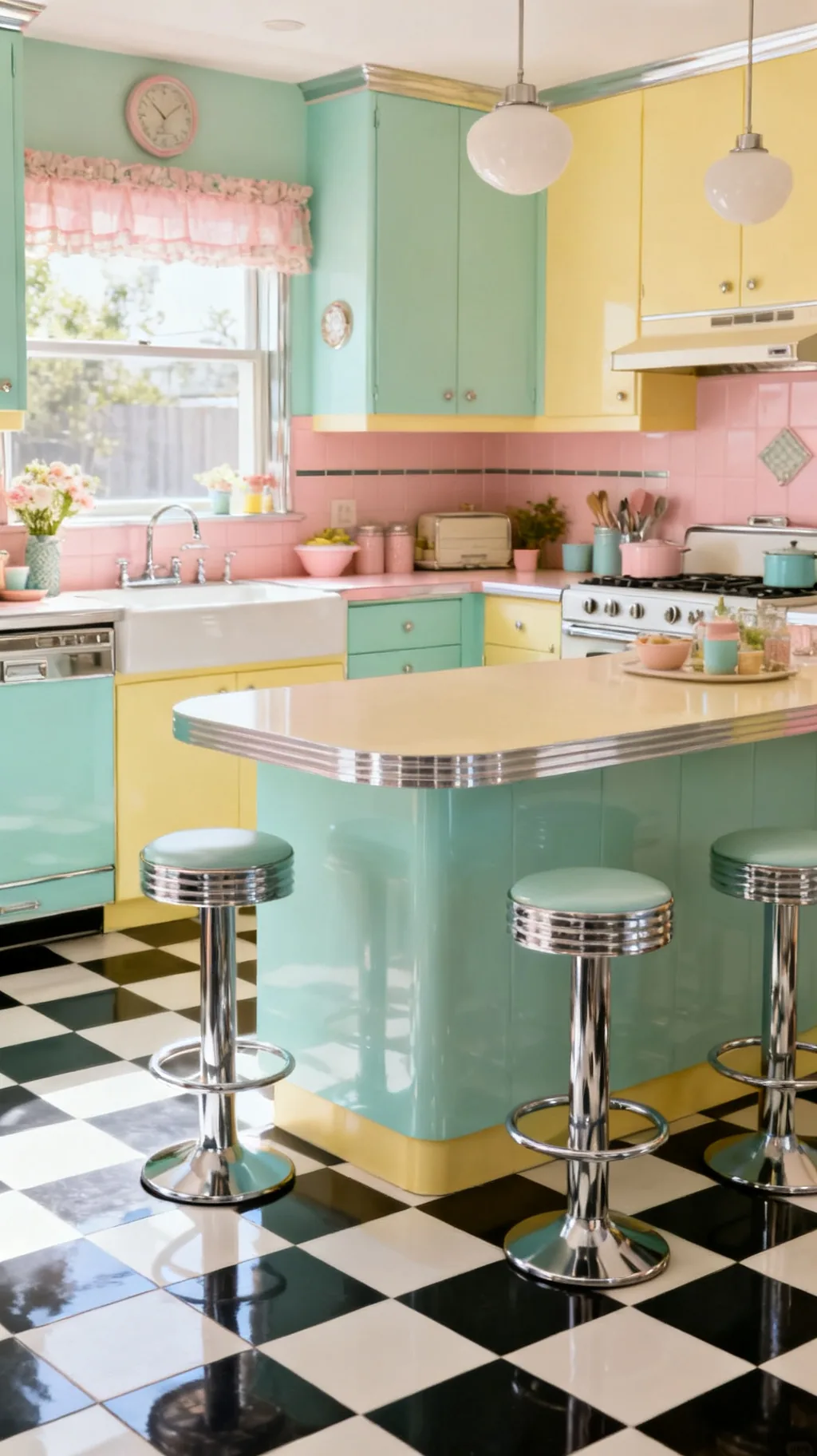
A checkerboard floor is a wonderful way to ground a kitchen island and give the center of the room a sense of place. The bold pattern beneath defines the island as the heart of the kitchen, and a pair of chrome or retro stools completes the picture. It turns the floor into a quiet stage for the busiest spot in the house. The effect is both practical and full of charm.
Island and Floor
- Defines the center: the pattern grounds the island visually.
- Stool-ready: retro or chrome seats finish the look.
- Heart of the room: the bold floor marks the gathering spot.
Leave a generous walkway of checks around the island so the pattern reads as a frame.
21. Carry the Pattern Into the Pantry
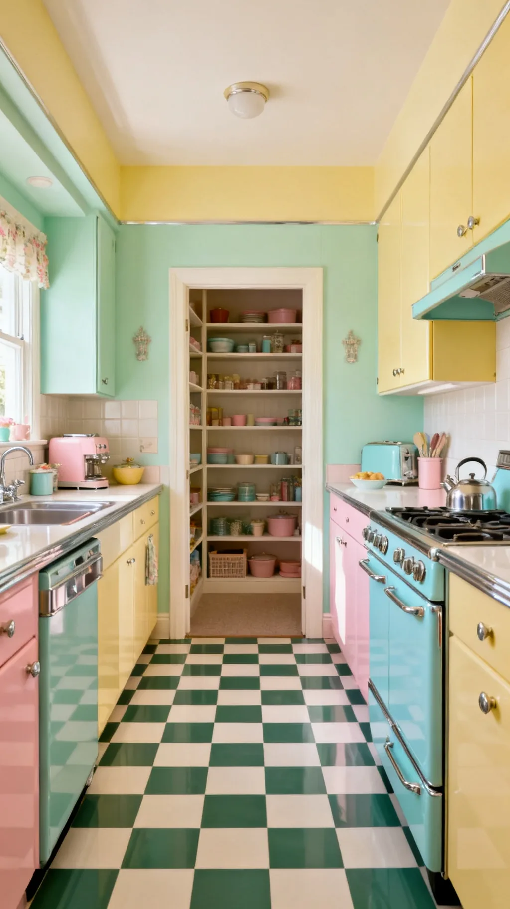
Why stop at the kitchen? Continuing your checkerboard into an adjoining pantry, mudroom, or breakfast nook makes the whole space feel cohesive and thoughtfully designed. The flowing pattern links the rooms and gives a small adjoining space a cheerful, finished look of its own. It is a lovely way to make a humble pantry feel like part of the fun. Carrying a floor through is a designer trick that always reads intentional.
Extending the Floor
- Cohesive flow: one floor links kitchen and pantry seamlessly.
- Lifts small spaces: a pantry or nook gets the same cheer.
- Designed feel: a continuous floor looks planned, not patched.
Keep the same tile size and colors through the doorway so the rooms read as one.
22. Match Your Grout to the Lighter Tile
Grout is a small choice that makes a big difference on a checkerboard floor. Matching the grout to the lighter tile keeps the squares looking crisp and clean, and it hides everyday dirt far better than a dark or contrasting line. Pale grout also lets the checker pattern stay the star rather than the grid between it. It is the kind of detail you only notice when it is done wrong.
Grout Guidance
- Match the light tile: pale grout keeps squares looking clean.
- Hide the grime: a soft tone disguises everyday dirt.
- Let checks lead: low-contrast grout keeps the focus on color.
Seal your grout once it cures, a sealed line stays cleaner and brighter for years.
23. Add Diner Shine With a Glossy Finish
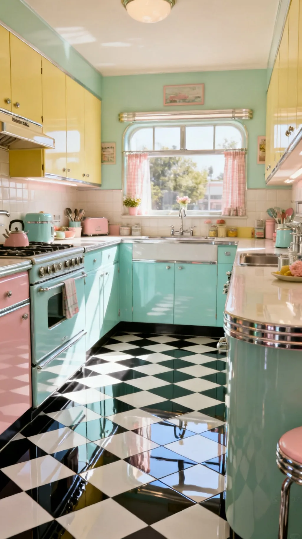
A high-gloss finish takes a checkerboard floor straight to the soda fountain. That bright, reflective sheen bounces light around, makes colors pop, and gives the whole kitchen a cheerful, polished glow. It pairs perfectly with chrome and shiny appliances for a full retro-diner effect. If you love the lively, sparkling side of vintage style, gloss is the way to go.
Going Glossy
- Reflects light: a shiny floor brightens the entire room.
- Diner-perfect: gloss completes the soda-fountain look.
- Colors pop: the sheen makes the checks feel vivid.
A glossy floor shows footprints, so keep a soft mop handy if you love that polished shine.
24. Calm It With Sage Green and Cream
For a quieter, more grown-up retro floor, sage green and cream checks are a gentle delight. The soft, dusty green feels restful and a touch sophisticated, bridging vintage charm and a calmer, modern mood. It is a beautiful match for wood, cream cabinets, and natural light. This is the version I would choose for a kitchen that wants retro character without too much sweetness.
Sage and Cream Style
- Restful green: dusty sage feels calm and grown-up.
- Bridges styles: it suits both retro and modern rooms.
- Natural partners: wood and cream warm the soft green.
Let in as much daylight as you can, sage greens look their loveliest in soft natural light.
A few more to spark your imagination.
 1 / 5
1 / 5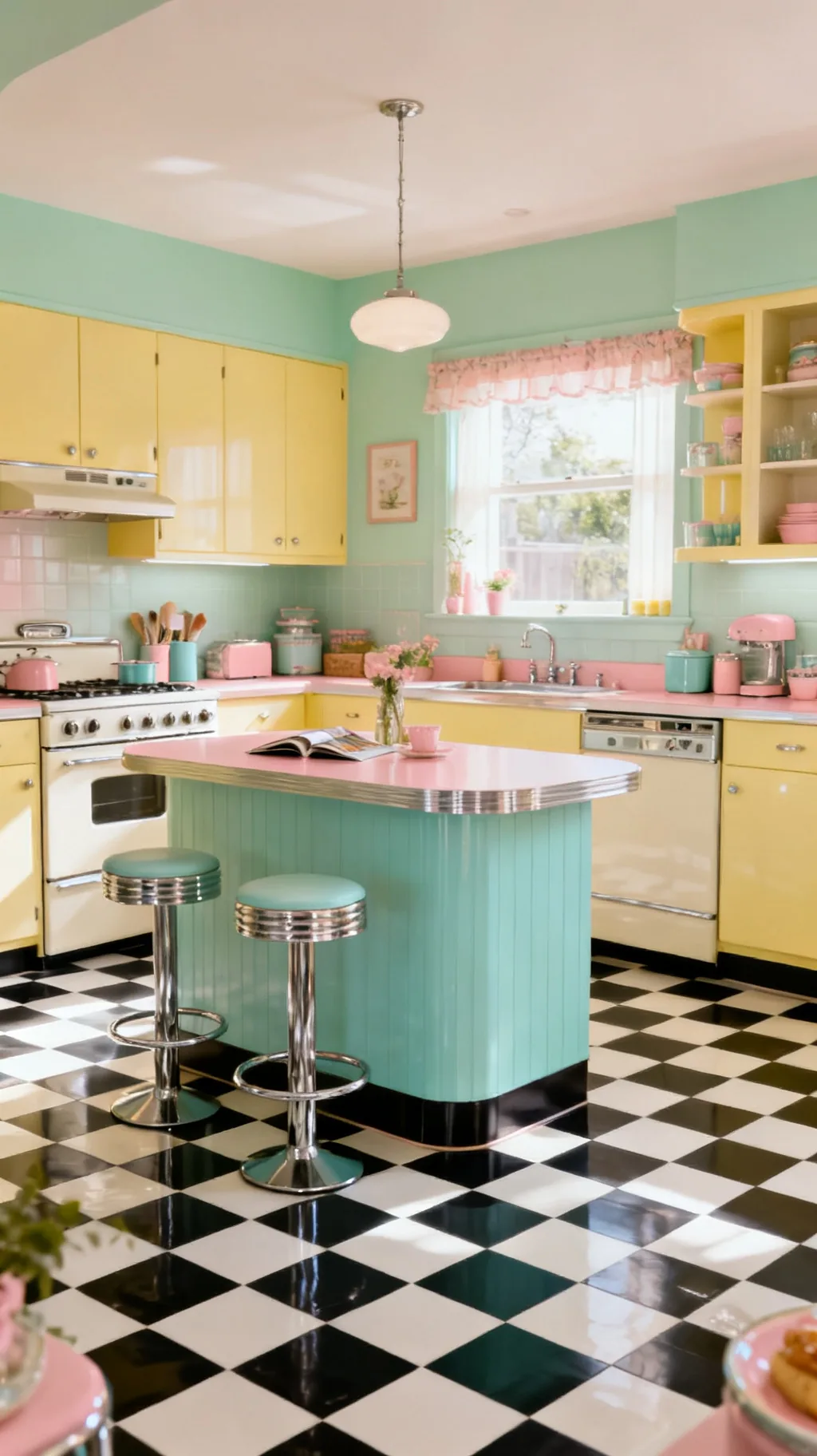 2 / 5
2 / 5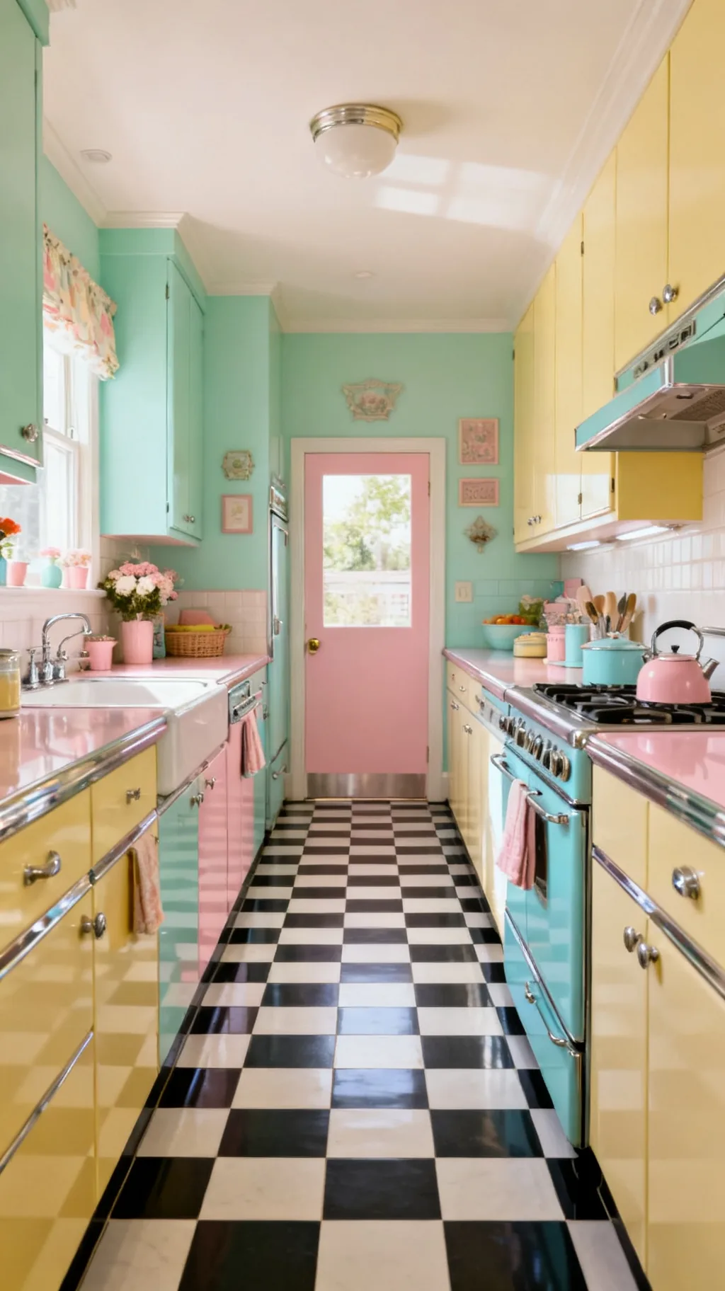 3 / 5
3 / 5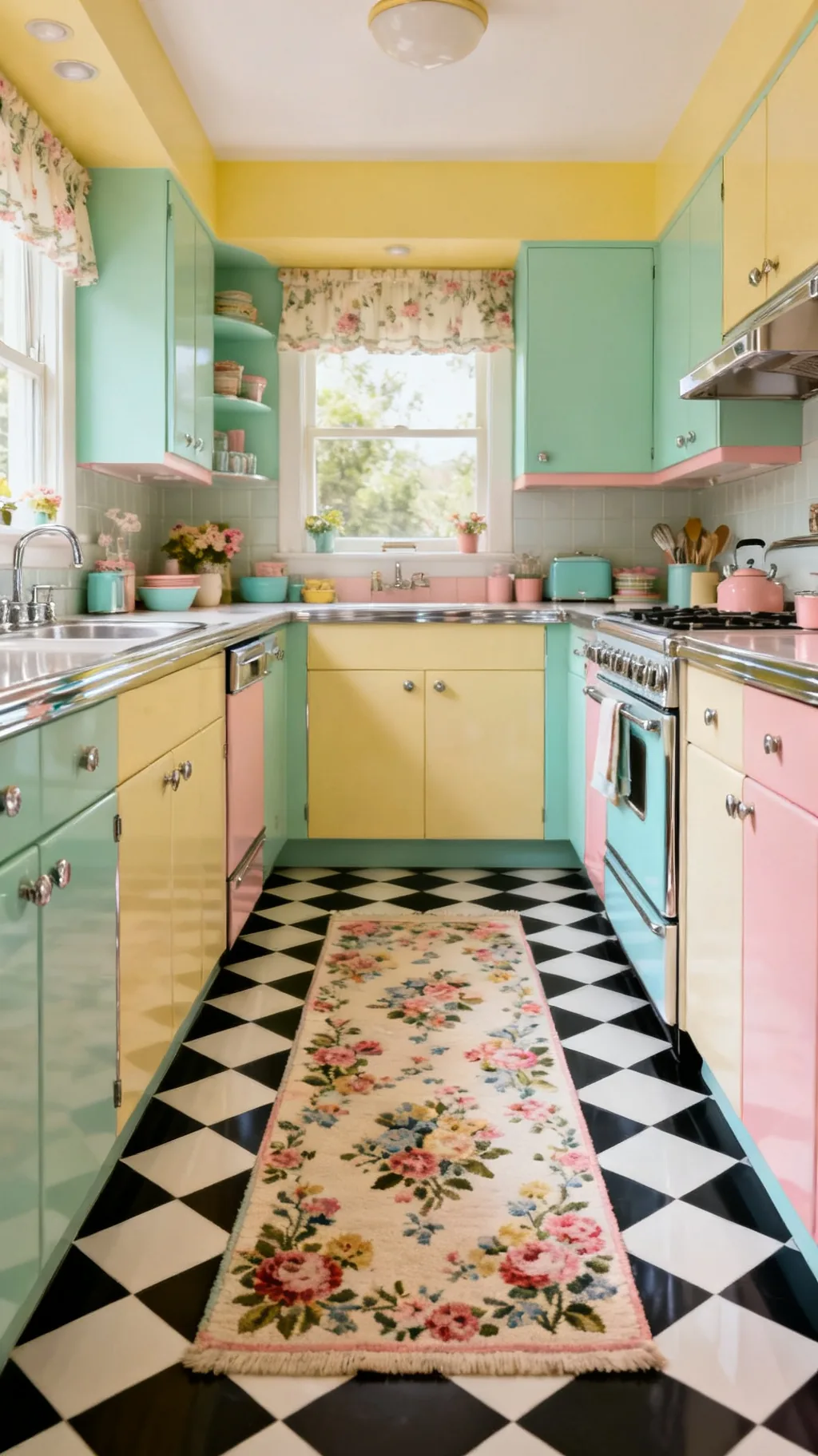 4 / 5
4 / 5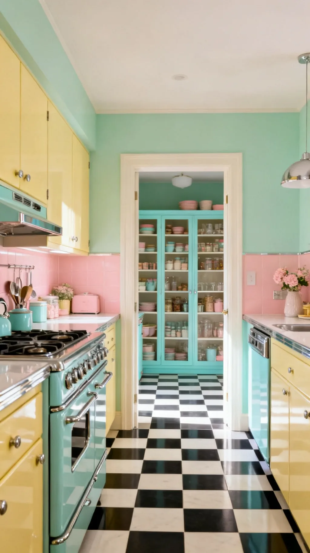 5 / 5
5 / 525. Style the Floor With Retro Accents
Once your checkerboard is down, a few well-chosen retro accents tie the whole room together. Think chrome bar stools, a pastel enamel kettle, jadeite dishware on open shelves, and a cheerful rug at the sink. These little touches let the floor sit in good company and read as a deliberate design choice rather than a lone statement. The floor sets the stage, the accents tell the story. For more ways to pull a cheerful retro kitchen together, see our 11 retro kitchen ideas that make your space pop.
Finishing Touches
- Chrome and pastel: shiny stools and soft enamel suit the floor.
- Display vintage: jadeite or printed china echoes the era.
- Soft at the sink: a cheerful rug warms the busiest spot.
Pull one color from your floor up into an accent or two, that simple echo makes the room feel whole.
Quick Checkerboard Pairings to Copy
- Diner Classic: Black and white checks, chrome stools, white walls, cherry-red accents.
- Fresh Mint: Mint and cream checks, white cabinets, soft wood, jadeite dishware.
- Sunny Pastel: Buttercup yellow and white, mint accents, green plants, chrome trim.
- Calm Vintage: Sage and cream checks, wood cabinets, brass hardware, natural light.
A simple rule: echo your floor color at least twice more around the room so the checks feel connected, not random. If you want to surround that playful floor with the full midcentury mood, the picks in our mid-century modern kitchen ideas pair beautifully with any checkerboard.
Frequently Asked Questions
Is a checkerboard floor good for a kitchen?
Yes, a checkerboard kitchen floor is a practical and cheerful choice. The busy two-tone pattern hides everyday crumbs and small marks far better than a plain floor, and durable materials like ceramic tile or vinyl stand up well to spills and traffic. On top of being hardworking, it brings instant retro charm, which is why it has stayed popular in kitchens for so many decades.
What colors look best for a checkerboard kitchen floor?
Classic black and white is the boldest and most timeless, but soft retro pastels are lovely too. Mint and cream, blush pink and gray, buttercup yellow and white, and turquoise and cream all read genuinely 1950s while feeling fresh. The trick is to pull one color from the floor up into your cabinets, accents, or dishware so the whole kitchen feels connected.
Can I put a checkerboard floor over my existing floor?
Often, yes. Peel-and-stick vinyl checkerboard tiles are designed to go right over a clean, smooth, dry existing floor, which makes them ideal for renters and quick updates. You can also paint a checkerboard directly onto wood or old linoleum with good floor paint and a careful grid. For ceramic tile, it is best to start from a properly prepared subfloor.
Are checkerboard floors hard to keep clean?
Not especially. The two-tone pattern is actually forgiving, since it disguises crumbs and footprints between cleanings. Sealed grout and a wipeable finish like glazed tile or vinyl make day-to-day care simple, just sweep and damp-mop. A glossy finish shows the odd footprint, so a quick once-over with a soft mop keeps that diner shine looking its best.
How do I make a checkerboard floor look retro instead of dated?
Lean into the cheerful, intentional side of the look. Pair the floor with retro touches like chrome stools, pastel cabinets, jadeite dishware, and a soft rug at the sink, and keep walls and counters calm so the floor stays the star. Choosing a softer pastel pairing or a diagonal layout also keeps the look feeling fresh and designed rather than tired.
Final Thoughts on Your Checkerboard Kitchen Floor
The wonderful thing about a checkerboard kitchen floor is how much personality it brings for such a simple idea. Two colors, a tidy grid, and suddenly the whole room feels cheerful, grounded, and full of retro charm. Start with the palette you love most, maybe a bold black and white or a soft pastel mint, and let your cabinets, accents, and a cozy rug grow from there. Happy decorating!
You Might Also Like
Get cozy seasonal ideas in your inbox
Seasonal decor, recipes & home inspiration — straight to you. No spam, unsubscribe anytime.