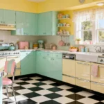
There’s something about a vintage sign that makes a kitchen feel instantly loved. Maybe it’s the soft, chipped enamel, the faded colors of an old coffee advertisement, or a sweet hand-painted word that turns a plain wall into a little piece of nostalgia. That warm, collected-over-time feeling is exactly what good vintage kitchen signs bring to a home, and the loveliest part is just how many ways there are to use them.
The most-loved vintage kitchen signs are classic enamel and tin advertising pieces, but pastel painted wood, farmhouse produce signs, framed recipe cards, and sweet sentimental words feel just as charming. Choose pieces with simple lettering and softly faded colors, hang one bold sign as a focal point or cluster a few into a gallery wall, and keep a loose color story so everything feels collected rather than cluttered.
These 27 ideas run from collectible advertising signs and cheerful diner pieces to DIY projects, clever placements, and the finishing touches that tie a wall together. You’ll find something for every kitchen, whether you’re hunting flea markets, framing a few old recipe cards, or painting your own. Pour yourself a coffee and let’s find your favorites.
&# 10024; New to the look? Start with the big picture:our favorite retro kitchen ideas→1. Start With a Classic Enamel Sign
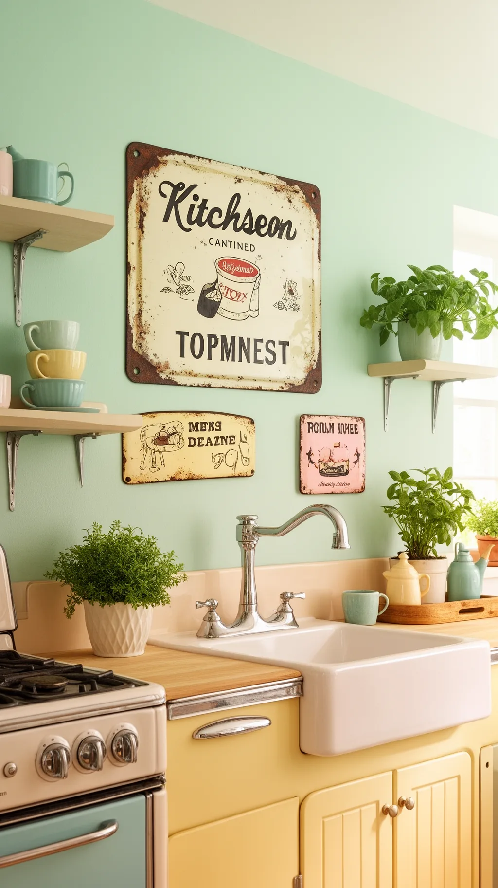
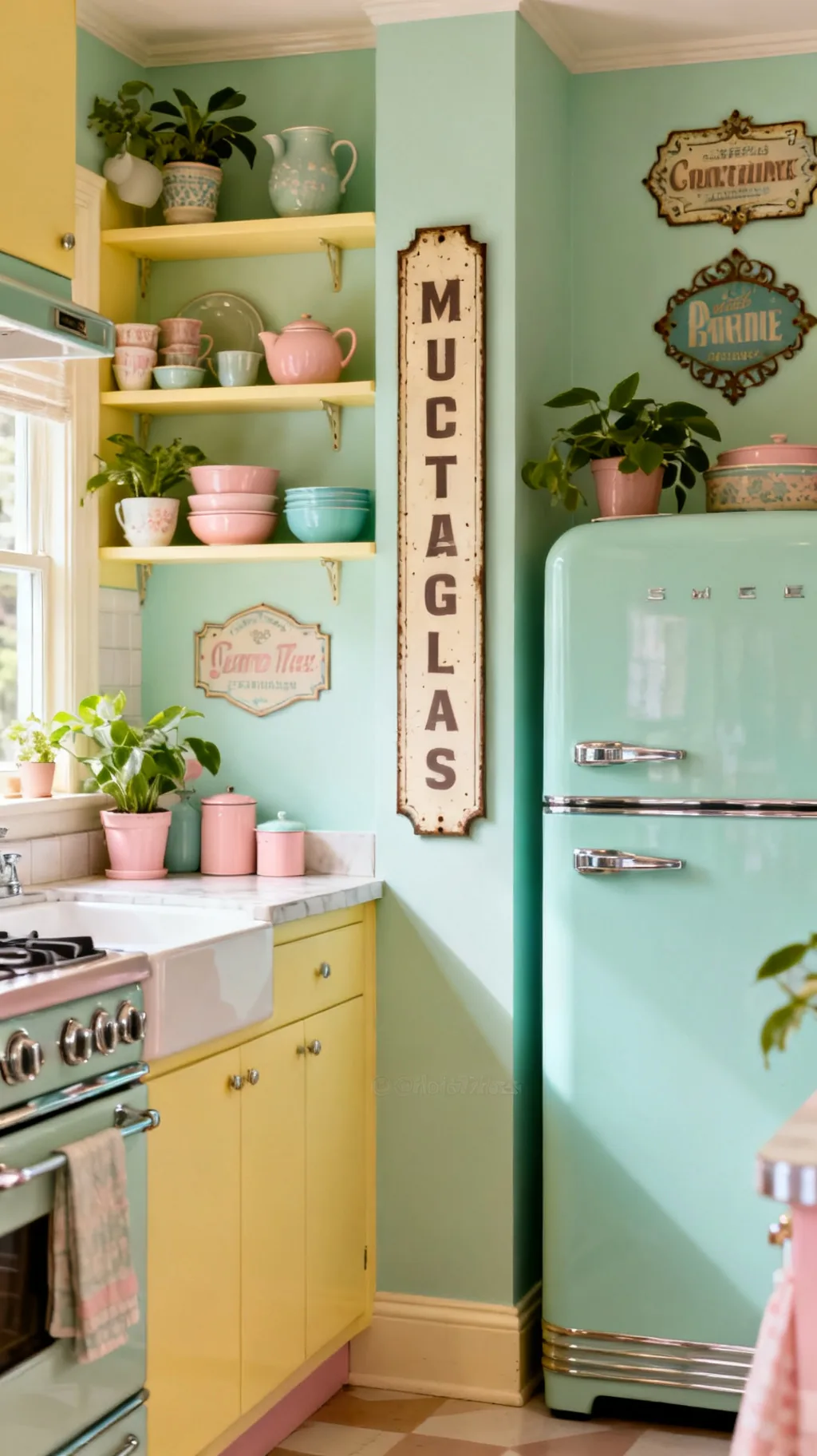
If you want one piece that instantly signals old-fashioned charm, reach for a classic enamel sign. That glossy, slightly chipped surface and bold simple lettering feel straight out of an old corner shop, and they sit beautifully against pastel cabinets. Enamel was built to last, so even a genuinely old one still looks crisp and cheerful. I keep coming back to these because they read vintage the moment they go on the wall.
Why Enamel Works So Well
- Glossy and durable: the baked finish stays bright for decades.
- Bold and readable: simple lettering pops from across the room.
- Wipes clean: a damp cloth is all it takes near the stove.
Hang one as your anchor piece and build the rest of your wall around it.
2. Hang a Bold Black and White Typography Sign
Sometimes the simplest vintage kitchen signs make the strongest statement. A bold black and white typography sign, all crisp letters and clean spacing, brings graphic punch without competing with a colorful room. It is the kind of piece that feels both retro and timeless, and it grounds a pastel kitchen the way a good black frame grounds a gallery wall. From what I’ve gathered, this is the easiest version to mix with almost anything.
Styling Black and White Type
- Graphic anchor: high contrast steadies a busy, colorful room.
- Mixes easily: black and white plays nicely with every pastel.
- Reads from afar: clean type stays legible across the kitchen.
Keep the frame slim and dark so the lettering stays the hero.
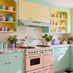
3. Choose a Cheerful Pastel Painted Sign
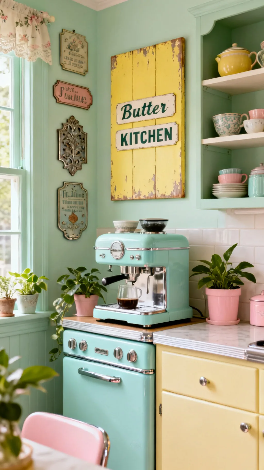
For a softer, sweeter look, a pastel painted sign in mint, butter yellow, or blush feels tailor made for a retro kitchen. The gentle colors echo midcentury cabinets and keep the whole wall feeling light and happy rather than heavy. A friend of mine hung a faded mint sign over her coffee station and said it made the corner feel like a permanent spring morning. These are a lovely way to bring color up onto the walls.
Picking Your Pastel
- Match your cabinets: echo an existing pastel for instant cohesion.
- Soft contrast: a faded finish reads vintage, not brand new.
- Lifts a corner: a happy color brightens a quiet nook.
Choose a slightly muted, chalky pastel so the sign feels gently aged.
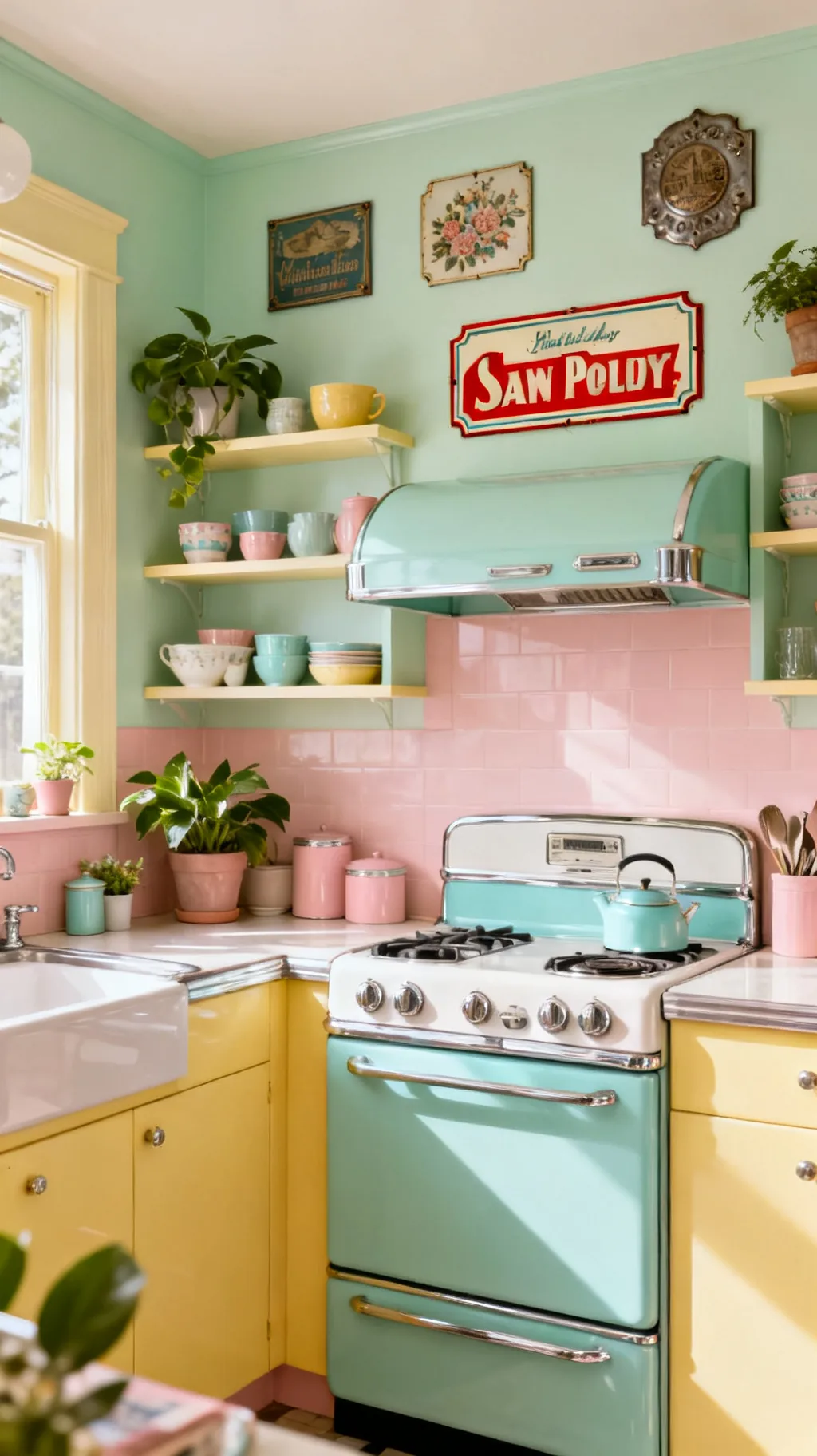
4. Bring Home a Vintage Advertising Sign
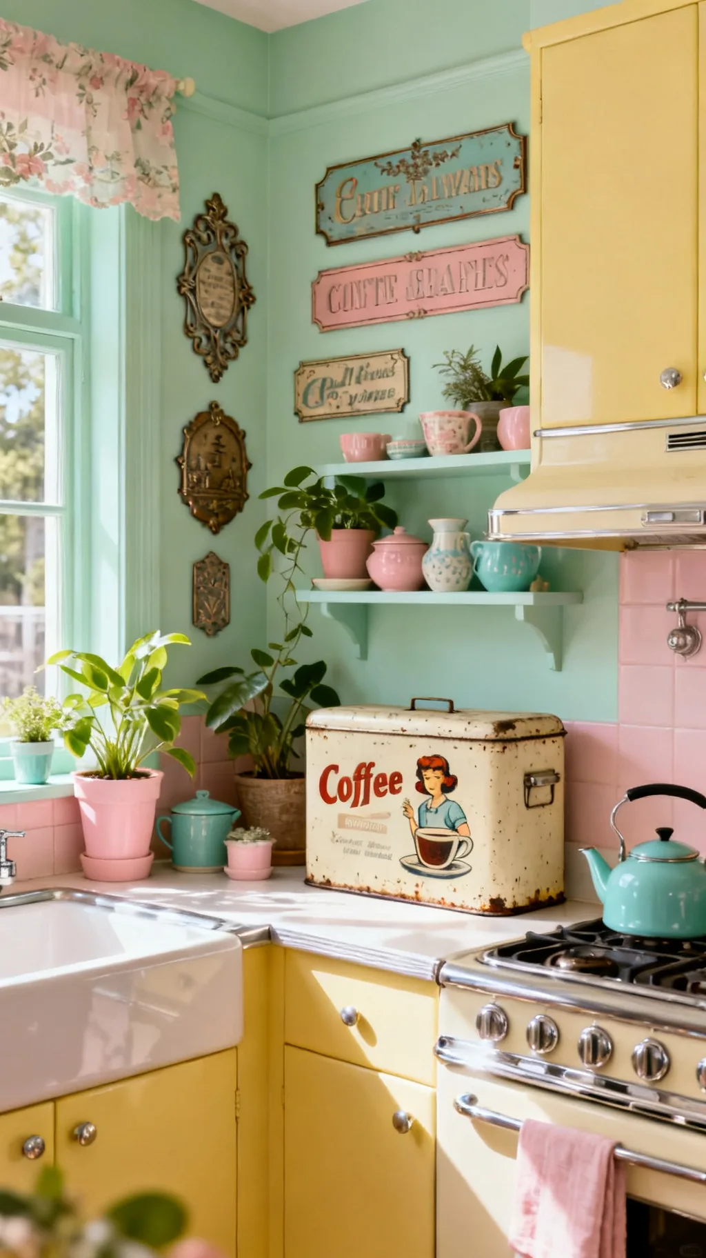
Old advertising signs for coffee, flour, or soda are some of the most collectible vintage kitchen signs around, and for good reason. Their faded colors and charming illustrations tell a little story, and they instantly fill a wall with personality. You do not need a rare antique either, a well-made reproduction captures the same nostalgic feeling. I love how a single advertising sign can set the mood for an entire kitchen.
Choosing an Ad Sign
- Faded is good: soft, worn colors feel authentic and warm.
- Pick a theme: coffee, baking, or soda all suit a kitchen.
- Repro is fine: a good copy gives the look for less.
Let the illustration guide your accent colors and pull one shade into your dishware.
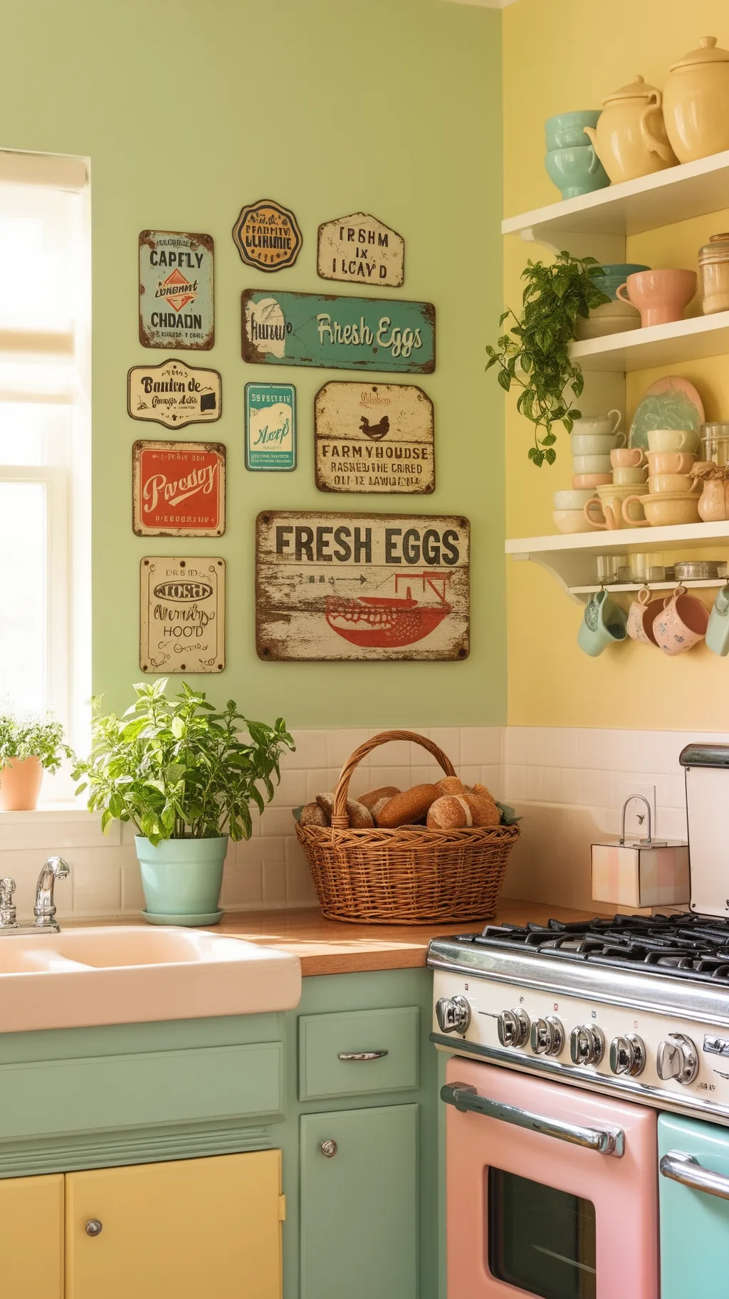
5. Try a Fresh Eggs Farmhouse Sign
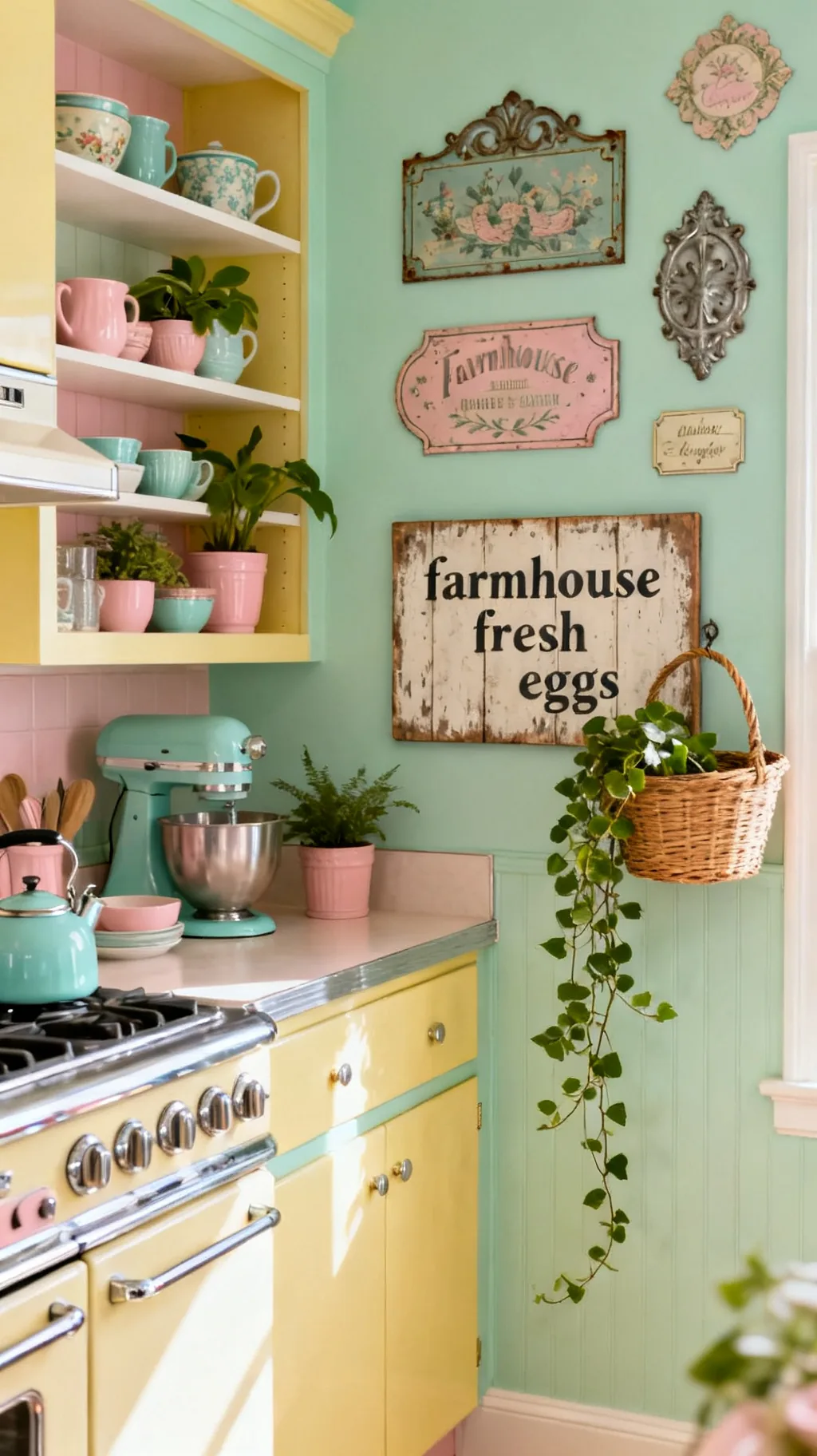
Few signs feel as homey as a sweet farmhouse piece announcing fresh eggs or garden produce. The rustic, slightly weathered look brings a country kitchen warmth that pairs wonderfully with wood, baskets, and a little greenery. It is cheerful without trying too hard, and it suits both cottage and modern farmhouse styles. I remember walking into a cottage with a sign just like this and feeling immediately at home.
Farmhouse Sign Style
- Rustic warmth: weathered wood feels cozy and lived in.
- Country pairings: baskets and greenery complete the look.
- Flexible style: it suits cottage and modern farmhouse alike.
Set it near a bowl of produce or a trailing plant so the theme feels natural.
6. Add a French Bistro or Market Sign
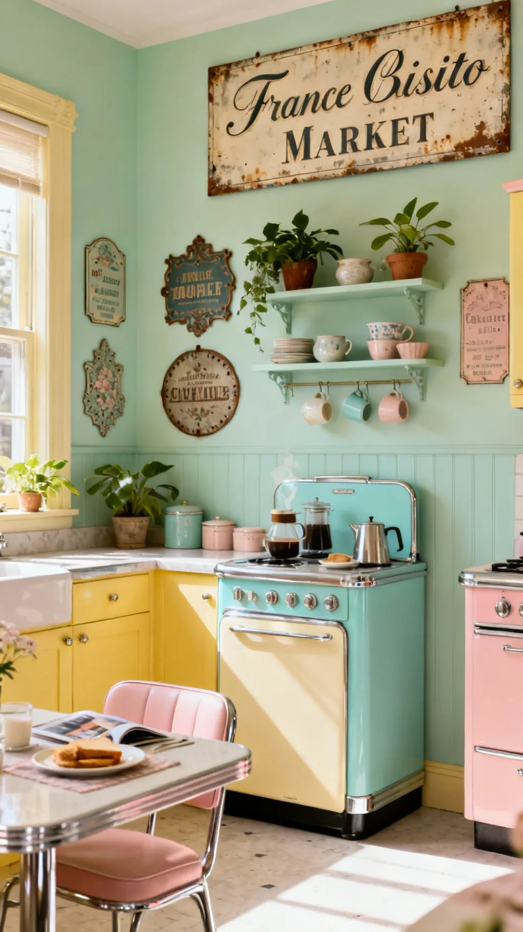
A French bistro or market sign brings a touch of old-world café charm to a kitchen, and it pairs surprisingly well with pastel retro decor. The elegant script and soft, sun-faded colors feel romantic and a little worldly, perfect over a coffee corner or a small breakfast table. It is an easy way to make a plain wall feel like a Paris side street. These signs add a quietly sophisticated note to the mix.
Bistro Sign Charm
- Café feeling: bistro script reads relaxed and romantic.
- Soft colors: sun-faded tones suit a pastel palette.
- Great over coffee: it makes a drink station feel special.
Hang it above your coffee setup so the corner reads like a tiny café.
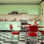
7. Pick a Retro Diner-Style Sign
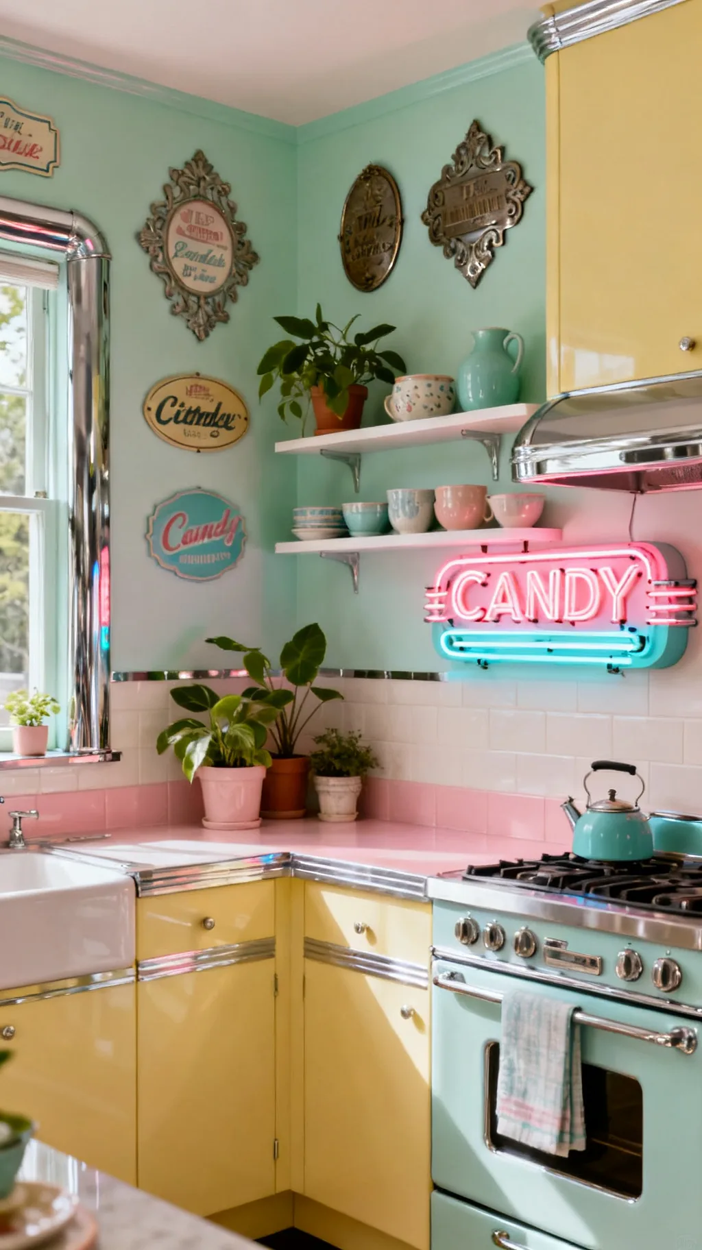
For pure cheerful nostalgia, nothing beats a retro diner-style sign. Think bold shapes, candy colors, and a hint of chrome or a faux-neon glow that nods straight to the soda fountain era. Paired with checkerboard touches and shiny accents, it turns a kitchen into a happy little throwback. This is the version that makes people smile the moment they walk in, and it carries a whole room on its own.
Diner Sign Details
- Candy colors: bold cheerful tones capture diner energy.
- Add shine: chrome or faux-neon completes the throwback.
- Statement maker: one bold sign sets the whole mood.
Keep surrounding decor calm so the diner sign gets to be the star.
Swipe through these for a little inspiration.
 1 / 5
1 / 5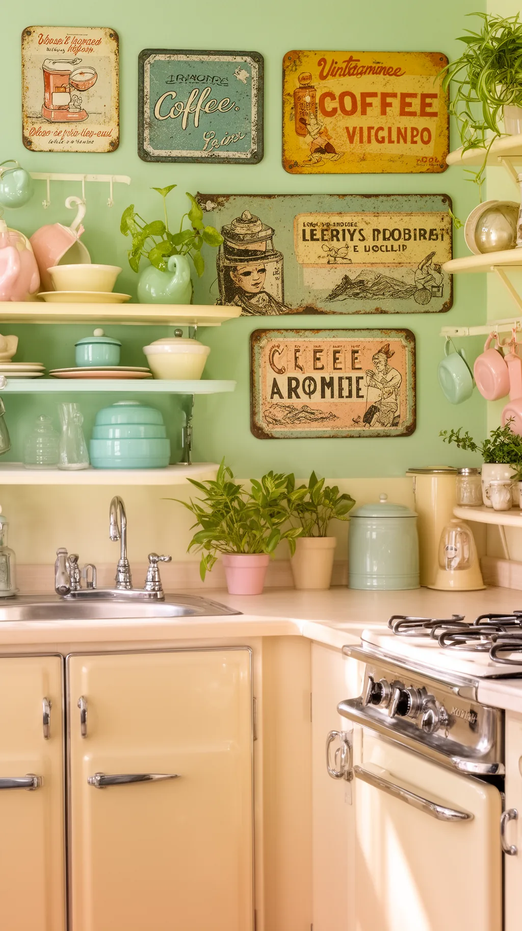 2 / 5
2 / 5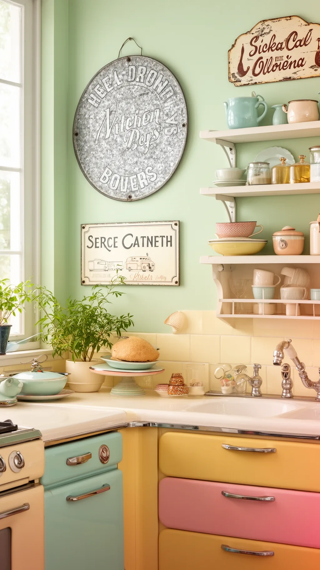 3 / 5
3 / 5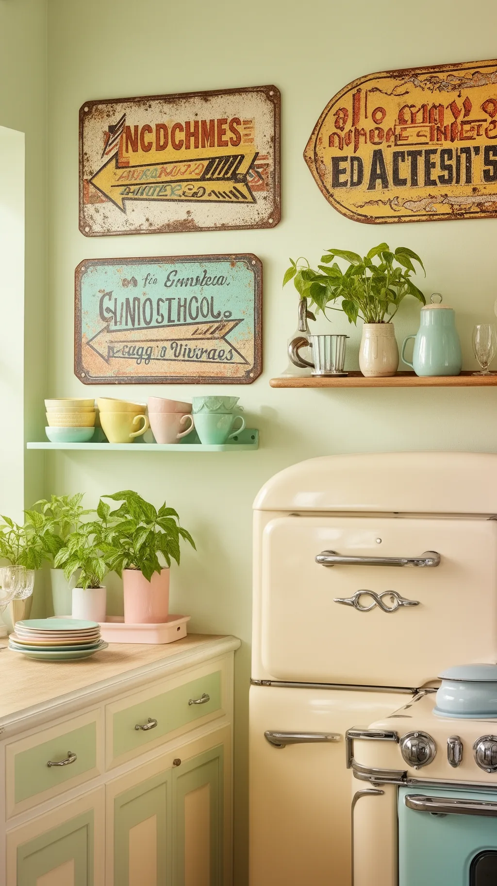 4 / 5
4 / 5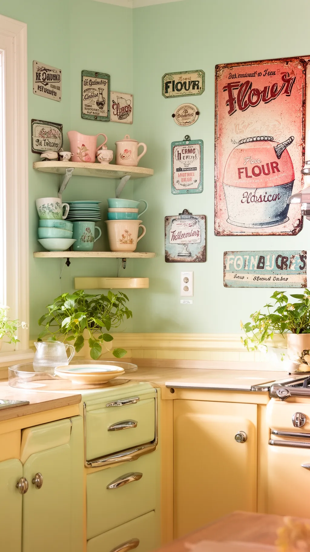 5 / 5
5 / 58. Use a Hand-Painted Wood Sign
There is a special warmth to a hand-painted wood sign, where the slightly imperfect brushwork shows a human touch. That handmade quality feels honest and cozy, and it brings texture to a wall full of smooth surfaces. Whether it is a simple word like kitchen or a sweet little saying, the soft, lived-in lettering reads genuinely old. I find these the easiest signs to fall in love with.
Hand-Painted Appeal
- Human touch: imperfect brushwork feels warm and real.
- Adds texture: wood grain softens a smooth, tiled room.
- Sweetly simple: one cozy word is often all you need.
Look for soft, slightly uneven lettering, that gentle imperfection is the charm.
9. Lean Into Galvanized Metal Signs
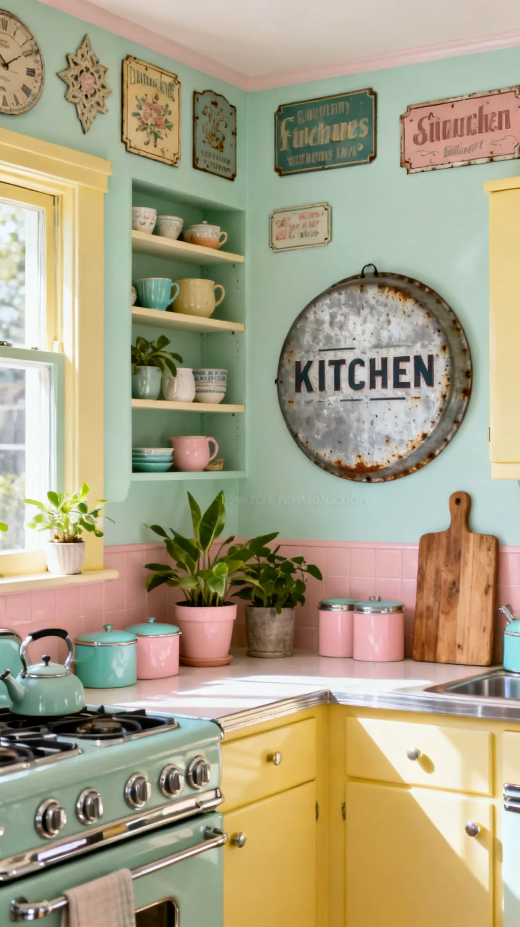
Galvanized metal signs bring an industrial farmhouse edge that balances all the softness of a pastel kitchen. Their cool gray sheen and slightly weathered surface feel sturdy and honest, a nice contrast to enamel and painted wood. Round shapes, arrows, and simple word signs all work, and the neutral metal goes with absolutely everything. From what I’ve gathered, a little metal keeps a sweet kitchen from feeling too precious.
Working With Metal
- Neutral tone: cool gray metal pairs with any color.
- Sturdy contrast: it grounds soft pastels and wood.
- Shape variety: rounds and arrows add visual interest.
Mix one metal piece in among your wood and enamel for a collected, layered look.
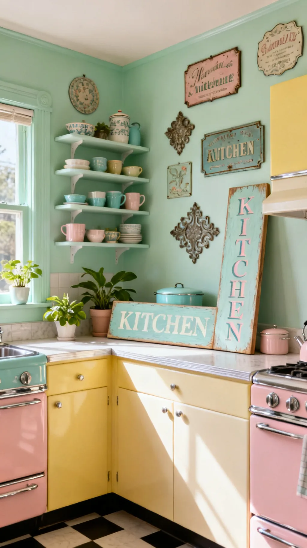
10. Frame Vintage Recipe Cards as Wall Art
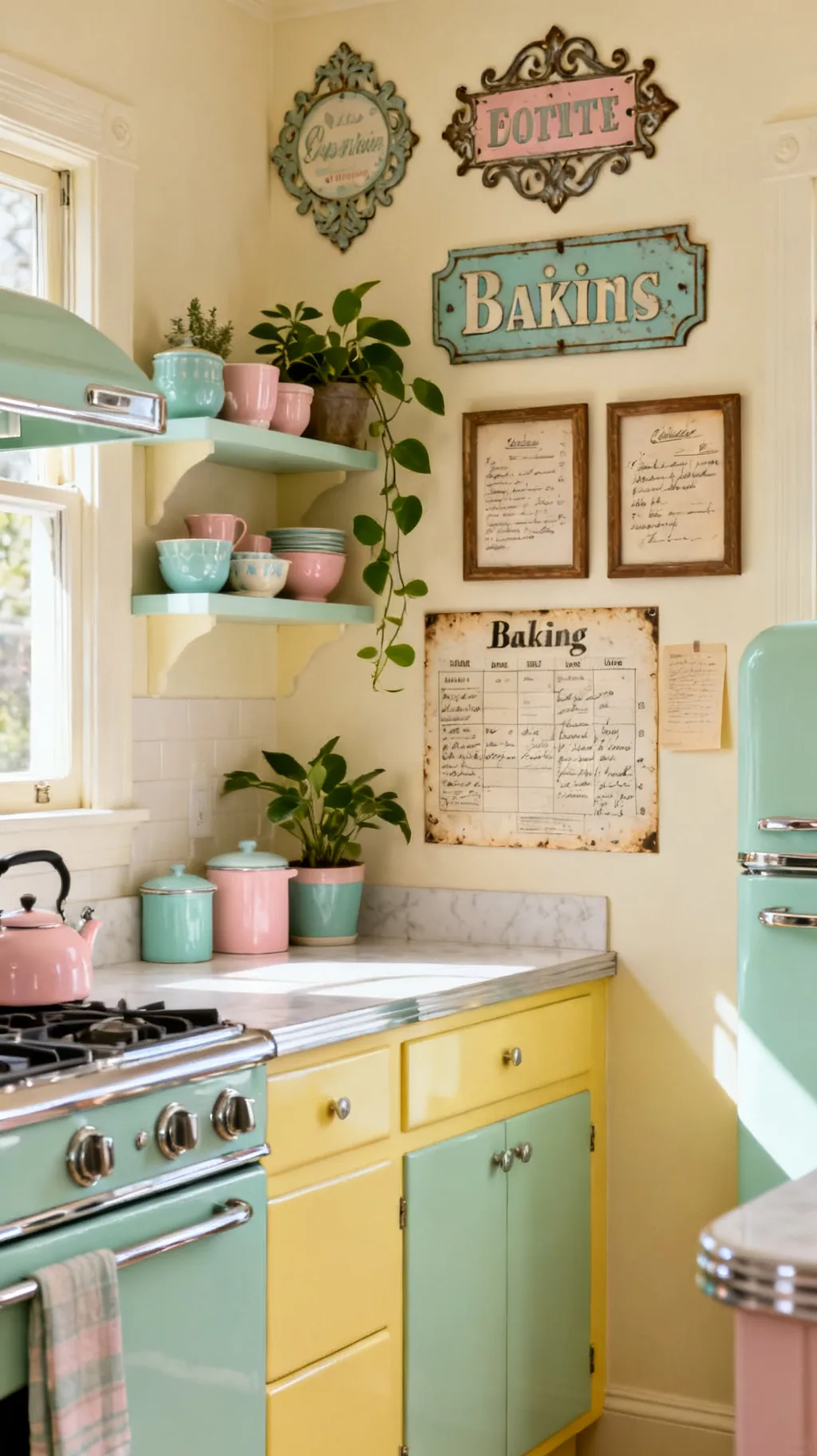
Some of the sweetest vintage kitchen signs are not signs at all, but framed bits of kitchen history. Old handwritten recipe cards, faded baking charts, or a page from a vintage cookbook look charming behind glass and bring a personal, storied feeling to a wall. Grouped in matching frames, they read like a tiny museum of home cooking. I love that this idea costs almost nothing and feels deeply personal.
Framing Ephemera
- Personal story: old recipes feel warm and meaningful.
- Budget-kind: a frame and a found card are all you need.
- Group them: matching frames make a tidy little set.
Use simple matching frames so the mismatched papers still feel pulled together.
&# 10024; Setting the whole scene?21 1950s Kitchen Ideas to Recreate That Nostalgic Charm→11. Display an Old Crate Label Sign
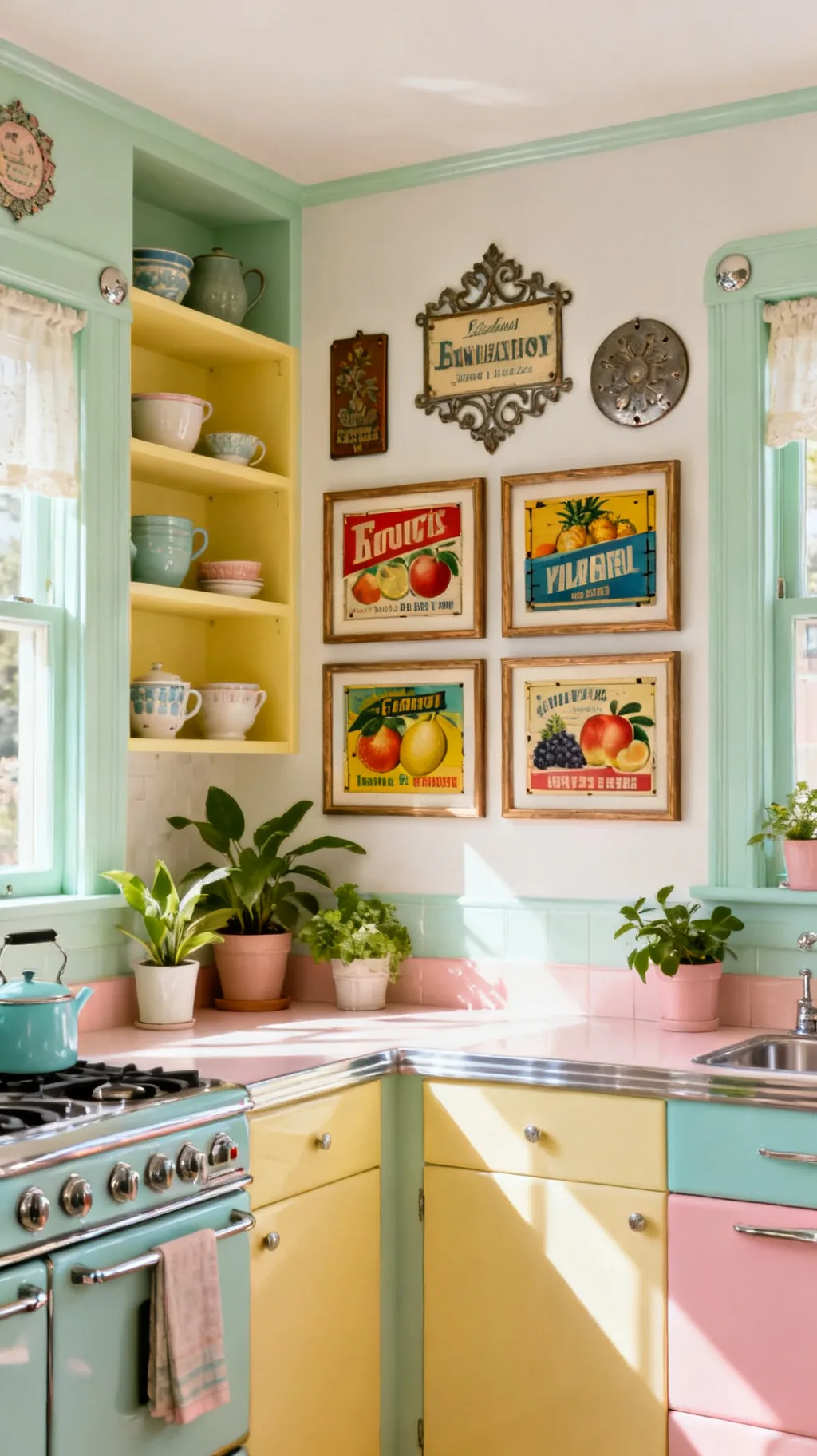
Vintage fruit-crate labels and produce signs are little works of art, full of bright illustrations and cheerful old typography. Reproduced as larger signs or framed as a set, they bring a pop of sun-faded color and a market-fresh feeling to a kitchen wall. The citrus and garden themes suit a bright, airy room beautifully. These are a joyful, slightly unexpected way to add vintage character.
Crate Label Looks
- Bright illustration: old labels are colorful and cheerful.
- Market feeling: produce themes suit a fresh kitchen.
- Frame a set: a few together make a lively display.
Pull a color from the label art into a nearby bowl or tea towel for a tied-together look.
12. Hang a Chalkboard Menu Sign
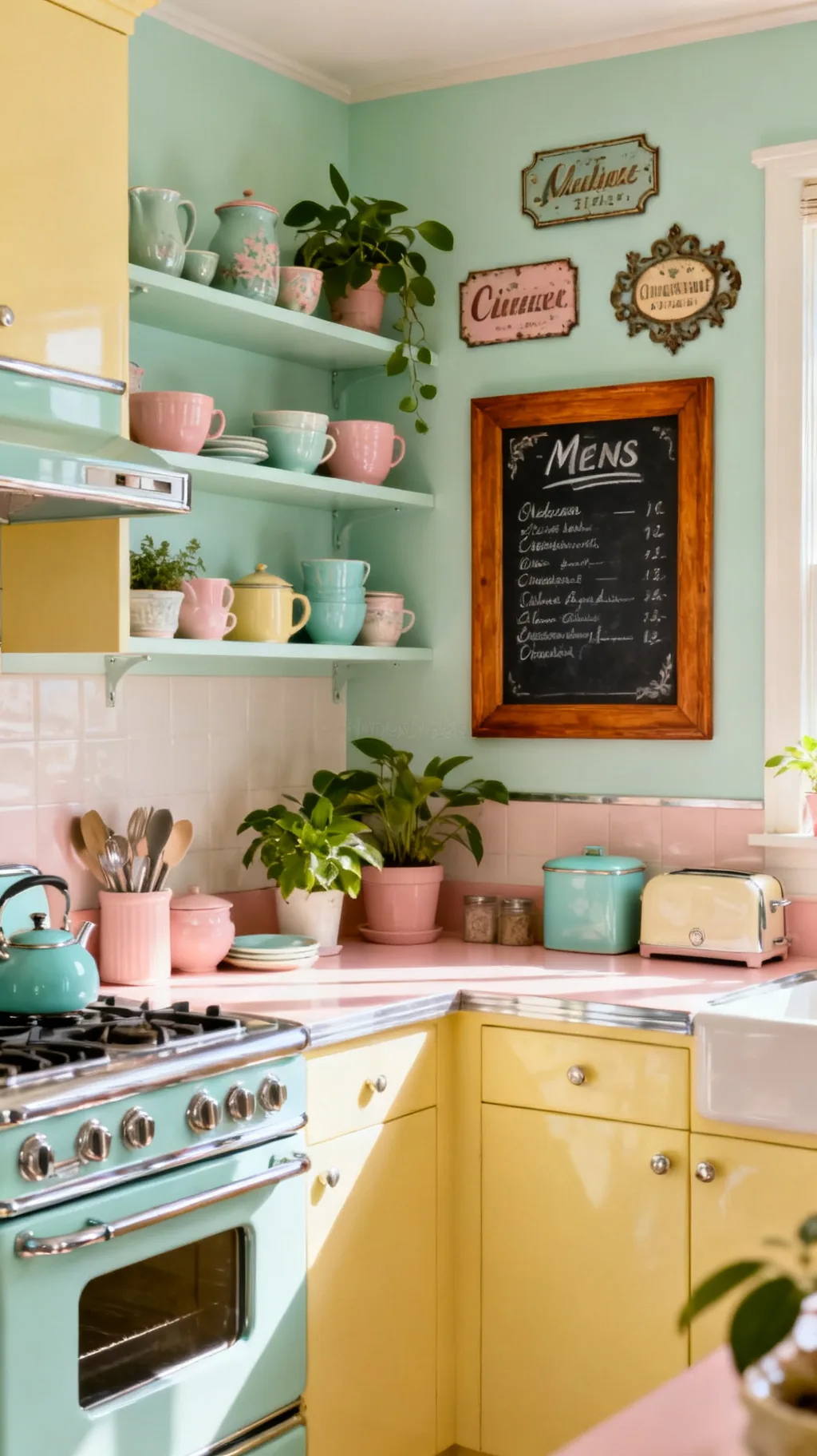
A vintage-style chalkboard sign brings café charm and a practical streak to the kitchen. The dark surface and a simple wooden frame feel timeless, and you can rewrite the menu, a grocery list, or a sweet seasonal note whenever the mood strikes. That changeable quality keeps a wall feeling fresh all year. It is one of the few signs that works just as hard as it looks.
Chalkboard Tips
- Always fresh: rewrite it for the season or the week.
- Café charm: a framed board reads classic and cozy.
- Practical too: lists and notes earn their wall space.
Frame the board in warm wood so it feels like decor, not just a message center.
13. Make Your Own DIY Vintage Sign
If you cannot find the perfect piece, making your own is wonderfully satisfying. With a plain wood board, soft chalky paint, and a simple stencil, you can create a sign in exactly the words and colors you want. The slightly handmade result is part of the charm, and a little sanding gives it that genuinely aged look. A weekend project like this turns a blank wall into something personal.
DIY Sign Basics
- Your words: a custom sign says exactly what you like.
- Chalky paint: a matte finish reads soft and old.
- Sand the edges: a little wear makes it feel vintage.
Stencil your letters lightly in pencil first so the spacing comes out even.
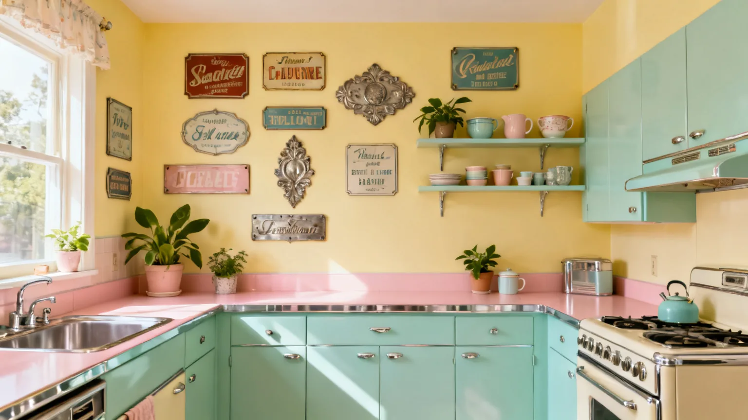
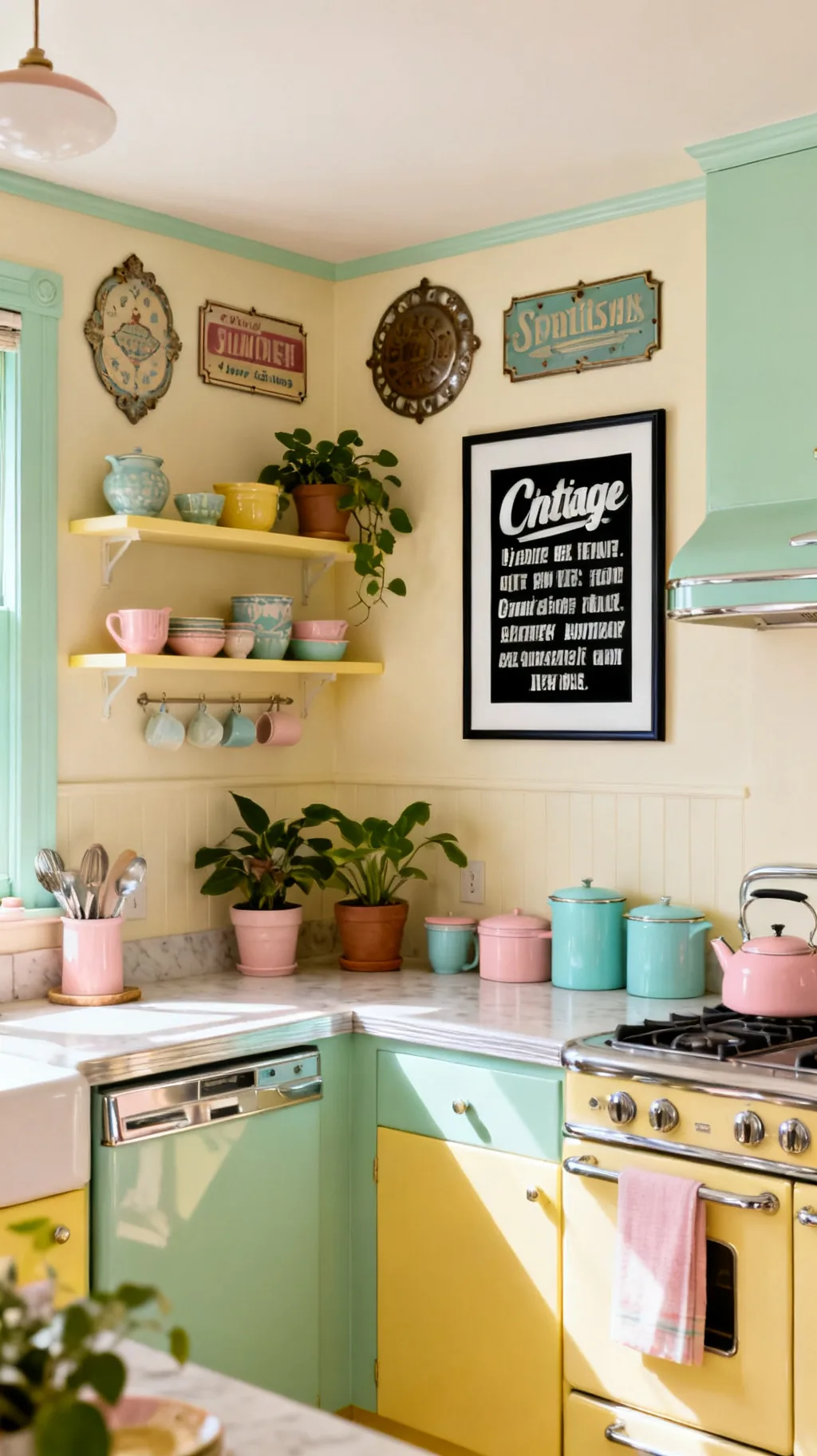
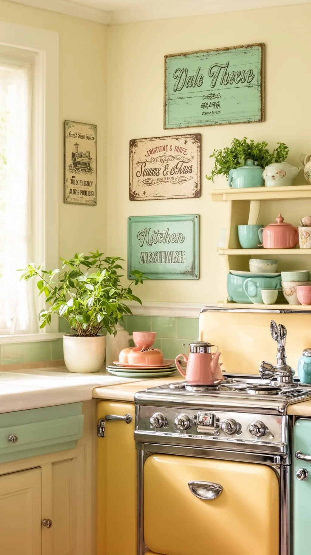
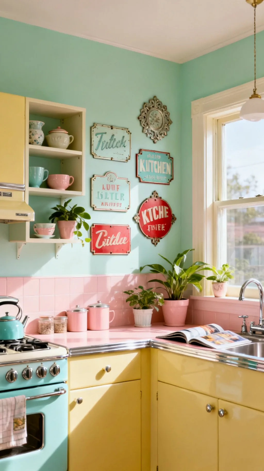
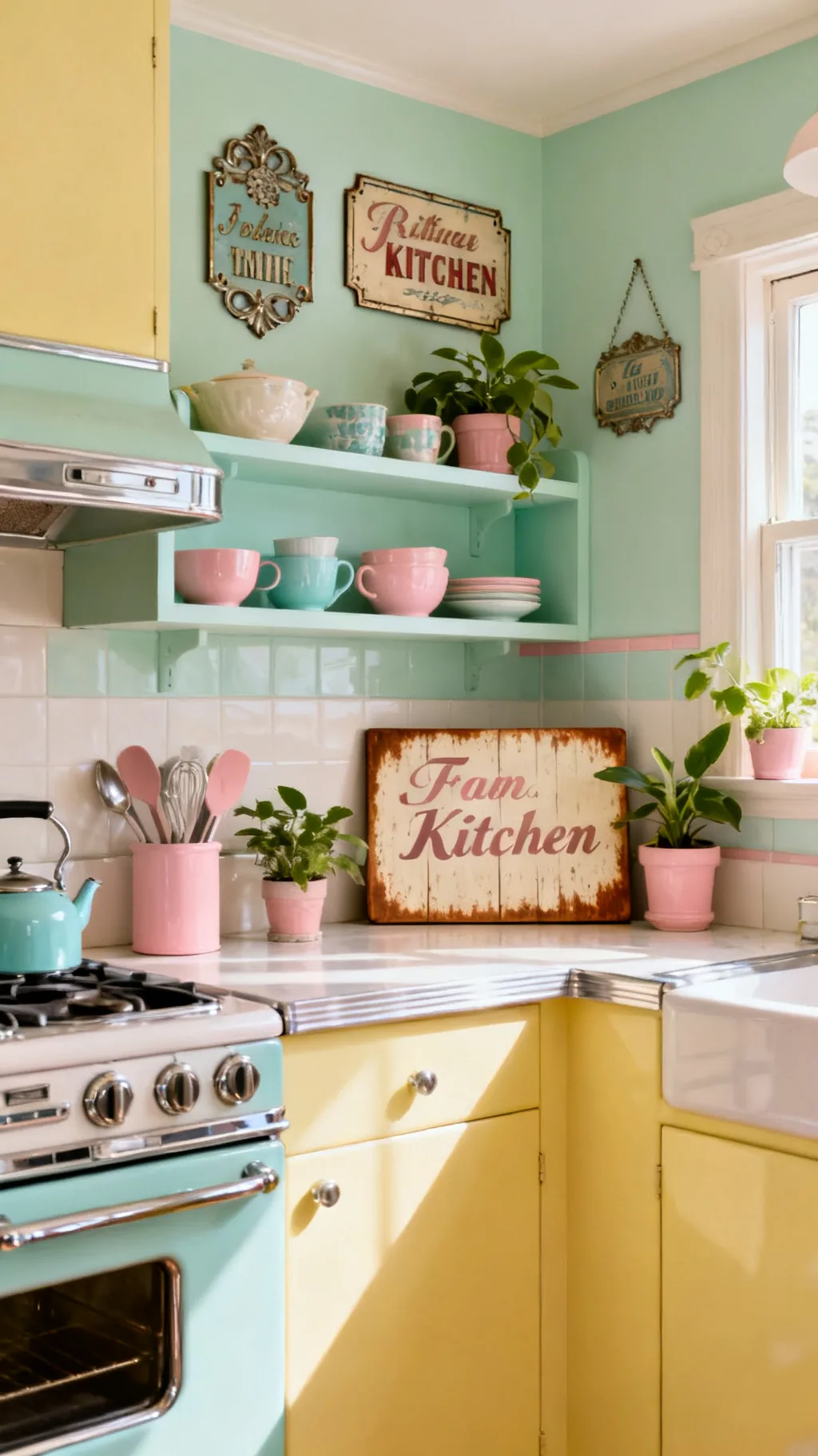
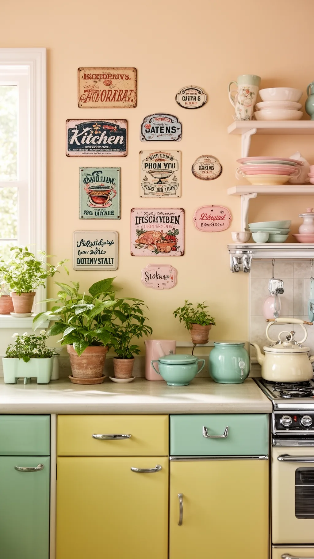
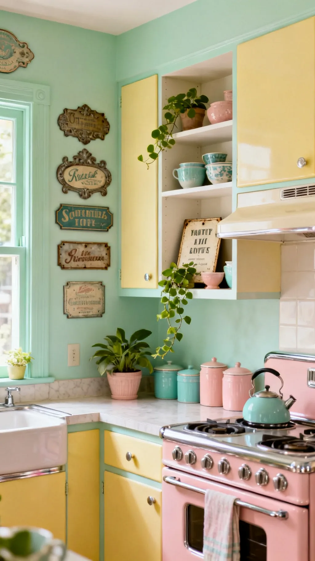
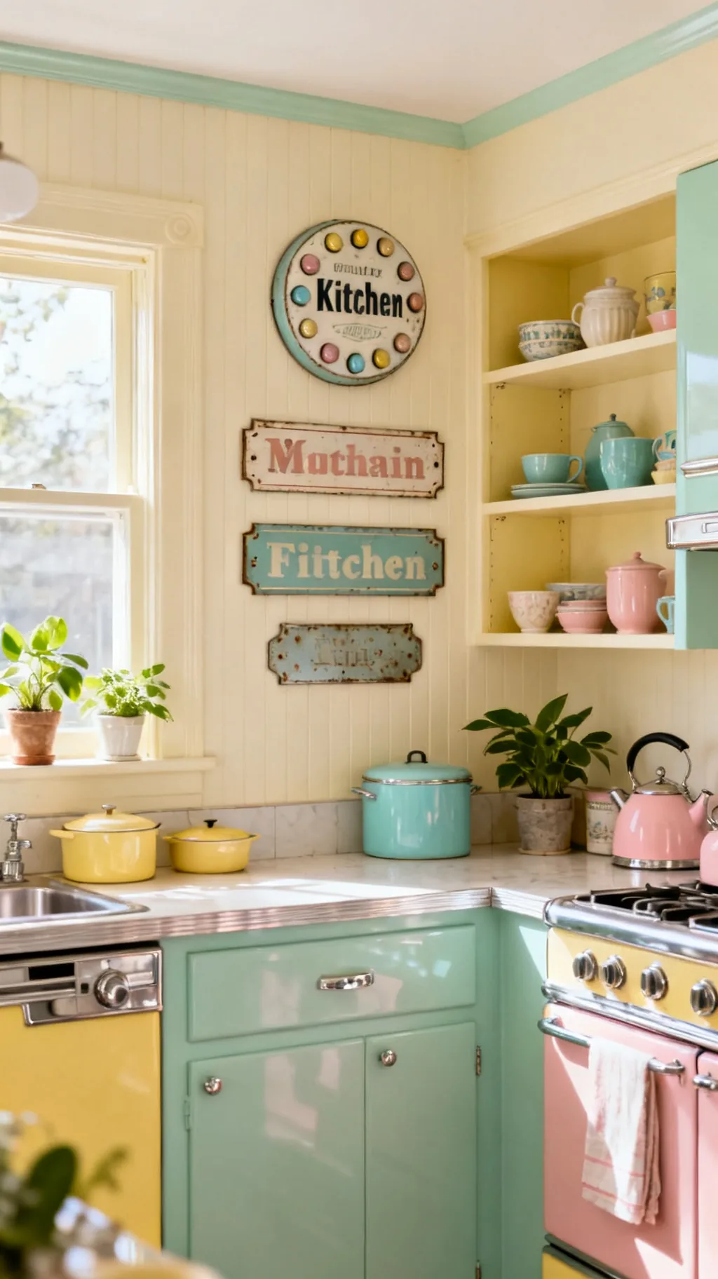
14. Group Small Signs Into a Gallery Wall
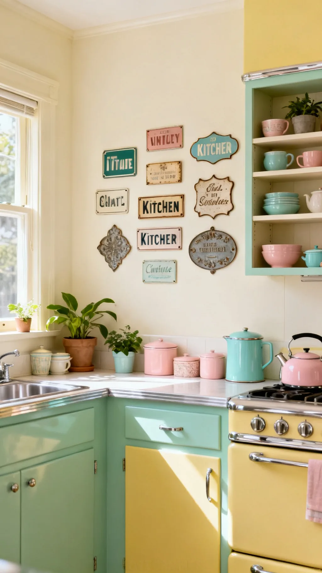
One sign is sweet, but a thoughtfully grouped cluster of small vintage kitchen signs turns a whole wall into a collected, characterful display. Mixing enamel, wood, and metal pieces in different shapes and sizes feels curated rather than matchy, like something gathered over years. The trick is to keep a loose theme or color thread running through them. I keep coming back to gallery walls because they tell such a lovely story.
Building the Cluster
- Mix materials: enamel, wood, and metal add rich variety.
- Vary the size: different shapes keep it lively, not stiff.
- Hold a thread: a shared color or theme ties it together.
Lay the whole arrangement on the floor first, then hang once it feels balanced.
Take a peek at a few of these looks.
 1 / 5
1 / 5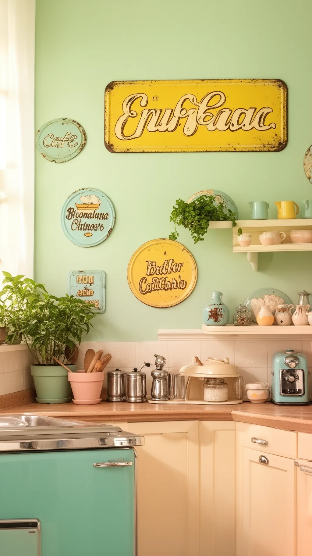 2 / 5
2 / 5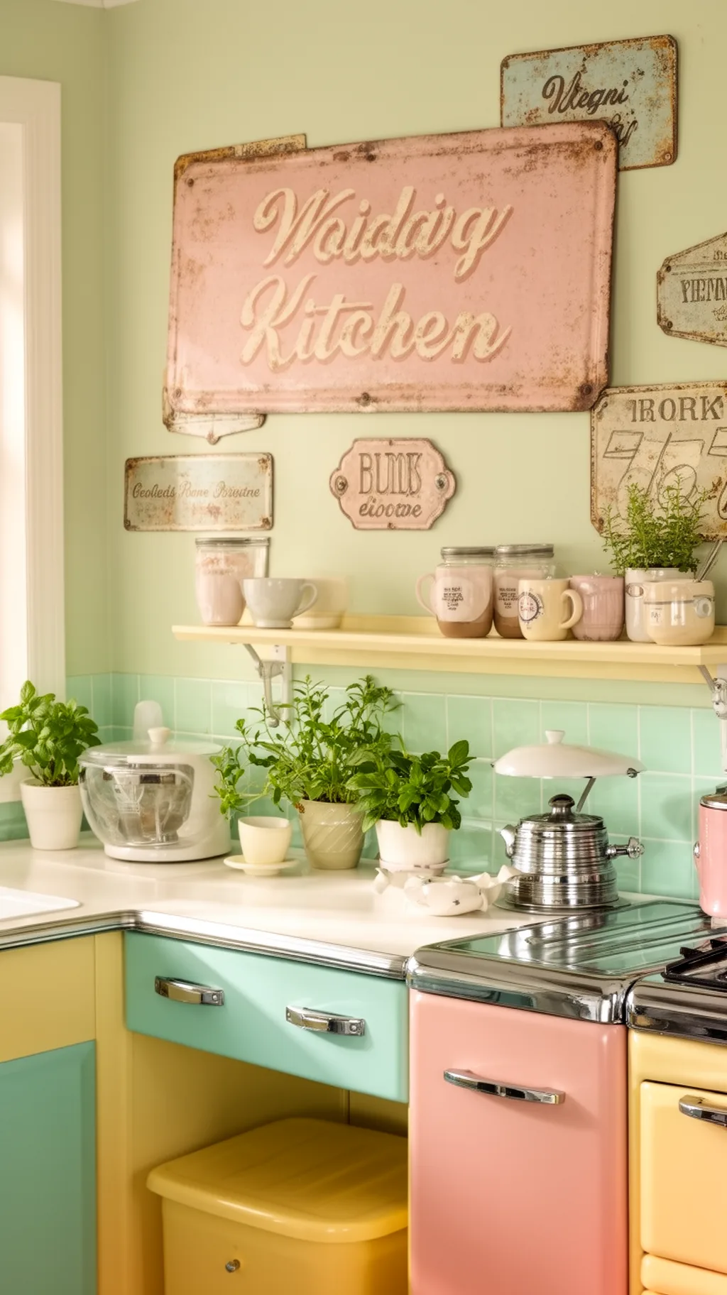 3 / 5
3 / 5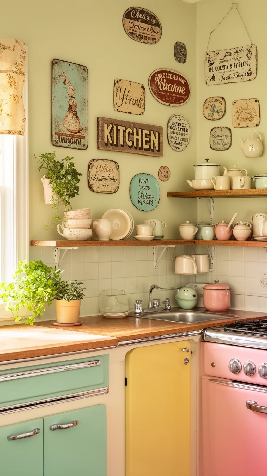 4 / 5
4 / 5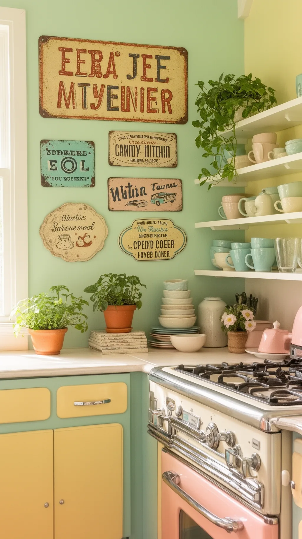 5 / 5
5 / 515. Make a Statement Over the Stove
The wall above the stove or range hood is prime real estate for a single, eye-catching sign. A bold piece there draws the eye up, becomes a natural focal point, and fills what is often an awkward blank space. Just choose something easy to wipe clean, since it will live near steam and the occasional splatter. This is where one well-chosen sign can quietly anchor the whole room.
Over-the-Stove Style
- Natural focal point: the spot draws every eye upward.
- Fills the gap: a sign solves that awkward blank wall.
- Wipeable wins: enamel or metal handles steam best.
Center the sign on the hood, not the stove, so it reads balanced from the doorway.
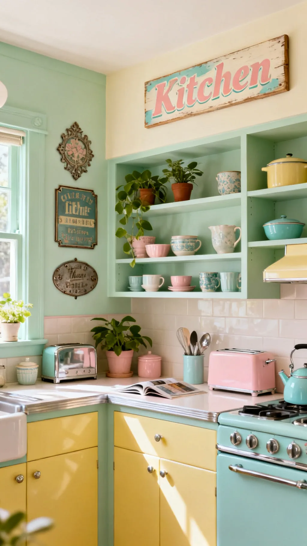
16. Welcome Guests With an Over-the-Door Sign
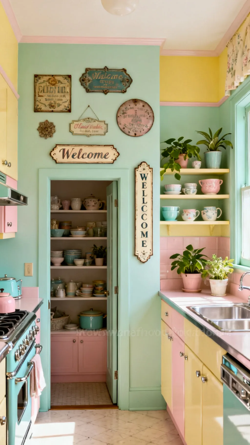
An over-the-door sign is a charming little welcome that most people forget to use. That narrow strip of wall above a doorway or pantry is the perfect home for a long, slim sign, and it greets you each time you walk through. A sweet word or a simple kitchen phrase up there adds a warm, finishing touch. It is a small detail that makes a kitchen feel thoughtfully put together.
Above-the-Door Ideas
- Uses dead space: the strip above a door rarely gets decor.
- Warm welcome: a sweet word greets you on the way in.
- Long and slim: the shape suits a narrow horizontal sign.
Pick a sign wider than it is tall so it sits comfortably above the frame.
17. Add a Coffee Bar or Cafe Corner Sign
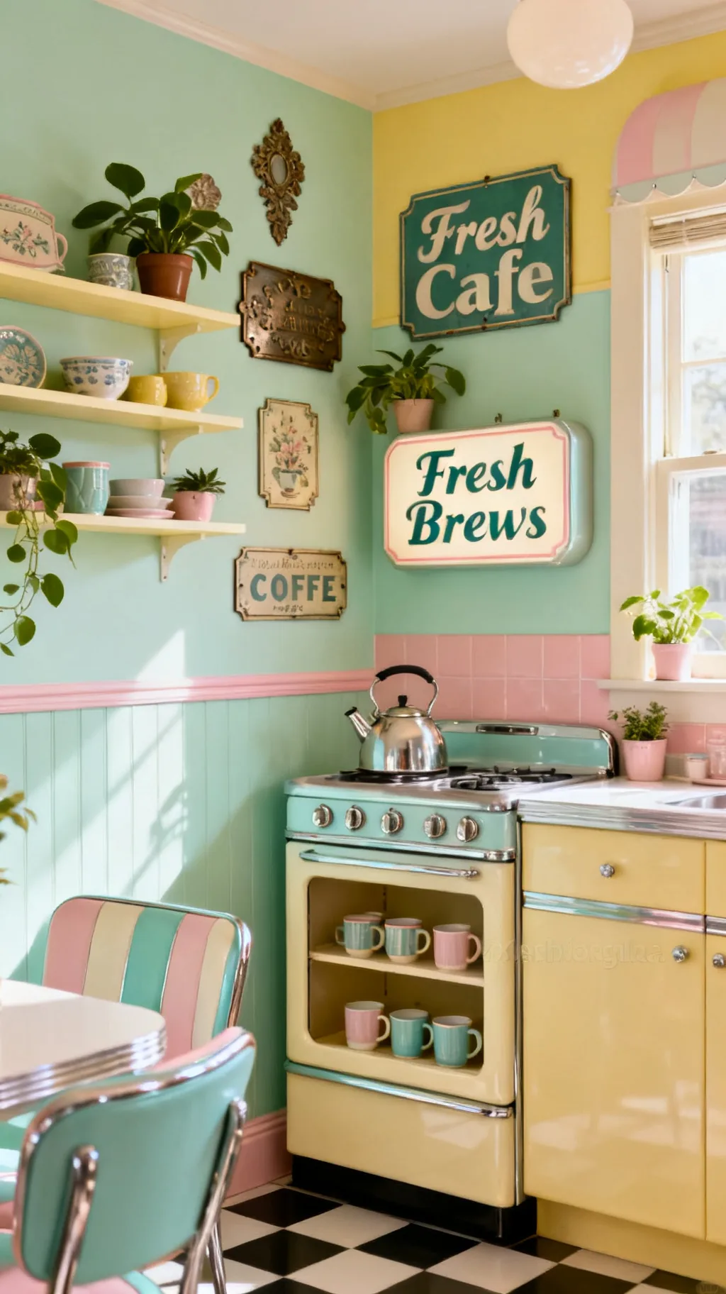
A little coffee bar deserves its own sweet sign, and it is one of the most popular ways to use vintage lettering in a kitchen. A cafe or fresh coffee sign turns a humble corner with a kettle and a few mugs into a destination, full of cozy morning charm. The theme is cheerful and universal, and it gives a small nook a real sense of purpose. This is a corner I would happily linger in every morning.
Coffee Corner Touches
- Defines the nook: a sign gives the corner a clear theme.
- Cozy mornings: coffee lettering feels warm and inviting.
- Pairs with mugs: open shelves of cups complete the scene.
Hang the sign just above the mugs and kettle so the whole vignette reads as one.
18. Mix in a Vintage Clock-and-Sign Combo
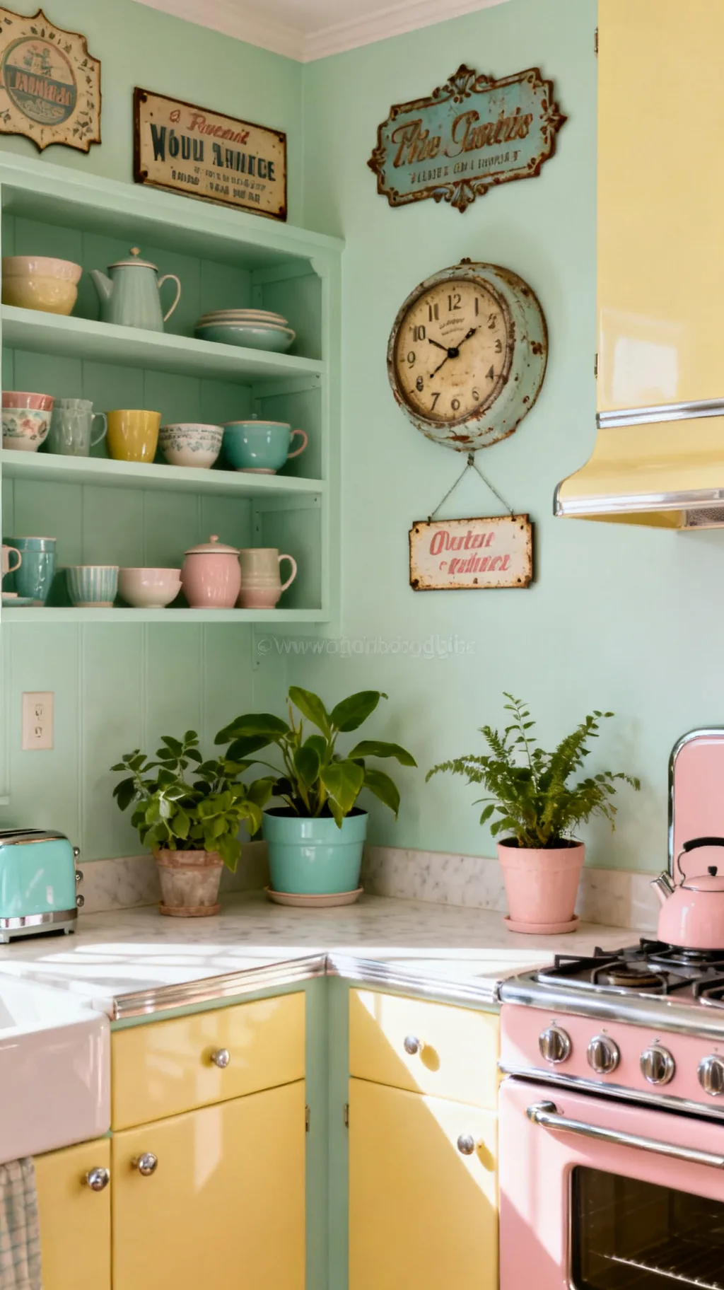
A wall clock with a vintage sign feel, or a clock hung right beside a favorite sign, brings both function and nostalgia to a kitchen. Old-style faces with simple numbers and a softly aged finish look right at home among retro decor, and pairing one with a sign creates a sweet little vignette. It is a practical piece that pulls double duty as charm. I love a spot on the wall that is useful and pretty at once.
Clock-and-Sign Pairing
- Function plus charm: a clock earns its place and looks lovely.
- Aged finish: a soft, worn face reads genuinely retro.
- Make a vignette: a clock beside a sign feels intentional.
Echo the clock’s metal or wood tone in the sign next to it for a matched pair.
19. Choose Signs in a Cohesive Color Story
When you are gathering several pieces, a loose color story keeps a wall of vintage kitchen signs feeling calm and collected rather than chaotic. Sticking to two or three shades that already live in your kitchen, perhaps mint, cream, and a touch of red, lets very different signs feel like a family. The signs can vary wildly in shape and theme as long as the colors agree. This one small rule makes everything look intentional.
Color-Story Tips
- Pick two or three: a tight palette unifies mixed pieces.
- Use room colors: echo shades already in your kitchen.
- Let shapes vary: color does the work, so themes can differ.
If a sign clashes, move it to another room rather than forcing the palette.
20. Distress and Age a New Sign for Patina
A brand-new sign can look a little too crisp for a vintage kitchen, but a gentle aging trick fixes that fast. Lightly sanding the edges, dabbing on a thin wash of brown glaze, or rubbing back the paint just slightly gives a fresh piece that soft, time-worn patina. The goal is subtle, like the sign has simply seen a few happy years. From what I’ve gathered, a touch of wear is what separates charming from generic.
Aging a Sign
- Sand the edges: light wear mimics years of handling.
- Thin glaze: a brown wash softens bright new color.
- Less is more: stop early so it reads aged, not damaged.
Work in thin layers and step back often, you can always add more wear but not remove it.
Scroll through and see which one speaks to you.
 1 / 5
1 / 5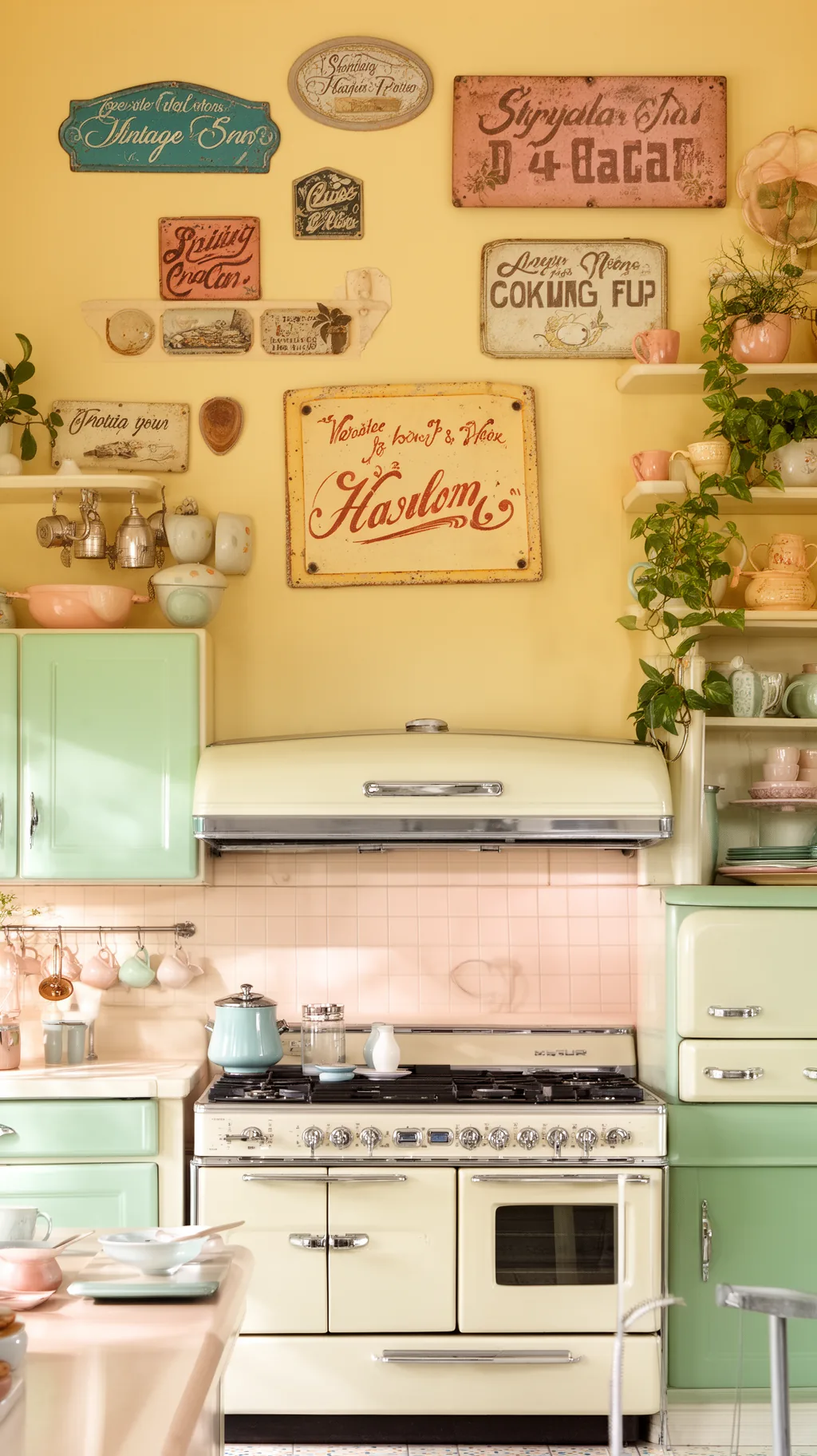 2 / 5
2 / 5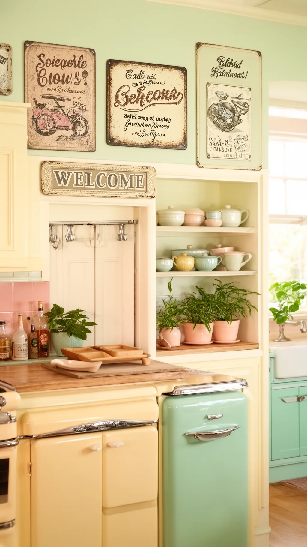 3 / 5
3 / 5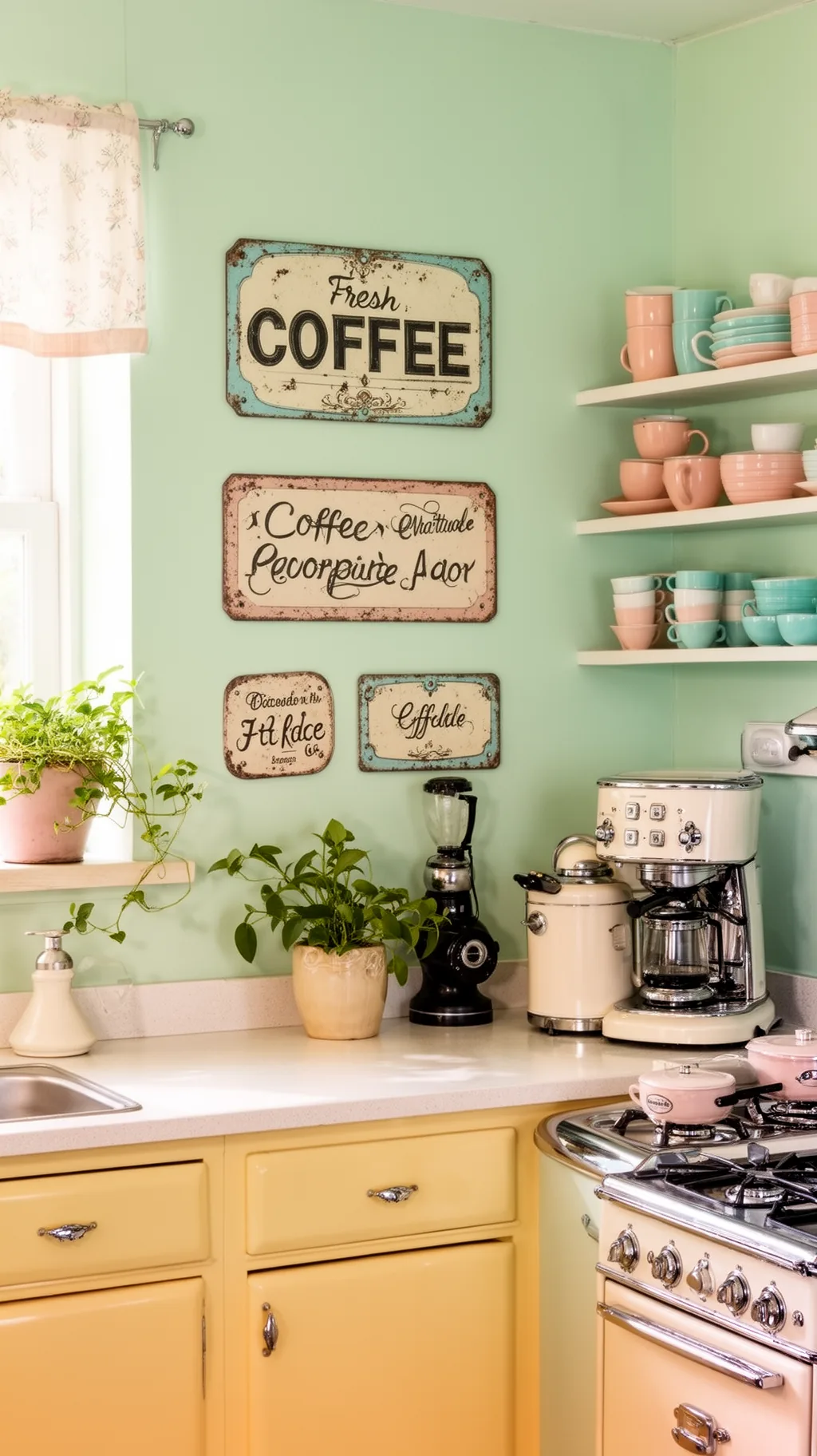 4 / 5
4 / 5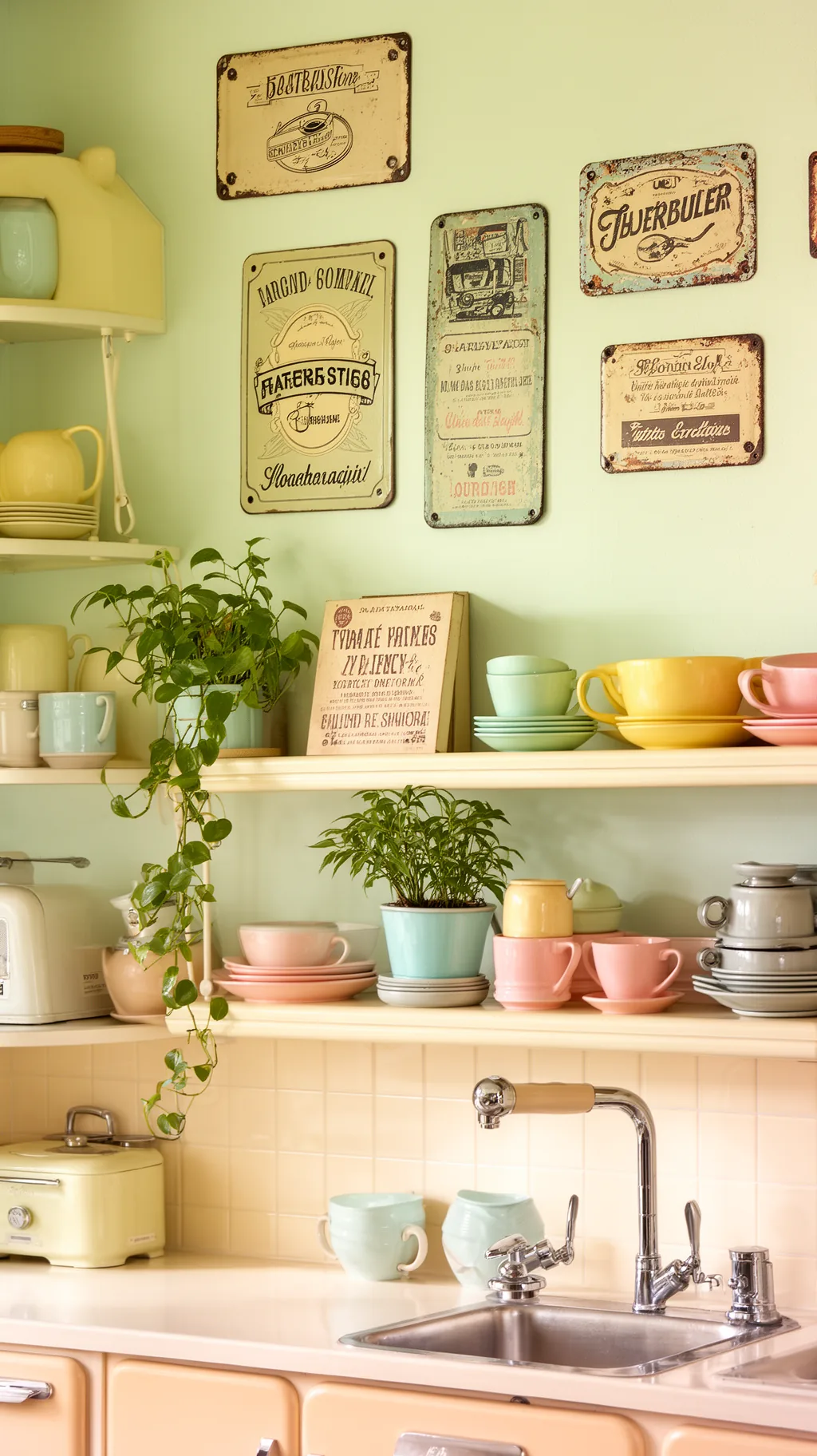 5 / 5
5 / 521. Layer Signs With Shelves and Plants
Signs do not have to hang alone on a bare wall. Tucking a small sign behind a row of ceramics on an open shelf, or letting a trailing plant soften one corner of a larger piece, makes the whole display feel relaxed and lived in. That gentle layering keeps a wall from looking flat and gives the eye sweet little details to find. A friend of mine layers this way and her kitchen always feels effortlessly cozy.
Layering Ideas
- Lean on a shelf: a propped sign feels casual and easy.
- Soften with green: a trailing plant warms a hard edge.
- Add depth: overlapping pieces keep a wall from feeling flat.
Let one object slightly overlap the sign so the grouping feels collected, not staged.
22. Pick a Round or Die-Cut Shape Sign
Most signs are rectangles, so a round button-style sign or a fun die-cut shape instantly adds variety to a wall. A circular sign breaks up all those straight edges, while a shaped piece, like an arrow or a coffee cup silhouette, brings a playful, custom feeling. These shapes catch the eye and keep a grouping from looking like a grid. I love how one curvy piece can liven up an entire arrangement.
Shape It Up
- Break the grid: a round sign softens rows of rectangles.
- Playful silhouettes: die-cut shapes feel custom and fun.
- Catches the eye: an unusual outline draws a second look.
Place a round or shaped sign near the center of a grouping so it anchors the variety.
&# 10024; Love a softer retro vibe?11 Vintage Kitchen Aesthetic Ideas With a 70s Vibe→23. Try a Hanging Double-Sided Bracket Sign
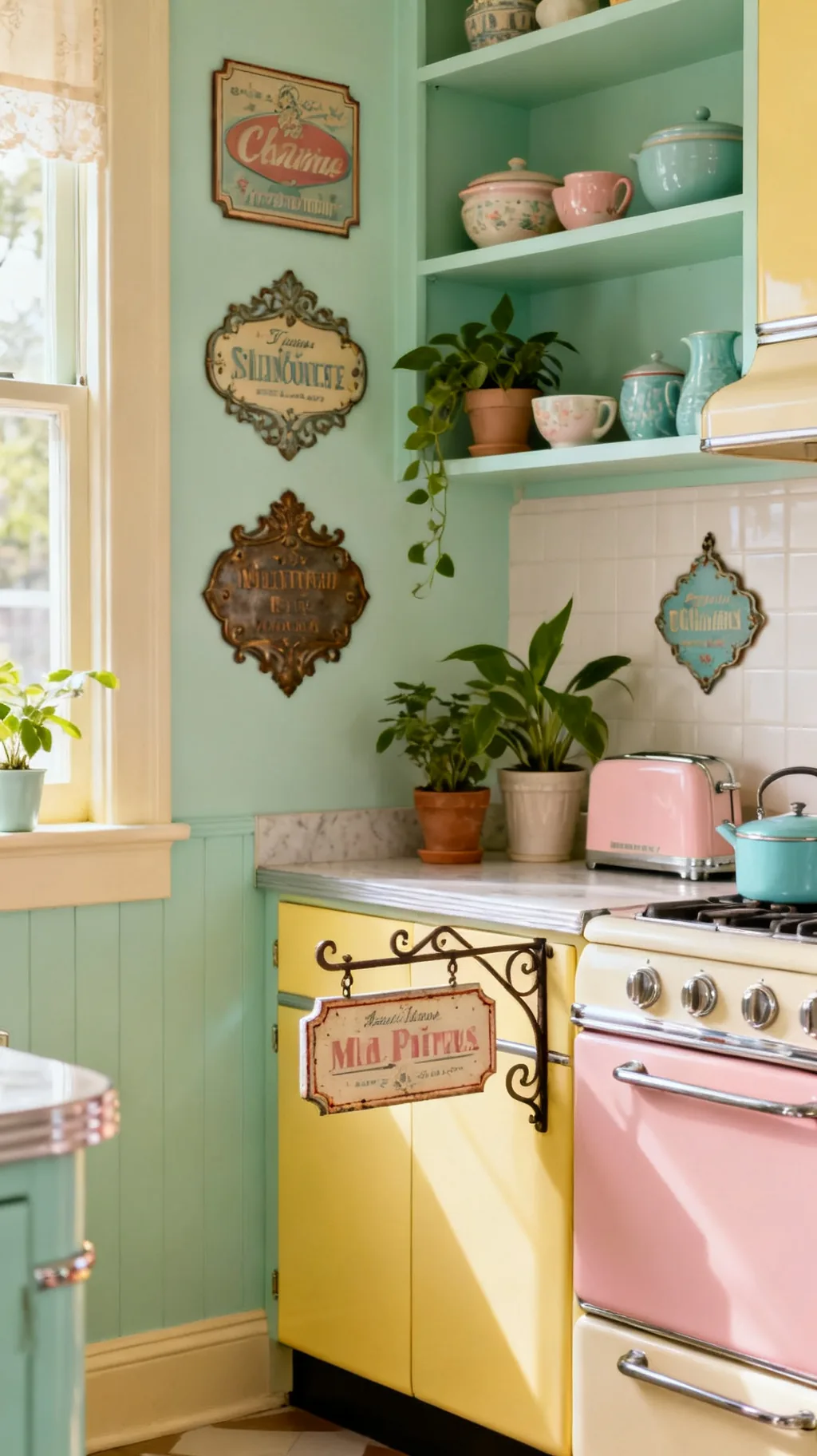
A double-sided sign on a little iron bracket, the kind that once swung outside a shop, brings wonderful old-world character indoors. Mounted on the end of a cabinet or beside a doorway, it adds dimension and a charming pub-or-shopfront feeling that flat signs cannot. The small projecting shape is unexpected and full of personality. It is a delightful way to use a corner that a regular sign would miss.
Bracket Sign Style
- Adds dimension: a projecting sign breaks up a flat wall.
- Shopfront charm: the bracket nods to old storefronts.
- Uses corners: cabinet ends and door edges suit it well.
Mount it where you can see both sides, like the end of an island or a cabinet run.
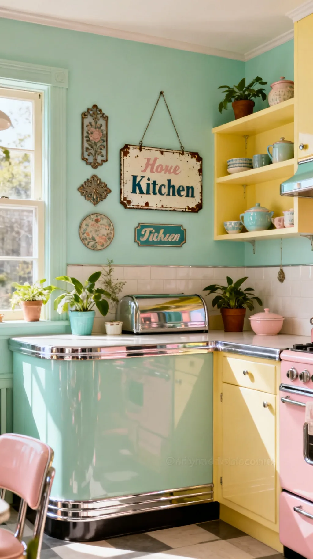
24. Add a Sentimental Gather or Home Sign
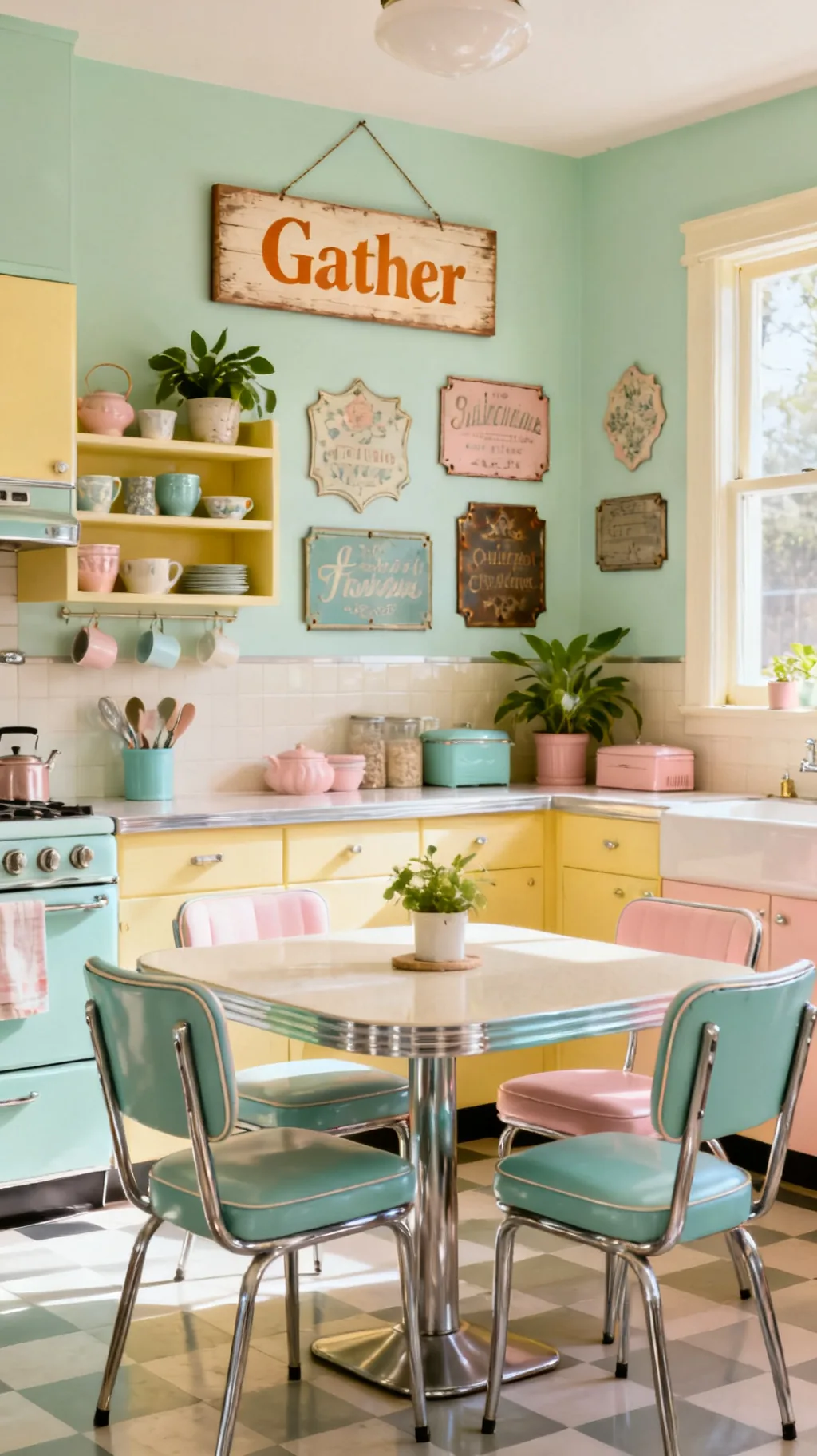
Sometimes the coziest vintage kitchen signs are the ones with a warm little word like gather, home, or family. These sentimental pieces speak to the heart of what a kitchen really is, the gathering place of a home, and they bring an instant sense of welcome. Kept simple and softly aged, they feel heartfelt rather than fussy. I find a single warm word can make a whole kitchen feel like a hug.
Sentimental Signs
- Heartfelt words: gather or home speaks to kitchen life.
- Instant welcome: a warm word softens the whole room.
- Keep it simple: soft lettering reads sincere, not busy.
Hang it where the family gathers, over the table or near the entry, so the word fits the spot.
25. Use Signs to Fill an Awkward Wall Gap
Every kitchen has that one tricky spot, a narrow strip beside the fridge, a short wall between cabinets, or the space under a window. A well-sized sign is the perfect fix, filling the gap with charm instead of leaving it bare or cluttered. Measure the space first and choose a sign that fits the proportions, tall and slim or short and wide as needed. This is the practical magic of signs, they make odd corners feel finished.
Filling Tricky Spots
- Measure first: match the sign shape to the gap.
- Tall or wide: slim strips and short panels both have a place.
- Finished feel: a filled gap reads tidy, not forgotten.
For a skinny gap, choose a vertical sign so it draws the eye up and feels deliberate.
A few more to spark your imagination.
 1 / 5
1 / 5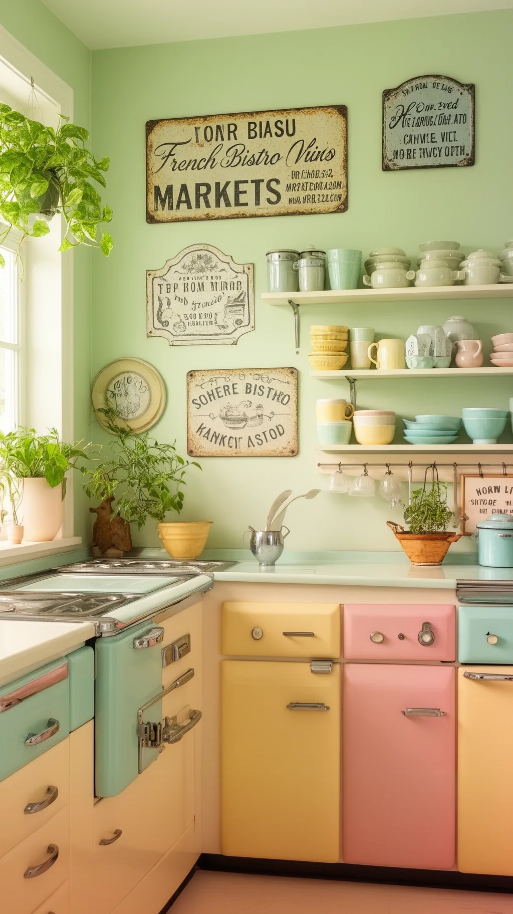 2 / 5
2 / 5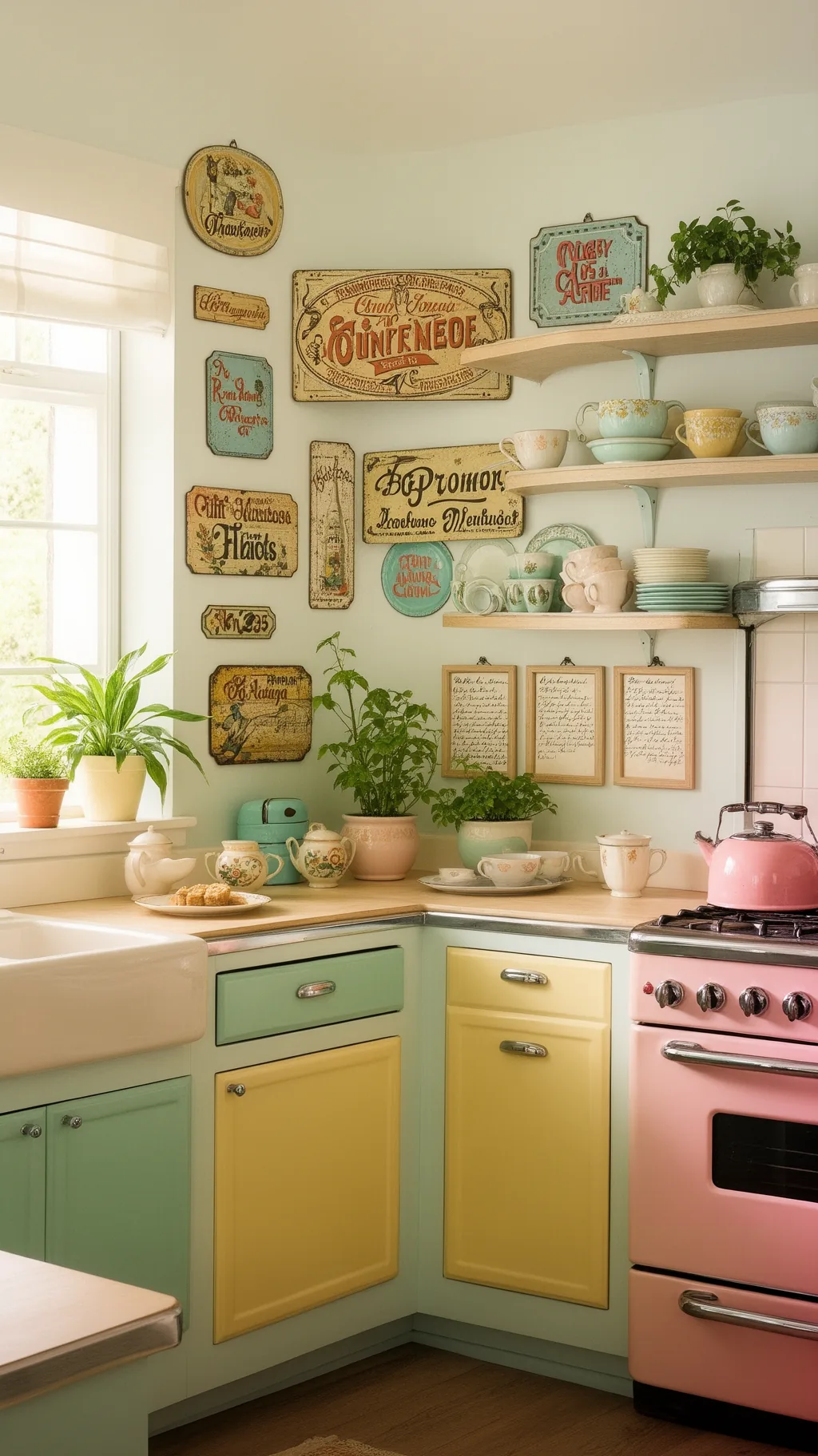 3 / 5
3 / 5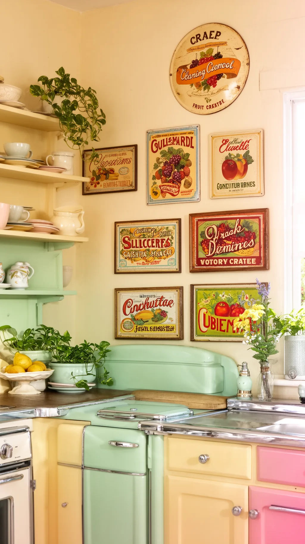 4 / 5
4 / 5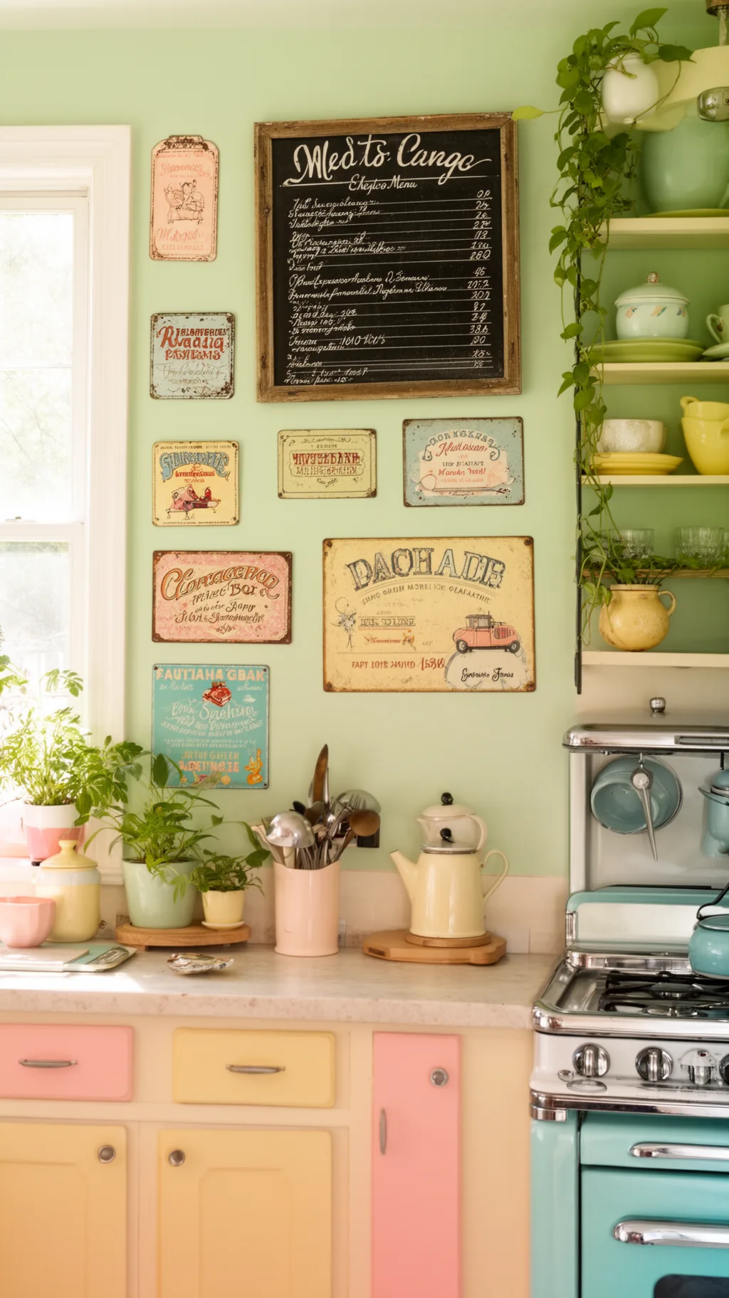 5 / 5
5 / 526. Light a Sign for Cozy Evening Glow
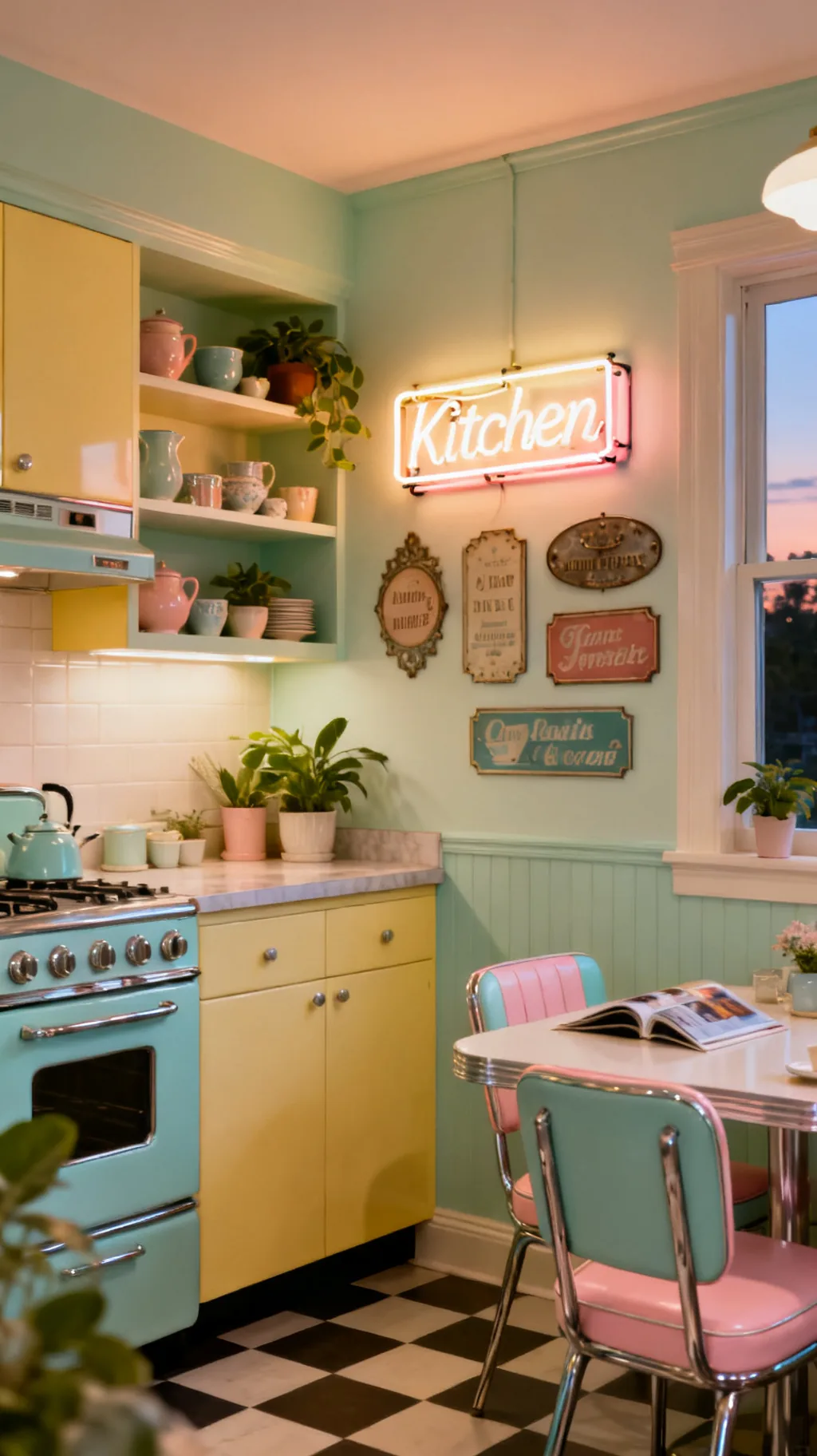
A sign with a soft glow takes a kitchen from cheerful by day to downright magical at night. A faux-neon piece or a sign with a gentle backlight casts a warm pool of light that feels cozy over a coffee bar or a little dining nook. It doubles as soft ambient lighting for quiet evenings, which is a lovely bonus. This is the kind of detail that makes a kitchen feel special after dark.
Glowing Sign Ideas
- Day and night: a lit sign works in any light.
- Cozy glow: warm backlight softens an evening kitchen.
- Bonus light: it adds gentle ambiance over a nook.
Choose a warm-toned glow rather than a cool white one so the light feels inviting.
27. Tie It All Together With Vintage Accents
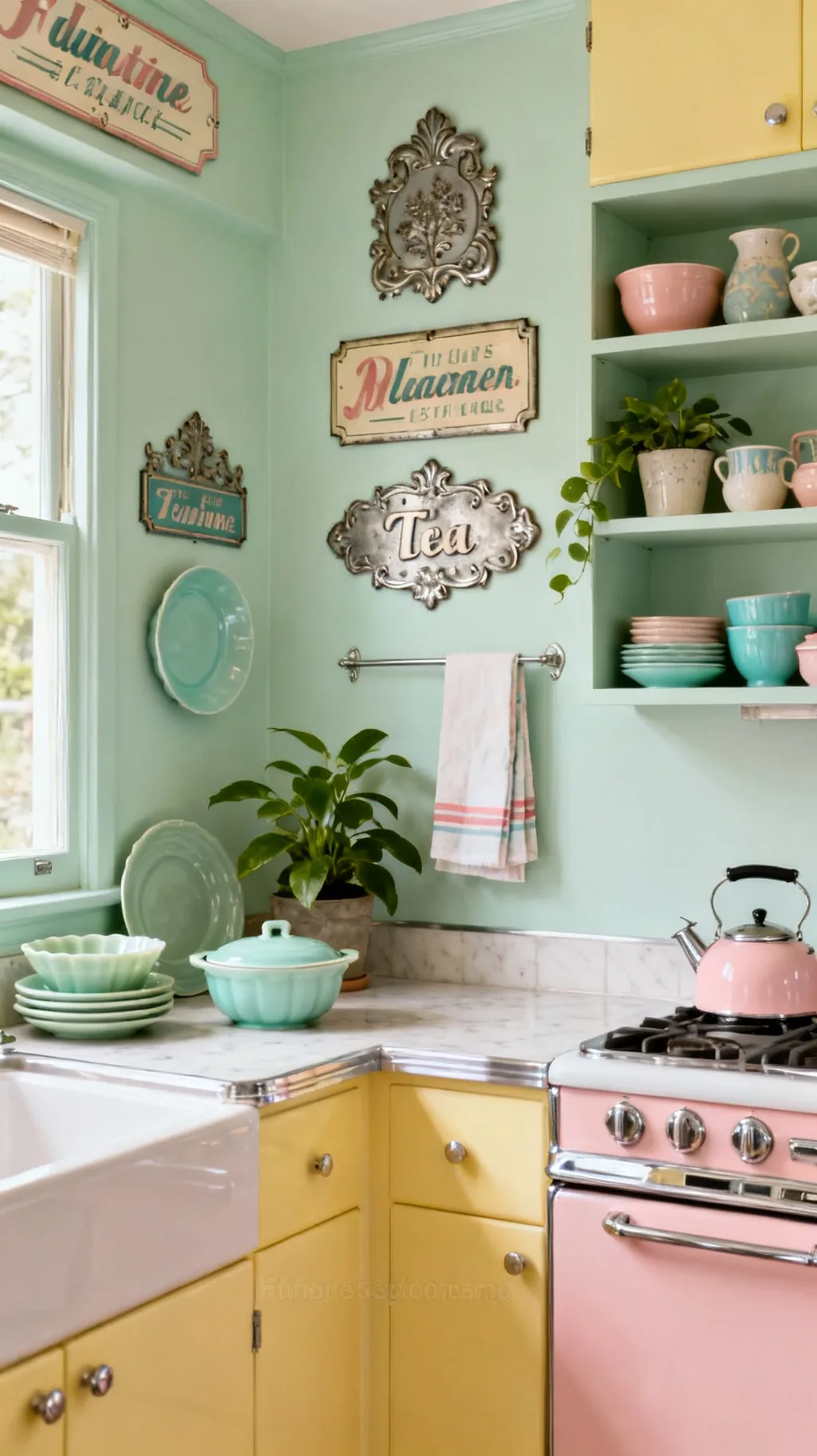
Once your signs are up, a few well-chosen accents let them sit in good company and feel like a deliberate part of the room. Think pastel enamelware, jadeite dishes on open shelves, a cheerful tea towel, and a little greenery, all echoing the colors and era of your signs. These small touches turn a wall of vintage kitchen signs into a complete, collected look. The signs set the tone, and the accents finish the story.
Finishing Touches
- Echo the era: enamelware and jadeite suit retro signs.
- Repeat a color: pull a sign shade into towels or dishes.
- Soften with green: a plant or two warms the whole vignette.
Pull one color from your favorite sign into two or three accents so the room feels whole.
Quick Vintage Sign Pairings to Copy
- Diner Cheer: A bold candy-colored diner sign, chrome accents, checkerboard touches, white walls.
- Soft Cottage: A faded mint painted sign, framed recipe cards, jadeite dishes, a trailing plant.
- Farmhouse Market: A fresh-eggs wood sign, a galvanized metal piece, baskets, and a chalkboard menu.
- French Cafe: A bistro script sign over the coffee corner, cream walls, brass accents, soft light.
A simple rule: let one or two signs lead and keep the rest supporting, so the wall feels collected rather than crowded. If you want to surround your signs with the full midcentury mood, the picks in our mid-century modern kitchen ideas pair beautifully with any vintage sign.
Frequently Asked Questions
Where should I hang vintage kitchen signs?
The best spots are the walls that often sit empty, above the stove or range hood, over a doorway or pantry, beside the refrigerator, or above a coffee corner. A single bold sign makes a lovely focal point over the stove, while a cluster of smaller signs fills a larger blank wall. Just keep signs that live near heat or steam easy to wipe clean, like enamel or metal.
What kind of vintage kitchen signs are most popular?
Classic enamel and tin advertising signs are perennial favorites, especially coffee, baking, and soda themes, along with farmhouse fresh-produce signs and sweet sentimental word signs like gather or home. Pastel painted wood signs and French bistro signs are popular in softer, retro pastel kitchens. The most loved vintage kitchen signs tend to have simple lettering, faded colors, and a gently worn finish.
How do I make a new sign look vintage?
Aging a fresh sign is quick and forgiving. Lightly sand the edges and corners where natural wear would happen, then rub a thin wash of brown glaze over the surface and wipe most of it back. Work in thin layers and stop early, since a subtle patina reads charming while too much looks damaged. A soft, chalky matte paint also helps a brand-new sign feel older from the start.
Where can I find authentic vintage kitchen signs?
Flea markets, estate sales, antique malls, and thrift stores are wonderful hunting grounds for genuine old signs, and online marketplaces are great when you are after a specific theme or color. Well-made reproductions are widely available too and give the same nostalgic look for less. Whether old or new, look for faded colors and simple lettering, which read most authentically vintage.
How many signs are too many for a kitchen?
There is no strict number, but a kitchen usually feels best with one or two statement signs plus a small grouping, rather than signs on every wall. The trick is to leave some breathing room and keep a loose color story so the pieces feel collected, not cluttered. If a wall starts to feel busy, remove one sign and let the others have a little space.
Final Thoughts on Your Vintage Kitchen Signs
The wonderful thing about vintage kitchen signs is how much warmth and personality they bring for such a simple idea. A little faded lettering, a chipped enamel edge, a sweet word above the table, and suddenly the whole room feels nostalgic and lovingly lived in. Start with one sign that makes you smile, then let a small grouping grow from there over time. The best collections feel gathered, not bought all at once, so have fun with the hunt and make it yours. Happy decorating!
You Might Also Like
Get cozy seasonal ideas in your inbox
Seasonal decor, recipes & home inspiration — straight to you. No spam, unsubscribe anytime.