There’s something about stepping into a beautifully decorated garden on a warm summer evening that just stops you in your tracks — the soft light, the scent of fresh flowers, and colors that somehow feel both effortless and intentional. If you’re planning an outdoor celebration this season, the colors you choose will set the entire mood before a single guest takes a sip of lemonade. This article is all about summer garden party color palettes: stunning seasonal combos that work with nature rather than against it. Whether you’re hosting a casual backyard brunch or a more polished garden soiree, the right palette can tie everything together beautifully and make your space feel truly special.
Why Does Color Matter More Than You Think at Outdoor Parties?
Color is the invisible thread that connects every element of your garden party — from tablecloths to napkins to the ribbon on a mason jar. When your palette works in harmony with the surrounding greenery, the whole space feels calm and intentional rather than chaotic.
Most of us focus on food, flowers, and fairy lights when planning a garden party — and those things absolutely matter. But color is the invisible thread that connects every element, from your tablecloth to your paper napkins to the ribbon tied around a mason jar.
One thing I’ve noticed is that the most memorable outdoor gatherings always have a clear color story. It doesn’t need to be rigid or perfectly coordinated, but there’s a sense of intention that guests feel even if they can’t name it. When your palette works in harmony with the greenery around you, the whole space feels select and calm rather than chaotic.
Why It Works
Outdoor light is different from indoor light — it’s brighter, more golden in the evening, and more diffused in shade. Colors that look bold inside can appear washed out in full sun, while softer, chalky tones often glow beautifully in natural light. Choosing your palette with outdoor conditions in mind makes a real difference in how your decor reads in photos and in person.
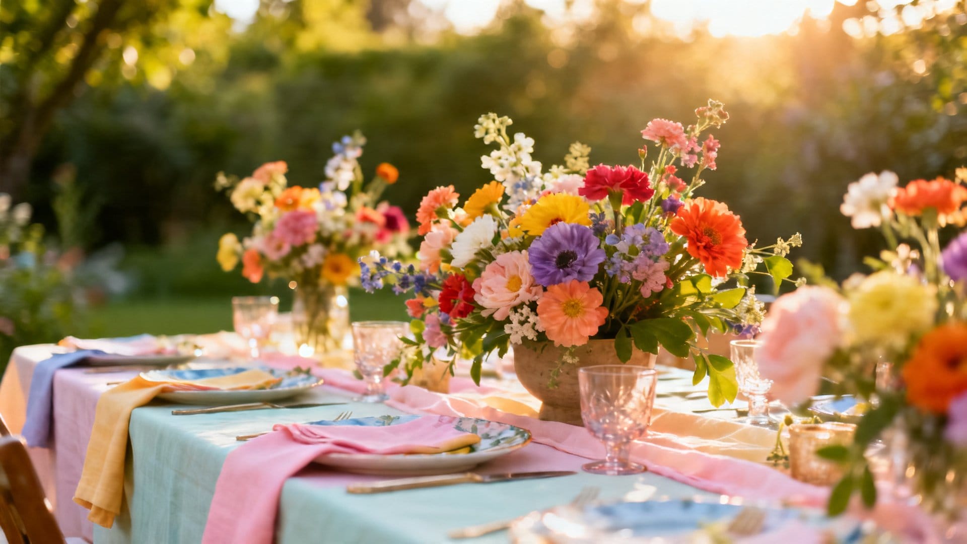
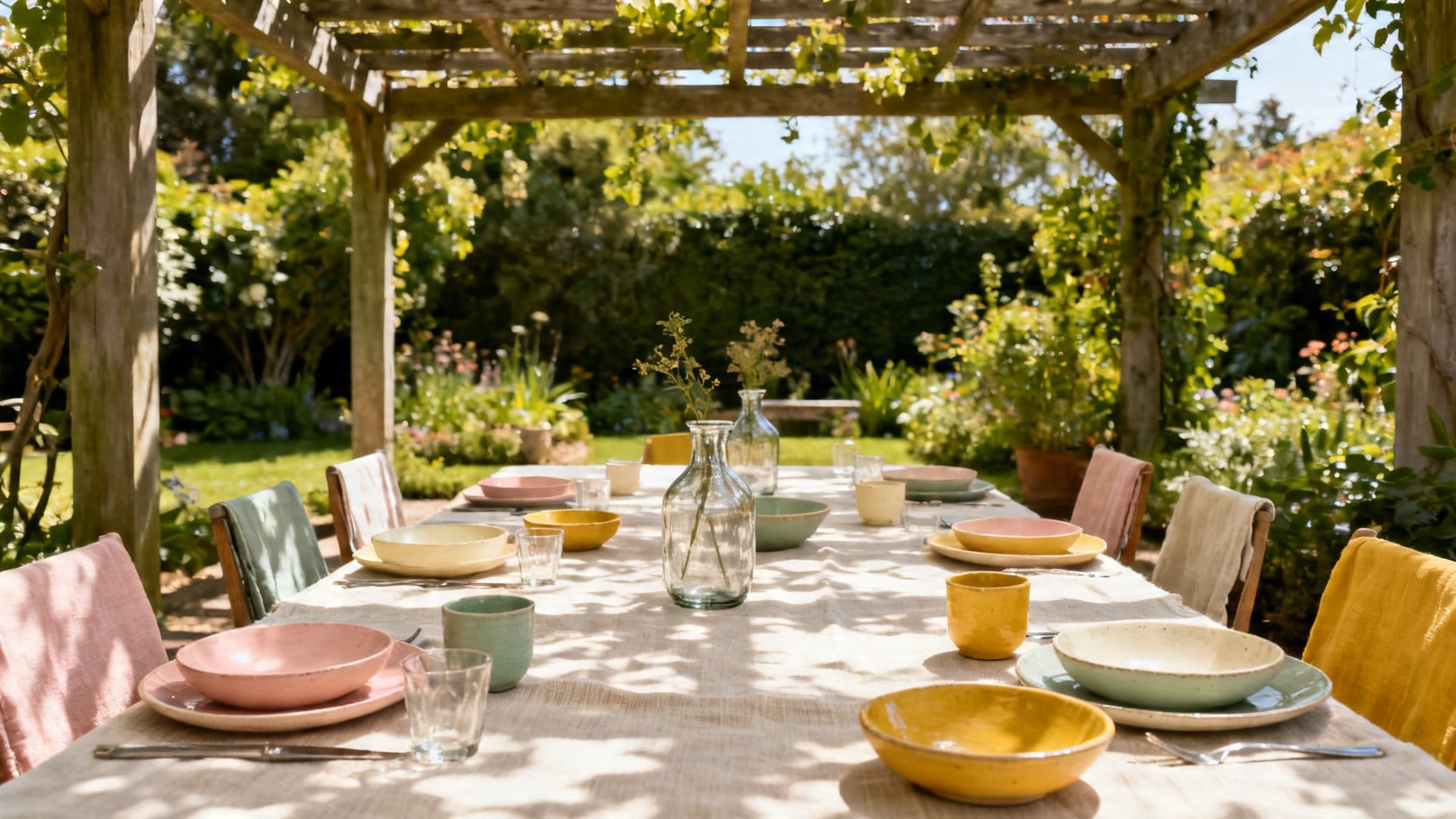
What Is the Classic Garden Party Palette?
The classic garden party palette combines soft blush pink, sage green, and warm ivory — a timeless trio that feels romantic without being overdone and works with almost any flower variety.
Think ivory linen tablecloths layered with sage green napkins, blush-toned candles in terracotta holders, and loose arrangements of garden roses, eucalyptus, and white cosmos tucked into simple ceramic pitchers. The textures matter here just as much as the colors — linen, ceramic, and natural wood all carry this palette beautifully and add a softness that feels genuinely inviting.
Pro tip: Add a single deep burgundy element — a ribbon, a cluster of darker roses, or a set of napkin rings — to give this palette just enough contrast so it doesn’t feel too sweet or flat.
Which Color Palette Works Best for a Bold and Festive Summer Vibe?
A citrus-inspired palette of sunshine yellow, tangerine orange, and lime green — balanced with white or natural linen — delivers the celebratory, energetic feel that a festive summer gathering calls for.
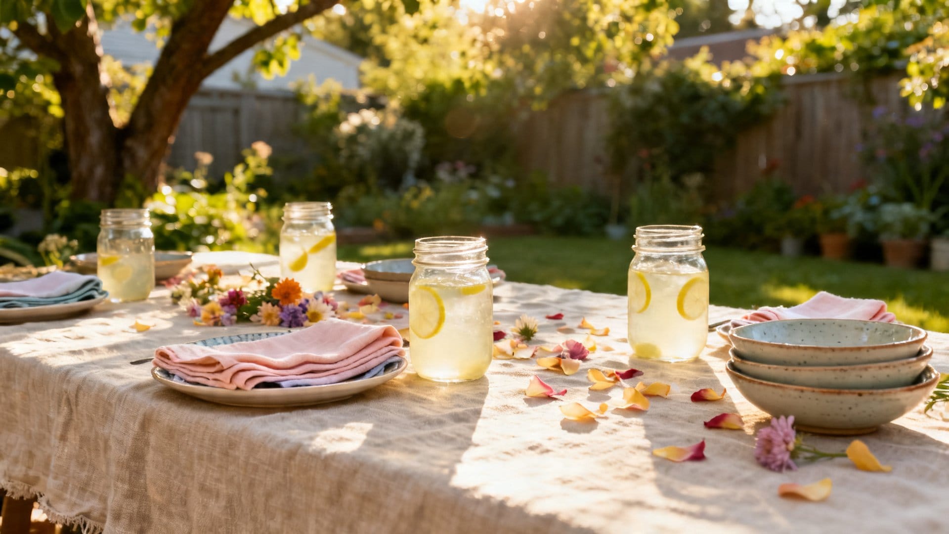
Not every garden party calls for soft and romantic. Sometimes you want color that feels celebratory, energetic, and just plain fun — and that’s where a citrus-inspired palette comes in. Think sunshine yellow, tangerine orange, and a pop of lime green, all balanced with white or natural linen as a grounding base.
I love how this palette plays with the warmth of summer light. In the late afternoon, those oranges and yellows practically glow, and the whole table looks like it belongs in a painting. Use bold citrus tones in your napkins, paper straws, and small bud vases, while keeping larger pieces like tablecloths and chair covers in crisp white or unbleached linen. Marigolds, sunflowers, and zinnias are the perfect flower companions here — they’re affordable, widely available in summer, and they lean right into the palette without any effort.
Pro tip: Scatter a few sliced citrus fruits — lemons, oranges, limes — directly on the table or inside a glass water pitcher as a decor element. It ties the color palette into the food and drink experience in a way that feels clever rather than contrived.
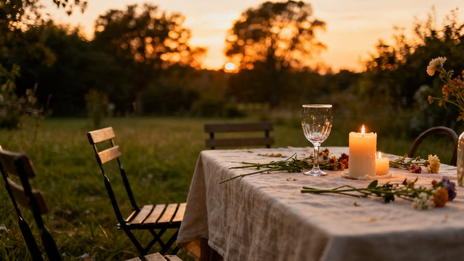
How Do You Create a Moody and Romantic Garden Party Palette?
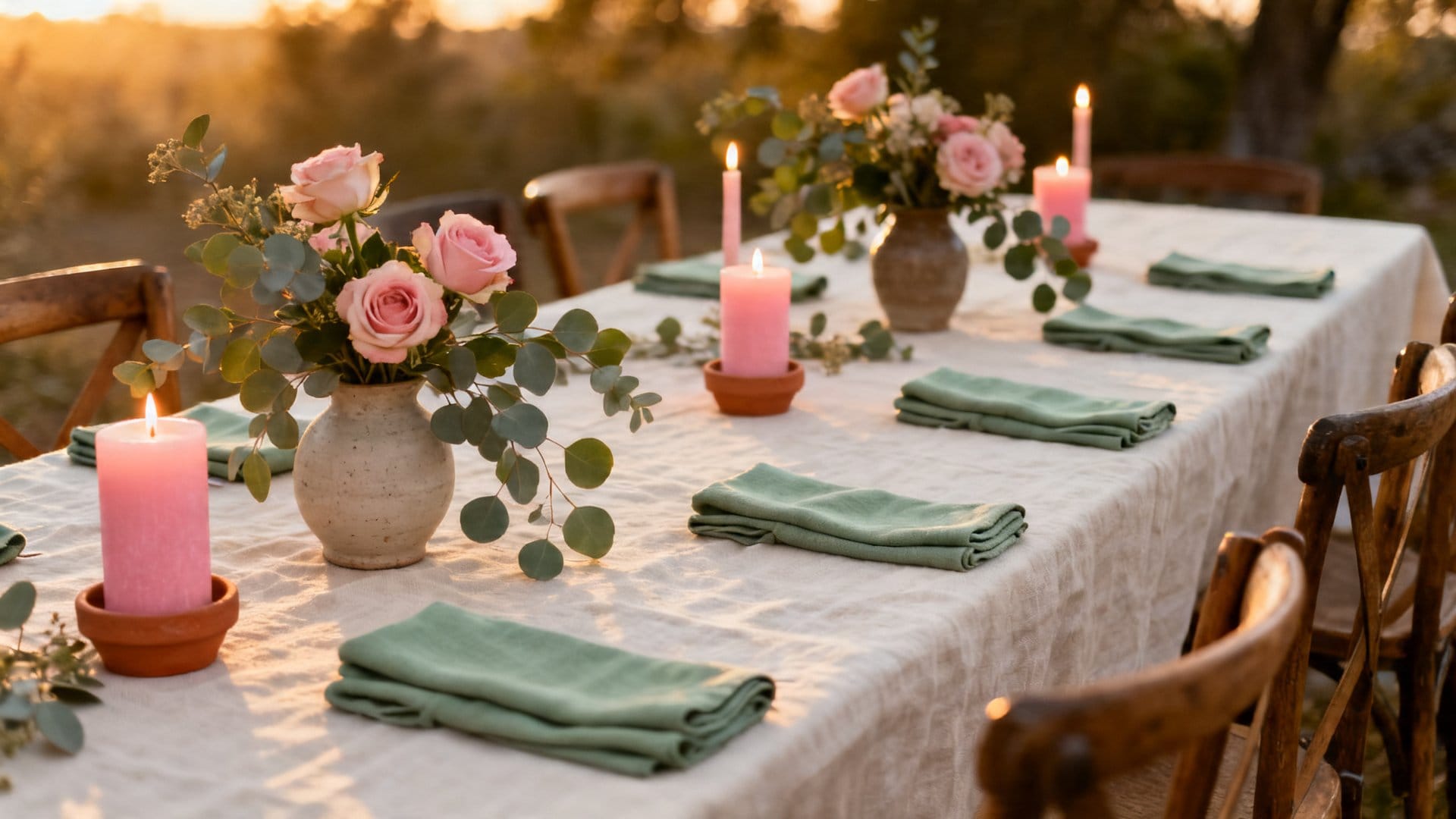
Combine soft lavender, dusty rose, and deep plum for a palette that feels intimate and magical. This combination works especially well in a shaded garden or under string lights, where the deeper tones come alive rather than disappearing into daylight.
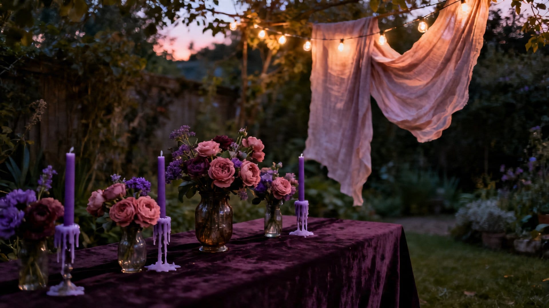
This palette pairs beautifully with silver and antique gold accents — think mismatched vintage candlesticks, aged silver trays, and thin gold ribbon wrapped around napkins. Flowers like lavender, sweet peas, alliums, and dark dahlias carry this palette naturally. A friend of mine styled a late-summer dinner party with this exact combination, and she described it as feeling like stepping into a secret garden — which is exactly the atmosphere you want for something a little more special.
Styling Notes
Layering textures is key with this palette — velvet ribbon, lace overlays on tablecloths, and glass votives all add depth without adding more color. Keep your greenery soft and trailing, like eucalyptus or fern fronds, rather than bold and structural, so the florals remain the focal point.
If the moody and romantic direction feels a little too dramatic for your occasion, a lighter and airier palette might be exactly what you need.
What Makes a Coastal-Inspired Garden Party Palette Work?
Sky blue, sandy cream, and soft white echo the breezy openness of summer itself. Together they create an atmosphere that feels calm and refreshing — equally suited to a morning brunch or a laid-back afternoon gathering.
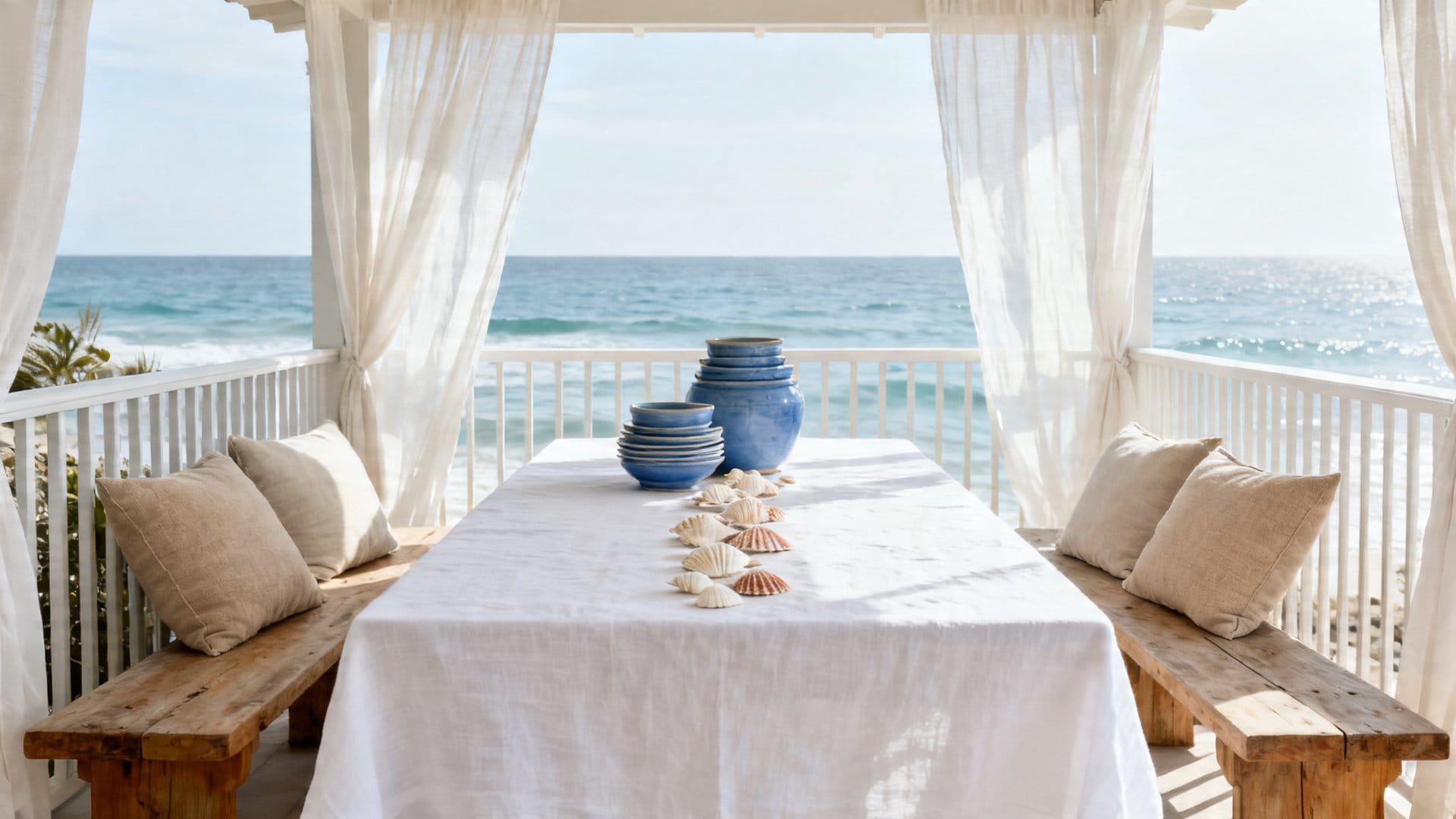
Color Combinations
- Sky blue linen napkins folded loosely beside cream ceramic plates for a relaxed, Hamptons-style place setting
- White hydrangeas and blue delphiniums arranged in a simple glass vase — no foam, no fuss, just water and flowers
- Sandy-toned wicker charger plates layered under white dinner plates to bring in natural texture
- Pale blue glass votives that catch the light and scatter a soft glow across the table at dusk
- Driftwood or light-toned wooden serving boards to anchor the palette with an organic, natural element
This palette breathes, which is exactly what you want on a warm summer afternoon when everything feels a little too bright and busy. It’s one of those combinations that looks effortless but is actually very thoughtfully put together.
What Is an Earthy and Wildflower-Inspired Garden Party Palette?
An earthy wildflower palette draws on terracotta, mustard yellow, and warm olive or sage green — tones that feel pulled directly from a late-summer meadow and deeply connected to the season.
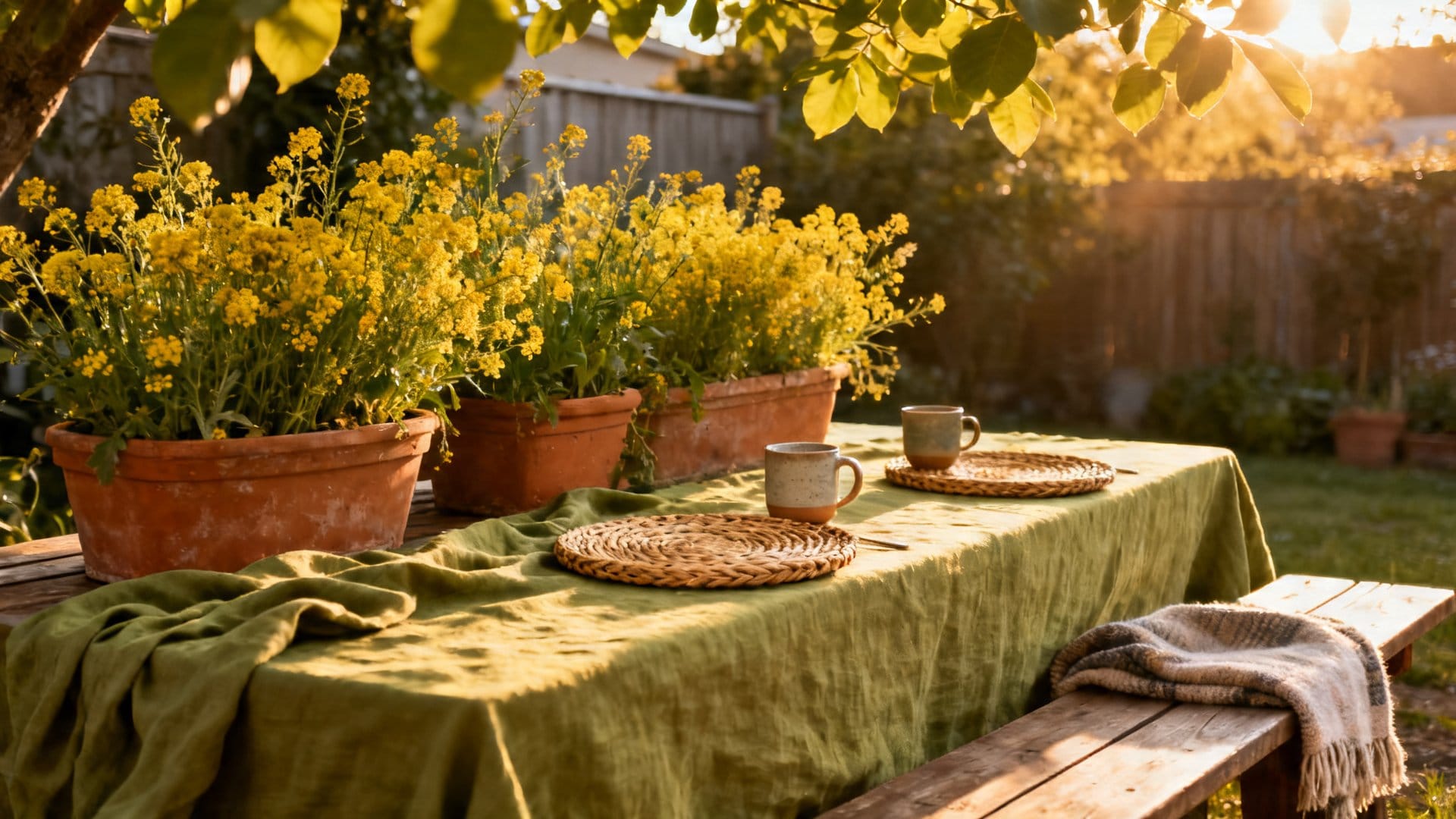
This palette leans into the cottagecore and boho aesthetics that feel so right for relaxed outdoor gatherings. Use terracotta pots as flower vessels, mustard-toned beeswax candles, and olive green linen napkins with a visible weave texture. Wildflowers — whether foraged or bought — are the natural floral choice here: think black-eyed Susans, chamomile, yarrow, and dried wheat stalks mixed into your arrangements. I keep coming back to this approach because it feels genuinely connected to the season rather than imposed on it.
Pro tip: Dried and fresh elements mixed together give this palette its signature look. A bundle of dried lavender tied with twine alongside fresh zinnias creates that beautifully imperfect, gathered-from-the-garden feel that no perfectly arranged bouquet can replicate.
Once you’ve found a palette that speaks to you, the next challenge is putting it all together without losing that sense of ease.
How Do You Mix Garden Party Color Palettes Without the Chaos?
The key is to anchor your palette with a neutral base and limit yourself to three main colors plus one accent. Repeating each color at least twice across your space ensures every choice reads as intentional rather than accidental.
One of the most common worries people have when planning party decor is going too far — mixing too many colors and ending up with something that feels overwhelming rather than festive. The good news is that there are a few simple principles that make mixing summer garden party color palettes feel intentional rather than accidental.
Quick Fixes
- If your palette feels too busy, remove the smallest color element first — often one less color immediately creates calm
- If it feels too flat or safe, add a single unexpected accent in a deeper or more saturated version of one of your existing colors
- Mismatched chairs or furniture can actually unify a palette — paint them all the same neutral color or tie a ribbon in your palette color around each back
From what I’ve gathered, the easiest way to test a palette before committing is to gather all your elements — napkins, flowers, candles, plates — and lay them out on the table together in daylight. You’ll know within seconds whether it works.
Final Thoughts
Choosing the right summer garden party color palettes is really about tuning into the season and the feeling you want your guests to carry home with them. Whether you’re drawn to soft blush and sage, bold citrus, moody lavender, breezy coastal tones, or earthy wildflower hues, the key is to trust your instincts and let the natural beauty of your outdoor space do some of the work. Your garden is already full of color — your palette just needs to have a conversation with it. Happy decorating!
Frequently Asked Questions
Some of the most stunning summer garden party color palettes include soft pastels like blush pink and sage green, vibrant tropical combos like coral and turquoise, and classic pairings like white and gold for a more elegant feel. The best palette for your event depends on the mood you want to create — relaxed and whimsical, bold and festive, or refined and sophisticated. Drawing inspiration from the natural colors already present in your garden, such as your existing flowers and foliage, is a great way to choose a palette that feels effortlessly cohesive.
Start by identifying the dominant colors already blooming in your garden and build your palette around those natural hues rather than competing with them. For example, if you have lots of lavender and white blooms, a soft purple, cream, and silver palette will feel harmonious and intentional. Using your garden’s existing colors as a foundation ensures your decorations feel like a natural extension of the outdoor space rather than an afterthought.
Absolutely — the key to mixing multiple colors successfully is to establish one or two dominant colors and use the others as accents in smaller doses throughout your décor. Sticking to colors within the same tonal family, such as all warm tones or all cool tones, also helps create a sense of visual harmony even when several shades are in play. Repeating your accent colors consistently across different elements like napkins, florals, and tableware will tie everything together and prevent the space from feeling overwhelming.
Daytime garden parties benefit from bright, cheerful palettes like lemon yellow and white, peach and mint, or sky blue and coral, which look fresh and vibrant in natural sunlight. Evening garden parties, on the other hand, tend to shine with deeper, moodier combinations such as dusty rose and burgundy, navy and gold, or emerald green and champagne, which glow beautifully under string lights and candles. Considering your lighting conditions is just as important as the colors themselves, since the same palette can look dramatically different depending on the time of day.
While it’s not strictly necessary, coordinating your color palette with your invitations and any stated theme creates a polished, cohesive guest experience from the very first impression. If your invitations feature a watercolor floral design in peach and green tones, carrying those same colors through your tablescapes, signage, and floral arrangements will make the entire event feel thoughtfully select. Even small nods to your invitation palette — like matching ribbon colors or coordinating paper goods — can improve the overall aesthetic without requiring a complete overhaul of your décor.
You Might Also Like


Get cozy seasonal ideas in your inbox
Seasonal decor, recipes & home inspiration — straight to you. No spam, unsubscribe anytime.